Adrian Frutiger: The Engineering of Modern Typography
I spent yesterday afternoon auditing a client’s “brand guidelines” that looked like they’d been assembled by a caffeinated intern with a Pinterest obsession.
They had five different fonts, none of which talked to each other, and a primary typeface that was illegible the moment you stepped three feet away from the screen.
It was a mess. It was “junk” in its purest, most expensive form.
Most entrepreneurs and small business owners view typography as a decorative choice—like selecting a paint colour for the office kitchen. You’re wrong.
Typography is infrastructure. If your customer can’t read your pricing table at a glance, or if they struggle to navigate your app because your “modern” sans-serif looks like a jumble of sticks, you are losing money.
Adrian Frutiger understood this better than anyone in the 20th century. He didn’t just draw letters; he engineered systems of visual communication.
He is the reason you can find your gate at an airport without having a panic attack.
If you want your brand to command authority, you need to stop looking for “nice” fonts and start looking for famous graphic designers who solved the problem of human perception.
- Typography is infrastructure; legibility reduces errors and increases conversions for businesses.
- Frutiger engineered systematic type families (Univers Grid) for precise hierarchy and scalability.
- Humanist designs like Frutiger and Avenir prioritise open forms for faster, less error‑prone reading.
- Practical solutions (OCR‑B, airport signage) prove function-first typography serves both humans and machines.
Who is Adrian Frutiger?
Adrian Frutiger (1928–2015) was a Swiss typeface designer who helped transition the world of typography from the era of metal type to the digital age. Unlike his contemporaries who focused on aesthetic “flavour,” Frutiger prioritised the systematic legibility and architectural harmony of letterforms across different weights and environments.
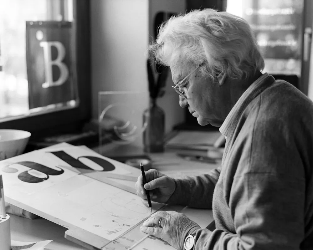
His work is defined by three core elements:
- The Frutiger Grid: A numerical system for classifying type weights and widths (pioneered with Univers).
- Humanist Geometry: Sans-serif forms that retain the warmth and “openness” of traditional calligraphic structures.
- Environmental Scalability: Typefaces designed specifically for wayfinding and high-speed recognition in physical spaces.
“Helvetica is the jeans, and Univers the dinner jacket. Helvetica is here to stay”.
The End of the “One-Size-Fits-All” Myth
For decades, the “creative” world has worshipped at the altar of Helvetica. It’s the safe choice. It’s the “vanilla” of the design world. But here is an uncomfortable truth: Helvetica is often a terrible choice for complex information systems.
Adrian Frutiger saw the flaws in the mid-century obsession with “closed” shapes.
In a 1998 interview, Frutiger remarked that the “eye does not read letters, but the space between them.” This is a fundamental principle of brand typography that most businesses ignore.
When characters are too uniform—as they often are in neo-grotesque faces like Helvetica—the brain has to work harder to distinguish an ‘a’ from an ‘o’ or an ‘e’.
“Typography must be as beautiful as a forest, not like the concrete jungle of the tenements. It gives the distance between the trees, the room to breathe and allows for life”.
The Univers System: Maths Meets Art
Before Frutiger, fonts were a chaotic mess of names like “Bold,” “Semi-bold,” and “Extra Condensed.” There was no standard. In 1957, Frutiger launched Univers. He didn’t just release a font; he released a matrix. He assigned each variation a two-digit number.
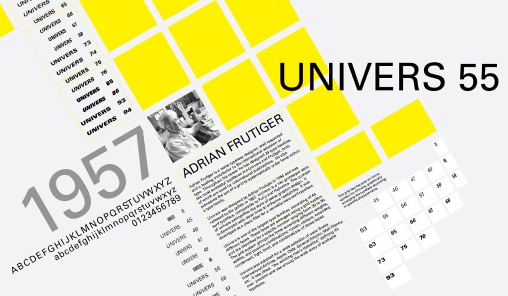
The first digit defined the weight (e.g., 5 is regular, 7 is bold). The second digit defined the width and whether it was Roman or italic.
“The creation of Univers was the first time a typeface was conceived as a family with a unified structure from the very beginning,” notes a Monotype study on typographic history.
This wasn’t just for show. It allowed designers to create a typographic hierarchy with mathematical precision. If you are building a complex SaaS platform or a 200-page technical manual today, you are using the descendants of this logic.
OCR-B: The Font That Spoke to Machines (and Humans)
In the 1960s, the world was entering the computer age. Banks needed a way for machines to read cheques. The solution was OCR-A—a typeface that looked like a jagged, robotic nightmare. It was easy for computers to read but painful for humans.
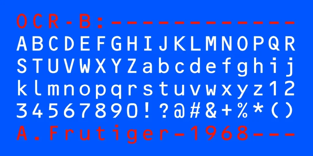
Frutiger found this offensive. He believed that even “technical” fonts should respect human biology. He developed OCR-B in 1968.
| Feature | OCR-A (The Amateur/Early Way) | OCR-B (The Frutiger Way) |
| Legibility | High for machines, Low for humans | High for both |
| Aesthetics | Distorted, “Computer-like” | Natural, Humanist |
| Global Standard | Limited | ISO 1073-2 Standard |
| Purpose | Purely functional/Data | Professional/Integrated |
This is a lesson for every SMB owner: just because something is “functional” or “back-end” doesn’t mean it has to be ugly. Frutiger’s OCR-B is still used on every barcode and passport today.
It is the invisible backbone of global commerce because it refused to sacrifice human readability for technical convenience. If your services page looks like it was written for a robot, you are failing your customers.
The Roissy Experiment: Why Architecture Needs Type
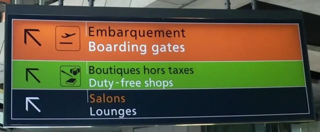
In 1970, Frutiger was commissioned to design the signage for the new Charles de Gaulle Airport (also known as Roissy) in Paris. The architectural world expected him to use Univers. It was his masterpiece, after all.
But Frutiger refused.
He realised that Univers—while perfect for printed books—was too “tight” for people rushing through an airport at 5 mph with luggage. He needed something with larger “apertures” (the openings in letters like ‘c’ and ‘e’). He needed letters that wouldn’t “blur” into circles when viewed from a distance or at an angle.
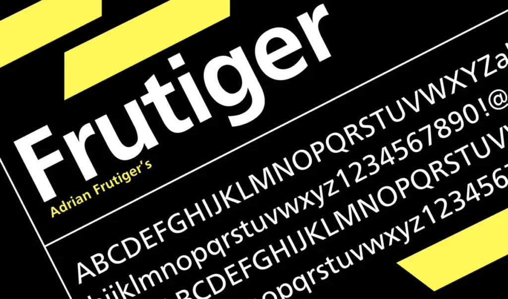
The result was the typeface simply called Frutiger.
The Real-World Failure of Helvetica
Data from the Nielsen Norman Group consistently shows that “open” sans-serif typefaces (Humanist) outperform “closed” (Grotesque) ones in terms of reading speed and error reduction. When you use a font with tight spacing and uniform letter shapes, you increase the cognitive load on your user.
In a B2B environment, that cognitive load is the “friction” that stops a lead from clicking “request a quote.” If your contact page is hard to read because you wanted to look “cool” like a 1960s fashion magazine, you’ve missed the point of design.
Avenir: The “Future” That Outperformed the Past
If Univers was about logic and Frutiger was about function, Avenir (1988) was about beauty. The name means “Future” in French. Frutiger wanted to take on Futura—the famous geometric font from the 1920s.
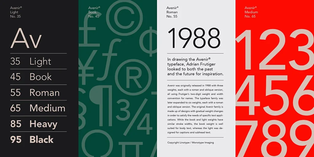
Futura is based on perfect circles and squares. It’s “mathematically” correct but “optically” wrong. Frutiger knew that the human eye is easily tricked. He designed Avenir with subtle variations in stroke thickness to make the letters feel more balanced.
- Futura: Cold, rigid, and sometimes “spiky.”
- Avenir: Warm, approachable, and highly professional.
We often recommend Avenir (or its modern counterpart, Avenir Next) for clients looking for font pairing that balances modern tech vibes with a sense of established trust. It’s why companies like Apple used it as their system font for years.
The State of Typography in 2026: The Variable Revolution
We are currently seeing a massive shift in how Frutiger’s principles are applied. In 2026, the focus isn’t just on static “weights” but on Variable Fonts.
A variable font is a single file that contains the entire “Frutiger Grid” within it. Instead of loading five separate files for light, regular, and bold, a website can now load one file and adjust the weight to the exact pixel. This reduces “layout shift”—a core metric in Google’s Core Web Vitals.
Frutiger’s 1957 numbering system was the “analogue” version of what we now do with CSS font-weight sliders. The man was sixty years ahead of his time in terms of technology. If you aren’t using these systems to create font combinations that adapt to mobile vs desktop screens, your brand will look antiquated by the end of the year.
The “Airport Test”
I once audited a client in the logistics sector. They were struggling with “user error” on their warehouse labels. They used a narrow, condensed font because they wanted to “save space.”
I told them they were failing the Airport Test.
If a worker can’t identify a shipping code from six feet away in dim light, the font is a failure. We replaced their “space-saving” font with a customised version of Frutiger (Frutiger Next). Error rates decreased by 14% over a three-month period.
Typography isn’t an “artistic” flourish. It is a tool for reducing errors and increasing efficiency. If you are choosing between serif vs sans serif based on what “looks pretty,” you are playing at business, not doing it.
Adrian Frutiger Typefaces: Complete Works
You’re using typefaces every day without understanding the engineering that makes them work. Your designs lack the structural integrity of a master. This is the fix. Adrian Frutiger — Typefaces: The Complete Works is the definitive, 460-page “bible” of 20th-century typography.
As an Amazon Partner, when you buy through our links, we may earn a commission.
Adrian Frutiger’s Legacy for the Modern Founder
Adrian Frutiger didn’t care about trends. He was interested in how the human eye perceives light and shadow. His work teaches us three things:
- Systematise Everything: Don’t pick fonts in a vacuum. Build a system (like the Univers Grid).
- Function Over Fashion: If it’s not legible at a distance or on a low-res screen, it’s useless.
- Respect the Space: It’s not about the black ink; it’s about the white space you leave behind.
“I am sure in some years from now you will see new posters with just white space and four lines in Garamond”.
Your brand is a conversation with your customer. If you’re using “fluff” typography, you’re basically mumbling.
Ready to stop guessing and start building a brand that actually works? Explore our design services or request a quote to see how we can fix your visual infrastructure.
Frequently Asked Questions (FAQ)
Why is Adrian Frutiger important to modern web design?
Adrian Frutiger pioneered the systematic approach to font families. His “Frutiger Grid” laid the groundwork for how we use CSS and variable fonts today. His focus on legibility ensures that websites remain accessible and easy to read on various screen sizes and resolutions.
What is the difference between Univers and Helvetica?
While both are Swiss sans serifs, Univers is a more “open” and systematic family. It was designed as a cohesive matrix of 21 weights and widths from the start. Helvetica is more “closed” and uniform, which can sometimes lead to lower legibility in complex environments compared to Univers.
Why did Frutiger design a font specifically for airports?
Traditional fonts often “blur” when viewed from a distance or under stress. Frutiger created his namesake font with wider apertures and distinct character shapes to ensure passengers at Charles de Gaulle Airport could read signs quickly and accurately while moving.
Is Avenir better than Futura?
“Better” depends on the goal, but Avenir is generally more legible for body text. While Futura is strictly geometric (based on circles and squares), Avenir uses “humanist” corrections to make the letters feel more natural and balanced to the human eye.
What is the “Frutiger Grid”?
It is a two-digit numbering system used to classify typefaces. The first digit represents the weight (thickness), and the second represents the width and posture (italic vs roman). This replaced the confusing naming conventions, such as “semi-bold,” with a logical, mathematical scale.
Why is OCR-B still used on passports and barcodes?
Frutiger designed OCR-B to be readable by both machines and humans. Unlike its predecessor, OCR-A, which appeared robotic and distorted, OCR-B adheres to natural typographic rules, making it a global standard for official documents that require high-security scanning.
Can I use Frutiger fonts for my small business branding?
Absolutely. Typefaces like Frutiger, Avenir, and Univers are excellent choices for businesses that want to project professional authority and clarity. They are particularly effective for technical, medical, or logistics companies where information accuracy is paramount.
How do I choose between a Frutiger font and a serif font?
It depends on your brand’s personality. Frutiger-style sans serifs are modern, clean, and functional. Serifs are often seen as more traditional and authoritative. Many successful brands use a “Frutiger” style for headers and a serif for long-form body text to balance the two.
What makes a font “Humanist”?
Humanist fonts, like those designed by Frutiger, are based on the proportions of classical calligraphy. They have more variation in stroke thickness and more “open” spaces than “Grotesque” fonts (like Arial), which makes them significantly easier to read at small sizes.
Did Adrian Frutiger design any serif fonts?
Yes, he designed several, including Meridien and Didot (a revival). However, he is most famous for his sans-serif work, as he revolutionised how those forms were engineered to meet the 20th century’s industrial and digital needs.
Why does typography affect my website’s conversion rate?
If a user finds your text difficult to scan, they experience “cognitive friction.” This makes them more likely to leave your site. Using Frutiger’s principles of legibility reduces this friction, making it easier for users to process your value proposition and take action.
Where can I see Adrian Frutiger’s work in the “wild”?
You can see it on the Swiss Post, the Paris Metro, Westminster Abbey’s signage (Avenir), and almost every passport or barcode in the world (OCR-B). His work is the “invisible” layer of communication that guides much of modern life.

