Raymond Loewy: The Industrial Design Blueprint
Most modern designers are obsessed with their own “creative vision.” They treat a brand identity like a gallery piece rather than a tool for profit.
They forget that the consumer doesn't care about your “process”; they care about how a product fits into their lives without making them feel stupid.
If you are an entrepreneur or an SMB owner, ignoring the principles of the “Man who Shaped America” is a fast track to market irrelevance.
Loewy understood a truth that many find uncomfortable: Design is not art. Design is the elimination of friction to accelerate the sales curve.
- Design is a commercial tool, not art; eliminate friction to accelerate sales and customer adoption.
- The MAYA principle: balance innovation with familiarity to avoid alienating or boring customers.
- Streamlining turns function into desirability, boosting sales by making products feel like furniture, not machines.
- Timeless logos rely on geometric simplicity, high-contrast colour, and scalability for enduring recognition.
- Human-centred design—cognitive streamlining and habitability—improves usability and long-term brand loyalty.
Who is Raymond Loewy?
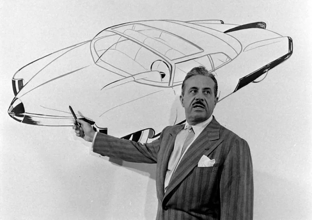
Raymond Loewy (1893–1986) was a French-born American industrial designer widely recognised as the “Father of Industrial Design.”
He pioneered the “Streamline” aesthetic and developed the MAYA principle, a framework for balancing innovation with consumer familiarity to maximise commercial adoption across industries.
The 3 Core Elements of the Loewy Methodology:
- The MAYA Principle: “Most Advanced Yet Acceptable.” The sweet spot between “boring” and “shocking.”
- Visual Streamlining: Reducing complex forms into simplified, aerodynamic, and repeatable geometries.
- Beauty Through Function: The belief that a product’s aesthetic appeal should be a direct result of its operational efficiency and ease of use.
The MAYA Principle: Why Innovation Fails Without Familiarity
The biggest mistake I see SMBs make is trying to “disrupt” a market by being too different. They launch products that require a manual to understand or logos that look like abstract Rorschach tests.
Raymond Loewy identified the MAYA Principle (Most Advanced Yet Acceptable) as the antidote to this ego-driven failure. He argued that the human mind is caught in a conflict between neophilia (a love of new things) and neophobia (a fear of the unknown).
If you go too far toward neophilia, you alienate the customer. If you stay too close to neophobia, you become a commodity.
The Data of Familiarity
A study by the Nielsen Norman Group on the Aesthetic-Usability Effect confirms that users perceive more “attractive” and familiar designs as more usable. This isn't just a preference; it’s a cognitive bias. When a design feels “right” because it mirrors something the user already understands, their brain requires less energy to process it.
Real-World Example: The Studebaker Avanti
When Loewy designed the Studebaker Avanti, he removed the front grille entirely. This was “Advanced.” However, he retained the classic sports car silhouette and utilised familiar interior materials. It looked like the future, but it didn't feel like an alien spacecraft. It was the “Acceptable” bridge.
| Feature | The Amateur (Trend Chaser) | The Pro (Loewy Disciple) |
| New Features | Added because “we can.” | Added to solve a specific friction point. |
| Visual Identity | Uses “trendy” gradients and fonts. | Uses timeless typography basics and geometric ratios. |
| User Onboarding | Reinvents the wheel for “uniqueness.” | Uses established mental models (MAYA). |
| Market Position | Tries to be “Disruptive.” | Tries to be “Inevitable.” |
Streamlining: More Than Just Shiny Chrome
When people think of Raymond Loewy, they think of the 1930s “Streamline Moderne” style—characterised by chrome, curves, and speed lines. But streamlining wasn't just an aesthetic choice; it was an economic one.
In 1934, Sears, Roebuck & Co. hired Loewy to redesign their “Coldspot” refrigerator. At the time, fridges were ugly, industrial boxes with exposed legs and mechanical parts. Loewy “streamlined” it. He enclosed the components, rounded the corners, and added chrome hardware.
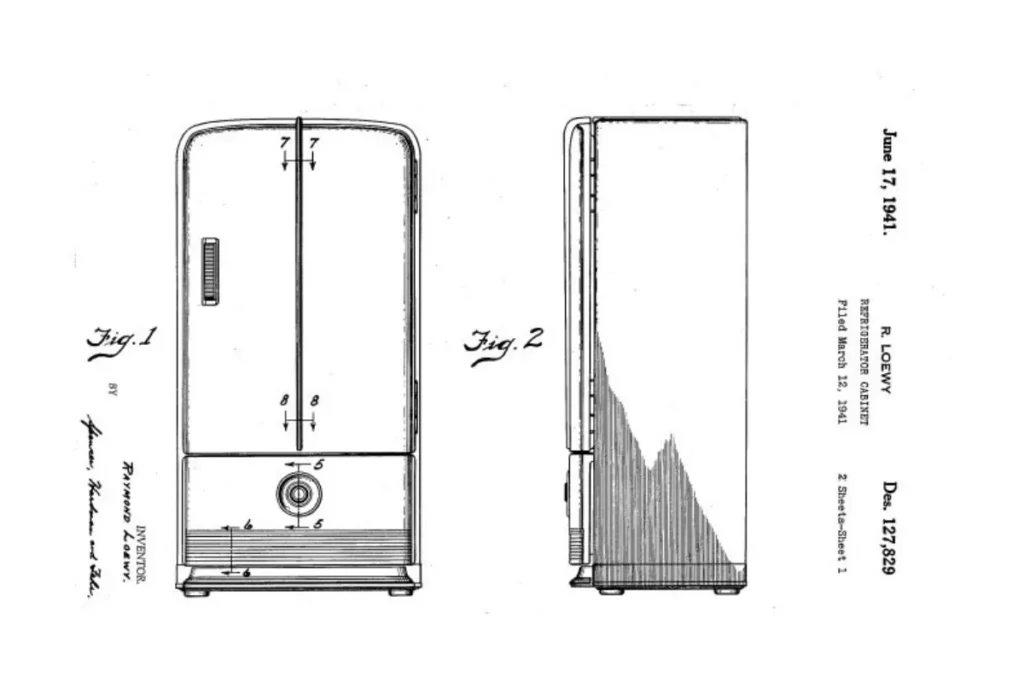
The Result: Sales skyrocketed from 60,000 units to 275,000 units in a single year.
Loewy didn't change how the fridge cooled food; he changed how the consumer felt about having it in their kitchen. He turned an appliance into a piece of furniture. This is the essence of brand strategy.
Digital Streamlining in 2026
In the current digital environment, streamlining is no longer about physical aerodynamics; it is about Cognitive Streamlining.
- Reducing “Click-Depth”: How many steps does it take for a user to complete a purchase?
- Visual Hierarchy: Is the “Call to Action” the most streamlined path for the eye?
- Language: Are you using creative thinking to simplify your message, or are you hiding behind “fluff”?
The Logomark Legacy: Shell, Exxon, and BP
Loewy’s work in brand identity is arguably the most successful in history. Many of the famous graphic designers we study today are still standing in his shadow.
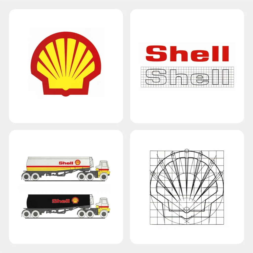
Consider the Shell logo. In 1971, Loewy took the existing, somewhat cluttered “pecten” (the shell shape) and simplified it into the bold, red-and-yellow geometric icon we see today. It was so effective that Shell has barely touched it in over 50 years.
Why Loewy's Logos Last
- High Scalability: They work on a tiny business card or a massive roadside sign.
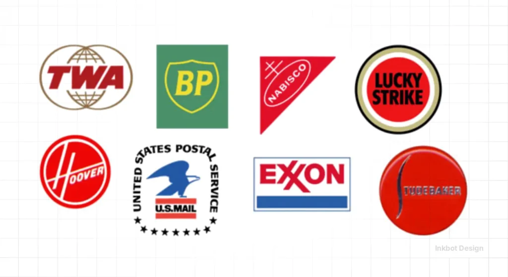
- Colour Psychology: He understood that high-contrast, primary colours (Red/Yellow for Shell, Blue/Red for Exxon) triggered immediate recognition. You can learn more about this in our guide to colour psychology.
- Geometric Stability: He used circles, squares, and triangles as the foundation for his work. These shapes are processed faster by the human eye than organic, complex forms.
“A logo is a signature. It is a way of saying, ‘I am here, and I am reliable.'” — Raymond Loewy (Paraphrased).
To understand why Raymond Loewy’s logic still dictates how you shop, drive, and even look at a screen in 2026, we have to look past the shiny surfaces of his work and into the commercial mechanics of his most famous projects.
Loewy didn't just “draw” things. He performed surgery on the consumer's expectations. Here is the forensic breakdown of the work that defined the 20th century and continues to provide the blueprint for modern brand identity.
1. The Coca-Cola Bottle Redesign (1954)
While Loewy didn't invent the original 1915 “hobbleskirt” bottle, he was the man tasked with making it fit for the modern, fast-paced vending machine era.
The Problem: The original bottle was iconic but lacked the sleekness required for modern manufacturing and branding consistency.
The Loewy Solution: He “slenderised” the silhouette. He removed the heavy embossing and replaced it with the crisp, white “Coca-Cola” script we recognise today.
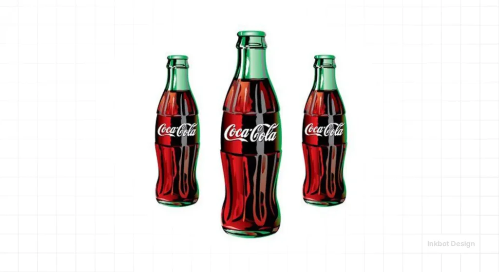
The Result: By streamlining the form, he made the bottle easier to grip and more efficient to pack. More importantly, he introduced the King Size and Family Size bottles.
He understood that as the American family grew, the “unit of consumption” had to grow with it. This is a classic example of using creative thinking to solve a logistical and psychological bottleneck.
2. The Lucky Strike “Green Has Gone to War” (1942)
This is perhaps the greatest “Consultant’s Reality Check” in design history. Before the 1940s, Lucky Strike packaging was a muddy, dark green.
The Problem: The green ink used copper, which was in short supply for the war effort. More importantly, market research showed that women—a growing demographic of smokers—found the green packaging unappealing and “clunky.”
The Loewy Solution: He changed the pack to brilliant white. He also did something radical for the time: he put the logo on both sides of the pack.
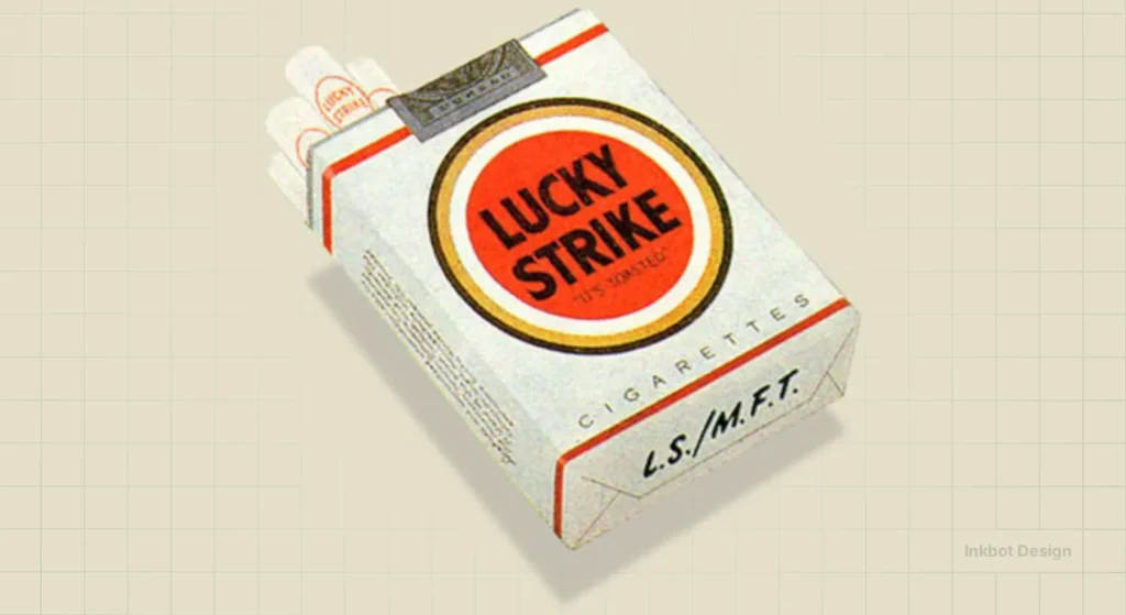
The Result: White made the product feel “cleaner” and more premium.
- Placing the logo on both sides ensured that, regardless of how a smoker tossed the pack onto a table, the brand remained visible.
This wasn't an artistic choice; it was a strategic move to increase visibility. It’s the 1940s version of SEO optimisation—ensuring your “keyword” (the brand) is always findable.
3. The Studebaker Starliner & Avanti
Loewy’s work with Studebaker is the textbook definition of the MAYA Principle. While the “Big Three” (Ford, GM, Chrysler) were adding massive fins and chrome to cars, Loewy went the other way.
The Starliner (1953): Often called the “Loewy Coupe,” it was low, lean, and lacked the aggressive “teeth” of its competitors. It seemed to be moving while standing still.
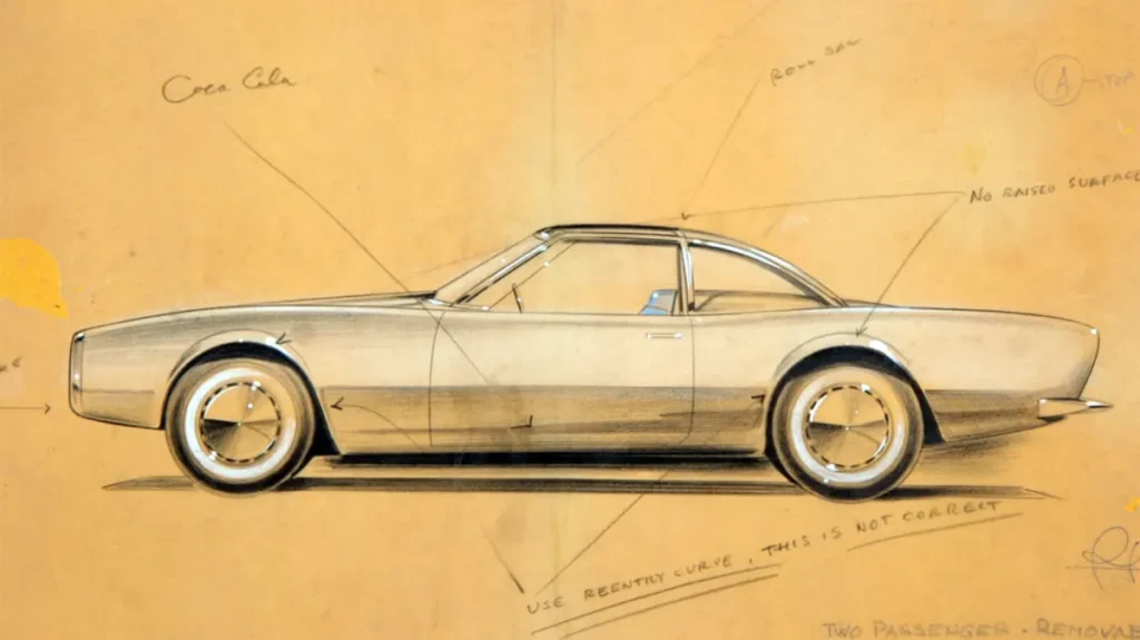
The Avanti (1962): This was his masterpiece. It was one of the first mass-produced fibreglass cars. Loewy famously holed up in a house in Palm Springs with a team of designers and a “no-distractions” rule to finish the design in record time.
- The “Advanced” Element: No front grille. Air was pulled from under the bumper.
- The “Acceptable” Element: A luxurious, cockpit-style interior that made the driver feel like a pilot.
He proved that you could sell a radical “future” if you wrapped it in the comfort of luxury. This is a lesson most tech startups in 2026 still haven't learned.
Technical Comparison: Iconic Loewy Assets
| Project | The “Old” Friction | The Loewy “Streamline” | The Commercial Impact |
| Greyhound Bus | Boxy, slow-looking, “bus-like.” | The Scenicruiser (split-level, curved glass). | Defined the “romance of the road” for a generation. |
| Pennsylvania Railroad | Dirty, industrial, intimidating. | The S-1 Locomotive (shrouded in a bullet-shaped casing). | Became the symbol of American industrial might. |
| Exxon Logo | The “Standard Oil” name was fragmented. | The interlocking “XX” with a bold red strike. | Created a visual “anchor” that survives to this day. |
4. The NASA Skylab Habitability
When NASA was preparing to put men in space for months at a time, they realised that “engineering” wasn't enough. They needed “humanity.” They hired Loewy to ensure the astronauts didn't lose their minds in a tin can.
The Innovation: Loewy insisted on a dining table. Engineers thought it was a waste of weight; why not just eat from tubes while floating? Loewy argued that the “ritual” of sitting down to eat was a psychological necessity for human performance.
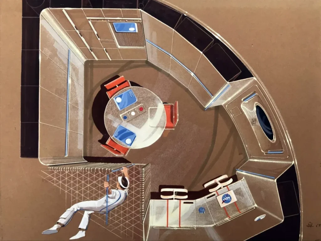
The Result: NASA adopted his recommendations for colour schemes (to define “up” and “down” in zero-G) and the famous observation window.
Loewy’s work for NASA proves that design isn't just about how things look; it’s about how they facilitate human behaviour. Whether you are designing a spacecraft or a services page, you are managing human psychology.
5. The Air Force One Livery (1962)
If you see a blue and white plane with “United States of America” written across it, you are looking at Raymond Loewy’s work.
Before Loewy, the presidential plane was a garish orange and silver military transport. President Kennedy wanted something that looked “stately” but not “imperial.” Loewy designed the typeface (based on the Declaration of Independence) and the cyan-blue colour palette.
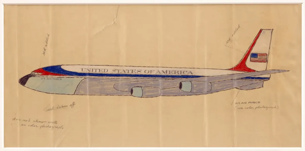
Why it matters in 2026:
The design is so effective that it has remained unchanged for over 60 years. Even when recent administrations suggested “updating” it, the public and military pushback was immense.
That is the power of a “Root Attribute” design—it becomes so synonymous with the entity that changing it feels like an attack on the entity itself.
The State of Industrial Design in 2026
As we move into 2026, we are seeing a “Loewy Renaissance.” After a decade of “Minimalism” that stripped brands of all personality (think of the “Blanding” trend where every tech company used the same sans-serif font), consumers are craving Human-Centric Streamlining.
The Shift:
- Physical-Digital Blurring: Products like the Rabbit R1 or the Humane AI Pin (regardless of their commercial success) are attempting to use Loewy’s MAYA principle. They are trying to make “Advanced” AI feel “Acceptable” through tactile, physical forms.
- Sustainable Industrialism: Design in 2026 is moving away from “planned obsolescence.” Loewy’s “Built to Last” philosophy is returning as consumers reject disposable plastic culture.
McKinsey’s Design Index indicates that companies with the strongest design practices experience nearly twice the revenue and shareholder return growth as their industry counterparts.
This isn't because they have “prettier” products; it's because they use design as a strategic business tool.
NASA and the Human Element
Perhaps Loewy’s most impressive feat was his work for NASA on the Skylab and Apollo missions. He wasn't designing rockets; he was designing “habitability.”
He insisted on the inclusion of a window in Skylab so astronauts could see the Earth. He argued for private sleeping quarters and “earth-like” dining areas.
He understood that even in the most “Advanced” environment in human history—space—the human element must be “Acceptable.”
If you are building a product or a service, you are designing a “habitat” for your customer's attention. Are you making it comfortable, or are you forcing them to survive in a vacuum of your own making?
The Verdict
Raymond Loewy didn't just design objects; he designed desire. He understood that the bridge between a warehouse full of inventory and a customer's wallet is a psychological one.
By applying the MAYA principle, focusing on streamlining (both visual and cognitive), and prioritising the sales curve over personal artistic flair, you can build a brand that doesn't just survive for a season but dominates for decades.
If your current brand feels cluttered, confusing, or just plain “off,” it’s time to stop guessing.
Would you like me to audit your current brand assets to see if they meet the MAYA standard for 2026?
Explore our design services or request a quote to start your journey toward industrial-strength branding.
Frequently Asked Questions
What is the MAYA principle?
MAYA stands for “Most Advanced Yet Acceptable.” It is the design theory that consumers prefer products that are innovative but still familiar enough to be easily understood and integrated into their daily lives.
How did Raymond Loewy influence branding?
Loewy transformed branding from simple labelling into a strategic visual system. He created iconic identities for Shell, Exxon, and BP, focusing on geometric simplicity and high-contrast colours to ensure long-term brand equity.
What are some of Raymond Loewy's most famous designs?
His portfolio includes the Shell logo, the Coca-Cola bottle (redesign), the Lucky Strike cigarette pack, the Studebaker Avanti, the Greyhound bus, and the interior of NASA's Skylab.
Why is streamlining important in design?
Streamlining reduces visual and functional friction. In physical products, it implies speed and efficiency. In digital design, it reduces cognitive load, making it easier for users to navigate and complete transactions.
How does the MAYA principle apply to digital marketing?
In marketing, MAYA suggests using familiar platforms and formats to deliver “advanced” or “disruptive” messages. For example, using a standard “Buy Now” button (familiar) for a revolutionary new AI service (advanced).
What is the difference between industrial design and graphic design?
Industrial design focuses on the form and function of physical products, while graphic design focuses on visual communication. Loewy was a master of both, often integrating them to create a cohesive brand experience.
Why did Loewy's redesign of the Coldspot refrigerator work?
It succeeded because it applied “Streamline Moderne” aesthetics to a boring appliance. By making the fridge look modern and easy to clean, he shifted it from a utility item to a desirable status symbol.
Can small businesses afford Raymond Loewy's design principles?
Yes. Loewy’s principles are about logic, not budget. Any SMB can apply the MAYA principle by simplifying its message and using clean, geometric design to build trust.
What is the “Sales Curve” in design?
Loewy famously said, “The loveliest curve I know is the sales curve.” This means that the ultimate metric for good design is its ability to generate revenue and market growth, rather than just winning awards.
How do I know if my design is “too advanced”?
If your customers are asking, “How does this work?” or if your bounce rate is high, your design is likely too advanced. You need to incorporate more “Acceptable” (familiar) elements to lower the barrier to entry.
What role did Loewy play in NASA's history?
Loewy was a habitability consultant. He focused on the psychological well-being of astronauts, ensuring that space stations felt “human” through the use of windows, privacy, and ergonomic furniture.
Is Raymond Loewy's style still relevant in 2026?
Absolutely. The need for simplification and the balance between innovation and familiarity is more critical than ever in our saturated, AI-driven market. “Streamlining” is now the key to surviving digital clutter.


