Business Card Design: Ultimate Guide to Print & Layouts
In an era of LinkedIn QR codes and digital wallets, you might be tempted to view the humble business card as a relic. A waste of paper. A relic of the Mad Men era.
You would be wrong.
If anything, the digitisation of business has made the physical business card more valuable, not less. When every interaction is fleeting, pixelated, and remote, a tangible object carries weight—literally and figuratively.
It is the only marketing asset you hand directly to a prospect. It is a physical token of your brand promise.
I have seen deals stall because a CEO handed over a flimsy, Vistaprint template card that felt like a bus ticket. It screams, “I cut corners.” If you cut corners on the one thing that represents you, what corners will you cut on my project?
This is not about vanity; it is about commerce. This guide is not a collection of pretty pictures. It is a forensic breakdown of print design, technical specifications, and psychological levers you need to pull to ensure your card stays on the desk and out of the recycling bin.
- Prioritise information hierarchy: clear Name, Role, and direct contact within safe margins for instant recognition and readability.
- Design for print: use CMYK, 300 DPI, correct bleed/trim, and vector logos to avoid colour shifts and pixelation.
- Choose substantial stock and finishes: 350–400gsm, soft touch, spot UV or foil to signal quality and avoid the bin.
- Keep typography legible: avoid thin weights, minimum 6–7pt for essentials, and ensure older readers can read contact details.
What is Business Card Design?
Business Card Design is the strategic arrangement of visual and textual elements on a small-format substrate (typically cardstock) to facilitate brand recognition and contact retrieval. It is a subset of brand identity that balances aesthetic appeal with strict technical constraints.

To function effectively, a professional card must possess three core components:
- Information Hierarchy: The immediate clarity of Who, What, and How (Name, Role, Contact).
- Brand Alignment: Consistent use of logos, colour palettes (CMYK), and typography that matches your wider identity.
- Technical Viability: Ensure correct bleed, trim, and safety margins to guarantee the manufactured product aligns with the digital file.
The Business Card Style Finder
Not sure what kind of card you need? Answer 7 questions about your business, and we'll generate a custom design brief including paper, finish, and layout recommendations.
Question…
Your Recommended Style
STYLE NAME
Description…
Your Design Specs
The Anatomy of a High-Conversion Card
Designing for print is unforgiving. Unlike a website, you cannot patch a typo after launch. Unlike a social media post, you cannot edit the colours once the ink hits the paper. Understanding the technical “bones” of your card is mandatory before you even open Illustrator.
1. Dimensions and Form Factors
The size of your canvas dictates the layout. While you can opt for custom die-cuts, deviating from standard sizes can be a logistical headache for your recipient (it won't fit in their wallet).
- Standard UK/Europe: 85mm x 55mm. This is similar to a standard credit card.
- Standard US: 3.5 inches x 2 inches (approx 89mm x 51mm).
- The “Credit Card” Size: 85.60mm × 53.98mm.
Consultant’s Note: If you trade internationally, be aware of these differences. A US card is slightly longer and narrower than a UK card. It might not fit perfectly in a European Rolodex or wallet slot. Stick to the standard of your primary market.
2. Paper Stock and “GSM”
The most critical non-visual element of your card is the paper weight, measured in GSM (Grams per Square Metre).
Haptic research suggests that humans associate physical weight with authority and quality. A lightweight card feels disposable.
- 200-300gsm: The “Economy” Zone. Avoid this. It feels like a flyer.
- 350-400gsm: The Professional Standard. It has a “snap” when you flick it. It holds its shape.
- 450gsm+: Premium/Luxury. Often used for duplexing (glueing two sheets together) to create a thick, unbendable board.
Data Check: According to a study on haptic sensations published in the Journal of Consumer Research, tactile input (i.e., touch) has a significant influence on product evaluation. Heavier objects are consistently rated as more “important” and “valuable” than lighter ones.
3. The Bleed, Trim, and Safe Area
Amateurs ignore these. Professionals live by them.
- Bleed (3mm): The area where your design extends past the cut line. If you have a background colour, it must bleed off the edge. If you don't add bleed, you risk thin white hairlines on the edges if the guillotine blade is off by a fraction of a millimetre.
- Trim Line: The actual edge of the final card.
- Safe Area (3-5mm inside Trim): Keep all text and logos inside this box. If you put your email address right on the edge, it looks messy and risks being chopped off.

The Content Audit: What to Keep (And Cut)
Space is premium. Don't clutter it.
Must Haves:
- Logo: The primary visual anchor.
- Name: Your actual name (not just the company).
- Job Title: Context is key.
- Direct Contact: Mobile number + Email.
- Website: The root domain (e.g., inkbotdesign.com).
Nice to Haves:
- QR Code: For instant digital saving.
- Social Handle: Only if it's a primary marketing channel (e.g., Instagram for a Photographer).
- Physical Address: Only if you have a shop front. If you are remote, cut it.
Cut Immediately:
- Fax Number: It's 2026. Let it go.
- Generic Email: Avoid info@ or sales@. People want to talk to you.
Typography: The Art of Legibility at Small Scale
You are working with a canvas smaller than a smartphone screen. Legibility is the priority.

Minimum Font Sizes
Do not use a font size below 6pt for non-essential text, and realistically, stick to 7pt or 8pt for contact details.
- The “Age” Test: Can someone over 45, reading in a dimly lit networking bar, read your phone number? If not, increase the point size.
Font Weights and Inks
Avoid “Thin” or “Light” font weights for body text, especially on dark backgrounds (reversed-out text). Ink spread during the printing process can fill in the fine gaps in letters like ‘e' or ‘a', turning them into blobs.
Hierarchy
You cannot emphasise everything. If the Logo is big, the Name should be medium, and the Contact Info should be small.
- Level 1: Name / Company Logo (The Hook).
- Level 2: Job Title (The Context).
- Level 3: Contact Details (The Utility).
Colour Theory for Print: CMYK vs RGB
This is where 90% of DIY designs fail.
Screens emit light; they use the RGB (Red, Green, Blue) colour model. Paper reflects light; it uses the CMYK colour model (Cyan, Magenta, Yellow, and Key/Black).
- The Gamut Warning: RGB has a wider colour gamut than CMYK. That neon electric blue you see on your monitor? It is physically impossible to print with standard four-colour process inks. It will print as a dull navy.
- Rich Black vs Standard Black:
- Standard Black (0,0,0,100): Use this for text. It keeps the letters crisp.
- Rich Black (e.g., 60, 40, 40, 100): Use this for large backgrounds. It adds other inks to the black to make it look deeper and darker. If you use just 100% K for a background, it often looks charcoal grey or washed out.
Real-World Example:
I once audited a high-end architectural firm, a client of mine. They had designed their cards in Canva using RGB hex codes. When the cards arrived, their signature “slate blue” was a muddy purple, and the black background looked grainy. We re-did the files in Adobe InDesign, set strict CMYK values, and used a Pantone spot colour for the blue. The difference was night and day—and the reprint cost them £500 they didn't need to spend.
For more on setting up your files correctly, read our guide to business card design services.
Finishes: The Texture of Success
Once the ink is down, the finish determines the feel. This is your chance to add a “Rare Attribute” to your card.

1. Lamination (Matt vs Gloss vs Soft Touch)
- Gloss: Shiny, high contrast, but can look cheap and show fingerprints. Good for photos.
- Matt: Smooth, sophisticated, non-reflective. The standard for corporate cards.
- Soft Touch (Velvet): A premium laminate that feels like peach skin or rubber. It screams luxury, but be warned: it can sometimes mute the colours slightly.
2. Spot UV
This involves applying a clear, shiny varnish to specific areas of a Matte card. It creates a contrast in texture.
- Usage: Use it on a logo or a pattern. Do not use it on small text; slight registration errors (misalignment) will make the text unreadable.
3. Foil Blocking
Stamping a metallic foil (Gold, Silver, Copper) onto the card using heat and pressure.
- Impact: High prestige. Excellent for logos.
- Cost: Significant. Requires a custom metal die to be made.
4. Letterpress and Debossing
The oldest form of printing. The design is pressed into the paper, creating a physical indentation.
- Best for: Minimalist designs on very thick (600gsm+) cotton stock.
- The Vibe: Artisanal, traditional, expensive.

The Comparison: Amateur vs. Professional
The difference is in the details. Here is how a DIY job compares to a professionally laid-out layout.
| Feature | The Amateur (DIY) | The Professional (Inkbot Design) |
| Software | Canva, MS Word, Photoshop | Adobe InDesign / Illustrator |
| Colour Mode | RGB (Screen colours) | CMYK (Print colours) + Pantones |
| Blacks | Standard Black (Washed out) | Rich Black (Deep, dark coverage) |
| Safe Area | Text right to the edge | 5mm breathing room |
| Format | Raster (Pixelated text) | Vector (Infinite sharpness) |
| Paper | Standard 250gsm | Premium 400gsm+ |
The InDesign “New Document” Recipe
Don't guess. Type these exact numbers into Adobe InDesign to ensure a perfect UK standard card.
- Width: 85mm
- Height: 55mm
- Pages: 2 (Front and Back)
- Margins: 5mm (This creates your Safe Area)
- Bleed: 3mm (Top, Bottom, Left, Right)
- Colour Mode: CMYK
- Resolution: 300 PPI (High Quality)
The State of Business Card Design in 2026
The print industry has not stood still. Over the last 18 months, we have witnessed a significant shift in variable data printing (VDP) costs.
Previously, if you wanted 50 different names for 50 employees, it was an expensive setup. Modern digital offset presses (like the HP Indigo series) have made VDP negligible in cost. This means you can now have hyper-personalised cards or different “backs” to your cards (e.g., displaying different products or portfolio pieces) within the same print run.
Furthermore, NFC (Near Field Communication) integration has matured. Early NFC cards were gimmicky and required apps. Now, embedding a chip inside a paper card (sandwiched between layers) allows a user to tap the card against a phone to open a portfolio or save a contact immediately. It bridges the physical-digital gap without looking like a sci-fi prop.
For ideas on how to integrate these trends, check out our roundup of business card ideas.
Consultant’s Reality Check: The “Bin Test”
Here is a brutal truth I share with clients. When you return from a conference, you likely empty your pockets onto your desk. You have a pile of receipts, wrappers, and business cards.
You sort them.
- Pile A: The “Important” ones.
- Pile B: The “Maybe” ones.
- The Bin: The cheap ones.
The cards that go instantly into the bin are the ones that are flimsy, dog-eared, or illegible. The ones that survive the cull are the ones that feel valuable. If a card is thick, has a tactile finish, or features a beautiful design, psychological aversion prevents us from discarding it. It feels wasteful to discard something of quality.
Your goal is to survive the sort.
If your card feels like a receipt, it gets treated like a receipt. If your card feels like a bank card, it gets treated like an asset.
Debunking the Myth: “QR Codes Are Ugly”

For years, designers (myself included) hated QR codes. They were ugly blocks of digital noise that ruined a clean layout.
That has changed.
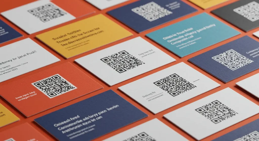
- Acceptance: Since 2020, the general public's literacy regarding QR codes has reached nearly 100%. People know what to do with them.
- Design Integration: You do not need a stark black and white box. You can round the corners, change the colour to match your brand (as long as there is sufficient contrast), and even embed a small logo in the centre.
Strategy: Where should the QR Code go?
Don't send them to your Home Page. They are already holding your card; they know who you are. Send them to a “Link-in-Bio” style page or a vCard (.vcf) download.
- The vCard Trick: Use a dynamic QR generator that triggers a “Save Contact” prompt on their phone. This saves them from having to type your number manually.
- The Portfolio Trick: If you are a creative, link the QR code directly to your “Best Work” showreel.
Frequently Asked Questions
What is the standard size for a business card in the UK?
The standard UK business card size is 85mm x 55mm. This fits standard European wallets. In the US, the standard is 3.5 x 2 inches (89mm x 51mm).
What is the best resolution for business card design?
Always use 300 DPI (Dots Per Inch) or higher. Anything lower will result in blurry text and pixelated logos. Never use 72 DPI web images for print.
Should I use CMYK or RGB?
Always design in CMYK for print. RGB is for screens. If you send an RGB file to a printer, the colours will shift, often becoming duller or muddy.
What paper weight is best for business cards?
For a professional feel, aim for 350gsm to 400gsm. Anything under 300gsm feels cheap. For a luxurious feel, consider 600gsm (often achieved by bonding two sheets together).
What is “bleed” in printing?
Bleed is the extra 3mm of artwork that extends beyond the trim edge of the card. It ensures that when the guillotine cuts the cards, there are no white hairline edges if the blade is slightly misaligned.
Can I design a business card in Photoshop?
You can, but you shouldn't. Photoshop is for raster images. Adobe Illustrator or InDesign are better because they handle vector text and layout more effectively, ensuring crisp typography.
What is Spot UV?
Spot UV is a clear, shiny varnish applied to specific areas of a card (like a logo) to create a contrast against a matte background. It adds texture and visual interest.
Are double-sided business cards better?
Yes. Printing on the back doubles your real estate at a marginal cost. Use the back for a logo, a tagline, a QR code, or an appointment slot—don't leave it blank white.
How small can the text be?
Avoid going below 6pt-7pt. While it may look readable on your zoomed-in screen, 6pt text can be illegible on the final printed card, especially for those with older eyes.
What is the difference between Vector and Raster?
Raster images (JPEG, PNG) are made of pixels and lose quality when resized. Vector graphics (EPS, AI, PDF) are based on mathematical curves and remain infinitely sharp at any size. Always use vector logos for business cards.
The Verdict
Business card design is not just about putting your email address on a piece of card. It is an exercise in precision engineering. It requires a mastery of marketing collateral principles, an understanding of print physics, and an appreciation for tactile psychology.
Get it right, and you have a 24/7 ambassador for your brand that fits in a pocket. Get it wrong, and you are just another piece of paper in the recycling bin.
Ready to create a card that closes deals?
Don't gamble on DIY templates. Request a quote from Inkbot Design today, and let’s put something substantial in your client's hand.


