
Unilever Logo Design: A Masterclass in Corporate Branding
The Unilever logo is not like other logos. It’s a complex, intricate puzzle box of 25 icons that form a giant ‘U'. And entrepreneurs love it.
I've seen it countless times. A founder, buzzing with ideas for their new artisanal coffee shop or SaaS app, points to it and says, “I want something like that. Something with meaning.”
What they're really asking for is a trap.
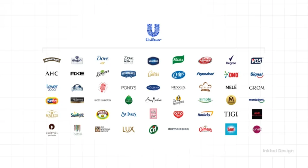
The Unilever logo is a strategic asset for a company with a market cap north of £100 billion, operating in 190+ countries with over 400 distinct brands. It is a brilliant solution to a problem you do not have.
Your logo is a sign. It's a flag in the ground that points to one thing: your business. It needs to be simple, memorable, and recognisable at a glance.
The Unilever logo is a container. It’s a corporate vessel designed to hold hundreds of other, more famous brands—Dove, Ben & Jerry's, Knorr, Axe—under one discreet, vaguely positive umbrella.
This article is a practical deconstruction of why this logo works for Unilever. We're going to look at the strategy, the history, and the architecture that make it a masterpiece.
This is not a fawning design review. It's a case study in corporate branding and a massive warning. Read this to understand the strategy, not to copy the style.
- Unilever’s 2004 "Vitality" U, made of 25 icons, is a corporate container uniting 400+ brands under one human, scalable identity.
- Wolff Olins designed the logo to express Unilever’s mission: health, well‑being, sustainability, and a cohesive brand portfolio.
- The 25 icons create a positive, organic texture rather than literal legibility; the U shape provides order, scalability, and warmth.
- Lesson for startups: most are "Branded House" — prioritise simple, memorable logos for recognition, not complex corporate stamps.
- Complexity is earned through time and budget; strategy and brand architecture must come before logo design.
The Unilever Logo Deconstructed: What Does It All Mean?
Who Designed the Modern Unilever Logo? A Masterclass in Meaning
The design agency Wolff Olins created the modern Unilever logo in 2004.
The brief wasn't simple. Unilever needed to unite a sprawling, disconnected empire of brands under a single, human-feeling identity. The company was shifting its entire business model to focus on a new central mission: “to add Vitality to life.”
This “Vitality” concept was the business strategy, and the logo was commissioned to be its public face. It had to communicate this new focus on health, well-being, and sustainability.
Cracking the Code: All 25 Unilever Logo Icons Explained
The 25 icons aren't random. Each one is a deliberate visual representation of the company's sub-brands or its “Vitality” mission.
They're not meant to be read individually at speed. They're meant to create an overall texture of positivity, nature, and humanity.
Let's group them thematically to make sense of the visual encyclopaedia.
Representing the Portfolio (Food & Drink):
- Sun: The primary source of life, growth, and a key element for many brands.
- Spoon: Represents tasting, cooking, and nutrition.
- Ice Cream: A clear nod to brands like Ben & Jerry's and Magnum.
- Fish: Represents the sea and fresh food.
- Tea Leaf: Directly points to agriculture and massive brands like Lipton.
- Chilli Pepper: Symbolises fresh flavours and spices (think Knorr).
- Bowl: A bowl of warm food, nourishment.
- Swirl: Represents mixing, stirring, and the flavours in products like Hellmann's mayonnaise.
Representing the Portfolio (Personal & Home Care):
- Hair: For beauty and looking good (Dove, Sunsilk, TRESemmé).
- Hand: Symbolises touch, skin, and cleanliness (Lifebuoy, Vaseline).
- Lips: Represents beauty, taste, and skincare.
- Shirt: A clear link to the massive laundry portfolio (Persil, Omo).
- Flower: Represents the fragrances in detergents and personal care products.
Representing the “Vitality” Strategy (The Concepts):
- Bee: Represents hard work, community, and biodiversity.
- Plant/Leaves: Symbolises the natural world and ingredients.
- Water Droplet: Purity, water, and cleanliness.
- Recycle Symbol: A direct promise of a commitment to sustainability.
- DNA: The double helix represents life's “building block,” R&D, and the science behind their products.
- Particle: Another nod to science and technology.
- Heart: Love, care, health, and well-being.
- Sparks: A symbol of a positive force, radiance, and “vitality.”
- Clothes: Looking good, which connects to self-esteem.
- Palm Tree: Represents nature and resources (this one has drawn criticism given the palm oil debate, but it's part of the original design).
- Wave: Symbolises cleanliness, freshness, and the sea.
The Masterstroke: Why the ‘U' Shape is the Real Genius
The 25 icons get all the attention, but the “U” shape is the smartest part of the design.
It’s a literal vessel. It's a “container” shape that visually holds all these disparate ideas and brands. It creates order from chaos.
This design is also incredibly scalable. It can be a tiny, embossed icon on the plastic cap of a Dove bottle, a small print on the back of a Knorr packet, or a 30-foot sign on a corporate headquarters. It’s recognisable at almost any size, even if the individual icons become illegible.
Finally, look closely at the lines. It’s not a perfect, sterile, computer-generated ‘U'. The lines are organic, fluid, and feel almost hand-drawn. This was a deliberate choice to make a massive, faceless conglomerate feel human, approachable, and caring.
Brand Architecture: The Real Reason the Unilever Logo Exists
This is the most important part of the entire analysis. If you learn one thing, make it this.
Your Most Important Lesson: “House of Brands” vs. “Branded House”
You must understand your brand architecture before you design a logo.
A “House of Brands” is a company like Unilever. Or Procter & Gamble (P&G). The parent company is in the background, almost invisible. The individual brands are the heroes. You buy Dove soap, Axe deodorant, or Ben & Jerry's ice cream. You don't go to the store to “buy some Unilever.” The sub-brands are the entire business.
A “Branded House” is a company like FedEx. Or Google. The parent brand is the hero. Every sub-brand is a descriptor that reinforces the parent. You use Google Maps, Google Mail, and Google Drive. You ship with FedEx Ground or FedEx Freight. The master brand is the primary asset.
99% of startups, small businesses, and consultancies are a “Branded House.”
The Unilever logo exists only to solve a “House of Brands” problem. It's a corporate mark, not a consumer product logo.
The “House of Brands” Problem: Why P&G Has No Real Consumer Logo

Let's look at Unilever's #1 competitor: Procter & Gamble. They own Tide, Gillette, Pampers, and Crest.
Can you draw the P&G logo from memory? Probably not. It's a simple “P&G” wordmark in blue. For decades, they actively hid the parent company from consumers. Their strategy was to let every brand stand 100% on its own.
Unilever took a different path. They want you to make a subtle, positive connection between their brands. The “U” logo is the tool for that job.
The Real Job of the Unilever Logo: A Subtle Corporate Stamp
The Unilever logo is not for you, the consumer, to choose a product. It's not on the front of the package.
It's on the back.
It’s a quiet “trust mark.” It’s a stamp of quality. It’s designed to create a subconscious link. “Oh, this Knorr soup is from the same people who make my Dove soap. They must be a good, reliable company.”
It also works for other audiences. It’s for investors (this is one unified, powerful portfolio). It's for potential employees (you're joining a global company with a mission). And it's for internal cohesion (it gives 150,000+ employees a single flag to rally around).
A Brief History: The Unilever Logo Evolution
Before the ‘U': The Lever Brothers Logo (1969-2004)
The “Vitality” U is a relatively new invention.
From 1969 to 2004, Unilever used a logo that looked like it belonged on the side of a chemical tanker. It was a blocky, industrial ‘U' made of two stark, arrow-like shapes.
That logo represented the original 1929 merger that formed the company: British soapmaker Lever Brothers and Dutch Margarine Unie. It was two pillars bolted together.
It felt cold, corporate, and disjointed. It screamed “industrial chemicals,” not “consumer goods.”
The 2004 Redesign: A Fundamental Shift in Corporate Strategy
The logo had to change because the business changed.
In the early 2000s, in a post-Enron world, massive corporations were terrified of being seen as faceless, evil empires. The new currency was “transparency,” “ethics,” “sustainability,” and “humanity.”

Unilever's “Path to Growth” strategy, launched in 1999, was culminating. They had shed hundreds of non-core businesses and were focusing entirely on consumer goods.
The 2004 redesign, led by Wolff Olins, wasn't just a “rebrand.” It was the public flag for a new corporate mission. The “Vitality” concept was the new central nervous system for the entire company, and the logo was the skin.
The Startup Trap: 3 Brutal Lessons from the Unilever Logo
This is the part where you stop admiring and start learning.
Lesson 1: Your Startup is Not a “House of Brands” (Yet)
Here is one of my biggest pet peeves. Founders try to be a conglomerate on day one.
You are not Unilever. You have one product, or one service, or one app. Your number one, non-negotiable job is to build recognition for that one brand.
Unilever's logo solves an organisation problem. Your logo needs to solve a recognition problem. These are opposite goals.
Cramming your logo full of icons for “our three values,” “our local landmark,” and “our founder's dog” doesn't make you look meaningful. It makes you look cluttered, amateurish, and impossible to remember. Stop the “logo overload.”
Lesson 2: Complexity is Earned, Not Designed
“But I want my logo to tell a story!”
The Unilever logo “tells a story” only because the company has spent two decades and billions of dollars in marketing, PR, and advertising to explain it.
You do not have a billion-dollar marketing budget.
Complexity is a luxury you earn with time and money. Simplicity is how you get there.
Think of the Nike swoosh. Think of the Apple. They are simple, distinct, memorable marks. They are empty vessels that became filled with meaning through decades of excellent products and marketing.
Your logo can't do that work for you. It's the beginning of the conversation, not the entire speech. Most businesses need a simple, memorable logo design that builds recognition fast, not a complex puzzle.
Lesson 3: Your Logo Follows Your Strategy (Not the Other Way Around)
This is the most common and most damaging mistake. Founders obsess over the visual style of a logo before they've even defined their business strategy.
Unilever first spent years changing its entire corporate mission to “Vitality.” Then it commissioned a logo to match.
Stop asking, “What's a cool logo style?”
Start asking, “What is my brand architecture?” (Branded House or House of Brands?)
“What is my one-word core concept?” (Is it “Speed”? “Luxury”? “Simplicity”?)
“Who is this logo for?” (Customers? Investors? Internal team?)
If you can't answer those questions, you are not ready to design a logo. You're just drawing pictures.
So, When Could a Complex Logo Ever Work for a Small Business?
There are rare exceptions.
A complex logo might work for a hyper-local business where a “sense of place” is the product. Think of a local pub using a detailed, crest-like logo with town landmarks. Or a craft brewery that heavily features local folklore on its bottles.
In these cases, the “story” is the unique selling proposition.
But the risk is enormous. That complex logo will be hard to reproduce. It will look like mud when embroidered on a shirt. It will be illegible as a social media profile picture. It often looks cluttered and dated.
You are almost always better off putting that rich “story” on your packaging, your website's “about” page, or your menu, and letting a simple, clean logomark do the heavy lifting of recognition.
The Bottom Line: Admire Unilever, But Don't Imitate It
The Unilever logo is a brilliant, beautiful, and strategically perfect piece of design.
It is a masterpiece of corporate branding. It solves a complex problem for a £100B+ conglomerate.
It is also a terrible, horrible, no-good role model for your small business.
Your business needs clarity, not complexity. It needs recognition, not organisation.
Admire the strategy, but imitate the simplicity of brands like Nike, Apple, or McDonald's. Your logo is the first word you say to a customer, not the entire encyclopaedia. Make it a word they can remember.
Thinking About Your Own Logo Strategy?
Don't start by sketching 25 icons on a napkin.
Start by asking the hard questions.
- What's your brand architecture? (Branded House or House of Brands?)
- Who is this logo actually for? (Customers, investors, internal team?)
- What is the one thing it absolutely must communicate?
If you're stuck on these questions, that's normal. It's the real work of branding, and it happens before a designer ever opens their laptop.
We help businesses answer these strategic questions before a single pixel is pushed. You can see our approach to logo design services or just request a quote to talk strategy.
FAQs About the Unilever Logo Design
What is the meaning of the Unilever logo design?
The Unilever logo, designed in 2004, is a large ‘U' made of 25 icons. The ‘U' stands for Unilever. The 25 icons collectively represent the company's “Vitality” mission and its diverse portfolio of food, home, and personal care brands.
How many icons are in the Unilever logo?
There are 25 individual icons that make up the ‘U' shape.
Who designed the Unilever logo?
The design agency Wolff Olins designed the current Unilever “Vitality” logo in 2004.
When did the Unilever logo change?
Unilever adopted its current logo in 2004, replacing the 1969 logo that had been in use for 35 years.
What did the old Unilever (Lever Brothers) logo look like?
The old logo (1969-2004) was a much starker, more industrial-looking ‘U'. It consisted of two blocky, arrow-like shapes representing the merger of Lever Brothers and Margarine Unie.
What is the “Vitality” concept?
“Vitality” is the corporate mission Unilever adopted in the early 2000s. It's a business strategy focused on “adding Vitality to life” through products that support health, well-being, and positive living. The logo was designed to be the visual expression of this mission.
What is the difference between a “House of Brands” and a “Branded House”?
A “House of Brands” (like Unilever or P&G) is a parent company that owns many different individual brands, which are the “heroes.” A “Branded House” (like Google or FedEx) is a parent company where the main brand is the “hero” and all sub-brands (like Google Maps) support it.
Why is the Unilever logo a “U”?
The ‘U' shape stands for Unilever. It also acts as a visual “container” or “vessel” to hold the 25 icons and, by extension, the 400+ brands in its portfolio.
Is the Unilever logo a good logo?
Yes, it is an excellent logo for its specific purpose. It brilliantly solves the complex problem of uniting a “House of Brands” conglomerate under a single, human-feeling corporate identity. However, its complex style is not a good model for most small businesses.
What are some of the icons in the Unilever logo?
Some of the 25 icons include a spoon (nutrition), hair (beauty), a tea leaf (Lipton), an ice cream cone (Ben & Jerry's), a heart (love/health), and a recycle symbol (sustainability).
Why shouldn't a small business copy the Unilever logo?
A small business's primary goal is recognition. A complex logo with many icons is hard to remember, difficult to reproduce, and expensive to build recognition for. Unilever's logo works because it's backed by billions in marketing. Startups need simplicity.
What company has a similar brand strategy to Unilever?
Procter & Gamble (P&G) is Unilever's main competitor and also uses a “House of Brands” strategy. However, P&G's corporate logo is much less visible to consumers, as they historically preferred to let each brand (like Tide or Gillette) stand completely on its own.
The Unilever logo is a brilliant solution to a problem you probably don't have. Your logo's job isn't to be a container for 400 brands; it's to be a beacon for one.
If you're ready to build a logo based on your unique business strategy, not just a trend, that's what we do.
Explore our logo design services to see our process, or request a quote when you're ready to talk strategy.

