Responsive Web Design: Why Most “Mobile-Friendly” Sites Fail
Business owners are often sold the lie that web design is a visual task. It isn’t.
It is an engineering challenge. If your site doesn’t adapt to the user’s context—their device, their connection speed, and their physical environment—you aren’t just “missing mobile users.”
You are actively insulting them.
- Responsive design is engineering, not visual — build fluid, context-aware systems, not separate "mobile" and "desktop" versions.
- Performance and accessibility matter: optimise images, reduce bloat, and ensure reflow and proper tap targets to avoid legal and UX costs.
- Use modern techniques — fluid grids, media and container queries, SVGs and progressive enhancement — for durable, device-agnostic UX.
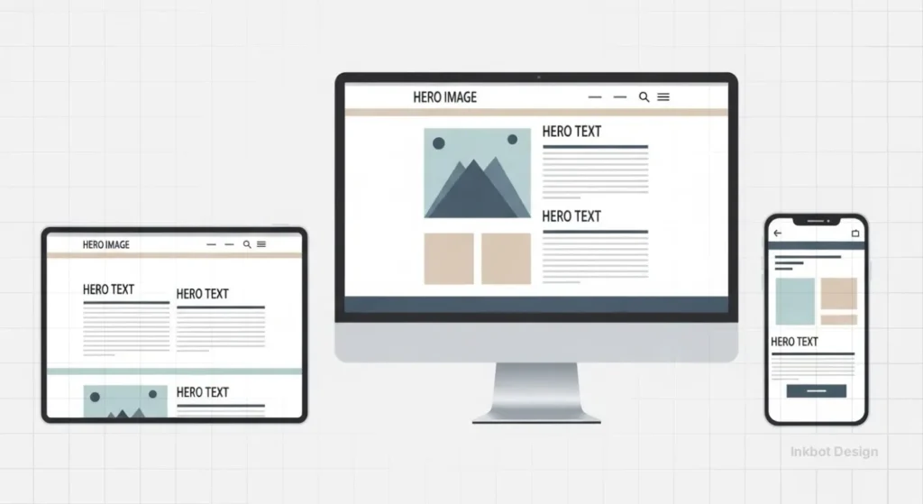
What is Responsive Web Design?
Responsive web design (RWD) is a technical approach to web development that creates a fluid interface, allowing content to adjust its layout, imagery, and functionality automatically based on the user’s screen size, resolution, and orientation. It eliminates the need for separate mobile sites by using a single codebase.
The three core elements of RWD are:
- Fluid Grids: A layout system based on relative percentages rather than fixed pixels.
- Flexible Images: Media that scale within their containing element to prevent overflow.
- Media Queries: CSS rules that apply specific styles based on device characteristics (e.g., width, height, or resolution).
At its most fundamental level, RWD is the implementation of Context-Aware Computing. It relies on the Viewport Meta Tag—a specific instruction in the HTML header that tells the browser how to control the page’s dimensions and scaling.
Without this “instruction manual,” a mobile browser will simply render a desktop site at a microscopic scale, forcing the user into the “Pinch-to-Zoom” era of 2010.
True responsiveness isn’t just about size; it’s about the browser understanding the physical constraints of the hardware it is currently occupying.
The Foundation: Beyond the Mobile-Friendly Checkbox
The term “mobile-friendly” is a relic of 2015. Today, the standard is much higher.
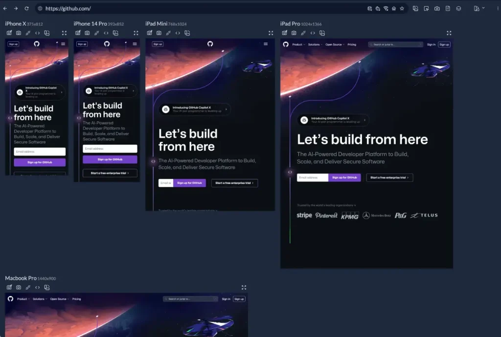
Modern responsive web design must account for an ecosystem of devices that range from smartwatches to 8K television screens.
If your designer is still referring to “the mobile version” and “the desktop version,” they are likely stuck in an outdated mindset.
We don’t build versions anymore. We build fluid systems.
According to the Nielsen Norman Group, the primary goal of RWD is to provide a consistent user experience (UX) across all platforms. However, consistency does not mean identity.
A “consistent” experience on a phone might mean a simplified navigation menu, whereas on a desktop, it involves a multi-column mega menu. The underlying information architecture remains the same, but the delivery mechanism adapts.
The Technical Anatomy of a Fluid System
To understand why your current site might be failing, we need to take a closer look. Most amateur sites use “adaptive” design disguised as responsive.
Adaptive design uses a series of fixed-width snapshots. When the screen hits a certain width (a “breakpoint”), the layout snaps to a new fixed size.
True responsive design is liquid. It flows.
1. Fluid Grids and Proportionality
In the old days, we designed in pixels. A sidebar was 300px wide. On a 1024px screen, that looked fine. On a 320px phone screen, it was a disaster.
Fluid grids replaced pixels with percentages. We stopped saying “this box is 300px” and started saying “this box occupies 30% of the viewport.”
A forensic approach to responsiveness requires Resolution Independence.
As we move into 2026, where devices like the Apple Vision Pro and 8K displays are becoming search touchpoints, traditional raster images (JPEGs/PNGs) fail. We must prioritise Vector Graphics (SVGs) for UI elements and logos.
For example, the Inkbot Design logo serves as a vector asset, ensuring that whether it is viewed on a 1-inch watch face or a 100-inch boardroom screen, the “Point Density” remains perfect. This isn’t just an aesthetic choice; it’s a technical signal of site quality.
2. The Power of Media Queries
Media queries are the logic gates of the modern web. They allow us to ask the browser: “How wide is the screen?” and “Is it in portrait or landscape mode?”
For example:
CSS
@media (max-width: 768px) {
.sidebar {
display: none;
}
}
This simple rule tells the browser to hide the sidebar on tablets and phones, prioritising the main content. But in 2026, we are going further. We are using “Container Queries.”
3. The 2026 Shift: Container Queries
For years, we were limited by the viewport (the whole screen). If a component sat inside a small sidebar or a large hero section, it didn’t know how much space it had—only how wide the screen was. Container queries changed that.
Now, a card component can change its layout based on the size of its immediate parent container. This is the pinnacle of modular web design services.
The Economic Cost of Poor UX
Why should an SMB owner care about CSS percentages? Because of the “Cost of Friction.”
Data from Deloitte Insights suggests that even a 0.1-second improvement in mobile site speed can increase conversion rates by up to 8% for retail sites and 10% for travel sites.
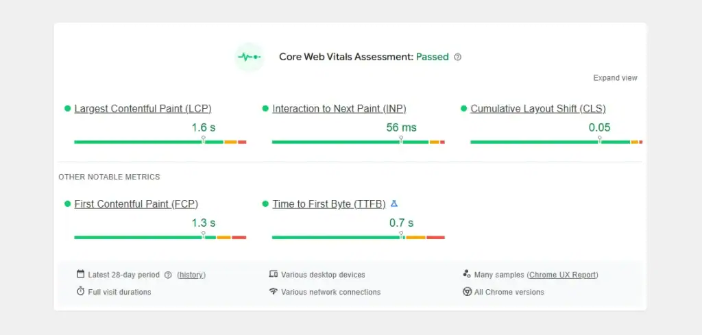
The commercial value of RWD is now measured by a new metric: Interaction to Next Paint (INP). This measures the latency of every user interaction.
A non-responsive site with “hidden” desktop elements often suffers from “Main Thread Thread Bottlenecks,” where a user taps a mobile button and nothing happens for 500ms.
In high-frequency e-commerce, this delay is the primary driver of Cart Abandonment. By streamlining the responsive codebase, you’re not just fixing a layout; you’re also removing the technical friction that prevents a transaction from completing.
When your site isn’t truly responsive, users experience “layout shifts.” You’ve seen this: you try to click a link, the page suddenly moves because an image finishes loading, and you end up clicking an advert instead.
Google refers to this as Cumulative Layout Shift (CLS), and it is a significant factor in their web design trends for businesses. If your CLS score is high, your search ranking will drop.
| Feature | Amateur (Static/Adaptive) | Professional (Fluid/Responsive) |
|---|---|---|
| Sizing Units | Pixels (px) | Percentages (%), Viewport Units (vw/vh), Rem |
| Images | Single large file scaled by browser | Responsive images (srcset) and WebP format |
| Breakpoints | Based on specific devices (iPhone 13, etc.) | Based on content needs and natural “break points” |
| Performance | High “Total Blocking Time” | Optimised “Core Web Vitals” |
| Maintenance | Multiple codebases or brittle CSS | Single, robust, modular CSS architecture |
Debunking the “Mobile-First” Myth: Why Desktop Still Matters
There is a dangerous trend in the design world: the “Mobile-First” obsession that leads to “Desktop-Last” reality.
The Myth: Since 60% of web traffic is mobile, we should prioritise the mobile experience.
The Reality: While traffic is mobile-heavy, conversion value is often higher on desktop, especially in B2B and high-ticket B2C sectors.
A study by the Baymard Institute shows that mobile conversion rates are still roughly half of desktop rates.
Why? Because complex tasks—like comparing technical specifications, filling out long contact forms, or reviewing legal documents—are inherently easier on a large screen with a physical keyboard.
If you follow a “Mobile-First” strategy too strictly, you often end up with a desktop site that looks like a giant, blown-up phone app.
Huge buttons, excessive white space, and hidden menus make the desktop experience feel “dumbed down.”
A professional responsive web design approach uses Progressive Enhancement. We start with a solid, lightweight mobile foundation and then add complexity and features as the screen real estate increases. We don’t just stretch the mobile layout; we evolve it.
Performance: The Invisible Side of Responsiveness
You cannot have a “responsive” site that takes 10 seconds to load. That isn’t responsive; it’s unresponsive.
The heaviest part of any website is its imagery. On a poorly built site, the browser downloads the same 2MB hero image regardless of whether the user is on a 5K monitor or an old Android phone. This is a failure of UX vs UI design.
Responsive Images and Art Direction
Modern RWD uses the srcset attribute. This allows the developer to provide a list of different image sizes. The browser then looks at the device’s resolution and bandwidth and picks the most appropriate file.
- Desktop: Loads hero-large.webp (2000px wide).
- Mobile: Loads hero-small.webp (600px wide).
This can reduce the page weight by up to 80%, drastically improving load times and SEO. Furthermore, “Art Direction” enables us to crop images differently for mobile devices.
Instead of a wide landscape shot that becomes a tiny sliver on a phone, we can serve a vertical crop that keeps the subject of the photo front and centre.
Accessibility: The Legal and Moral Imperative
If your responsive site isn’t accessible, it isn’t finished.
The W3C Web Accessibility Guidelines (WCAG) are very clear on this. For instance, a site must allow for “Reflow.” This means a user should be able to zoom in to 400% on a desktop browser without having to scroll horizontally to read a line of text.
Many “responsive” sites break when zoomed. The text overlaps, buttons disappear, and the site becomes a legal liability.
In the UK, the Equality Act 2010 implies that digital services must be accessible to people with disabilities. Failing to build a truly fluid, accessible site isn’t just bad for business; it’s a legal risk.
A common “mobile-friendly” failure is the Tap Target Overlap. Google’s “Lighthouse” audits now penalise sites where buttons are closer than 48px apart. This creates “Click Interception,” where a user intends to click “Menu” but accidentally triggers a “Log Out.”
The solution is to implement Touch-Specific CSS, increasing the padding of interactive elements specifically for “Coarse Pointers” (fingers).
This forensic refinement solves the “Fat Finger” frustration that leads to high mobile bounce rates.
I Audited Your Site, and It’s Bloated
During my fieldwork as Creative Director at Inkbot Design, I frequently encounter the same mistake: the “Template Trap.”
Small businesses buy a £50 WordPress theme that claims to be “100% Responsive.” Under the hood, these themes are often held together by “Page Builders” like Elementor or WPBakery.
While these tools make it easy for non-coders to drag and drop elements, they generate massive amounts of redundant code.
I once audited a client’s site that was “responsive” but had a “Time to Interactive” (TTI) of 14 seconds on a standard mobile connection.
The reason? The theme was loading five different versions of the navigation menu and hiding four of them with CSS. The browser still had to download and process all five.
My advice: If you are serious about your business, stop using bloated templates. A custom-coded, lightweight responsive framework will outperform a “premium theme” every single time. It’s the difference between a tailored suit and a “one size fits all” poncho.
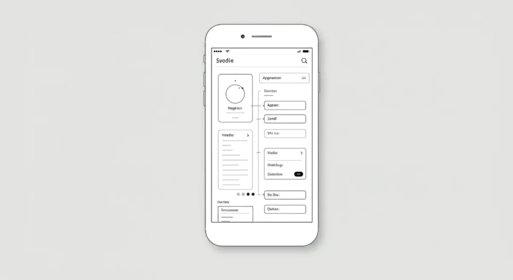
The Role of Wireframing in Responsive Success
You cannot “code” your way out of a bad layout. The responsiveness of a site must be baked in at the wireframing stage.
We use wireframes to map out the arrangement and positioning of content blocks. We ask the difficult questions early:
- Where does the secondary sidebar go on a phone? (Hint: Usually at the bottom, where no one sees it. Is it even necessary?)
- How do we handle large data tables on mobile? (Do we use a horizontal scroll, or do we transform the table into a series of cards?)
- Is the “Contact Us” button always within thumb reach?
If you skip this stage, you are just guessing. And guessing is expensive.
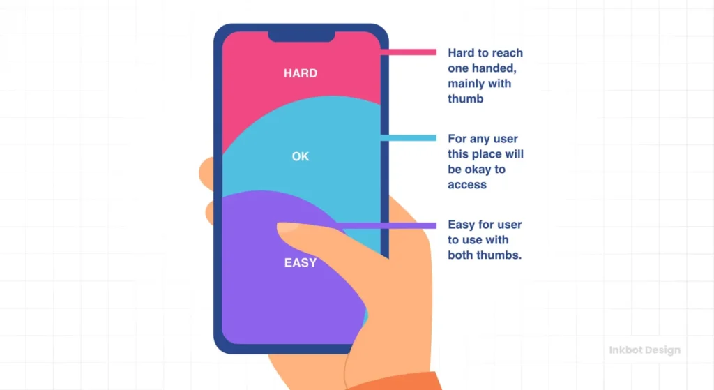
The Thumb-Reach Tester
Being “Responsive” isn’t enough. Is your site actually “Usable”? Select where your primary button sits on mobile to see if it passes the Thumb Zone test.
Painful
The State of Responsive Web Design in 2026
As we move through 2026, we are seeing the rise of Device-Agnostic Design.
We are moving away from the idea of “phones” and “laptops” and toward “capabilities.” Modern CSS now allows us to detect whether a user has a high-precision pointer (such as a mouse) or a coarse pointer (like a finger).
We can detect if they have “Reduced Motion” enabled in their OS settings to prevent vestibular triggers.
We are also seeing the integration of AI in layout engines. Some advanced frameworks are beginning to use machine learning to observe user behaviour and adjust the “responsiveness” of the layout in real-time.
For example, if a user consistently struggles to click a specific button on a mobile device, the layout can dynamically increase the hit area for that specific user.
Don’t Just “Fit” the Screen—Master the Context
Responsive web design is not about making things smaller; it’s about making them more accessible. It is about making things smarter.
It is the bridge between your business goals and your customers’ reality. Whether they are browsing your landing page design while on a vibrating train or researching your services on a quiet Sunday morning on their laptop, the experience must be flawless.
If your site feels like a struggle, your customers will leave. They won’t tell you why; they’ll just click “Back” and go to a competitor whose site actually works.
The final word: RWD is an investment in your brand’s credibility. In a world where first impressions are digital, your layout is your handshake. Make sure it’s a firm one.
Would you like me to audit your current website’s responsiveness or provide a quote for a custom, high-performance redesign?
Explore Inkbot Design’s Services | Request a Quote
Frequently Asked Questions (FAQ)
What is the difference between responsive and adaptive web design?
Responsive design employs a single, fluid layout that adapts to fill any container, flowing smoothly like a liquid. Adaptive design uses several fixed-width layouts tailored to specific screen sizes. Responsive is generally superior as it covers every possible screen size, including those that may not have been invented yet.
Why is responsive web design important for SEO?
Google uses “Mobile-First Indexing,” meaning it crawls the mobile version of your site to determine your ranking. If your responsive design is poor, slow, or difficult to use on mobile devices, your entire site’s search visibility will suffer across all platforms.
Does responsive web design affect site speed?
Yes. If implemented correctly, it improves speed by serving optimised images and code. If done poorly (e.g., using a bloated theme), it can slow down your site by loading unnecessary assets meant for other devices. Performance is a core pillar of RWD.
What are breakpoints in responsive design?
Breakpoints are specific pixel widths defined in CSS where the website layout changes to accommodate different screen sizes. Common breakpoints are set for mobile (320px-480px), tablets (768px-1024px), and desktops (1024px+).
Do I need a separate mobile app if I have a responsive website?
Usually, no. A well-executed responsive website can mimic many features of an app. Unless you require specific hardware access (such as the accelerometer or offline processing), a mobile-first design is more cost-effective and easier for users to access.
What is a fluid grid?
A fluid grid is a layout system that utilises relative units, such as percentages, rather than fixed units, like pixels. This ensures that every element on the page remains in proportion to the others, regardless of the screen’s width.
How do I test if my website is responsive?
You can use Google’s Search Console to check for mobile usability errors. Manually, you can resize your desktop browser window or use “Inspect Element” in Chrome to toggle device simulations for various phones and tablets.
Why is Responsive Design critical for SEO in 2026?
Google uses Mobile-First Indexing, meaning it exclusively crawls the mobile version of your site to determine its ranking. If your responsive execution is flawed—even if the desktop version is perfect—your search visibility will plummet across all devices.
What are “Core Web Vitals” in Responsive Design?
Core Web Vitals are Google’s metrics for speed and stability. Specifically, Cumulative Layout Shift (CLS) measures if elements jump around as they load on mobile, and Largest Contentful Paint (LCP) measures how fast the main content appears. A truly responsive site must pass all three vitals to rank.
How do “Container Queries” differ from “Media Queries”?
Media queries examine the size of the entire screen (the viewport). Container queries enable a component to examine the size of its parent box. This allows for a modular design, where a card or button can intelligently reformat itself regardless of its placement on the page.
Does a responsive site need a separate mobile URL (like m.example.com)?
No. Separate mobile sites are a deprecated practice that splits your “Link Equity” and complicates maintenance. A single URL with a responsive codebase is the most efficient way to build authority and ensure a consistent user experience.
What is “Reflow” and why is it a legal requirement?
Reflow is an accessibility standard (WCAG) that requires content to remain readable and functional when zoomed up to 400%. If your site forces horizontal scrolling when a visually impaired user zooms in, you may be in breach of the UK Equality Act 2010.
How do I handle large data tables on a mobile phone?
Tables are the enemy of fluid grids. The forensic solution is to use “Responsive Tables” that either allow for an isolated horizontal scroll or transform into a “Card-Based” layout on small screens, ensuring the data remains legible, and the layout doesn’t “break.”
Is it more cost-effective to buy a template or build custom, responsive code?
A template is cheaper initially but carries a high “Technical Debt” cost. Templates are often bloated with redundant CSS that slows down mobile load times. A custom-coded, lightweight framework will almost always deliver a higher ROI through improved conversion rates and enhanced SEO.