Colour Theory: A Guide for Designers & SMBs
Most business owners choose colours because they “look sharp” or because a generic infographic told them blue creates trust.
That’s not branding; that’s guesswork. And in a high-stakes market, guesswork is expensive.
If you’re selecting your identity based on “vibes” rather than variables, you aren’t just building a mediocre brand—you’re leaving money on the table.
In my years auditing global identities, I’ve seen companies with massive potential fail to scale simply because they ignored the physics of light and the mathematics of contrast.
In 2026, with dark mode as the digital default and accessibility moving from a “nice-to-have” to a legal and ethical mandate, “picking a nice red” isn’t a creative choice—it’s a liability.
When you ignore the technical depth of colour theory, you risk your brand becoming literally invisible to a segment of your audience.
If they can’t see you, they can’t buy from you. It’s time to stop decorating and start strategising.
- Treat colour as strategy: Use OKLCH and design tokens, not vibes, to ensure consistent, dynamic palettes across screens and print.
- Prioritise accessibility: Verify contrast with APCA, test for CVD and dark mode, and meet UK/EU legal standards to avoid liability.
- Account for context and gamut: Test for simultaneous contrast, metamerism, and Display P3/CMYK differences to preserve brand perception.
What is Colour Theory?
Colour theory is a structured framework that combines art, physics, and mathematics to determine how humans perceive and interact with visual stimuli.
It is the science of creating visual harmony and hierarchy through the strategic application of hue, saturation, and value.
The Scientific Foundations: From Newton to OKLCH
The modern understanding of colour began in 1666 when Isaac Newton passed a beam of sunlight through a glass prism, proving that white light is composed of a visible spectrum.
While Newton laid the mathematical foundation, Johann Wolfgang von Goethe challenged this by focusing on human perception of colour—the precursor to modern colour psychology.
In 2026, we have moved beyond simple wheels. Professional designers now use the OKLCH colour space (Over-perceptual, Karolus, Lightness, Chroma, Hue).
Unlike traditional RGB, OKLCH is “perceptually uniform.” This means that if you increase the lightness of a blue and a yellow by 10%, they actually look 10% lighter to the human eye, preventing the “muddy” or “neon” shifts common in older digital formats.
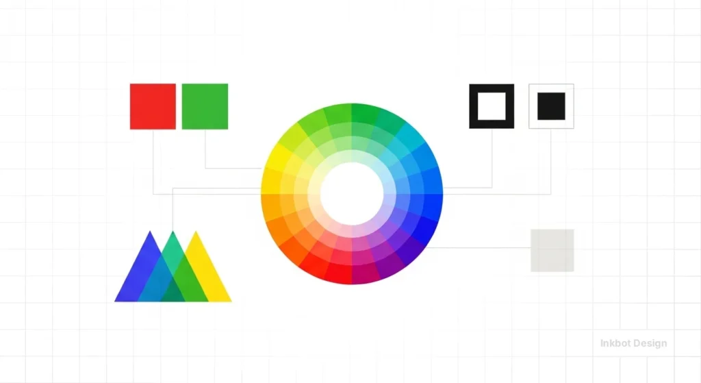
The 3 Core Elements of Colour Theory
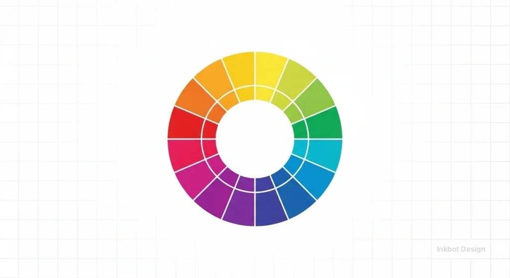
The Colour Wheel
To build a high-performance brand, you must understand the three distinct “wheels” or models that govern modern design:
1. The Traditional Artistic Wheel (RYB)
This is the model taught in primary schools. It uses Red, Yellow, and Blue as primary colours. While it remains the standard for physical media like oil painting or interior design, it is mathematically inaccurate for digital displays.
- Best for: Initial “vibe” brainstorming and high-level mood boarding.
- The Trap: If you pick a “complementary” pair on this wheel, they will likely fail accessibility tests when translated to a website or mobile app.
2. The Digital/Additive Wheel (RGB)
In the digital age, your “primaries” shift to Red, Green, and Blue. This is an additive model: combining all three at full intensity produces white light.
- The Technical Reality: This wheel governs every pixel on your customer’s smartphone.
- Pro Scenario: When designing a “Dark Mode” interface, you are manipulating the RGB wheel. Because blue light has a higher frequency and causes more eye strain, modern 2026 brands are “shifting the wheel” toward warmer, low-energy hues for nighttime browsing to improve user retention.
3. The Perceptual Wheel (OKLCH & CIELAB)
This is the “Pro” standard for 2026. Traditional wheels assume that all colours at 100% saturation look equally bright to the human eye. They don’t.
A pure yellow looks significantly brighter than a pure blue. The OKLCH model (introduced by Björn Ottosson) maps colours based on how humans actually perceive them.
- Why it wins for SMBs: If you use an OKLCH-based wheel to create a palette, your “Primary Brand Blue” and “Secondary Brand Yellow” will have the same perceived lightness. This prevents your website from looking “lopsided” or visually vibrating, which is a common cause of high bounce rates.
Colour Harmony
In 2026, “picking colours that look good” is no longer a viable strategy for competitive brands.
Professional brand architecture relies on Colour Harmony—the strategic application of mathematical relationships on the colour wheel to guide user behaviour, establish hierarchy, and trigger specific emotional responses.
When we audit brand identities at Inkbot Design, we categorise harmony into five core mathematical schemes. Each serves a distinct business objective.
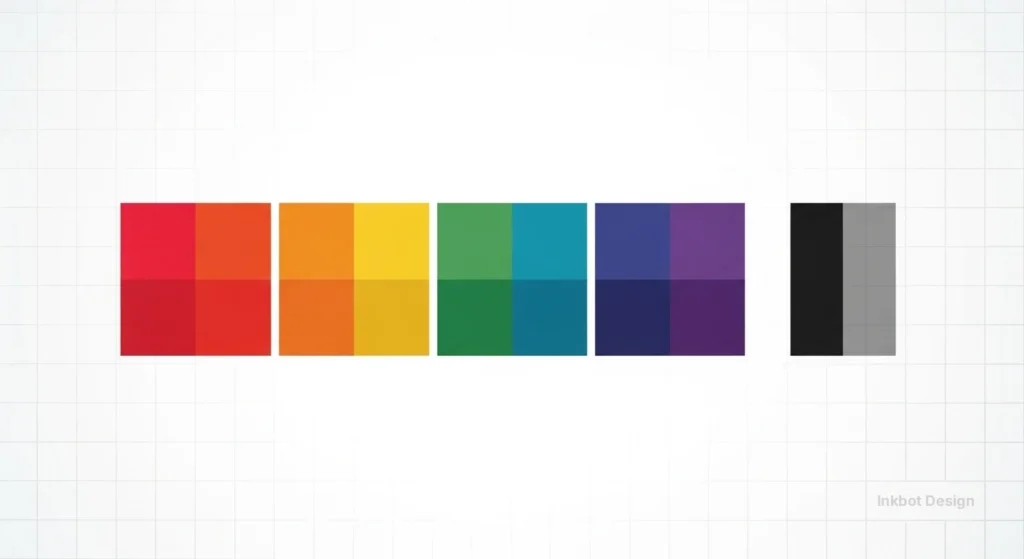
1. Monochromatic: The Power of Focus
A monochromatic scheme uses a single hue as its foundation, extending the palette through tints (adding white), shades (adding black), and tones (adding grey).
- Strategic Intent: This is the gold standard for minimalist tech brands and high-end luxury services. It eliminates “visual noise,” allowing the user to focus entirely on the content or the product.
- 2026 Use Case: Modern SaaS dashboards often use a monochromatic blue or grey scale. By keeping 90% of the UI monochromatic, you ensure that when a single, non-monochromatic “Action Colour” appears, it commands 100% of the user’s attention.
- The Technical Edge: Use the OKLCH model to ensure that your tints and shades maintain “Perceptual Uniformity.” This avoids the common issue where a lightened blue starts to look like a “baby blue” or a darkened red looks like a “muddy brown.”
2. Analogous: Creating Natural Trust
Analogous schemes use three or more colours that sit side by side on the wheel (e.g., Blue, Blue-Green, and Green).
- Strategic Intent: Because this grouping is frequently found in nature (think of a forest or an ocean), it is inherently pleasing to the human eye and creates a sense of serenity and stability.
- Strategic Persona: Ideal for Healthcare, Environmental, and Wellness brands. It communicates that your business is in “harmony” with the user’s needs.
- Pro Tip: To prevent an analogous site from feeling “flat,” choose one colour as the dominant “Anchor” and use the others as subtle support accents for secondary information, such as tags or icons.
3. Split-Complementary: High Contrast, Low Friction
A standard complementary pair (colours directly opposite each other, like Red and Green) can often “vibrate” on a screen, causing eye strain.
A Split-Complementary scheme uses a base colour plus the two colours adjacent to its complement.
- Strategic Intent: This offers the high visual contrast of a complementary scheme but with much more sophistication and “breathing room.”
- Business Application: Perfect for B2B Tech and Fintech. You get the professional stability of a primary blue/teal palette. Still, you can use a “split” warm accent (like a soft gold or coral) to highlight conversion points without the jarring aggression of a “hazard” orange.
4. Triadic: The Energy of Diversity
The Triadic scheme uses three hues spaced equally (120 degrees apart) on the wheel, such as Red, Yellow, and Blue.
- Strategic Intent: This is the hallmark of vibrant, high-energy, and accessible brands like Google, eBay, or Slack. It signals diversity, playfulness, and a “jack-of-all-trades” capability.
- Risk Management: Triadic schemes can easily become overwhelming. In 2026, the trend is to let one colour dominate (60%) while the other two act as “punctuation marks” (10% each) across the UI.
5. Tetradic: Mastering Complex Systems
Also known as “Double-Complementary,” this uses two sets of complementary pairs. It is the most difficult to balance, but essential for complex design systems.
- Strategic Intent: It provides maximum variety, allowing you to “colour-code” different product tiers or departments within a single parent brand.
- Implementation: If you are an enterprise-level SMB with multiple service pillars (e.g., a construction firm with “Residential,” “Commercial,” “Maintenance,” and “Consultancy” arms), a tetradic scheme allows each pillar to have its own unique “identity colour” while still feeling part of the same visual family.
Selecting the Right Harmony for Your Business Goals
| Harmony Scheme | Primary Business Goal | Psychological Impact | Recommended Industry |
| Monochromatic | Focus & Sophistication | Professional, clean, elite | Luxury, Minimalist SaaS, AI |
| Analogous | Trust & Serenity | Calm, reliable, natural | Healthcare, FinTech, ESG |
| Split-Comp | Conversion & Clarity | Bold but approachable | E-commerce, B2B Services |
| Triadic | Energy & Innovation | Playful, diverse, creative | EdTech, Apps, Entertainment |
| Tetradic | Hierarchy & Scale | Complex, organised, broad | Multi-service Corporations |
The Context of Perception
One of the most dangerous assumptions in branding is that a colour is “fixed.”
In reality, colour does not exist in a vacuum; it is a neurological interpretation of light reflected from surfaces or emitted by diodes.
For an SMB, ignoring the Context of Perception is how you end up with a “luxury” gold logo that looks like “muddy brown” on a customer’s dimly lit mobile screen.
To master this, we must examine the two phenomena that determine how your audience actually sees your brand: Simultaneous Contrast and Metamerism.
Simultaneous Contrast: The “Background” Effect
Discovered by the chemist Michel Eugène Chevreul, simultaneous contrast is the phenomenon in which two colours, placed side-by-side, alter our perception of each other’s hue and brightness.
Your brand colour will never be seen alone; it will always be seen against a background, a photo, or a competitor’s UI.
The Three Shifts of Contrast:
- Lightness Shift: A medium-grey logo will look nearly white on a black background, but dark and heavy on a white background.
- Saturation Shift: A desaturated “dusty rose” will look vibrant and “pink” next to a dull olive green, but it will look grey and lifeless next to a high-chroma magenta.
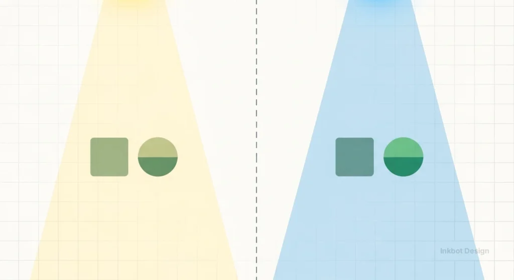
- Hue Shift (The Bezold Effect): Our brains try to “push” adjacent colours toward their complements. If you place a neutral grey box on a bright blue background, the grey will actually appear slightly orange (the complement of blue).
Pro Scenario: If you are designing a SaaS dashboard, you must account for “Interaction Vibration.” Placing bright red text on a bright blue button creates a visual “flicker” that makes the text physically painful to read. In 2026, we solve this by adding a “Luminance Buffer”—adjusting the OKLCH lightness value so the two colours have a clear separation in “visual weight,” even when both are saturated.
Metamerism: The Lighting Trap
Metamerism occurs when two surfaces appear to match under one light source but look completely different under another.
This is the primary reason why a physical product (like a branded hoodie or a printed brochure) might look perfect in your office’s LED lighting but looks “off” or “cheap” when the customer opens it at home under warm incandescent light or outside in natural sunlight.
Why SMBs Fail at Metamerism:
Most small businesses choose their colours on a backlit monitor (emissive light). They then try to match that “digital glow” to a physical ink (reflective light).
- The Result: The brand loses its “Soul” across channels.
- The 2026 Solution: Professional designers now use D50 or D65 standard illuminants when verifying brand colours. When we build a brand identity at Inkbot Design, we test the palette against “Environmental Profiles”—simulating how the brand looks in “Daylight,” “Office Fluorescent,” and “Warm Home” settings.
The Financial Blueprint: ROI, Conversion, and Legal Compliance
Many business owners view colour as a “design choice.” In reality, it is a risk management and revenue generation tool.
In 2026, the European Accessibility Act (EAA) and updated UK regulations made digital accessibility a non-negotiable legal requirement for most SMBs.
The Cost of “Getting it Wrong”:
- Legal Liability: In 2025, UK businesses faced a record number of “failure to provide” digital claims. A non-compliant colour palette is the most easily detectable “breach” for automated legal bots.
- Conversion Friction: If a user over 50 (the “Silver Economy” with the highest disposable income) cannot distinguish your grey-on-white text, they will leave. You are effectively paying for traffic (via PPC or SEO) and then blocking the door.
- Brand Rebuilds: It is 3x more expensive to rebrand a functional company than it is to build a technically sound identity from day one.
| Industry | Primary Strategy | Common Mistake | 2026 Performance Metric |
| Fintech | Analogous blues/teals | Low-contrast “trust” blue | 22% higher trust rating with APCA compliance |
| SaaS | High-chroma CTAs | Pure black (#000) backgrounds | 18% lower fatigue in “soft dark mode” |
| Healthcare | High-value pastels | “Clinical” pure white | Improved patient retention via “soothing UI” |
| E-commerce | Complementary CTAs | Over-saturation of product pages | 12% increase in AOV (average order value) |
The Advanced Perceptual Contrast Algorithm (APCA)
For years, the industry relied on WCAG 2.1 contrast ratios (the 4.5:1 rule).
But in 2026, we have moved toward the APCA. Unlike old methods, APCA accounts for how our eyes actually perceive light on modern OLED screens.
If you are still using 2010 standards, your “accessible” site might still be unreadable for many.
Understanding Lc (Luminance Contrast) in 2026
The old WCAG 2.1 ratio (e.g., 4.5:1) was a simple mathematical division of brightness. However, it didn’t account for “spatial frequency” (how big the text is) or how the human eye perceives light on a glowing screen vs paper.
The APCA (Advanced Perceptual Contrast Algorithm) provides an Lc score.
- Body Text: Requires an Lc of 75.
- Large Headers: Can get away with an Lc of 60.
- Small, Ancillary Text: Requires a higher Lc of 90 to remain legible.
Accessibility is no longer a checklist; it is a fundamental user requirement. Approximately 1 in 12 men and 1 in 200 women have some form of Colour Vision Deficiency (CVD).
- Protanopia & Deuteranopia: Red-green colour blindness. If your “Error” state is red and your “Success” state is green with no accompanying icons, these users will see them as the same muddy brown.
- Tritanopia: Blue-yellow deficiency. Rarer, but critical for brands using yellow as a primary action colour.
- Neurodivergent Considerations: Users with ADHD or Autism often experience sensory overload. High-chroma (very bright) palettes can be physically painful, leading to high bounce rates. In 2026, “Quiet UI”—using lower saturation with high value contrast—is the gold standard for inclusive retention.
| Feature | The Amateur Way (Incorrect) | The Pro Way (Inkbot Standard) |
| Selection | “I like this shade of mint.” | Based on brand identity goals and contrast math. |
| Accessibility | Eye-balling the contrast. | Verified via APCA and WCAG 2.2 testing. |
| Consistency | Using the same HEX for Print and Web. | Separate RGB vs CMYK vs Pantone profiles. |
| Dark Mode | Inverting the white background to black. | Re-calculating saturation for luminous surfaces. |
| Naming | “Light Blue.” | Semantic naming (e.g., brand-primary-500). |
The Rise of “Quiet UI”: Designing for Neurodiversity and Sensory Comfort
In 2026, the digital landscape is loud. As a result, we have seen a significant shift toward “Quiet UI”—a design philosophy that prioritises low-stimulus palettes to support neurodivergent users.
Individuals with ADHD or Autism often experience sensory hypersensitivity; high-chroma, vibrating colour combinations can cause literal physical discomfort, leading to immediate site abandonment.
Key Principles of Quiet UI:
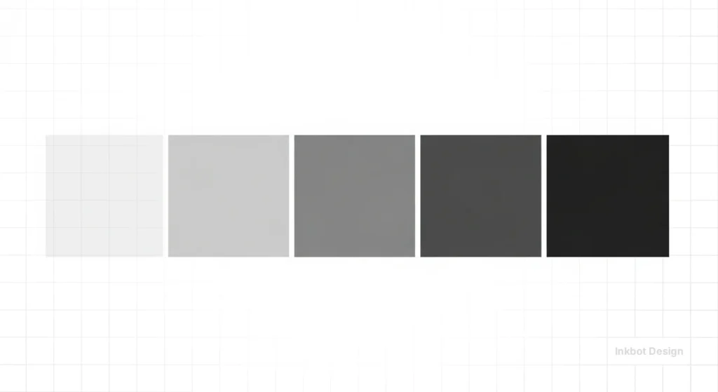
- Reduced Chroma: Instead of using 100% saturation for backgrounds, use “off-whites” or “deep charcoals” with a chroma value below 0.02 in the OKLCH space.
- Functional Contrast: High contrast doesn’t require bright colours. Black text on a soft cream (#F5F5FDC) background is more readable and less fatiguing than pure white (#FFFFFF).
- Predictable States: Use consistent, desaturated tones for secondary actions, reserving your high-chroma “action colour” for a single, primary CTA.
By adopting a sensory-friendly palette, businesses aren’t just being “kind”—they are increasing “Time on Page” and reducing bounce rates. A 2025 study by Nielsen Norman Group highlighted that sites using “low-glare” palettes saw a 14% increase in user retention among adult populations.
The “Blue = Trust” Myth: Why Your Psychology is Wrong

Ask any low-level designer about colour, and they will tell you blue means trust, green means nature, and red implies urgency. This is a reductionist lie.
Blue only signals “trust” if it is legible. If you place a mid-tone blue text on a grey background, the user doesn’t feel “trust”; they feel eye strain.
A study by McKinsey & Company found that the highest-performing companies don’t just use “happy” colours—they use consistent, technically sound visual systems.
Cultural context can override biological response. Before launching a global campaign, audit your palette against these regional benchmarks:
- Red: In China, it symbolises prosperity and luck (stock markets use red to mark gains). In the West, it signals danger or debt. In South Africa, it is the colour of mourning.
- White: Purity and weddings in the UK/USA; death and misfortune in many East Asian cultures.
- Yellow: Bravery in Japan; jealousy in France; high status and royalty in many African nations.
- Green: While globally associated with nature, it is the traditional colour of Islam and should be used with specific respect in Middle Eastern markets.
The reality of colour psychology in branding is that cultural context and technical execution matter more than the hue itself.
In some cultures, white is the colour of mourning. In others, it is purity.
If you are an SMB owner targeting a global market, your “safe” palette might be a cultural disaster. We see this often in cultural colour meanings where brands fail to translate their visual language across borders.
Physics of the Screen: RGB vs CMYK vs Pantone
I once audited a client who spent £20,000 on a rebrand, only to realise their vibrant digital purple looked like a muddy plum when printed on their business cards. They didn’t understand gamut.
- RGB (Red, Green, Blue): This is additive light. It is for screens. It allows for vibrant, neon-adjacent colours because you are literally looking at a light source.
- CMYK (Cyan, Magenta, Yellow, Key/Black): This is subtractive light. It is for ink. You can never achieve the same brightness as a screen because paper absorbs light rather than emitting it.
- Pantone (PMS): This is for physical consistency. If you need your logo to be the same shade in London as it is in Dallas, you use a spot colour.
If your designer hasn’t provided a stylesheet that accounts for these shifts, they haven’t finished the job. You can find stunning colour palettes online, but without the technical breakdown for each medium, they are useless for a growing business.
Beyond sRGB: Designing for Wide Gamut and Display P3
While sRGB has been the standard for decades, in 2026, we are designing for a world of high-dynamic-range (HDR) displays.
Apple and Samsung have pushed mobile screens into the Display P3 colour space, which offers 25% more colour than traditional sRGB.
For an SMB, this means that the “vibrant orange” you chose for your logo might look stunning on an iPhone 16 but appears muted and muddy on an older office monitor.
This is known as gamut mapping. When your brand colour falls outside the range a screen can display, the device “clips” it to the nearest available shade.
Pro Scenario: If your brand relies on high-energy neons (standard in the energy drink or tech startup sectors), you must define your colours in OKLCH or Display P3 values.
This ensures that on high-end devices, your brand “pops” with its full intended intensity, while gracefully degrading on older hardware without losing visual hierarchy.
Colour Theory in 2026: The Shift to Dynamic Palettes
The most significant shift we have seen in the last 18 months is the death of the “Static Brand.” In 2026, your brand colour shouldn’t be a single HEX code. It should be a dynamic range.
With the rise of “Fluid Design Systems,” brands now use generative algorithms to shift their palettes based on users’ environments.
If a user is browsing your site at 11 PM, your brand colours should automatically shift to a colour contrast accessibility compliant dark mode. If they are in a high-glare outdoor environment, the saturation should spike to maintain legibility.
This isn’t “nice to have” anymore. Google’s latest ranking factors (Early 2026 leaks) suggest that UX signals, including legibility and visual comfort, are weighted more heavily than ever before.
If your site causes “flicker” or “glare” due to poor colour management, your SEO will tank.
From Figma to Code: Design Tokens and Semantic Naming
In 2026, we no longer pass “Hex Codes” to developers. We use Design Tokens. This is a system in which colours are given “semantic names” based on their function rather than their appearance.
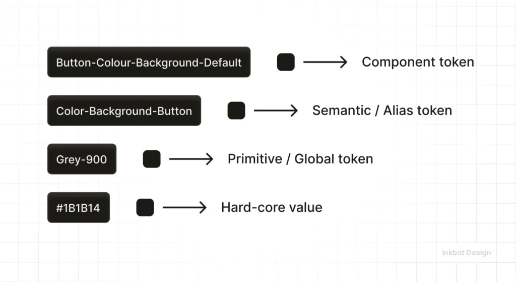
Why this matters for SMBs: If you decide to change your brand’s primary blue to a modern purple, you shouldn’t have to update 50 different pages. You simply update the token brand-primary-500.
Recommended Naming Convention:
- surface-primary: The primary background colour.
- text-on-surface: The most accessible text colour for that background.
- action-enabled: The colour of a clickable button.
- action-hover: The slightly darker/lighter shade for user interaction.
Using tools like Figma variables or Style Dictionary, your brand remains consistent across your website, your app, and even your email newsletters.
This “Single Source of Truth” is what separates professional 2026 brands from amateurs.
Technical Implementation: The 2026 Toolstack & Workflow
To maintain consistency in 2026, your team should use a single “Single Source of Truth” for colour.
| Tool | Category | Best For… |
| Adobe Color | Discovery | Generating initial schemes based on harmony rules. |
| Coolors.co | Prototyping | Fast palette generation and contrast testing for SMBs. |
| Leonardo.io | Enterprise | Creating adaptive, contrast-based design systems. |
| Stark | Audit | Checking WCAG 2.2 and APCA compliance directly in Figma or Chrome. |
The Modern Workflow:
- Define the Core: Select your primary brand hue in HSL (Hue, Saturation, Lightness) for easier handoff to developers.
- Generate the Scale: Use a “Curve” approach rather than linear steps to ensure your palette remains vibrant across all 10 shades.
- Validate via APCA: Ensure your text-on-background combinations meet a Luminance Contrast (Lc) score of at least 75 for body text.
- Semantic Naming: Instead of naming a colour “Light Blue,” name it brand-primary-100. This allows for dynamic theme switching (e.g., Dark Mode) without rewriting your entire codebase.
Agency Notes
In our fieldwork at Inkbot Design, we often see SMBs trying to save money by using colour palette generators to build their identity.
While these tools are excellent for inspiration, they lack the strategic “weight” required for a professional brand.
I recently worked with a tech startup that used a “trending” palette of soft pastels. On their 5K iMacs, it looked beautiful. On the average customer’s $200 smartphone, the text was invisible.
We had to scrap the entire identity and rebuild it using a “Contrast-First” methodology. It cost them three months of momentum.
Don’t be the business owner who chooses aesthetics over function. A pretty palette that doesn’t convert is just expensive art.
The Verdict
Colour theory is the bridge between how your brand looks and how it performs.
If you ignore the technical requirements—accessibility, gamut mapping, and cultural context—you are building your business on a shaky foundation.
In 2026, the brands that win are the ones that treat colour as a technical asset, not a decorative afterthought.
Stop guessing. Start measuring. Your bottom line depends on it.
Ready to fix your brand’s visual strategy? Request a quote and let’s get the math right.
Frequently Asked Questions (FAQ)
What is the 60-30-10 rule in colour theory?
The 60-30-10 rule is a timeless decorating and design guideline. It suggests using 60% of a dominant colour (usually a neutral), 30% of a secondary colour, and 10% of an accent colour. This creates balance and prevents the design from feeling cluttered or overwhelming to the viewer’s eye.
What is the difference between Hue, Saturation, and Value?
Hue is the actual “colour” (e.g., Red). Saturation is the intensity or purity of that colour (how vivid it is). Value is the brightness or darkness of the colour. Professionals manipulate value and saturation to create contrast, which is far more critical for legibility than the hue itself.
Why do my brand colours look different on my phone versus my laptop?
This is due to hardware variations in screen technology (OLED vs LCD) and colour calibration. Screens also use the RGB colour model, which varies by manufacturer. To mitigate this, professionals use “Web-Safe” or “Standard” colour profiles to ensure maximum consistency across different devices and browsers.
What is a complementary colour scheme?
Complementary colours sit directly opposite each other on the colour wheel (e.g., Blue and Orange). These pairings offer the highest level of visual contrast, making them excellent for Call-to-Action buttons. However, using them in equal amounts can cause visual “vibration,” so they must be balanced carefully.
How does dark mode affect my brand’s colour theory?
Dark mode isn’t just a background swap. Colours that look great on white can appear “neon” or “vibrating” on black. You must adjust the saturation and value of your brand colours for dark mode to maintain both brand recognition and WCAG accessibility standards.
What is the most accessible colour combination?
Technically, black text on a white (or slightly off-white) background provides the highest contrast. However, for branding, the “most accessible” combination is any pair that meets a minimum contrast ratio of 4.5:1 (or higher for APCA standards). Avoid “Red on Green” due to common colour-blindness issues.
Do I really need separate colours for Print and Web?
Absolutely. Your screen uses additive light (RGB), while your business cards use subtractive pigment (CMYK). If you use a digital-only “Neon Purple,” it will look muddy on paper. Always ask your designer for a Pantone match for physical assets.
What is the most ‘clickable’ colour for a button?
There is no single “magic” colour. However, high-chroma (saturated) colours that are complementary to your site’s dominant hue perform best. If your site is primarily blue, an “Action Orange” will consistently out-convert a green button.
Can I use AI to pick my brand colours?
AI tools are excellent for generating “moods” and rapid variations. However, they often lack the technical understanding of gamut mapping and APCA compliance. Use AI for the creative spark, but always use a technical audit tool like Stark or Leonardo to verify the math.
Why is colour theory critical for SEO in 2026?
Search engines now measure User Experience (UX) metrics. If your colour choices lead to high bounce rates—due to poor legibility or “eye fatigue”—your rankings will suffer. Accessibility is no longer a “bonus”; it is a core component of how Google evaluates site quality and authority.
What is metamerism in colour theory?
Metamerism is a phenomenon where two colours appear to match under one light source but look different under another. This is why a logo might look perfect in your office’s LED lighting but looks “off” on a physical billboard under natural sunlight. Testing under different lights is a professional requirement.
What are the primary colours in digital design?
In digital design (additive light), the primary colours are Red, Green, and Blue (RGB). By combining these three colours in different intensities, you can create over 16 million different shades. This differs from traditional painting, where the primary colours are Red, Yellow, and Blue (RYB).
How does age affect how people see my brand colours?
As we age, the lens of the eye yellows, making blues look duller and greens look yellower. If your target market is the 55+ demographic (the Silver Economy), increase the saturation of your blues and avoid low-contrast yellow/white combinations.
What is the ‘Bezold Effect’?
It’s an optical illusion in which a design’s entire mood changes with the substitution of just one colour. This is critical for logo variations; a white-background version of your logo might feel “cheap,” while the same logo on a navy background feels “premium.”
What are the legal accessibility standards in the UK for 2026?
Public and private sector websites must generally comply with WCAG 2.2 Level AA. This includes specific contrast ratios for text and “non-text UI elements,” such as form borders and icons.