The 7 Best Typography Books for Designers
Typography is the structural engineering of communication.
Get it wrong, and your message collapses.
Get it right, and you create an invisible path straight to the “Buy” button.
To fix the rot, you need to return to the source.
You need the right brand typography foundation.
- Typography is structural engineering of communication; wrong type collapses your message, right type guides users to action.
- Bringhurst: mathematical precision—use golden ratios and 45–75 character line lengths for legibility and responsive typography.
- Lupton and Müller-Brockmann: practical grids and contrast create scalable, accessible layouts and consistent brand systems.
- Variable fonts and AI demand technical knowledge of letter construction, optical sizing, and semantic HTML for modern performance.
What are Typography Books?
Typography books are technical manuals and philosophical treatises that define the rules of arranging type to make written language legible, readable, and visually appealing.
They cover the anatomy of letterforms, the physics of white space, and the psychological impact of different typefaces.
Key Components of Typographic Mastery:
- Micro-typography: The fine details of kerning (space between letters), tracking (space between groups of letters), and leading (vertical space between lines).
- Macro-typography: The overall structure of the page, including columns, margins, and typographic hierarchy.
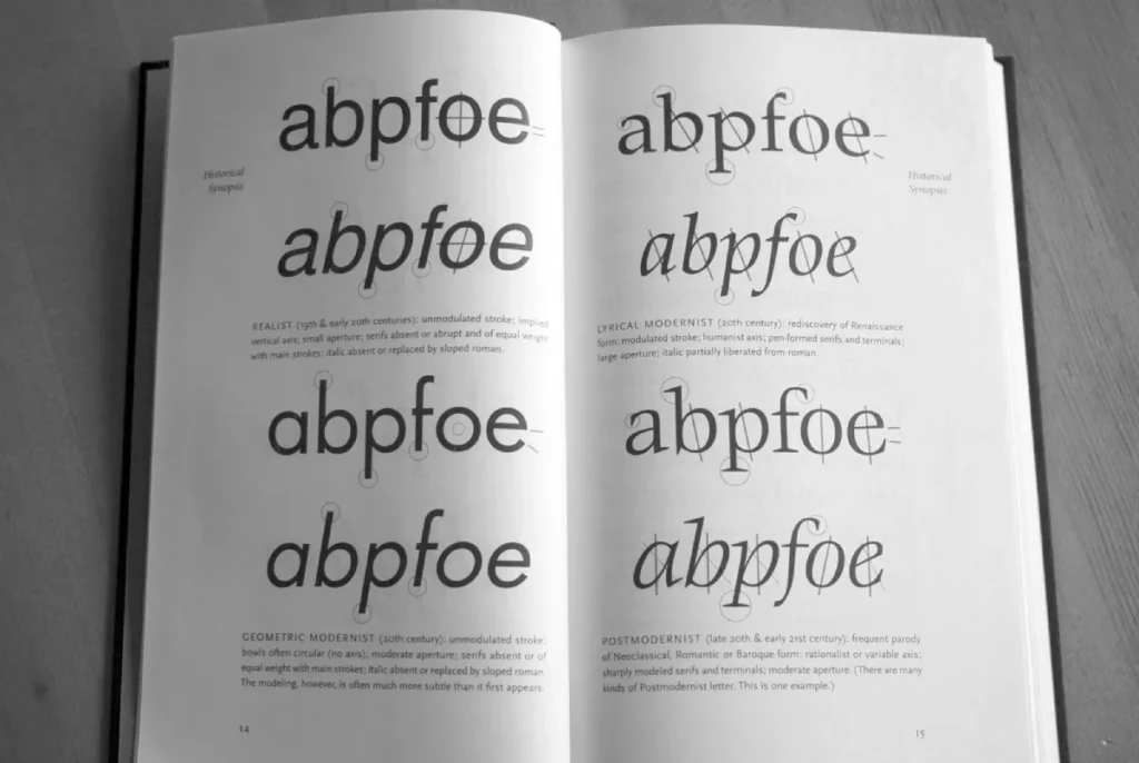
- Classification & History: Understanding why a 15th-century humanist serif feels “trustworthy” while a 21st-century geometric sans feels “efficient.”
1. The Elements of Typographic Style by Robert Bringhurst
If you only buy one book in your career, let it be Robert Bringhurst’s The Elements of Typographic Style.
In the design community, it is not merely a book; it is the Typographer’s Bible.
Bringhurst, a poet and typographer, approaches the arrangement of letters as both a biological necessity and a mathematical art form.
Elements of Typographic Style
In the world of design, if David Aaker is the architect of brand strategy and Seth Godin is the prophet of remarkable ideas, Robert Bringhurst is the high priest of the written word. The Elements of Typographic Style is not a book about “picking fonts”; it is a philosophical and technical manual for “endowing human language with a durable visual form.”
As an Amazon Partner, when you buy through our links, we may earn a commission.
The Technical Architecture of the Page
Bringhurst’s primary contribution to a modern designer’s workflow is his insistence on the Golden Section and the relationship between the x-height of a typeface and its line-length (measure).
He argues that a line of text should ideally contain 45-75 characters.
In 2026, when we design for everything from foldable screens to AR overlays, this principle is the bedrock of Responsive Typography.
When you apply Bringhurst’s ratios, you aren’t just making text look “nice”; you are managing the saccadic jumps of the human eye. If a line is too long, the eye tires; if it’s too short, the rhythm is broken.
This technical precision is what separates a high-converting landing page from a wall of unreadable digital noise.
Practical Application: The 2026 Variable Font Context
While Bringhurst wrote primarily for the printed page, his theories on Optical Sizing have found a second life in Variable Fonts.
In 2026, designers use CSS to adjust the ‘opsz’ axis of a font based on the user’s viewport size.
Bringhurst’s chapters on “Tact” and “Grooming” provide the philosophical framework for why a font needs to be physically wider and have more open counters at smaller sizes (like 10px on a smartwatch) than at headline sizes on a 4k monitor.
Golden Section: A mathematical ratio (1:1.618) used to create harmonious page layouts.
- Optical Sizing: Adjusting the design of a typeface based on the size at which it is displayed to maintain legibility.
2. Thinking with Type by Ellen Lupton
Lupton’s book is the antidote to the “academic” dryness of other manuals. It’s practical, visual, and direct. She breaks the book into three sections: Letter, Text, and Grid.
Thinking with Type
Thinking with Type is the modern manifesto for the screen-first designer. Ellen Lupton—a legendary educator at MICA—famously declares that typography is a “tool for doing things with.” This isn’t a book about fonts; it’s a guide to shaping language, giving it a physical body, and enabling the social flow of messages.
As an Amazon Partner, when you buy through our links, we may earn a commission.
Why it Matters for SMBs
Most business owners fail because they don’t understand font pairing. They use a loud, aggressive header with an equally loud subheader. Lupton teaches you how to create “visual contrast” without causing a headache.
If you’re trying to build a brand identity, you need to understand the “Grid” section of this book. Without a grid, your design is just a collection of accidents.
3. Grid Systems in Graphic Design by Josef Müller-Brockmann
Josef Müller-Brockmann’s Grid Systems in Graphic Design is the definitive manifesto of the International Typographic Style (also known as Swiss Style).
Müller-Brockmann was a functionalist who believed that the grid is a tool for total objectivity. For him, the grid is not a cage; it is a skeleton that allows for infinite flexibility within a logical framework.
Why the Grid is the DNA of Modern UI
In 2026, we no longer design “pages”; we design Design Systems. Müller-Brockmann’s work is more relevant today than in the 1960s because it mirrors the logic of Flexbox and CSS Grid.
When you study this book, you are learning how to create a “Modular Grid”—a system of columns and “gutters” that allows content to flow across devices without losing its structural integrity.
Grid Systems in Graphic Design
If Robert Bringhurst provides the soul of typography and Ellen Lupton gives it a modern voice, Josef Müller-Brockmann is the architect who builds the house. His seminal work, Grid Systems in Graphic Design (Rastersysteme), is the definitive manifesto for the “International Typographic Style” (Swiss Style).
As an Amazon Partner, when you buy through our links, we may earn a commission.
The “Swiss Style” and Accessibility
A common misconception is that the Swiss Style is “cold.”
In reality, it is the most accessible form of design. By using a rigid grid, you create a Visual Hierarchy that users can decode instantly. This is crucial for Cognitive Accessibility.
When the “Rule of Thirds” and alignment are used correctly, users with ADHD or dyslexia find the content much easier to navigate because the “anchor points” of the information are predictable.
Case Example: Global FinTech Branding
Consider the 2025 brand refresh for Revolut or Stripe. Their interfaces are built on the exact 8-column and 12-column grids championed by Müller-Brockmann.
By removing unnecessary decoration and focusing on the mathematical alignment of “Type as Image,” they convey a sense of stability and institutional trust.
4. Designing Type by Karen Cheng
This is for the person who wants to know how the watch is made, not just how to tell the time. Cheng breaks down every single letterform in the alphabet and explains its construction.
Designing Type
While Bringhurst explains the soul and Müller-Brockmann the structure, Karen Cheng provides the engineering manual. Designing Type is a masterclass in the “optical physics” of letterforms. It deconstructs every character in the Latin alphabet to reveal why they look “right” to the human eye—and how to fix them when they don’t.
As an Amazon Partner, when you buy through our links, we may earn a commission.
The Focus of 2026
In 2026, we are seeing the rise of variable fonts. To use these effectively, you must understand the “construction” of the type that Cheng details.
You can’t manipulate font axes (weight, width, slant) if you don’t understand where the “stress” of a letter lies.
The Data Point:
A study by MIT AgeLab showed that in “high-stress” environments (like driving or browsing a cluttered website), the legibility of individual letterforms—specifically the distinction between ‘i’, ‘l’, and ‘1’—can reduce cognitive load by up to 20%.
5. Just My Type by Simon Garfield
This isn’t a “how-to” manual. It’s a “why” book. Garfield explores the cultural history of fonts, from the ubiquity of Helvetica to the hatred of Comic Sans.
Just My Type
If The Elements of Typographic Style is the “Bible” and Grid Systems is the “Architecture,” then Just My Type by Simon Garfield is the “Dinner Party.” It is the book that took typography out of the dusty design studio and proved that fonts are the most visible, yet ignored, artefacts of human history.
As an Amazon Partner, when you buy through our links, we may earn a commission.
The Psychological Anchor
Choosing a font is a psychological act. If you are a high-end law firm using a font associated with 1990s tech startups, you are bleeding credibility.
Garfield’s book helps you avoid these “semiotic failures.” It’s about the “vibe,” but backed by historical context.
Before you request a quote for a redesign, read this to understand why your current font might be lying to your customers.
6. Typographie: A Manual of Design by Emil Ruder
Ruder was among the first to argue that typography’s primary purpose is communication, not art. His book focuses on the “unprinted” space as much as the printed space.
Typographie: A Manual of Design
Typography: A Manual of Design (1967) is the magnum opus of the Basel School. Ruder was a pioneer who discarded conventional rules to establish a “Typography of Order” that remains the bedrock of graphic and web design.
As an Amazon Partner, when you buy through our links, we may earn a commission.
The “Fluff” Debunk
Many “designers” will tell you that white space is “empty” space. Ruder proves it is an “active” space.
“Typography has one plain duty before it, and that is to convey information in writing.” — Emil Ruder.
If your website is a wall of text with no typographic hierarchy, you aren’t communicating; you’re just making noise.
7. Stop Stealing Sheep & Find Out How Type Works by Erik Spiekermann
The title comes from a quote by Frederic Goudy: “Anyone who would letterspace lower case would steal sheep.”
Spiekermann is the master of the “edgy and direct” tone I appreciate. He treats type as a living, breathing tool for business.
Stop Stealing Sheep & Find Out How Type Works
The title comes from a famous quote by Frederic Goudy: “Anyone who would letterspace lowercase would steal sheep.” In this fourth edition, legendary designer Erik Spiekermann brings his “commonsense” classic into 2026. While many typography books feel like academic lectures, Stop Stealing Sheep is an entertaining, visual conversation about how type affects our moods, our work, and our digital experiences.
As an Amazon Partner, when you buy through our links, we may earn a commission.
The State of Typography in 2026
We are currently in the era of “GEO” (Generative Engine Optimisation). AI models scrape your site. If your typography and HTML structure (H1, H2, H3) are confusing, the AI won’t categorise your content correctly.
Spiekermann’s focus on “Type as Tool” is more relevant now than ever. Using font combinations that clearly define sections isn’t just for humans; it’s for the algorithms, too.
The “Wrong Way” vs The “Pro Way”
| Feature | Amateur (The Wrong Way) | Pro (The Inkbot Way) |
| Font Choice | Picks whatever is “trending” on Canva. | Selects based on font licensing and performance. |
| Hierarchy | Uses “Bold” and “Bigger” randomly. | Employs a mathematical scale (e.g., 1.25 ratio). |
| Line Length | Spans the whole width of the screen. | Restricts to 45–75 characters per line for readability. |
| Kerning | Never touches it. Trusts the software. | Manually adjusts “problem pairs” in logos and headers. |
| Mobile | Hopes for the best. | Uses “Fluid Typography” and variable fonts. |
Debunking the Myth: “More Fonts = More Personality”
There is a persistent, dangerous myth in the SMB world that using five different fonts on a page makes the brand look “creative” or “multidimensional.”
The Truth: It makes you look like a ransom note. Data from Nielsen Norman Group consistently shows that “Design Consistency” is a primary driver of user trust.
Every additional font you add increases the “Cost of Retrieval” for the user’s brain. They have to “re-learn” how to read your site every time the typeface changes.
Stick to two font families. One for headers, one for body text. Maybe a third for “UI elements” if you’re feeling spicy. But that’s it.
If you can’t express personality with two fonts, the problem isn’t the fonts; it’s your brand strategy. Understanding the serif vs sans serif debate is a good place to start.
Which Book Should You Read First?
| Book Title | Primary Audience | Core Philosophy | Best For… |
| Thinking with Type | Beginners / SMB Owners | Flexibility & Playfulness | Quick brand improvements. |
| The Elements of Typographic Style | Professional Designers | Mathematical Precision | Establishing a long-term technical foundation. |
| Grid Systems | UI/UX Designers | Logic & Order | Building scalable design systems and CSS layouts. |
| Designing Type | Type Designers / Pros | Structural Anatomy | Understanding font construction and variable axes. |
| Just My Type | Marketers / Entrepreneurs | Psychological Context | Choosing a font that matches the brand “voice.” |
| Typographie | Minimalists | Communication as Duty | Creating high-readability, low-distraction interfaces. |
| Stop Stealing Sheep | Developers / Modern Pros | Type as a Business Tool | Practical, “no-nonsense” implementation. |
The State of Typography Books in 2026
The biggest shift in the last 12 months hasn’t been a new book, but how we apply the old ones to new technology.
- Variable Font Proliferation: We no longer load “Light,” “Regular,” and “Bold” as separate files. We load one file and use CSS to toggle the weight. This has cut font-related load times by up to 70%.
- AI-Assisted Kerning: Tools like Font-Self and Adobe’s latest updates use machine learning to suggest “perfect” kerning. However, as Spiekermann would tell you, these tools often fail on the “Display” type. You still need a human eye.
- Sustainability in Type: “Eco-fonts” that use less ink/toner are being replaced by “Energy-fonts” that require less CPU power to render on mobile screens.
The 2026 Typographic Frontier: Variable Fonts and AI
The books listed above provide the “rules,” but the medium of 2026 demands a new application. We are currently witnessing the total integration of Generative Engine Optimisation (GEO) and Fluid Typography.
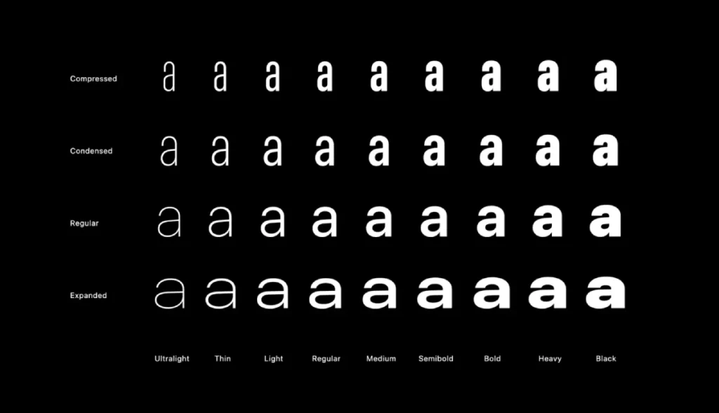
The Rise of Variable Fonts (VF)
A Variable Font is a single file that acts like an entire font family. Instead of loading “Roboto-Light.woff2” and “Roboto-Bold.woff2,” you load one file with an “axis of variation.”
- Weight (wght): Smoothly transition from hairline to ultra-black.
- Width (wdth): Condense or expand the font to fit a specific container.
- Slant (slnt): Adjust the angle of the italics for better emphasis.
The books by Karen Cheng and Erik Spiekermann are essential here. Cheng teaches you where the “stress” of a letter lies, which is vital when you are manually tweaking a variable font’s interpolation to ensure it doesn’t “break” at extreme weights.
Typography for AI Overviews and LLMs
As search engines transition to AI, the “readability” of your site isn’t just for humans. AI crawlers evaluate your Semantic HTML (H1, H2, H3 tags) and their relationship to the visual weight of the type.
If your typography doesn’t match your HTML structure—for example, if a “Body Text” class is visually larger than an “H2″—AI systems may flag the site for “Deceptive Layouts,” which can negatively impact your authority score.
Global Typography: Designing for the Next Billion Users
In 2026, a “Best Typography Books” list is incomplete without addressing Multilingual Design.
Books like Arabic Typography by Huda Smitshuijzen AbiFarès (a necessary addition to your library) explain how the “Kashida” (justification) in Arabic script differs fundamentally from Latin “Kerning.”
As brands expand into MENA and APAC regions, understanding these nuances is no longer optional; it is a core business requirement for global authority.
The Verdict
Typography is the most undervalued asset in your marketing stack. You can spend £50,000 on “strategy,” but if your message is delivered in 12pt Comic Sans, you are a joke.
The books listed above aren’t just for “designers.” They are for anyone who wants their words to have weight. Start with The Elements of Typographic Style.
It will ruin your ability to look at a poorly designed menu ever again, but it will also make you a better communicator.
If your current brand feels “off” but you can’t put your finger on why, it’s probably the type. Don’t guess. Contact us for a professional audit, or request a quote to fix your visual identity for good.
Frequently Asked Questions (FAQ)
What is the best typography book for beginners?
“Thinking with Type” by Ellen Lupton is the most accessible. It uses clear visual examples to explain complex concepts without drowning the reader in historical jargon. It’s perfect for SMB owners who need immediate, actionable design improvements.
How does typography affect SEO in 2026?
Typography affects SEO through user signals like “Dwell Time” and “Bounce Rate.” If your type is hard to read, users leave. Additionally, properly using H-tags (H1, H2, H3) helps LLMs and search engines understand your “Entity Relationship,” which is crucial for modern GEO.
What is the difference between legibility and readability?
Legibility refers to how easy it is to distinguish one letter from another (a function of typeface design). Readability refers to how easy it is to read blocks of text (a function of the designer’s layout, line spacing, and size).
How do I choose between a Serif and a Sans-Serif font for a digital brand in 2026?
Base your choice on Render Performance and Brand Archetype. Sans-serif fonts (such as Geometric or Humanist styles) generally offer better legibility on low-resolution mobile screens. However, with the proliferation of high-DPI displays, Serifs are now widely used to convey “Heritage” and “Authority” without the blurriness seen in the early web era.
What are variable fonts?
Variable fonts are a single font file that behaves like multiple fonts. Instead of loading separate files for “Bold” and “Italic,” you can use a slider to choose any weight or slant in between, improving site performance and design flexibility.
Can I use AI to pick my brand’s fonts?
AI tools like Fontjoy or Adobe’s AI suggestions are excellent for generating initial pairings. However, they often lack the “Cultural Semiotics” found in Simon Garfield’s Just My Type. AI might find a mathematical match that is a historical disaster (e.g., pairing a 1930s German font with a 1960s American corporate logo).
What is kerning?
Kerning is the process of adjusting the spacing between individual letter pairs. “AV” often needs to be moved closer together than “NN.” Bad kerning is the hallmark of an amateur designer and can ruin the look of a professional logo.
Is typography more important than imagery?
Typography is an image. It’s a visual representation of your brand’s voice. While a photo can show a product, typography conveys how the user should feel about that product and the company behind it.
Why is hierarchy important in design?
Hierarchy tells the reader what to look at first, second, and third. Without it, all information becomes equally important, leading to “Cognitive Overload.” Good hierarchy guides the user toward your Call to Action (CTA).
What is the most common typography mistake entrepreneurs make?
Ignoring Line-Height (Leading). Most amateurs set their line-height too tightly, causing the ascenders of one line to touch the descenders of the line above. A good rule of thumb is to set your leading to roughly 1.4 to 1.6 times the body text font size.
Where can I learn more about brand strategy?
Check out our comprehensive guide on brand identity or explore our blog for technical deep dives into font pairing and hierarchy.


