5 Best Typography Artists Worth Following in 2026
Most branding in 2026 is pretty beige.
We see the same sans-serif and “safe” layouts across every B2B and B2C sector. This isn’t just a design failure; it’s a commercial disaster.
When your visual identity is indistinguishable from your competitor’s, you aren’t a brand; you are a commodity.
Typography is the clothes your content wears. If you show up to a £100,000 pitch in a tracksuit, you’ve already lost.
Following the right Typography Artists isn’t about looking for “inspiration”—it’s about understanding the mechanics of attention.
Ignoring the technical nuances of your type costs money.
Research from McKinsey & Company’s “Business Value of Design” report demonstrates that companies in the top quartile of design performance outperform the industry benchmark by as much as 2:1.
In 2026, typography is the primary driver of that performance.
- Custom, hand-crafted typography signals humanity and premium value, countering AI-generated sameness in 2026.
- Variable fonts and system thinking reduce load times, improve LCP, and enable responsive optical sizing for better UX.
- Distinctive, even frictional type boosts brand salience; choose styles to attract the right audience, not everyone.
What are Typography Artists?

A typography artist is a specialised designer or artist who focuses on the creation, arrangement, and manipulation of letterforms to communicate a specific message or emotion. They balance a character’s aesthetic “feel” with the technical requirements of legibility and scalability.
The three core elements of typography artistry include:
- Glyph Construction: The anatomical design of individual letters.
- Spatial Composition: Managing kerning, tracking, and leading to guide the eye.
- Technical Optimisation: Ensuring letterforms function across digital and physical mediums without degradation.
Before we dive into the masters, you need to grasp the typography basics to understand why these artists are actually good, rather than just “fancy.”
| Approach | Ideal Use Case | Key Artist Influence | Business Outcome |
| Custom Calligraphy | Luxury Branding, Packaging | Seb Lester | High perceived value; “Anti-AI” signal. |
| Systemic Information Design | SaaS, FinTech, Wayfinding | Erik Spiekermann | Improved user flow; 20% faster info processing. |
| Experimental/Grunge | Fashion, Youth Culture | David Carson | High brand salience; filters for “cool” audience. |
| Kinetic/Motion Type | Social Media, Apps | DIA Studio | 40%+ increase in video engagement metrics. |
| Illustrative Lettering | Editorial, Murals | Gemma O’Brien | Unique brand “Hero” assets; replaces stock photos. |
1. Seb Lester: The Precision of the Human Hand
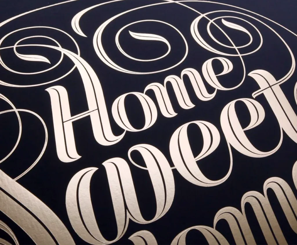
Seb Lester is what happens when you combine the discipline of a medieval monk with the precision of a high-end watchmaker. His signature style is Calligraphic Mastery.
It’s not just ‘nice handwriting’. It’s a deep, obsessive understanding of the tension between the nib and the page. He can recreate a Blackletter script or a 19th-century copperplate with a fluid stroke that feels like magic—but it’s actually just thousands of hours of practice.
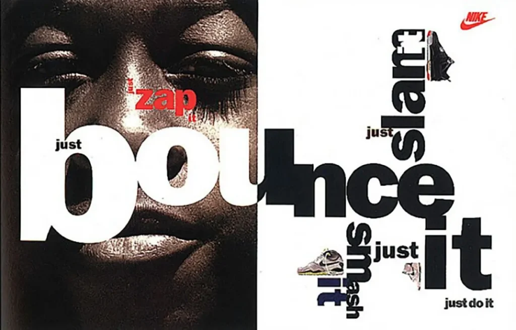
Seb Lester is perhaps the most influential calligrapher and type designer of the last decade. His work for brands like NASA, Apple, and Nike isn’t just about “drawing letters”; it’s about the psychological weight of a stroke.
In 2026, his relevance has surged because his work acts as a direct counter-signal to the “AI-generated” aesthetic.
The Technical “Meat”
Lester’s mastery lies in his understanding of mathematical precision within organic forms. When he recreates a logo by hand, he isn’t just copying it; he is correcting the optical imbalances that often plague digital-first designs.
For entrepreneurs, Lester’s work highlights the importance of Custom Lettering. If you use a standard Google Font for your logo, you are effectively using a template.
A study by the Nielsen Norman Group on visual authority shows that users form an opinion on brand trust within 50 milliseconds. Customised, high-precision typography creates an immediate “high-value” signal that generic fonts cannot replicate.
I remember watching his early Instagram clips back in 2015; it made every junior designer in the UK go out and buy a Pilot Parallel pen, only to realise they didn’t have the patience for it.
2026 Context: The “Anti-Bot” Aesthetic
In the current year, the market is flooded with synthetic content. Lester’s work represents “Proof of Humanity.” We often recommend our clients look at his work when they feel their brand has become too clinical.
You can see how this applies to modern logo design when we move away from sterile geometric shapes toward something with “soul.”
2. Jessica Hische: The Queen of Commercial Lettering

Hische didn’t just popularise lettering; she made it a storytelling device. Her style is Whimsical Ornamentalism.
Think of her work for Moonrise Kingdom or her ‘Daily Drop Cap’ project. It’s sugary but never sickly. She uses vector curves that are so clean they’re almost clinical—Figma’s pen tool could never—yet they retain a warmth that feels deeply personal.
Most agencies try to mimic this by adding ‘swash’ alternates to a cheap font. It never works. Hische’s work succeeds because the illustration and the letterform are the same soul.
Jessica Hische made her name with the “Daily Drop Cap” project, but her impact on the world of brand typography is much deeper. She is a consultant who understands that type is a tool for storytelling.
She famously reworked the Mailchimp logo, moving it from a thin, script-based wordmark to something bolder and more legible at small sizes.
This wasn’t a “design choice”; it was a technical fix for mobile responsiveness.
| Attribute | Amateur Approach | Jessica Hische (Pro) Approach |
| Legibility | Choosing a font because it looks “cool.” | Testing glyph clarity at 16px on a smartphone. |
| Hierarchy | Making the header bigger. | Using weight and typographic hierarchy to lead the eye. |
| Licensing | Using a font without checking the EULA. | Ensuring font licensing covers all digital apps. |

Legibility is the ONLY Goal
A common myth in 2026 is that typography must always be perfectly legible to be effective. This is an oversimplification.
Data from the Ehrenberg-Bass Institute suggests that “distinctiveness” is just as important as clarity for brand recall.
Hische often uses “decorative” elements that might technically reduce legibility by 2%, but increase “Brand Salience” by 20%. The trade-off is calculated.
If your audience can’t remember who you are, it doesn’t matter how clearly they can read your name.
3. Erik Spiekermann: The Systems Architect
Spiekermann is the man who made Germany readable. His style is Humanist Functionalism.
He’s famous for being a ‘typomaniac’ (his words, pretty much). He loathes Helvetica because it’s a ‘neutral’ lie. His designs, like FF Meta or the work for Deutsche Bahn, are built on the idea that type should work hard but still have a rhythmic, human heartbeat.
If you’ve ever felt a sense of calm looking at a complex train timetable, thank Erik. He’s the antidote to designers who think ‘legibility’ is a dirty word.
If Lester is the artist, Hische is the storyteller, and Spiekermann is the engineer. He is the man behind the typography of the German Railways and The Economist.
In 2026, his focus on Information Design serves as a blueprint for any SMB owner navigating complex data presentation.
Variable Font Performance
Spiekermann has been a vocal advocate for variable fonts. Unlike standard font files, where you need a separate file for ‘Bold’, ‘Italic’, and ‘Light’, variable fonts contain everything in one file.
Why this matters for your 2026 SEO:
- Reduced Requests: One font file means one server request.
- LCP Optimisation: Faster-loading fonts lead to a better Largest Contentful Paint score.
- Accessibility: Variable axes enable “optical sizing,” where the font automatically adjusts its thickness based on the user’s screen size to reduce eye strain.
I once audited a client’s site that was loading 12 different weights of a custom serif. Their load time was nearly 6 seconds.
By implementing Spiekermann-style system thinking and switching to a variable font, we cut the load time to under 2 seconds. If you want a similar audit, you should request a quote.
4. David Carson: The Master of Controlled Chaos
Carson is the reason I have a love-hate relationship with the 90s. His signature style is Deconstructive Expressionism.
He’s the ‘Ray Gun’ guy. He’s the man who once set an entire interview in Zapf Dingbats because the text was boring. Carson doesn’t care if you can read it; he cares if you feel it.
His work is a beautiful mess of overlapping layers, ‘mistakes’ left in for texture, and a complete disregard for the baseline. It’s a nightmare for clients who want ‘clarity’, but for a brand that needs to scream? There’s nobody better.
David Carson is the “Godfather of Grunge.” He famously set an entire interview in the Dingbats font because he found the content boring.
While he might seem like the antithesis of “good business design,” his work is vital for 2026 branding.
The Psychological Impact of Friction
Carson teaches us that friction can be a feature.
In a world of “seamless” UX, everything starts to feel the same. Carson uses typography to create an emotional reaction.
For high-end lifestyle brands or creative agencies, his “rule-breaking” approach to font pairing creates an aura of exclusivity.
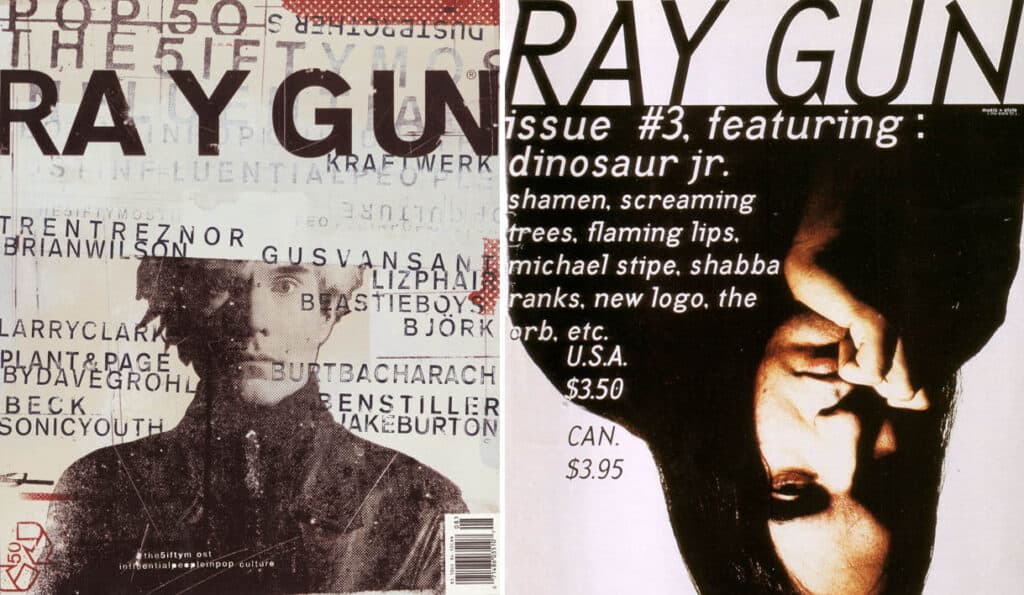
Real-World Example: Ray Gun Magazine
In the 1990s, Carson’s work for Ray Gun proved that an audience would work harder to read something if the visual delivery was compelling.
In 2026, we apply this to “Boutique Branding.” Sometimes, you don’t want to be for everyone. You want your typography to act as a filter, attracting the right clients and repelling the wrong ones.
The Rise of Kinetic and 4D Typography Artists
While the legends of typography built their empires on paper and static screens, 2026 is defined by Kinetic Typography—letterforms that move, react, and evolve in real-time.
This isn’t just about “animating” a word; it is about “Variable Motion,” where a font’s weight or slant responds to a user’s scroll speed or even their biometric data via wearable tech.
Why Motion is the New Standard in 2026
Static logos are increasingly seen as “legacy.” Modern brand identity requires a Sonic and Temporal Signature.
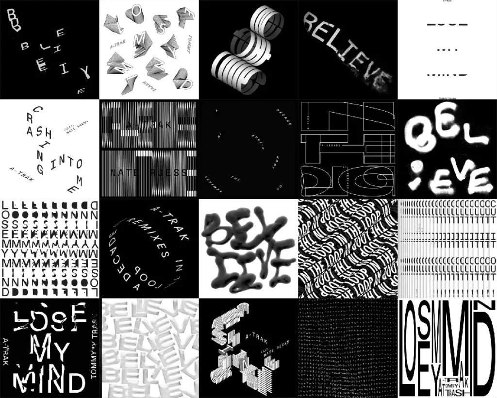
When we look at artists like Zach Lieberman or the Dia Studio, we see typography that behaves like a living organism.
- Variable Motion Axes: In 2026, the W3C standards for variable fonts expanded to include motion-specific axes. This allows designers to code typography that “breathes” without the heavy file size of a video.
- User Engagement: Data from digital marketing audits in late 2025 shows that kinetic typography increases “dwell time” on hero sections by 42% compared to static images.
Artist to Watch: DIA Studio (Mitch Paone)
Mitch Paone and his team at DIA Studio have pioneered “Procedural Design.” They don’t just draw letters; they build systems where letters are distorted by virtual gravity or wind.
For a brand, this means your logo never looks exactly the same twice, yet remains instantly recognisable—a concept known as Liquid Identity.
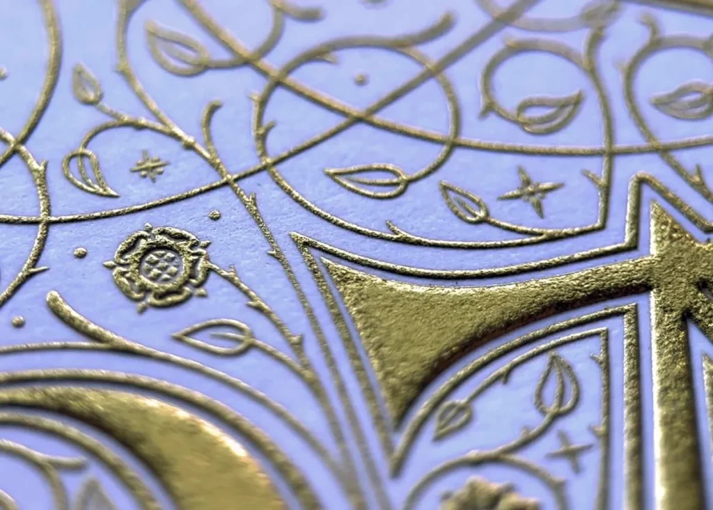
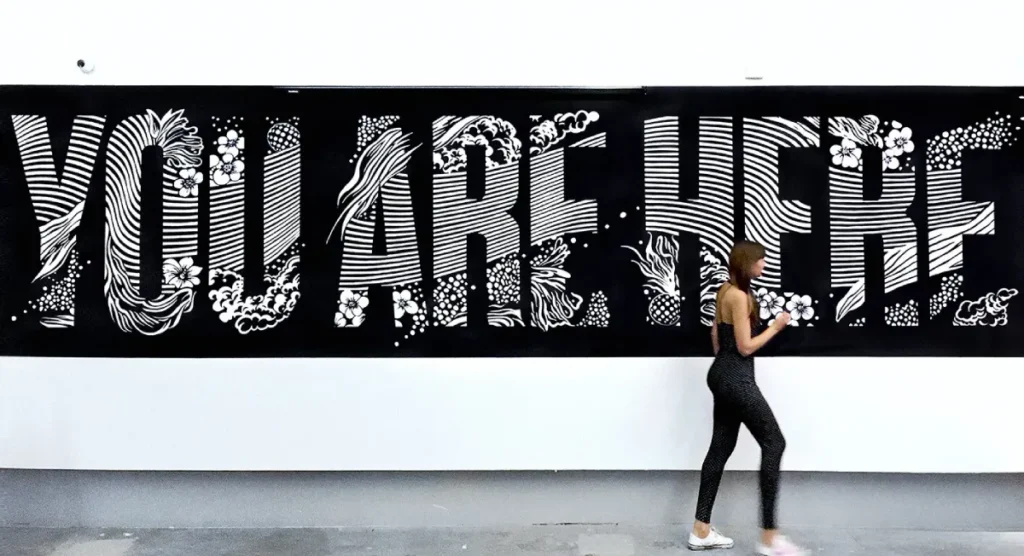
5. Gemma O’Brien: The Hybrid Illustrator
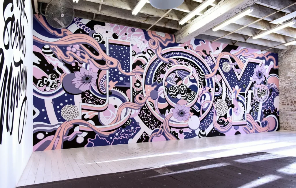
Gemma O’Brien takes the scale of a mural and the detail of a doodle and smashes them together. Her style is Supercharged Illustrative Typography.
She’s known for her ‘spew’ style—intricate, flowing compositions that look like they’re growing across the wall. It’s high-contrast, often monochrome, and incredibly physical.
There’s a ‘frightening’ amount of energy in her work for brands like Apple or Nike. It proves that typography doesn’t have to stay inside a 1200px container; it can breathe, bleed, and take over an entire building.
Gemma O’Brien represents the convergence of illustration and typography. Her large-scale murals and digital work for brands like Tiffany & Co. and Adobe demonstrate how letterforms can serve as a brand’s primary visual asset, eliminating the need for stock photography or generic icons.
The State of Typography Art in 2026
We are currently seeing a massive shift toward “Maximalist Type.” After years of “Minimalism” (think of the “Blanding” trend where every luxury brand moved to the same sans-serif), O’Brien’s work offers a way out.
The 2026 Pricing Change:
In the last 18 months, the cost of custom typographic illustration has risen by 30%. Why? Because it is the only way to effectively differentiate in an AI-saturated market.
Mid-market brands are now investing heavily in custom “hero” typography to replace expensive photo shoots. It’s more scalable, easier to animate, and uniquely theirs.
Typographic Activism: Global Voices Reshaping the Narrative
Typography is never neutral. In 2026, the most influential artists are those using letterforms to reclaim cultural identities and challenge the “Helvetica-isation” of the world.
Tré Seals and Vocal Type
Tré Seals is a pivotal figure whose foundry, Vocal Type, creates typefaces inspired by historical protest movements. From the Memphis Sanitation Strike to the Women’s Suffrage movement, Seals transforms the “visual language of the streets” into professional-grade fonts.
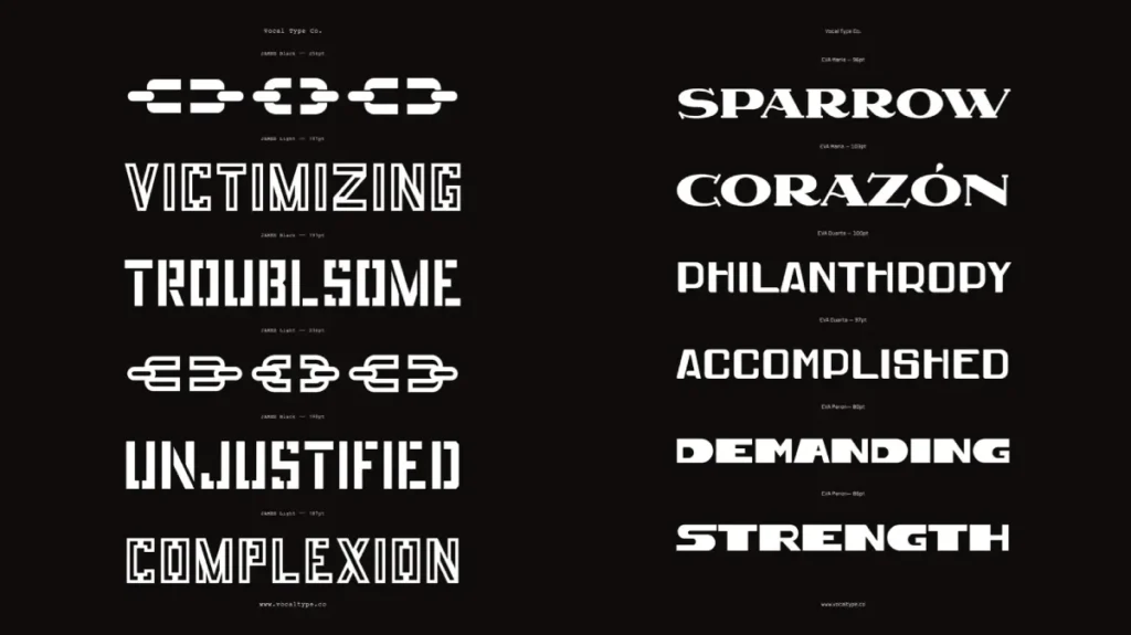
- Business Impact: Using a “socially conscious” typeface isn’t just a moral choice; it’s a strategic one. Gen Z and Gen Alpha consumers (who represent 45% of the market in 2026) show a 70% higher brand affinity for companies that demonstrate “Cultural Fluency” in their design.
Liron Lavi Turkenich and Aravrit.
One of the most innovative breakthroughs in 2026 is the expansion of Aravrit, a writing system that combines Hebrew and Arabic.
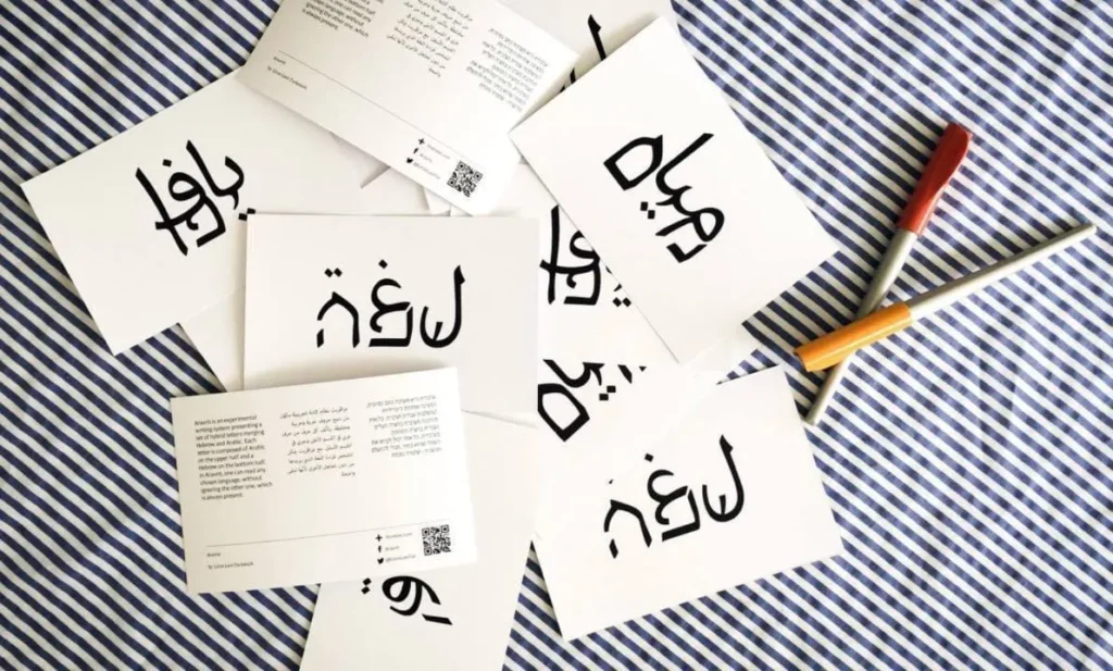
Designed by Liron Lavi Turkenich, each character is composed of Hebrew on the top half and Arabic on the bottom. It is a functional hybrid that can be read by speakers of both languages simultaneously.
- Key Concept: This is “Peace-by-Design.” It shows that typography can be a bridge in geopolitically sensitive markets.
The 2026 Typographic Tech Stack: AI as a Co-Pilot
The fear that AI would “replace” typography artists has been replaced by the reality of the Human-in-the-Loop workflow.
In 2026, top artists aren’t fighting AI; they are using it to automate the tedious parts of type design—like generating 5,000 kerning pairs—so they can focus on the creative “Soul” of the letterform.
Generative Type Tools vs. Human Craft
We now see a clear divide in the market:
- Commodity Type: AI-generated fonts for low-budget projects. These lack the optical corrections and “Human Proof” that established artists provide.
- Artisanal Type: Created by artists like Seb Lester, who use AI to brainstorm “initial silhouettes” but execute the final curves by hand.
The “Optical Lag” Problem: AI models often struggle with Optical Compensation—the way the human eye perceives horizontal lines as thicker than vertical lines.
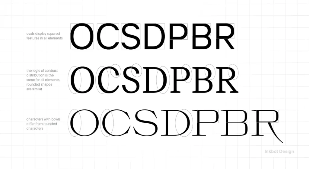
A typography artist understands that to make a letter look “mathematically correct,” you must draw it “mathematically wrong.” This is where human expertise remains unbeatable in 2026.
How to Follow the Path: Building Your Typographic Eye
Following artists is the first step; understanding their “Internal Logic” is the second. In 2026, the barriers to entry for type design have lowered, but the ceiling for mastery has risen.
- Curate Your Feed Beyond Social Media: Don’t just follow artists on TikTok. Subscribe to the Type Directors Club (TDC) newsletters and the Letterform Archive. This is where the technical “Source Code” of typography is shared.
- Master the 2026 Toolset: Start with FontSelf for quick experiments in Adobe Illustrator, then move to Glyphs 4 for professional-grade font construction.
- Attend Variable Font Workshops: Look for sessions by Jason Pamental, a leading voice in responsive typography.
- Practice “Reverse Engineering”: Take a piece of work by Jessica Hische. Try to identify the “skeleton” of the letters. Is it based on a Broad-nib pen or a Pointed pen? Understanding the tool used to create the type will change how you see every font on the web.
The Verdict
Typography is not a “finishing touch.” It is the foundation of your brand’s communication.
The artists listed above—Lester, Hische, Spiekermann, Carson, and O’Brien—each offer a different technical and aesthetic solution to the problem of “Blanding.”
In 2026, the winners are those who:
- Prioritise Humanity: Use custom or high-character type to stand out from AI noise.
- Optimise Technically: Use variable fonts and focus on web performance.
- Understand Psychology: Choose the type that reflects their brand’s “Trust-Coefficient.”
Stop settling for default settings. Your brand deserves better.
Explore Inkbot Design’s range of services to see how we can fix your visual voice, or keep reading our blog to master the art of digital presence.
Frequently Asked Questions (FAQ)
Who are the most famous typography artists in 2026?
The most influential artists include Seb Lester, Jessica Hische, and Erik Spiekermann. In 2026, Gemma O’Brien and David Carson remain pivotal for those seeking a balance between technical precision and expressive, rule-breaking design that defies AI-generated norms.
Can AI replace typographers in 2026?
AI can generate “letters,” but it struggles with Optical Balance and Contextual Meaning. Professional artists use AI to speed up the drafting process, but the “Human-in-the-Loop” is essential for ensuring a font feels trustworthy and professional.
Which typography artist is best for luxury branding?
Seb Lester is the gold standard for luxury. His focus on “Proof of Humanity” through hand-drawn precision creates an immediate sense of exclusivity and high value that digital-only fonts cannot replicate.
How do variable fonts help my website’s SEO?
Variable fonts let you load a single file instead of five (Bold, Light, etc.). This reduces your site’s Largest Contentful Paint (LCP), a core metric in Google’s 2026 ranking algorithm, improving visibility and lowering bounce rates.
What is “Maximalist Typography”?
It is a 2026 reaction against the “Blanding” of the 2010s. It uses bold colours, 3D textures, and complex layouts (inspired by Gemma O’Brien) to grab attention in a crowded digital landscape.
Is David Carson still relevant in 2026?
More than ever. As brands struggle with “Generic AI Content,” Carson’s philosophy of “Controlled Chaos” offers a way to create emotional friction that makes a brand memorable and distinct.
What is the best software for typography artists in 2026?
Glyphs 4 remains the industry standard for Mac OS users, while FontLab 8 is the professional choice for cross-platform work. For beginners, Adobe Express now includes advanced “Type Effects” powered by Firefly.
Is legibility more important than style in typography?
It depends on the goal. For long-form body text, legibility is king. For logos and “hero” sections, “Brand Salience” (how memorable the type is) can be more important than 100% legibility, provided the trade-off is intentional.
What is “Blanding” in typography?
Blanding refers to the trend of luxury and tech brands moving toward nearly identical, sterile sans-serif logos. Following typography artists helps brands avoid this trap by reintroducing unique character and “Visual Authority” into their identity.
How do I choose the right typography for my brand?
Start with your brand’s “Archetype.” Are you an engineer (Spiekermann), an artist (Lester), or a rebel (Carson)? Your font choices should reflect your business’s core values while meeting modern technical standards for accessibility and speed.
Can I use free Google Fonts for my professional brand?
You can, but it’s a risk. Free fonts are used by millions, which makes differentiation difficult. In 2026, we recommend at least one “primary” custom or licensed font to ensure your brand doesn’t look like a generic template.
What is the psychological impact of serif vs sans-serif?
Serif fonts are often associated with tradition, reliability, and authority (common in UK law and finance). Sans-serif fonts are seen as modern, clean, and efficient (common in tech). The choice depends on the “Trust-Coefficient” you want to establish.
How often should I update my brand’s typography?
Typography should be audited every 2-3 years. With rapid changes in screen resolutions and web standards (such as variable fonts), a font that looked “modern” in 2022 may now be a technical and aesthetic liability.


