Logo Redesign Services
Modernise Your Brand Without Losing Your Heritage.
Is your current logo stuck in the past? We help established businesses evolve their visual identity to stay relevant, competitive, and profitable in a digital-first world.
Your logo is the visual cornerstone of your brand identity. A dated or poorly designed logo can convey a lack of professionalism and fail to connect with your target audience.
Our expert team of UK-based designers will work closely with you to understand your brand's evolution, values, and future aspirations. We then translate that understanding into a compelling new logo that resonates with your customers and sets you apart from the competition.
A Strategic Investment in Your Brand's Future
A logo redesign is more than just a cosmetic update; it's a strategic investment in your business's long-term success. Whether you're a growing startup or an established corporation, a revitalised logo can:
Boost Employee Morale: A strong and unified brand identity can instil a sense of pride and purpose within your team.
Increase Brand Recall: A memorable logo ensures your business stays top-of-mind with consumers.
Foster Trust and Credibility: A professional and modern design inspires confidence in your products and services.
Improve Market Position: Stand out in a crowded marketplace and attract your ideal customers.
Get a Free Quote for Logo Redesign

“Working with Inkbot Design to create my logo was one of the smartest investments I've made for my business.”
From our initial consultation, they took the time to truly understand my brand vision and target audience. The design concepts they presented weren't just visually stunning—they perfectly captured the essence of what my company represents.

7 Warning Signs Your Corporate Logo Needs an Urgent Makeover
Your logo sits there on your website. Day after day. Month after month. Sometimes, year after year.
But here's the thing – whilst you've been busy running your business, the world around your brand has shifted. Your competitors have evolved. Your customers have changed. And that logo you were so proud of three years ago? It might be quietly sabotaging your success.
I've worked with hundreds of businesses across the UK and can spot a logo crisis from a mile away. The signs are always there – declining engagement, confused customers, or that nagging feeling that something's just… off.
Let's dive into the seven warning signs that scream your corporate logo redesign can't wait another quarter.
When Your Logo Becomes Your Liability
Brand recognition drives 80% of purchasing decisions. That's not marketing fluff – complex data from the Design Management Institute. Yet most business owners treat their logo like wallpaper, assuming it'll do its job indefinitely.
Wrong move.
Your visual identity works harder than your best salesperson. It communicates trust, professionalism, and value before you even get a chance to speak. When it fails, everything becomes an uphill battle.
Warning Sign #1: Your Logo Looks Dated Compared to Direct Competitors
Walk into any high street, and you'll see it immediately. Some brands look fresh, modern, and relevant. Others appear to be stuck in 2010.
Here's a quick test: Pull up the websites of your top three competitors now. Place your logo next to theirs. Does yours look like it belongs in the same decade?
Modern logo design trends aren't about following fashion but staying relevant to your target audience. Clean typography, simplified graphics, and responsive design elements have become table stakes, not nice-to-haves.
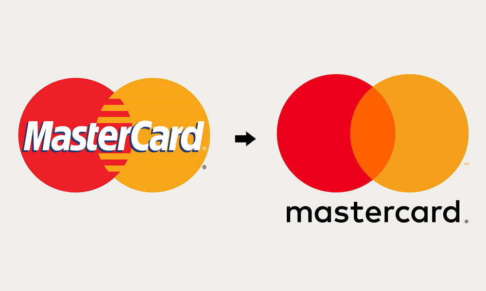
Take a look at major corporate identity evolutions over the past five years. Companies like Mastercard removed their name from the logo entirely in 2019, betting on pure symbol recognition. Meanwhile, brands like Spotify refined their icon to work seamlessly across digital platforms.
Your customers expect visual consistency with contemporary standards. When your logo screams “2015 design trends,” you unconsciously position yourself as outdated before the conversation starts.
Action step: Take a screenshot of your logo alongside those of your three biggest competitors. Show it to five people outside your industry. Ask them which brand looks most current and trustworthy.
Warning Sign #2: It Doesn't Work Across Different Platforms and Sizes
Remember when logos only appeared on letterheads and shopfronts? Those days ended around 2008.
Today's logos must perform across dozens of touchpoints – from 64-pixel favicons to billboard advertisements. From Instagram profile pictures to email signatures. From mobile apps to merchandise.
I call this the “scalability test”: Shrink your logo down to the size of a 20p coin. Can you still read the text? Are the design elements clear? Now, blow it up to A0 poster size. Does it pixelate or lose impact?
Many established businesses fall into the complexity trap. Their logos worked perfectly on business cards in 2015, but became illegible blurs on social media profiles. Or they look sharp on screens but fall apart when embroidered on uniforms.
Consider the BBC's logo evolution. Their original design was complex and detailed, perfect for television broadcasts. However, as digital platforms multiplied, they simplified to three bold letters that work everywhere, from Twitter avatars to massive outdoor advertising.
Red flag moment: If you need different logo versions for other uses (beyond basic colour variations), that's a design problem, not a solution.
Warning Sign #3: Your Target Audience Has Significantly Changed

Business evolution rarely happens overnight. You start targeting small local businesses, then expand to mid-market companies, and suddenly, you're pitching to enterprise clients.
However, here's what most founders often overlook – your visual identity needs to evolve in tandem with your ambitions.
That playful, quirky logo that worked brilliantly for startup clients might actively hurt your credibility with Fortune 500 prospects. Conversely, an ultra-corporate identity could alienate the creative agencies you're now trying to attract.
Real example: A Manchester-based tech consultancy came to us after losing three major pitches. Their feedback was consistent – “great proposal, but we're looking for something more established.” Their logo seemed to belong to a university student's side project, not a £2M consultancy.
We redesigned their corporate identity with sophisticated typography and a refined colour palette. Within six months, they closed their largest contract ever.
Know your audience shift: Survey your current clients versus your target clients. What visual cues do they associate with credibility in your industry? Your logo should bridge the gap between where you are and where you're going.
Warning Sign #4: Low Brand Recognition Among Your Customer Base
This one stings because it's measurable. Brand recognition directly correlates with customer lifetime value – recognised brands command 20% higher prices on average.
Try this exercise: Ask ten existing customers to describe your logo without looking at it. Can they remember the colours? The fonts? The basic shape?
If they struggle, your logo isn't memorable enough to stick in their minds. And if existing customers can't remember it, prospects definitely won't.
Brand recall happens in layers:
- Level 1: Customers recognise your logo when they see it
- Level 2: They can describe it from memory
- Level 3: They associate it with specific values or emotions
- Level 4: It triggers purchase consideration
Most struggling logos never make it past the first level. They're pleasant enough when customers encounter them, but completely forgettable afterwards.
Strong logos create mental shortcuts. When customers think of “reliable web hosting,” they should immediately picture your brand. When they need “creative marketing support,” your visual identity should pop into their minds.
Test this with your current branding. Your logo isn't working hard enough if you're not creating those mental shortcuts.
Warning Sign #5: Negative Feedback or Confusion About Your Brand Identity
Customer feedback comes in many forms. Sometimes, it's direct: “Your logo looks amateur.” More often, it's subtle: longer decision times, requests for additional credentials, or questions about your company's stability.
Pay attention to these conversation patterns:
- “How long have you been in business?” (when you've been operating for years)
- “Do you work with companies our size?” (when your experience matches their needs)
- Can you provide more references?” (despite having an impressive portfolio)
These questions often stem from visual credibility gaps. Your expertise is solid, but your logo isn't communicating that expertise effectively.
Established businesses lose deals because their visual identity suggests they are new or inexperienced. First impressions matter tremendously – research shows people form opinions about websites within 50 milliseconds, and logos play a crucial role in that split-second judgment.
Document feedback patterns: Keep a simple spreadsheet of client conversations. Note when prospects seem hesitant or request additional proof of credibility. Look for correlations with your visual presentation.
Warning Sign #6: Your Logo Doesn't Reflect Current Company Values or Mission
Companies evolve. Mission statements get refined. Values shift as teams grow and markets change.
But logos often remain frozen, representing who you were rather than who you've become.
Common evolution patterns:
- From local to national: Your original design screamed “neighbourhood business”, but now you serve clients across the UK
- From generalist to specialist: You've focused on a specific niche, but your logo still suggests you do everything for everyone
- From traditional to innovative: You've embraced new technologies and methodologies, but your visual identity looks conservative and outdated.
The brand audit question: If a stranger looked at your logo for ten seconds, what would they assume about your company's personality, capabilities, and market position? Do those assumptions align with reality?
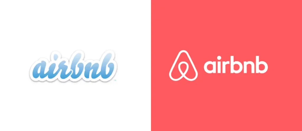
Take Airbnb's rebrand as an example. Their original logo was quirky and startup-y, perfect for their early days. However, as they grew into a global hospitality platform, they needed something more sophisticated that conveyed trust and professionalism whilst maintaining approachability.
Your logo should be your brand's ambassador, accurately representing your current identity and aspirations.
Warning Sign #7: Technical Issues Like Poor Resolution or Outdated File Formats
This warning sign is often overlooked until it becomes a crisis. You're preparing for a significant trade show and suddenly realise your logo files are all wrong.
Common technical red flags:
- Low-resolution files: Your logo looks crisp on your website, but pixelated when printed
- Limited file formats: You only have JPEGs when you need vector files for large-format printing
- Incorrect colour specifications: Your “blue” looks different across various applications
- Missing brand guidelines: No one knows the exact colours, fonts, or spacing requirements
Professional design agencies provide comprehensive file packages, including vector files (AI, EPS) and high-resolution rasters (PNG, JPEG), as well as complete brand guidelines. You're not prepared for professional marketing opportunities if you're missing any of these elements.
The technical standard checklist:
- Vector files for scalability
- High-resolution rasters (at least 300 DPI)
- Transparent background versions
- Black and white variations
- Colour specifications (Pantone, CMYK, RGB, HEX)
- Minimum size requirements
- Clear space guidelines
Without these assets, every marketing project becomes a struggle.
The Hidden Cost of Logo Procrastination
Delaying your corporate logo redesign isn't just about aesthetics – it's about opportunity cost. Every day, your visual identity underperforms; you're leaving money on the table.
Conservative calculations: If better branding helps you close just one additional deal per quarter, the redesign investment pays for itself within 12 months. However, the benefits compound – improved brand recognition, higher perceived value, and stronger customer loyalty- create long-term competitive advantages.
The timing factor: Market conditions change rapidly. What feels like a minor branding issue today could become a significant competitive disadvantage tomorrow. Early action gives you breathing room to implement changes strategically rather than reactively.
Creating Your Brand Refresh Action Plan
Step 1: Audit your current situation. Use the seven warning signs as a checklist. Rate each area from 1-10. Any score below seven needs immediate attention.
Step 2: Define Your Brand Positioning. Where is your company headed? What values drive your decisions? How do you want customers to perceive your business?
Step 3: Research your competitive landscape. Analyse successful brands in your industry. What design elements do they use? How can you differentiate whilst remaining relevant?
Step 4: Set clear objectives. Are you targeting new market segments? Expanding geographically? Launching new services? Your logo should support these business goals.
Step 5: Work with professionals. A corporate logo redesign affects every aspect of your marketing—partner with experienced designers who understand both business strategy and visual aesthetics.
Corporate Logo Redesign FAQs
How often should companies update their logos?
Most successful brands refresh their visual identity every 7-10 years, with minor updates every 3-5 years. However, business changes might necessitate earlier updates.
What's the difference between a logo refresh and a complete rebrand?
A refresh updates existing elements whilst maintaining brand recognition. A rebrand creates a new visual identity, typically used when a company undergoes a significant pivot.
How long does a professional logo redesign process take?
Expect 4-8 weeks for a thorough process, including research, concept development, refinement, and file preparation. Rushed timelines often produce suboptimal results.
Should we test new logo designs with customers before finalising them?
Absolutely. Focus groups and A/B testing offer valuable insights into customer reactions and changes in brand perception.
What file formats do we need for our new logo?
Request vector files (AI, EPS), high-resolution PNGs and JPEGs, SVG for web use, and comprehensive brand guidelines with colour specifications.
How do we maintain brand recognition during a logo transition?
Gradual rollout strategies work best. Update digital assets first, then printed materials, as they need reprinting. Communicate changes to existing customers.
Can we trademark a new logo design?
Yes, but the process takes 6-12 months. Work with intellectual property solicitors to ensure your design doesn't infringe existing trademarks.
What's the typical investment range for professional logo redesign?
Quality corporate logo design ranges from £2,000-£15,000, depending on complexity and scope. Remember, this investment affects every future marketing pound you spend.
How do we measure the success of our new logo?
Track brand recognition surveys, website engagement metrics, sales conversion rates, and qualitative feedback from customers and prospects.
Should our new logo work internationally?
If you have global aspirations, yes. Consider cultural colour associations, text readability across languages, and symbol meanings in different markets.
What happens to our existing marketing materials after a logo change?
Plan a phased transition. Update digital assets immediately, replace printed materials as inventory levels decline, and allocate a budget for key items such as signage and uniforms.
How do we choose between design agencies and freelance designers?
Agencies offer broader expertise and project management but cost more. Freelancers provide personalised attention and flexibility. Choose based on your budget, timeline, and complexity requirements.
Don't let an outdated logo hold your business back another day. The market won't wait for you to catch up, nor will your competitors. Your brand deserves better than “good enough.”
Ready to give your corporate identity the makeover it deserves? Contact our design team, and let's create a logo that works as hard as you do.
