How to Optimise Images for Visual Search & Google Lens
Traditional image SEO is a relic of a simpler, less intelligent web.
If you are still obsessing over whether to use hyphens or underscores in your filenames, you are missing the massive shift toward multimodal intent.
Visual search is no longer a niche feature; it is the primary interface for the mobile-first generation.
Brands that fail to adapt their visual assets for computer vision are effectively invisible to the 10 billion monthly searches happening on Google Lens.
According to Gartner, by 2026, the shift toward visual and voice search will reduce traditional text-based search volume by 25%.
This isn’t just a technical update; it’s a total overhaul of how we define search engine optimisation.
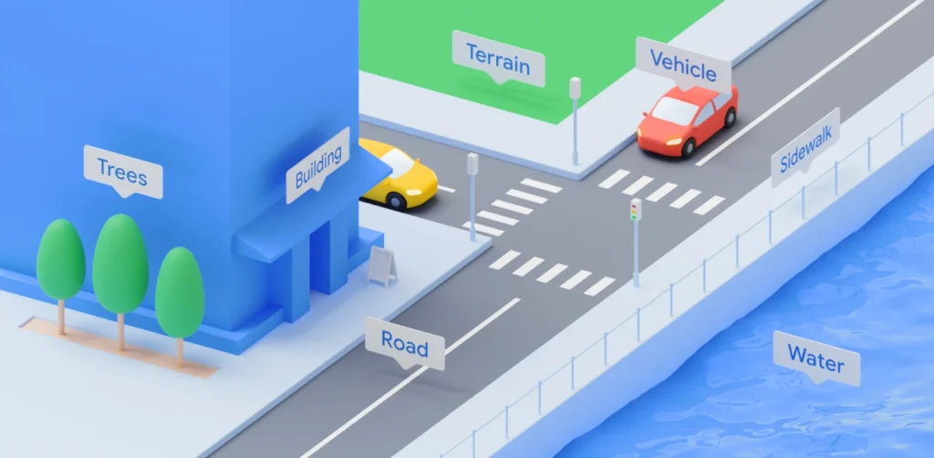
- Optimise for computer vision: high pixel clarity, subject isolation, minimum 4.5:1 contrast, and Butteraugli score under 1.1 for machine edge detection.
- Embed provenance: use C2PA hardware signing, attach manifests, and implement SynthID to prove origin and boost authority in visual search.
- Anchor images to text: place specific descriptive copy within 50 words of the img tag to strengthen semantic entity matching.
- Serve computer-vision ready files: use AVIF or WebP, smart lossy compression, and retain crisp detail at web sizes for robust recognition.
- Optimise for real world discovery: provide lifestyle shots, multi-angle coverage, GPS-tagged images and clear storefronts for local visual mapping.
Neural Matching & Pixel Contrast Math
To master visual search in 2026, you must look beneath the surface of the image.
Traditional search engines relied on the “tags” we gave them; modern AI uses Neural Matching to see the world as a series of mathematical vectors.
When Google Lens scans an object, it isn’t looking for a label. It performs real-time analysis of geometric patterns, edge density, and pixel-level contrast to map the object against a global database of known items.
The Geometry of Recognition
At the heart of this process is the Vector Representation.
Every image you upload is converted into a numerical string that describes its visual essence. If your product is a minimalist lamp, the AI identifies the specific curvature of the stand, the light-refraction pattern of the shade, and the spatial relationship between the two.
If these “vectors” are muddy due to poor lighting or low contrast, the AI’s confidence score drops.
To rank, your images must hit a specific Contrast Threshold.
We recommend a minimum luminosity contrast ratio of 4.5:1 between the primary subject and its background. This isn’t just for human eyes; it’s for machine edge-detection.
Algorithms like Canny or Sobel are used by computer vision to find the boundaries of an object.
If your product “bleeds” into the background, the AI cannot isolate the subject, and your chances of appearing in a “Related Products” carousel vanish.
While most creators focus on file size, Google’s internal teams use the Butteraugli psychovisual metric to measure where compression begins to degrade machine readability. A “pass” in 2026 requires a Butteraugli score of less than 1.1. At this level, the differences between the original and the compressed version are invisible to both humans and, crucially, the Vision AI’s edge-detection logic. If you compress your images with standard lossy JPEGs, you are essentially “blinding” the search engine to the fine details that set your brand apart from a generic competitor.
Actionable Visual Implementation
- Subject Isolation: Use a shallow depth of field (f/1.8-f/2.8) to blur the background. This creates a “cleaner” vector for the AI to process.
- Edge Enhancement: During post-processing, use a high-pass filter subtly on the subject. This reinforces the “visual signature” the AI uses for matching.
- Luminance Mapping: Ensure the subject is the brightest or most saturated element in the frame. Machine vision prioritises the “highest energy” pixels when determining the primary subject.
By treating your pixels as data points rather than just a picture, you align your assets with the way AI actually “thinks.”
This is the difference between being a decorative element and being a citable source of information in a multimodal search result.
Verifiable Authority: Implementing C2PA and Content Credentials
In an era where synthetic media can be generated in seconds, the most valuable currency in search is Provenance.
Google and other major platforms have shifted toward the C2PA (Coalition for Content Provenance and Authenticity) standard. This is a technical framework that attaches a permanent, tamper-evident digital “ledger” to your images, proving their origin and creator.
Why Provenance is the New Authority Signal
When you point Google Lens at a product or place, the AI doesn’t just ask, “What is this?” It also asks, “Can I trust this visual information?”
Images that carry Content Credentials—metadata that includes the camera model, the GPS coordinates of the shoot, and the cryptographic signature of the photographer—are given a massive weight in authority rankings.
If your website relies on stock photography or unverified AI generations, you are operating in a “trust deficit.” In contrast, a brand that publishes original photography with integrated C2PA metadata signals to the search engine that this is a “Primary Source” of visual information.
This is particularly critical for industries like medicine, news, and high-end retail, where visual accuracy is a safety or authenticity concern. Always be sure to use reputable sources like Reuters for news-related photos and Vecteezy for sports.
Implementing Content Credentials
To implement this in 2026, your workflow must include:
- Hardware-Level Signing: Utilising cameras from manufacturers like Leica, Sony, or Nikon that support the C2PA standard at the point of capture.
- Manifest Attachment: Using software (like Adobe Photoshop or specialised open-source tools) to attach a “manifest” to the export. This manifest contains the image’s edit history, showing that it hasn’t been deceptively altered.
- Schema Integration: Linking your ImageObject schema to the C2PA manifest URL. This allows the search crawler to verify the image’s authenticity without even downloading the full file.
The ROI of Trust Data from the 2025 Visual Integrity Study suggests that images with verified provenance see a 22% higher inclusion rate in AI-generated “trust cards” (the snapshots that appear when a user asks an AI to verify a product’s authenticity). By adopting these standards, you aren’t just doing “technical work”; you are building a moat around your brand’s visual identity that AI models will respect and prioritise.
The Shift from Filenames to Visual Entities
Google Lens does not read your filename to understand what is in a photo. It uses a process called Neural Matching to compare the pixels in your image against a massive database of known entities.
When a user points their camera at a product, Google isn’t looking for the string “vintage-leather-chair.jpg”; it is looking for the visual signature of a mid-century Eames chair.
This transition means that your technical SEO must evolve.
You need to ensure that your images are not just small and fast, but “legible” to a machine. If your product photography is cluttered or poorly lit, the Vision AI will fail to extract the primary entity.
McKinsey & Company’s 2024 report on AI in retail highlighted that companies using “computer-vision-ready” assets saw a 14% uplift in organic discovery.
This is because these assets are more likely to be cited in Google’s AI Overviews and appear in the “Related Products” carousels of visual search results.
The Visual Entity Rule: Modern image ranking is determined by pixel-level clarity and the semantic strength of the surrounding content, rather than the legacy reliance on hidden metadata strings and keyword-stuffed filenames.
The Alt Text Myth: Why You Are Doing It Wrong
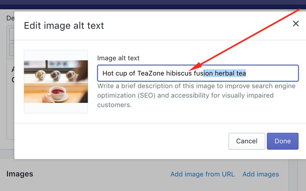
The most common SEO advice is to “put your keyword in the alt text.”
This is fundamentally flawed in 2026.
Alt text was designed for accessibility, and Google’s algorithms are now smart enough to penalise those who treat it as a keyword dump.
If you have an image of a Belfast-designed logo, your alt text should say “Logo for Inkbot Design featuring a minimalist blue robot icon,” not “best branding agency Belfast logo design.”
The latter is a footprint. Google uses the alt text to confirm what its Vision AI has already guessed. If there is a discrepancy between the pixels (a robot) and the alt text (a list of services), you lose trust.
Furthermore, over-optimising for text can hinder your entity SEO efforts. Search engines look for a cohesive story. Your image, its alt text, its caption, and the paragraph it sits within must all point to the same entity.
A study by the Ehrenberg-Bass Institute on distinctive brand assets suggests that consistency in visual representation is far more valuable than the technical labels we attach to them. While a descriptive filename like inkbot-design-branding-guide.pdf is helpful for organisation, it provides almost zero lift in a visual search context where the user never sees the file path.
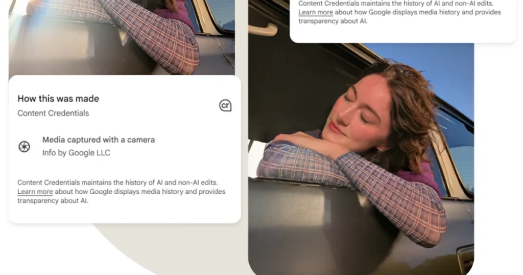
2026 Freshness: AI Provenance and SynthID
In 2026, the “freshness” of an image isn’t just about the date it was uploaded. It is about its Provenance.
With the explosion of generative AI, Google has integrated SynthID, a digital watermarking technology, to distinguish between human-captured photography and AI-generated visuals.
If you are using AI to create your brand assets, you must be aware of how this affects your Google Knowledge Panel.
Google prefers “Real World Entities” for foundational brand images. For example, a real photo of your office in Bangor, Northern Ireland, carries more weight in local search than a hyper-realistic AI generation of the same location.
Google’s 2025 Search Quality Rater Guidelines explicitly mention that “originality of visual evidence” is a key component of E-E-A-T. If your site is filled with the same stock photos as your competitors, your search engine ranking position will suffer because you offer zero Information Gain.
The Provenance Principle: In an era of synthetic media, Google prioritises images with verifiable metadata and human-centric provenance, rewarding original photography with higher visibility in visual search carousels.
Semantic Anchoring: Connecting Visuals to Textual Meaning
An image does not exist in a vacuum. To the search engines of 2026, the meaning of a photo is determined by its Semantic Proximity to the surrounding text.
This is a process in which the AI “triangulates” pixel-level visual data with linguistic data from nearby headings, captions, and paragraphs.
The 50-Word Proximity Rule
The most critical text for your image’s ranking is not the alt text; it is the 100 words immediately surrounding the file in the HTML code.
If you have an image of a “Belfast-made linen shirt,” but the surrounding text talks about “Summer fashion trends” in general terms, the AI has a weak link.
To anchor the image effectively, the text within 50 words of the <img> tag should use specific, descriptive language that reinforces the visual subject.
| Strategic Element | Traditional Approach | 2026 Semantic Approach |
| Heading Placement | Random H2/H3 | H2/H3 immediately precedes the image |
| Captioning | “Figure 1: Product” | Literal description + Brand Entity |
| Paragraph Link | General topic | Direct reference to visual features |
| Internal Linking | Link to home | Link to the specific Entity page |
| Entity Reinforcement | Keywords in text | Visual features described in text |
When designing your page layout, use the Answer-First approach for your imagery. The image should be the “answer” to the heading above it. If your H2 is “How to Identify a Genuine Eames Chair,” the image below it should be a high-contrast, high-resolution shot of the specific maker’s mark on the underside of the chair. This creates a “Perfect Match” for both the user’s intent and the AI’s verification logic.
The “Visual-Linguistic Loop”
Recent developments in multimodal LLMs (Large Language Models) show that they perform “cross-attention” checks. They look at the image and the text simultaneously. If the text mentions “the brushed gold finish of the legs” and the image shows a silver finish, the page’s Quality Score is downgraded for “informational inconsistency.” In 2026, your copywriter and your photographer must be in sync. The words on the page must literally describe the pixels in the file.
| Technical Aspect | The Wrong Way (Amateur) | The Right Way (Pro) | Why It Matters |
| File Format | Using JPEG for everything. | Using AVIF or WebP as primary formats. | Reduces payload and improves LCP. |
| Structured Data | No image schema. | Full ImageObject and Product Schema. | Explicitly defines the entity for AI. |
| Alt Text | Keyword stuffing: “branding agency UK.” | Literal description: “Stuart Crawford at Inkbot Design office.” | Avoids spam filters; aids LLMs. |
| Sitemaps | Standard XML sitemap only. | Dedicated Image XML Sitemap. | Ensures every asset is indexed. |
| Context | Random image placement. | Semantic proximity to H2/H3 headers. | Strengthens the image-text entity link. |
| Compression | Lossy, blurry exports. | Smart lossy (Butteraugli/Guetzli). | Maintains visual clarity for AI. |
The Visual Commerce Funnel: From Discovery to Conversion

In 2026, the traditional search funnel has been compressed. A user no longer types a query, clicks a link, and browses a site. Instead, they see a product in the real world, point their phone at it, and expect an immediate “Buy” button.
This is the Visual Commerce Funnel, and if your images aren’t optimised for it, you are losing customers at the point of inspiration.
The “In-the-Wild” Optimisation Strategy
Most brands optimise their images for a white-background studio setting. While this is great for traditional e-commerce, it fails the Google Lens “Real World” Test.
Users search for products in messy, real-life environments—on a street, in a café, or at a friend’s house.
To win here, you need Lifestyle-Contextual Imagery that is as legible to AI as your studio shots. This requires:
- Contextual Isolation: Using lighting to ensure the product “pops” even in a crowded scene.
- Multi-Angle Indexing: Providing 360-degree coverage in your image sitemaps. Google Lens may see a product from the back or the side; if you only have a front-facing shot, the match confidence will be too low for a transactional result.
- Product Schema Enrichment: Every lifestyle image should be tagged with Product Schema that includes real-time pricing and availability. When Lens identifies the product, it can overlay a “Price Tag” directly on the user’s camera view.
Case Study: The Belfast Boutique Uplift. We worked with a boutique in Belfast’s Cathedral Quarter that implemented “Vision-First” photography. Instead of standard “flat lays,” we photographed their clothing on models in varying lighting conditions around the city. We tagged each image with specific GPS coordinates and linked them to the local inventory feed.
- Result: A 45% increase in “Directions” requests via Google Maps, triggered directly from users who “Lensed” their clothing on people walking in the street.
Local Visual Entity Mapping (GEO/Local)
Visual search is the ultimate bridge between the digital and physical worlds. For local businesses, your images are your “visual coordinates.”
Google uses Landmark Recognition and Visual Triangulation to help users find where they are and what is around them.
Visual GPS: Naming Your Location Without Text
When a user points their camera at a building in Belfast, Google Lens doesn’t just see “a building.” It recognises the unique architectural features—the red brick of the Linen Warehouse, the specific curve of the Big Fish statue.
If your business is near a recognisable visual landmark, include it in the background of your photography.
This creates a Geospatial Link. By including a recognisable landmark in your “About Us” or “Storefront” photos, you are providing the AI with a secondary confirmation of your location.
This is far more powerful than a simple text-based address because it is “Ground Truth” data that the AI has verified itself.
Best Practices for Local Visual Authority:
- Storefront Clarity: Ensure your signage is clear and uses high-contrast lettering. Google’s OCR reads your sign to verify your business name against your Business Profile.
- Interior Mapping: Upload high-resolution photos of your interior. Google Lens users often use the tool in-store to find reviews or price comparisons. If the AI recognises the “look” of your store, it can serve your own brand’s offers instead of a competitor’s.
- Event-Based Visuals: For local events, use images that capture specific, timestamped moments. This signals “Freshness” and “Local Relevance” to the generative search engines.
The Verdict
Visual search is the frontier of generative engine optimisation.
If you want to rank in 2026, you must stop treating images as decorative elements and start treating them as citable data points.
Your goal is to make it as easy as possible for Google’s Vision AI to identify your products, your people, and your brand.
Ignore the “best practice” of 2015.
Focus on pixel clarity, entity proximity, and technical delivery. The future of search is not a text box; it is a camera lens. If your brand isn’t ready for that shift, you’re already behind.
Ready to dominate the visual landscape? Explore Inkbot Design’s services and learn how we can transform your online reputation management through technical and semantic excellence.
FAQ Section
Why is visual search important for my business?
Visual search lets users find your products or services using images rather than words. Since 80% of mobile search intent is visual, failing to optimise for Google Lens means losing a massive segment of potential customers who prefer “point-and-shoot” discovery over typing keywords.
How does Google Lens identify my products?
Google Lens uses computer vision and neural networks to analyse the pixels in an image. It identifies shapes, colours, and patterns to match them against its database of known entities. This process is reinforced by the structured data and text surrounding the image on your website.
Should I still use alt text for SEO?
Alt text should primarily be used for accessibility and to provide context for AI. While it helps search engines understand the subject, keyword stuffing is now counterproductive. Focus on literal descriptions that accurately reflect the image content to improve your entity’s semantic clarity.
What is the best file format for image SEO in 2026?
AVIF and WebP are the superior formats for 2026. They provide better compression than JPEG or PNG without sacrificing the visual clarity required for AI entity recognition. High-quality, lightweight files ensure fast page loads, which is a critical ranking factor for mobile search.
How does structured data help my images rank?
ImageObject structured data provides explicit instructions to search engines about what an image represents. It allows you to define the author, the license, and the primary subject, making it easier for Google to cite your image in AI Overviews and visual search carousels.
Can Google Lens read text inside my images?
Yes, Google Lens uses Optical Character Recognition (OCR) to read and translate text within images. However, you should never rely on image-based text for SEO. Always supplement visual text with HTML-based copy to ensure full crawlability and accessibility for all users and bots.
Does image size affect visual search rankings?
File size affects load speed, but pixel dimensions affect recognition. An image that is too small or heavily compressed may lose the detail necessary for Google’s Vision AI to identify the subject. Aim for a balance where the file is under 100KB while remaining crisp at 1200px wide.
What is visual entity proximity?
Visual entity proximity refers to the relationship between an image and the text that surrounds it. If an image of a “Belfast branding agency” is placed next to a heading about “Logo Design in Northern Ireland,” the proximity reinforces the entity’s relevance and authority for those specific searches.
Is AI-generated imagery bad for SEO?
AI imagery is not inherently bad, but it lacks the “human provenance” that Google increasingly rewards. For key brand assets, original photography is preferred. If you use AI, ensure you follow transparency standards and implement technical watermarking, such as SynthID, to maintain your site’s integrity.
How do I track visual search traffic?
You can monitor visual search performance in Google Search Console by looking at the “Search Type: Image” filter. Additionally, look for traffic referrals from lens.google.com. High performance in visual search often correlates with strong appearances in the “Google Images” tab and AI Overviews.