How to Optimise Images for Web Performance
Images can significantly impact a website’s performance.
With images accounting for over 60% of the bytes downloaded on the average web page, optimising them is crucial for fast load times.
This allows pages to load quicker, users to consume content faster, and results in a better overall experience.
In this comprehensive guide, we’ll explore various ways to optimise images for the web and improve site speed.
- Choose the right format per content—AVIF/JPEG XL for photos, WebP fallback, PNG for transparency, SVG for vectors.
- Automate delivery—use responsive srcset, picture element, CDN edge transformations and fetchpriority for critical images.
- Reduce weight and layout shifts—compress with tools, set width/height or aspect-ratio, and lazy-load non‑critical images.
Why Image Optimisation Matters
With the rise of mobile internet usage, users expect sites to load incredibly fast. 53% of users will abandon a mobile site that takes over 3 seconds to load. Optimising images allows you to:
- Reduce Page Weight: The smaller an image’s file size, the less data the user needs to download. This directly speeds up load times.
- Minimise Data Usage: For mobile users or those with capped data plans, downloading large files can eat into their allowance. Compressing images uses less of their bandwidth.
- Improve SEO: Page speed is a ranking factor for Google and other search engines. Optimised images improve performance and boost search rankings.
- Cut Hosting Costs: Smaller page sizes reduce bandwidth usage, saving money if you pay for traffic.
- Enhance UX: Faster load times keep visitors engaged. Every extra second risks them leaving your site out of frustration.
Simply put, making your images lean and fast improves user experience and site performance.
The Impact of Image Optimisation on Core Web Vitals
Image optimisation isn’t just about raw speed. It’s directly tied to Google’s Core Web Vitals, the metrics used to measure a user’s real-world experience on a page.
Failing to manage your images properly can damage your scores in two key areas:
- Largest Contentful Paint (LCP): This measures how long it takes for the largest element, often a hero image, to appear on the screen. Large, unoptimised images are a primary cause of poor LCP scores because they take far too long to download and render.
- Cumulative Layout Shift (CLS): This metric tracks the visual stability of your page. If you don’t define the width and height for your images, the browser doesn’t know how much space to save. When the image finally loads, it pushes other content down the page, creating a jarring layout shift and a poor CLS score.
Getting your images right is a non-negotiable part of passing the Core Web Vitals assessment and ensuring your site is seen as high-quality by search engines.
Getting Started with Image Optimisation

Optimising your web images involves both technical and design choices.
On the technical side, you need to understand:
- Image formats like JPEG, PNG, GIF
- Tools to compress and resize images
- Hosting optimised files correctly
For design, you should grasp principles like:
- Ensuring images are purposeful
- Balancing quality vs performance
- Displaying resized images cleanly.
We can trim down images substantially while retaining visual quality with the proper knowledge of formats, tools and design.
Similar optimisation principles apply to multimedia assets, where Compress Video API can help reduce file sizes while preserving playback quality.
Choosing the Right Image Format
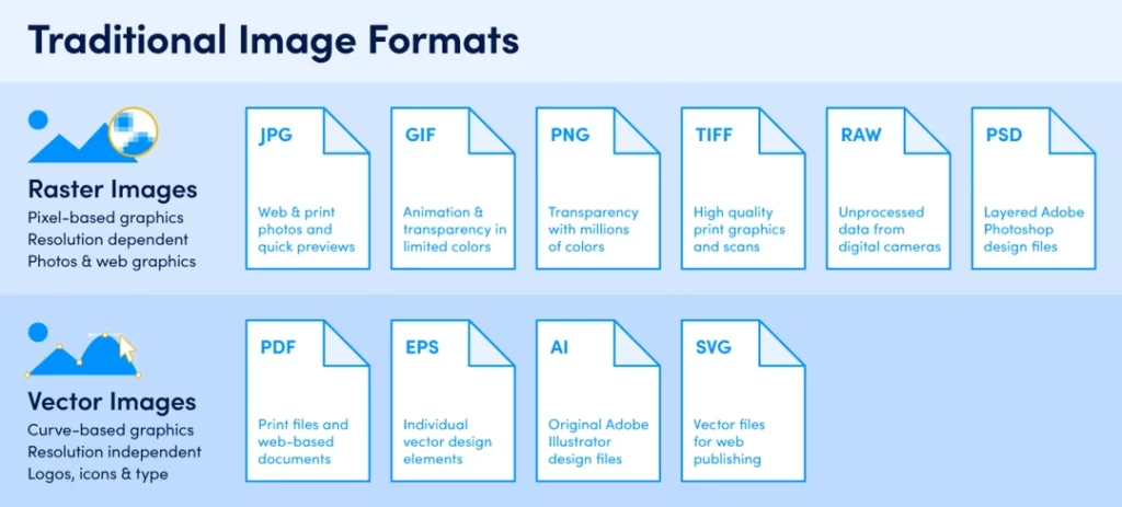
Three main image file types are used online – JPG, PNG and GIF. The format you select impacts the image’s quality, capabilities and file size.
When adding a new image, consider:
- Is a lossless or lossy format best?
- Does the image need transparency or animation?
- What content and colour palette is shown?
This determines the optimal choice between JPG, PNG, and GIF.
JPG/JPEG
- Type: Lossy compressed bitmap image
- Transparency: No
- Animation: No
Use JPG for:
- Photographic images
- Complex colour scapes with many tones
- Largest file size reductions
JPEGs use lossy compression, permanently reducing image quality to shrink file size. A high-quality photo saved as a JPEG could be 200KB+, but it can be optimised to 20-30KB with minimal visual quality loss.
JPEGs render colour gradients smoothly, which suits photos but results in larger file sizes than line art PNGs.
Quality Setting
JPEGs let you adjust the quality from 0-100%, which determines the compression level. Find the sweet spot between visual quality and file size for your images. Many images look great, even at 60-75% quality.
PNG
- Type: Lossless compressed bitmap image
- Transparency: Yes
- Animation: No
Use PNG for:
- Logos, icons and illustrations need transparency
- Images with text, sharp edges and flat colours
- Higher quality than GIF
PNGs retain full image quality on compression, unlike lossy JPEGs. However, they achieve smaller sizes than uncompressed formats like BMP.
PNGs handle transparency, which is vital for logos and icons. This makes them preferable to JPG for images that require shaped backgrounds. The lossless compression ensures that quality remains maximised.
File sizes are significantly smaller than lossless GIFs while retaining more colours.
GIF
- Type: Lossless compressed bitmap image
- Transparency: Yes
- Animation: Yes
Use GIF for:
- Animated images and illustrations
- Simple images with blocks of flat colour
- Small file sizes suitable for old browsers
GIFs offer basic animation, which is handy for communicating processes and capturing attention. They are also compatible with older browsers, unlike advanced formats like JPEG 2000.
For still images, PNGs should take priority over GIFs due to supporting better transparency and more colours that avoid banding artefacts.
However, flat-colour cartoons with defined edges compress very poorly as GIFs due to their basic image data. Dithering creates the illusion of extra shades through dot patterns.
The 2026 Format War: AVIF vs JPEG XL vs WebP
The landscape of image formats has shifted significantly.
While WebP was once the revolutionary newcomer, it is now considered the “safe baseline.” For true performance leaders, the choice now lies between AVIF and the resurgent JPEG XL.
Comparing Modern Image Formats
| Format | Best For | Support (2026) | Key Advantage |
| WebP | General web use, legacy support | Universal | Better than JPEG/PNG, very safe choice. |
| AVIF | Hero images, complex graphics | High (95%+) | Best-in-class compression for tiny files. |
| JPEG XL | High-end photography, HDR | Growing | Superior fidelity, progressive rendering. |
| SVG | Logos, icons, simple UI | Universal | Infinite scaling with zero pixelation. |
AVIF (AV1 Image File Format) remains the king of efficiency for the average website. It can often reduce file sizes by 30% compared to WebP, with no visible loss of detail.
However, JPEG XL has become the preferred choice for photography-heavy sites and luxury brands.
Unlike other formats, JPEG XL supports “progressive loading,” where a blurry version of the image appears almost instantly and then snaps into focus, providing a much smoother user experience on slower 4G or 5G connections.
When implementing these, use the <picture> tag to provide fallbacks. This ensures that a user on an older browser receives a standard WebP or JPEG, while a user on a modern device gets the ultra-optimised AVIF version.
HTML
<picture>
  <source srcset="image.jxl" type="image/jxl">
  <source srcset="image.avif" type="image/avif">
  <source srcset="image.webp" type="image/webp">
  <img src="image.jpg" alt="Description of the image" width="800" height="600">
</picture>
The Case for SVG (Scalable Vector Graphics)
Unlike the pixel-based formats we’ve discussed, SVGs are entirely different. They are vector images built with XML code.
- Type: XML-based vector image
- Transparency: Yes
- Animation: Yes (with CSS/JS)
Use SVG for:
- Logos, icons, and illustrations
- Graphics that need to scale perfectly
- Interactive elements
Because they are code, not pixels, SVGs are resolution-independent. They remain perfectly crisp on any screen, from a small mobile to a massive 4K display. Their file sizes are often tiny, and they can be styled and manipulated directly with CSS and JavaScript.
Choosing Wisely
Consider the strengths of JPEG, PNG and GIF to make informed choices.
Prioritise PNG for logos, illustrations and flat colour drawings requiring transparency or sharp edges. JPEG excels for photographic content without transparency. Use GIFs when basic animation is needed or supporting legacy browsers.
By selecting formats aligned to image content and intended use, you can obtain excellent visuals optimised for the web.
Tools to Compress and Shrink Images
Compression tools can further reduce individual file sizes after you export images in appropriate formats, without compromising visual quality.
Let’s explore the top tools for optimising JPG, PNG and GIF files.
JPEG Optimisation Tools
1. JPEGmini
A premium tool offering patented JPEG compression technology, minimising artefacts during file size reductions. Easy to use and interfaces with popular CMS platforms. 60-day free trial available.
2. ShortPixel
Provides both lossy and lossless JPEG compression options. It integrates with WordPress and offers a cloud-based API. Offers free and paid plans.
3. TinyJPG
A completely free drag-and-drop web service that efficiently compresses JPEGs. No downloads are required, and fast to use for individual images.
4. RIOT
Desktop application utilising powerful optimisation algorithms and colour profiling to shrink JPEGs without quality loss. 14-day free trial, then a paid license is required.
PNG Optimisation Tools
1. TinyPNG
Free web service that applies intelligent PNG compression, powered by cloud servers, for fast results. Easy to use with no software downloads necessary.
2. PNGoo
Simple Windows application supporting bulk PNG optimisation and colour profile conversions for added file size reductions.
3. FileOptimizer
Excellent paid tool offering lossless optimisations for PNG, GIF and JPEG files. The command-line interface requires technical skill to operate.
4. ImageAlpha
Mac & Windows utility focused solely on optimising PNG files without affecting visual quality. Reduces colours and metadata bloat.
GIF Optimisation Tools
1. Gifsicle
Open-source command-line tool for Linux and macOS that provides lossless GIF compression. Requires developer skills to leverage its capabilities.
2. GifLossy
Applies lossless and lossy compression to GIFs by strategically reducing colours and dither quality. Windows and Mac versions are available.
3. ImageOptim
It is an easy-to-use paid Mac app featuring drag-and-drop support and integrations with common image editors. Optimises PNG, JPEG, GIF, and SVG formats.
4. Kraken.io
Web-based API offering paid plans for GIF, JPEG and PNG optimisation via lossy and lossless techniques. Easy to integrate.
The wealth of tools available means finding an optimiser matching budget, platform and technical skills is achievable. Many offer free tiers that support occasional image enhancements.
For developers, command-line tools like FileOptimizer provide fine-grained control for systematically enhancing images during site builds. Designers often prefer simple GUI tools like RIOT or TinyPNG to manually refine exported assets in batches.
Optimising a few hero images can reduce total page weight by 10%+. Compressing all image assets using these tools is an intelligent performance win.
Automating the Optimisation Process
While manual tools are great, optimising every single image by hand isn’t always practical, especially for large sites. Automating the process saves time and ensures nothing gets missed.
There are two primary ways to achieve this:
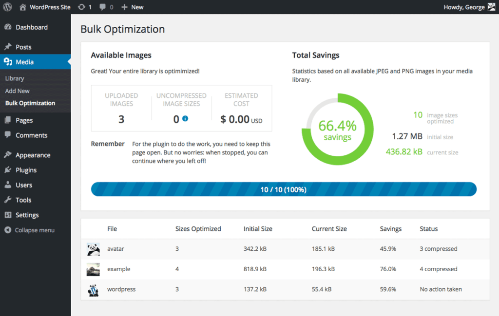
CMS Plugins
For platforms like WordPress, plugins are the easiest solution. Tools like ShortPixel, Imagify, or Smush can automatically compress images the moment you upload them to your media library.
This “set it and forget it” approach is perfect for most site owners. Many of these plugins can also go back and bulk-optimise all of your existing images, giving your site an immediate performance boost.
Developer Build Tools
For custom-built sites and web applications, optimisation can be baked directly into the development workflow. This gives you more control over the process.
Developers can use command-line tools and libraries such as `imagemin` in their project’s build process. This ensures that every image is automatically compressed and prepared for the web before the site is even deployed to a live server, enforcing performance standards from the ground up.
Optimise Images Without Slowing Sites
Serving compressed image files is only half the story when it comes to optimising performance. We must also display them correctly on web pages without impacting user experience.
Some considerations when embedding images:
- Lazy load of offscreen images
- Set width + height attributes
- Choose appropriate image formats
- Deliver next-gen formats responsively
- Host files on a CDN
Getting these right keeps pages fast while allowing images to enhance content.
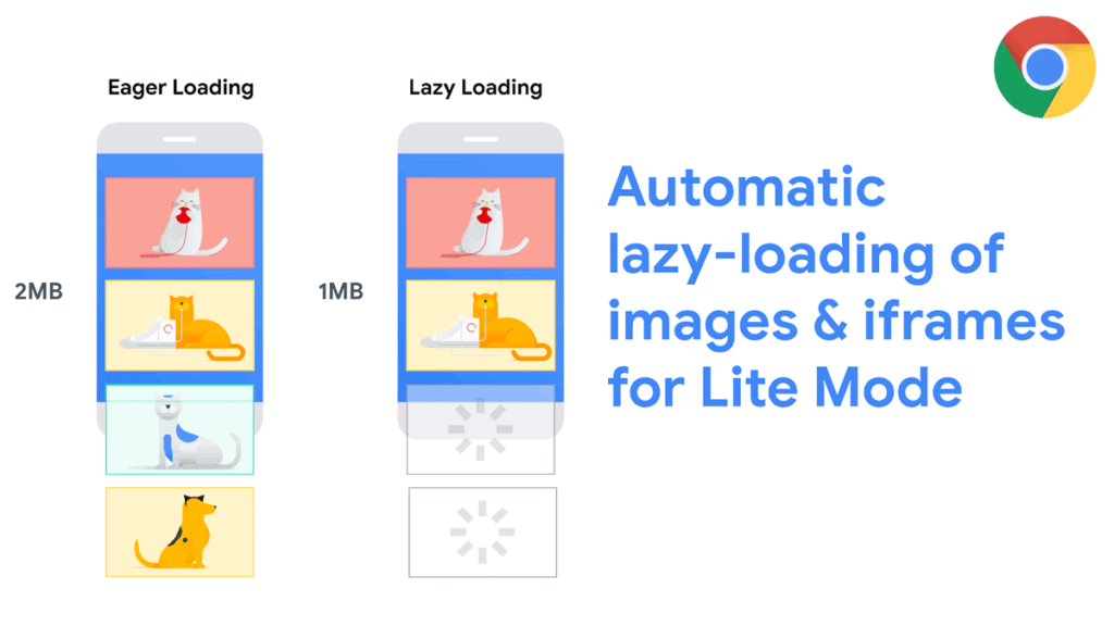
Lazy Load Images
Lazy loading defers loading offscreen images until users scroll near them. This prevents downloading unnecessary assets.
- Images load just before they appear during scrolling.
- Avoids downloading imagery below the page fold unnecessarily.
- A lightweight blank placeholder image was used initially.
Simple to set up in CMSs or with JS plugins. Keeps initial payloads small and only loads images as needed.
Advanced 2026 Loading Strategies: Fetch Priority and Decoding
While lazy loading is excellent for saving bandwidth on secondary images, it can actually harm your performance if applied to your hero image.
If a browser waits to load your primary visual until the JavaScript execution is complete, your Largest Contentful Paint (LCP) score will plummet.
To master image delivery in 2026, you must use the fetchpriority attribute. This tells the browser which images are mission-critical.
For your main banner or product image, use fetchpriority="high". This ensures the browser discovers and downloads this file before less important scripts or stylesheets.
Conversely, for images that are visible but not vital, you should use decoding="async". This allows the browser to continue parsing the rest of the HTML while the image is being decoded in the background, preventing those frustrating “stutter” moments during page scroll.
Pro Tip: Never lazy load your hero image. Instead, use a combination of
fetchpriority="high"and an eager loading state to ensure the fastest possible visual arrival for your users.
Set Width + Height Attributes
Setting the width and height Attributes in your HTML are the first step, but modern responsive design requires a more robust approach using CSS aspect-ratio property.
One of the most common causes of a poor Cumulative Layout Shift (CLS) score is the browser not knowing how much vertical space to reserve for an image before it has downloaded. By defining an aspect ratio in your global stylesheet, you create a “placeholder box” that prevents content from jumping around.
CSS
img {
  max-width: 100%;
  height: auto;
  aspect-ratio: 16 / 9; /* Matches your standard photography ratio */
  content-visibility: auto; /* Only renders the image when it nears the viewport */
}
Using content-visibility: auto It’s a 2026 power move. It tells the browser to skip rendering images that are currently off-screen, saving CPU cycles and battery life for mobile users. This is particularly effective for long-form articles or e-commerce category pages with dozens of product shots.
Use Responsive Images
Responsive images load optimised image files depending on screen size breakpoints.
- srcset attribute defines multiple-resolution image candidates.
- The sizes attribute sets media conditions matching secret files.
- The browser selects the best srcset source for the user’s display.
- Native lazy loading works automatically.
Less data is consumed on smaller screens. Helpful in serving WebP/JPEG XL images to capable browsers.
Host Images on CDN
In a professional 2026 workflow, you should rarely need to optimise images manually. Instead, leverage Edge Computing via providers such as Cloudflare, Akamai, or Fastly.
An Image CDN does more than just host your files; it transforms them on the fly. When a user requests an image, the CDN checks their browser support and screen size. It then automatically:
- Converts the image to AVIF if the browser supports it.
- Resizes the image to the exact pixel width of the user’s screen.
- Compresses the file based on the detected connection speed (serving lighter files to users on poor mobile data).
This “transformation at the edge” removes the burden from your development team and ensures that every visitor—whether on a 4K desktop in London or a budget smartphone in a rural area—gets the best possible version of your visual content.
Finding the Right Image Balance
Image optimisation isn’t just about bytes; it’s about meaning. A perfectly compressed image is useless if it’s invisible to screen readers or fails to provide context to search engines.
In 2026, Alt Text should be treated as a core part of your content strategy. Avoid “keyword stuffing” and focus on describing the image’s intent.
For example, instead of alt="blue running shoes discount", use alt="Pair of blue lightweight running shoes shown from a side profile against a white background."
For purely decorative images (like background patterns or abstract shapes), use an empty alt attribute (alt=""). This tells assistive technologies to skip the image, preventing a cluttered experience for users with visual impairments.
Furthermore, ensure you strip unnecessary EXIF data (such as GPS coordinates or camera settings) during compression to protect user privacy and shave off a few extra kilobytes of hidden metadata.
Optimising Images During Design

Many image optimisation principles tie back to intelligent design choices when initially creating assets.
Consider web performance from the early stages of image production to maximise results later.
Design Relevant Image Sizes
Export the image dimensions to match the intended display size. Avoid massive source files getting squashed with HTML/CSS.
- Target 1x – 2x display size
- Set exact pixels for CSS sizing
- Avoid scaling images in markup
- Use vector sources where possible
Supplying custom-cropped sizes that require no scaling via HTML, JS, or CSS prevents inflated page weight.
Reduce Colour Palettes
Limiting the number of colours in indexed PNGs shrinks file sizes.
- Quantise to optimal web palette
- Adjust levels to necessities
- Avoid PNG8 for gradients (use JPG)
- Set Matte options to transparency
Even with photos, consider the conveyed message vs colour accuracy. One hundred fifty shades often suffice vs 30,000 actual colours.
Establish Performance Budgets
Define image byte thresholds aligned to user priorities and goals. Enforce these early in the design phases.
- Hero image budget: <100kb
- Article thumbnail: <20kb
- Icon set: <60kb total
- Ten images per page max
Guide designers and developers to balance perceived quality with weight.
Building in optimised practices during content creation multiplies the effectiveness of compression tools later down the line.
Putting it All Together
We’ve covered a lot of ground on optimising images for web performance. Let’s summarise the complete process:
1. Analyse existing imagery
- Audit total page weight
- Identify large files lacking ROI
- Set performance budgets
2. Optimise image delivery
- Lazy load of offscreen images
- Add width + height attributes
- Host compressed files on CDN
- Use responsive images
3. Select appropriate formats
- JPEG for photos
- PNG for logos and illustrations
- GIF for animations
- Adapt to the user’s browser
4. Compress images
- Shrink JPEG, PNG and GIF files with optimisation tools
- Find a balance between size and quality
5. Optimise during design
- Export the exact display dimensions required
- Limit colour palettes through indexing
- Define image performance budgets
Combining these technical and design practices allows you to load images that are 50-80% smaller without perceptible quality loss.
The gains in site speed, engagement and conversions make the effort worthwhile.
Image Optimisation FAQs
Still have some questions about optimising images for web performance? Here are answers to frequent queries:
How do I fix the “Avoid enormous network payloads” warning in Lighthouse?
This warning usually triggers when your total page weight exceeds 1.6MB. To fix it, audit your images for “hidden” weight. Often, hero images are saved at 4K resolution but displayed in a 1200px container. Use a tool like ShortPixel or Squoosh to resize images to their maximum required display size before uploading.
Is it better to use CSS background images or HTML <img> tag?
For performance, the <img> The tag is almost always superior. Modern browsers can pre-scan HTML tags and start downloads much earlier than they can discover images buried inside a CSS file. If you must use a background image, ensure you use the fetchpriority="high" hint in a <link rel="preload"> tag in your document head.
Can AI help me optimise my images?
Absolutely. In 2026, AI-driven tools like Magnific AI or Topaz Photo AI are used to “upscale” small, low-weight images into high-resolution assets. This allows you to host smaller source files while serving crisp visuals. Additionally, many CMS platforms now use AI to automatically generate descriptive alt text.
Does image compression affect my carbon footprint?
Yes. Every byte transferred across the internet requires electricity. By reducing your image file sizes by 50%, you are directly lowering the energy required to serve your website. Sustainability is increasingly a factor in how modern brands are perceived by users.
Should I still use GIFs for simple animations?
Ideally, no. WebP and AVIF both support animation with much better compression than the legacy GIF format. For longer or more complex animations, converting the file to an MP4 or WebM video and using a muted, looping <video> The tag is significantly more efficient.
Conclusion
Optimising images substantially enhances web performance and user experience, making it one of the easiest wins.
Following the technical and design practices outlined empowers you to load pages faster, reduce bandwidth costs and boost conversions through optimised imagery.
Understanding the balance between visual quality and download footprint is critical. You can effectively minimise image file sizes without sacrificing user experience with the right formats, compression tools, and delivery methods.
Implement these essential image optimisation strategies and observe your site speed leap forward.