Neville Brody: The Architect of Disruptive Graphic Design
Most small business owners are terrified of their own brand. They hide behind “best practices,” which is usually just a polite term for copying what everyone else is doing.
The result is a sea of meh.
In my years as a Creative Director, I have seen countless companies pour thousands of pounds into visual identities that have the shelf life of a ripe avocado. They are forgettable because they lack a point of view.
Neville Brody is the antidote to this mediocrity.
He is a designer who understood that if you aren’t offending someone, you probably aren’t interesting to anyone.
In an era where AI can churn out “perfect” layouts in seconds, Brody’s legacy of intentional friction and typographic rebellion is more valuable than ever.
If your brand feels like a template, you are losing money to competitors who actually stand for something.
- Brody championed experimental typography, treating letters as architectural shapes to provoke engagement rather than passive legibility.
- He disrupted traditional grids, using narrative layouts and calculated friction to create memorable, attention-grabbing brand experiences.
- Brody combined punk roots with systems thinking, pioneering digital typefoundries and cohesive global design systems for major brands.
Who is Neville Brody?
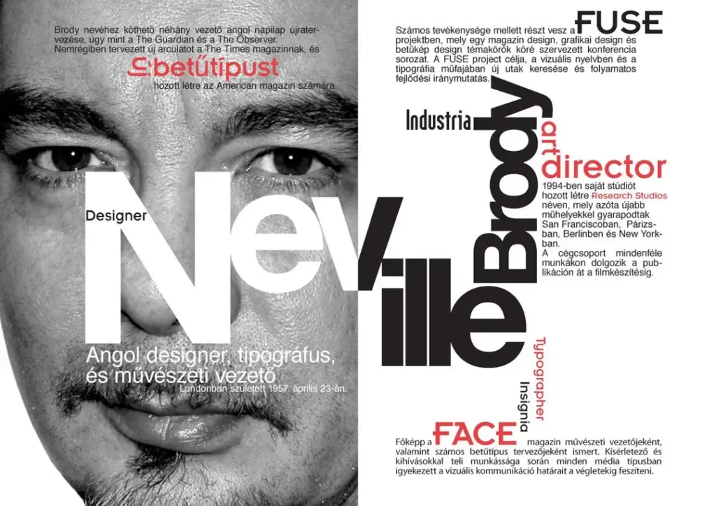
Neville Brody is a seminal British graphic designer, typographer, and art director whose work redefined visual communication in the 1980s and 1990s. He is best known for his experimental approach to typography and his ability to fuse subcultural energy with high-level commercial strategy.

- Experimental Typography: Treating letters as abstract shapes and architectural elements rather than just carriers of phonetic information.
- Narrative Layout: Designing pages that guide the viewer through an emotional journey, often breaking traditional grid systems to create tension.
- Digital Pioneering: One of the first major designers to embrace the Apple Macintosh, shifting the industry from physical paste-ups to digital manipulation.
The Face of Rebellion: Disrupting the Grid
In the early 1980s, The Face became the platform for Brody’s most radical ideas. At a time when publishing followed strict, predictable rules, Brody treated every page like a manifesto.
He didn’t just place text; he manipulated it. He stretched and overlapped letters, creating symbols that required the reader to work to understand the content.
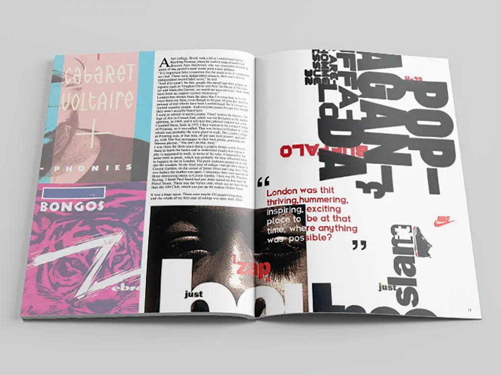
This wasn’t just about being “edgy.” It was about engagement. Research from the Decision Lab suggests that while “simple” designs are easy to process, they often fail to create lasting memory markers. Brody’s work forced the eye to slow down.
For a brand today, this translates to “stopping power.” If a user scrolls past your ad in 0.2 seconds, your design has failed.
The Myth of Absolute Legibility
There is a common misconception in the SMB world that every piece of text must be perfectly legible at all times. This is a myth that kills creativity. Brody demonstrated that readability and legibility are distinct concepts.
You can have a perfectly legible font (like Arial) that is so boring no one bothers to read it. Conversely, you can have a complex, layered typographic arrangement that captures the viewer’s curiosity, forcing them to engage with the message.
In our fieldwork, we often see brands sacrifice their soul on the altar of “cleanness,” only to wonder why their conversion rates are stagnant.
Typography as a Strategic Asset
Brody’s influence is most visible in his work with famous graphic designers who transitioned from the punk scene into the boardroom. He founded FontFont (with Erik Spiekermann), one of the most influential digital type foundries in history. This wasn’t just about creating beautiful letters; it was about developing a proprietary visual language.
Case Study: The Times Redesign
In 2006, Brody was tasked with redesigning The Times. This wasn’t a job for a “stylist.” It was a job for a systems thinker. He introduced Times Modern, a font family designed to bridge the gap between traditional prestige and modern digital readability.
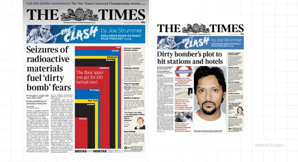
According to a McKinsey & Company report on the business value of design, companies that integrate design into their strategic planning outperform the industry benchmark by as much as two to one. Brody’s work for The Times wasn’t just a “lick of paint”; it was a structural overhaul that reinforced the paper’s authority in a declining print market.
| Feature | The Amateur Approach | The Brody (Pro) Approach |
| Font Selection | Uses whatever is “trending” on Google Fonts. | Creates or selects fonts based on brand psychology. |
| Grid Usage | Rigidly follows a template without variation. | Breaks the grid to highlight key emotional hooks. |
| White Space | Used to fill gaps or look “minimalist.” | Used as a structural element to create focus. |
| Hierarchy | Size-based only (Big = Important). | Uses weight, colour, and positioning to tell a story. |
The State of Graphic Design in 2026
We are currently witnessing a massive shift in how visual assets are produced. AI tools like Midjourney and Canva have democratised design, but they have also led to a “homogenisation of aesthetic.” Everything is starting to look the same because the algorithms are trained on the “average.”
In 2026, the real value lies in Intentional Imperfection. Brody’s work always felt human because it was flawed, aggressive, and unpredictable. For entrepreneurs, the lesson is clear: if your design portfolio looks like it was generated by a prompt, you have no competitive advantage.
The most successful brands this year are those leaning back into “analogue” sensibilities—textured typography, non-linear layouts, and bold colour psychology. They are using typography basics to build something that feels curated, not calculated.
From Subculture to Global Systems
Brody didn’t stay in the underground. He went on to develop massive global design systems for companies like Samsung and Sony. This is where most SMBs get it wrong. They think “brand” is a logo. Brody teaches us that a brand is a system.
When we provide design services, we don’t just give you a file; we also provide ongoing support. We give you a framework.
Brody’s work for Samsung involved creating a bespoke typeface that worked across every device, from microwaves to smartphones.
This consistency is what builds trust. If your packaging design appears to belong to a different company than your website, you are leaking authority.
“Design is more than just a few tricks to the eye. It’s a few tricks to the brain.”
Neville Brody
The Consultant’s Reality Check
I once audited a client in the fintech space who spent £50,000 on a rebrand. It was “perfect.” It was clean, it was blue, and it was entirely invisible. They looked exactly like every other “disruptor” in the market. I told them they didn’t need a designer; they needed a vandal.
We looked at Brody’s early work on Arena magazine and applied that sense of “structured chaos” to their data visualisations. We broke the rules of traditional banking aesthetics. Their user engagement increased by 40% within three months. Why? Because people actually noticed them. They stopped being background noise and began to be a signal.
The Architect of Digital Space
Brody was one of the first to realise that the computer wasn’t just a tool for making print faster; it was a new medium entirely. Through his Fuse project, he explored the boundaries of how we interact with symbols on a screen.

For the modern entrepreneur, this means your productive workplace at home needs to be a laboratory for creative thinking. You cannot expect to create disruptive work if you are working in a sterile environment using the same tools as everyone else.
Whether you are debating self-taught vs formal education, the core lesson from Brody remains the same: learn the rules specifically so you can break them effectively. If you don’t understand the “Why” behind a grid, your attempt to break it will just look like a mistake.
The Verdict
Neville Brody’s work is a testament to the power of visual courage. He proved that you can be commercially successful without being visually subservient. For the SMB owner, the takeaway is simple: stop trying to fit in. Your customers are tired of generic “optimised” experiences. They want to feel something.
If your current branding feels like a safe, middle-of-the-road compromise, it’s time to stop. You are invisible, and invisibility is the most expensive mistake in business.
Would you like me to audit your current brand identity to see where you’re playing it too safe? You can request a quote or explore more of our insights at Inkbot Design.
Frequently Asked Questions
Who is Neville Brody, and why is he famous?
Neville Brody is a renowned British graphic designer who rose to fame in the 1980s. He is renowned for his revolutionary art direction of The Face magazine and his innovative, experimental typography, which challenged traditional design norms and paved the way for modern digital design.
What are the key characteristics of Neville Brody’s style?
His style is characterised by experimental typography, the rejection of traditional grid systems, and a blend of punk-inspired rebellion with commercial structure. He often treats letters as shapes and uses heavy, bold elements to create visual tension and narrative flow.
How did Neville Brody influence modern typography?
Brody was a pioneer in digital typography, co-founding FontFont and launching the experimental Fuse project. He shifted typography from being a purely functional tool to an expressive art form, influencing how designers use fonts in digital interfaces and branding today.
What magazines did Neville Brody design?
His most famous magazine work was for The Face and Arena. He also contributed to the redesign of major newspapers, such as The Times and The Guardian, bringing a modern, crisp aesthetic to traditional journalism.
Why is Neville Brody’s work still relevant for businesses in 2026?
In an age of AI-generated, “perfect” design, Brody’s focus on human-centric, disruptive, and intentional design stands out. Businesses utilise his principles to create unique identities that avoid the “template” look commonly found in modern digital marketing.
Did Neville Brody work for major brands?
Yes. Despite his “rebel” roots, Brody has worked with massive global entities including Samsung, Nike, Sony, and the BBC. He specialises in creating cohesive visual systems and bespoke typography that work across various platforms and languages.
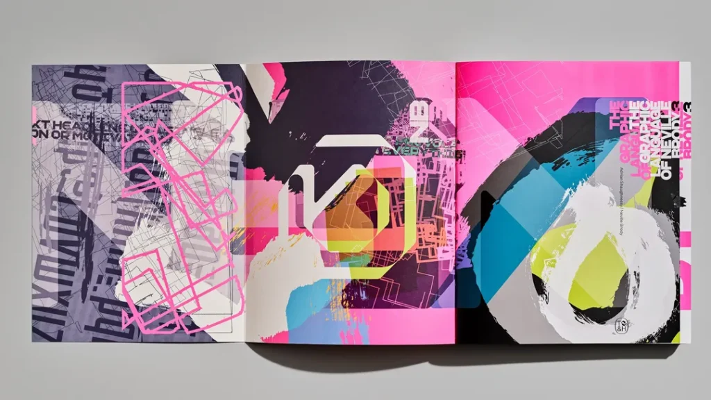
What is the “Graphic Language of Neville Brody”?
This refers to his specific approach to visual communication, where the design itself—not just the text—carries the message. It was also the title of a famous book and exhibition at the Victoria and Albert Museum that cemented his status as a design icon.
Is Neville Brody a typographer or a graphic designer?
He is both. While he is an expert typographer who has created numerous influential fonts, his work encompasses art direction, brand strategy, and the overall architecture of graphic design systems.
How did Brody use computers in his early work?
Brody was an early adopter of the Apple Macintosh. He saw it as a way to manipulate type in ways that were physically impossible with traditional typesetting, resulting in the layered, complex visual style for which he is known.
What can SMBs learn from Neville Brody?
SMBs can learn that “safe” design is often a liability. By taking calculated risks with typography and layout, a small brand can gain a significant competitive advantage over larger, more conservative competitors.
What is the difference between Brody’s early and late work?
His early work was more overtly “punk” and experimental, focusing on subverting magazine conventions. His later work is more systematic and corporate, focusing on global branding and digital-first design languages for major tech companies.
Where can I see Neville Brody’s designs today?
You can see his influence in the typography of The Times, the interface systems of Samsung devices, and in various design museums globally. His studio, Brody Associates, continues to work on high-profile global branding projects.

