Margaret Calvert: The Woman Who Defined British Wayfinding
Margaret Calvert didn’t just design road signs; she built a visual language for a nation.
From the ‘Men at Work’ pictogram to the New Transport font, her work remains the gold standard for functional design.
- Margaret Calvert created a nationwide visual language, making British road signs legible and reliable at speed.
- She championed lowercase, sans-serif Transport type for word-shape reading, proven by rigorous trials.
- Her pictograms, like the Children Crossing and cow, used personal, hand-drawn specificity for clarity and empathy.
- Calvert's principles—Head, Heart, Hand—remain essential for functional, public-centred design in both physical and digital realms.
Why This Matters
We live in a world where everyone thinks they’re a designer because they’ve a Canva subscription and a prompt for Midjourney. But look at your window. If you’re in the UK, you’re looking at Margaret Calvert’s brain.

Her work wasn’t about ‘branding’—a word she famously hates because it reminds her of cattle. It was about solving the chaos of post-war Britain’s road networks.
In 2026, as the Give Way to Design documentary previews at the St Bride Foundation this March, we’re reminded that design isn’t just decoration. It’s a public service.
The film moves beyond the “what” of road signs and explores the cultural DNA of the UK. It features insights from Calvert herself, alongside unexpected voices like fashion icon Anya Hindmarch and car designer Nick Hull. The documentary highlights how functional signage evolved from Roman milestones to a cohesive national identity.
For those attending the Fleet Street screening, the event includes a live introduction by Orozo and a panel of design historians. It’s a rare opportunity to see the “Head, Heart, and Hand” philosophy explained through the eyes of those who have spent a lifetime studying the Worboys Committee’s legacy.
If you can read a sign at 70mph in the rain without wrapping your car around a tree, you owe her a pint. It’s that simple.
The Battle of the Serif and the Soul of Type

Why was the ‘Battle of the Serif’ such a big deal?
Design in the 1960s wasn’t about aesthetics; it was a response to the terrifying rise of high-speed motoring. Before Calvert and Jock Kinneir took over, UK roads were a cacophony of different fonts, sizes, and colours.
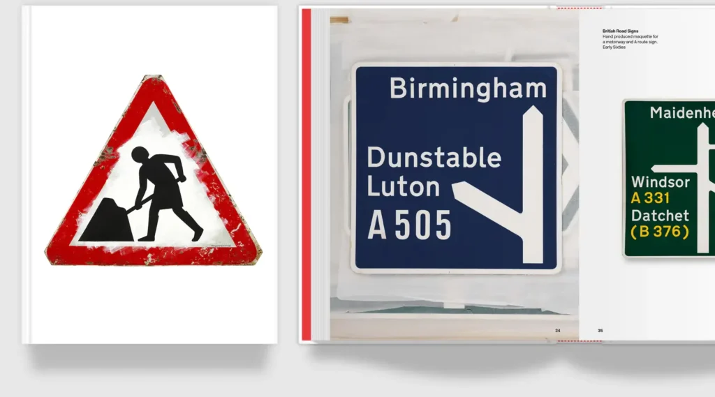
The “Word Shape” Revolution. The core innovation was the move from all-caps to lower-case lettering. Humans do not read letter by letter; we recognise the “bouma,” or the overall silhouette, of a word. By using the Transport typeface—a sans-serif font with open counters and generous spacing—Calvert ensured that a driver could identify “Birmingham” from hundreds of yards away, even in the driving rain.
The Tiling System. Unlike modern digital fonts, which use software to handle kerning, Calvert and Kinneir developed a manual “tiling” system. Each letter sat on a tile of a specific width, with predefined rules for the amount of space between specific characters (e.g., an ‘A’ next to a ‘V’).
- Transport Medium: Used for white and yellow text on dark backgrounds (Blue/Green signs).
- Transport Heavy: Used for black text on white backgrounds, where “ink spread” (irradiation) is more likely to blur the letter.
The Speed Factor. The sizing of signs was mathematically linked to the font’s “x-height”. On a motorway, where drivers have mere seconds to react, the letters are significantly larger than on an urban B-road. This wasn’t guesswork—it was data-driven design tested in underground car parks and on the Preston By-pass (the UK’s first motorway-standard road) in 1958.
What’s the story behind the icons?
Everything was personal. The ‘Children Crossing’ sign? That’s Calvert herself, a girl with bobbed hair leading a younger boy. The cow in the ‘Cattle’ warning? That’s Patience, a real cow from her relatives’ farm in Wiltshire.

This is what’s missing from modern design. We’ve traded hand-drawn gouache and ink pens for soulless vectors that have no weight. Calvert describes a letter’s form as a ‘skeleton fleshed out’. It’s a visceral, human approach.
I mean, she even used to zip around in a white Porsche 356C. She bought it for its beauty, even though it constantly broke down. That’s the designer’s curse—valuing the aesthetic over the convenience, though in her work, she never lets the two conflict.
How does her work live on in the digital age?
Funny enough, the same principles that worked on a rain-slicked motorway in 1965 work on your smartphone in 2026.

The ‘New Transport’ typeface, which she reconceived with Henrik Kubel, powers gov.uk. It’s clean, it’s authoritative, and it doesn’t try too hard. It’s the antithesis of the ‘disruptive’ nonsense we see from tech startups every other week.
Weirdly enough, the French rejected her ‘Calvert’ slab serif in 1971 for being ‘too English’. Their loss. We got the Tyne and Wear Metro out of it, with that iconic black ‘M’ on a yellow background. It’s a landmark of the North East.
Margaret Calvert: Woman at Work
This 2024 monograph is a historic release, finally documenting the woman who—alongside Jock Kinneir—transformed the UK from a chaotic jumble of local signage into a masterclass of global Information Design. In early 2026, her work remains the gold standard for anyone interested in the intersection of UX, legibility, and public service.
As an Amazon Partner, when you buy through our links, we may earn a commission.
The “Calvert” Slab Serif and the Metro Identity
While Transport is her most famous creation, her work for the Tyne and Wear Metro in 1980 remains a high-water mark for regional identity. For this project, she designed the Calvert typeface—a robust, elegant slab serif.
Why a Slab Serif?
Unlike the “soft and friendly” curves of the motorway signs, the Metro required something that felt architectural and sturdy. The “M” logo, set against a bright yellow background, became a landmark of the North East of England. Ironically, this typeface was originally designed for a French “new town” called Saint-Quentin-en-Yvelines in 1971, but it was rejected for being “too English.”
Rail Alphabet 2
Her influence on rail travel didn’t end in the 80s. In 2021, Calvert collaborated with Henrik Kubel of A2/SW/HK to create Rail Alphabet 2. This was specifically designed for Network Rail to improve legibility on digital screens within stations—proving that her principles of “word shape” and clarity are just as relevant to a 4K monitor as they are to a piece of sheet metal.
The Creative Verdict
At Inkbot Design, we’re often asked how to make a brand ‘stand out’. Usually, the client wants something flashy. Something loud.
I tell them to look at Margaret Calvert.
She didn’t try to be loud; she tried to be clear. Her methodology—Head, Heart, and Hand—is exactly how we approach a project. You need the logic (Head), the empathy for the user (Heart), and the craft (Hand) to actually execute it.
The thing is, design today is being flattened by templates. Everyone wants a shortcut. But there are no shortcuts to legibility. You can’t AI-generate your way to a system that unifies an entire nation’s transport network.
Anyway, the lesson is simple: if it doesn’t work at 70mph, it doesn’t work. Strip away the fluff. Find the skeleton. Flesh it out.
Stop trying to be clever and start trying to be useful.
Strategic Takeaways
- Graphic Designers: Prioritise ‘word shape’ and legibility over decorative flourishes; if the skeleton of your type is weak, the branding will fail.
- Business Owners: Clarity is the ultimate competitive advantage; if your customers have to work to understand you, you’ve already lost them.
FAQs
Is Margaret Calvert still working?
Yes. Even at 90, she’s still taking on commissions and involvement in exhibitions, like the one in Kyoto. She’s the definition of ‘not finished yet’.
Did she really design the ‘Men at Work’ sign?
The original pictogram, yes. Though she recently playfully updated it for her book cover to show a ‘Woman at Work’ with her signature bobbed hair. Fair play.
Why did she use a real cow for the sign?
Because generic drawings look like rubbish. She wanted something that felt ‘right,’ and Patience the cow fit the bill. Specificity always beats generalisation.
Is ‘Transport’ a better font than Helvetica?
For road signs? Absolutely. Helvetica is great for a minimalist poster, but ‘Transport’ was built for speed and distance. It’s a tool, not just a typeface.
What’s her take on ‘branding’?
She hates the word. Literally. She thinks it sounds like marking animals. She prefers the term ‘identity’ or just ‘design’.
Was she the first woman in the industry?
Hardly, but she was one of the first to dominate what was seen as a ‘man’s discipline’. She didn’t make a fuss about it; she just worked like a maniac and out-designed everyone else.
Should I use slab serifs for my business?
Maybe. If you want to look sturdy and ‘English’ like the Metro. But don’t do it just because you like the look—do it because it fits the message.


