Heatmaps for UX: How to Read the “Matrix” of User Behaviour
Most business owners treat their website like a digital billboard. They pay a designer to make it “pop,” launch it, and then wonder why the phone isn’t ringing. They look at Google Analytics, see a high bounce rate, and shrug their shoulders.
This is the digital equivalent of opening a retail shop, blindfolding yourself, and trying to guess why customers are walking out without making a purchase.
You cannot fix what you cannot see.
This is where heatmaps come in. They are not merely colourful overlays for your marketing reports; they are forensic evidence. They strip away your assumptions and show you exactly where your users are getting confused, frustrated, or bored.
At Inkbot Design, when we conduct UX Research, we often find that the “beautiful” design elements the client loves are the very things killing their conversion rate.
- Heatmaps visualise user interactions (clicks, scrolls, mouse movement) to reveal real behaviour, not assumptions.
- Use four types—click, scroll, move, rage—to diagnose intent, attention, hesitation and frustration.
- Always segment by device and combine heatmaps with A/B tests to validate hypotheses before permanent changes.
- Fix dead clicks, false bottoms and rage-click hotspots first; design must prioritise function over aesthetic preference.
What is a Website Heatmap?
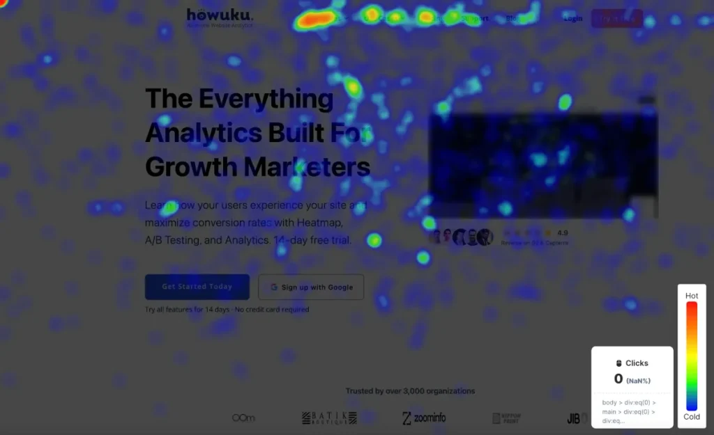
A heatmap is a data visualisation tool that aggregates user behaviour on a webpage using a colour-coded system to represent values. It translates complex numerical data (such as clicks, taps, scrolls, and mouse movements) into an intuitive graphical format.

The Core Components:
- The Matrix: A two-dimensional representation of your web page.
- The Values: User interactions (clicks, pauses, scrolls).
- The Gradient: A colour scale ranging from “Warm” (Red/Orange = High Interaction) to “Cold” (Blue/Green = Low Interaction).
However, there is a catch: Red does not always mean “Good.” A bright red spot could indicate that your users are delighted, or it could mean they are clicking in rage on a broken link. Context is everything.
The Four Pillars of Heatmap Analysis
To use this technology effectively, you must understand that “Heatmap” is an umbrella term. There are four distinct types, each diagnosing a different illness in your website’s anatomy.
1. Click Maps (The Intent Tracker)
Click maps (or “Tap Maps” on mobile) show you exactly where users are clicking or tapping. This seems straightforward, but the insights are often counterintuitive.
What to look for:
- The “Dead Click” Phenomenon: This occurs when users click on an element that appears interactive but isn’t—such as an image, a bold headline, or a non-linked icon. If you see a cluster of clicks on a static image, your users are telling you, “I expect this to take me somewhere.” Make it a link.
- The Navigation Gap: Are users clicking your main navigation bar, or are they ignoring it entirely? If your “Contact” button is ice blue, but your “About Us” is glowing red, you have a misalignment between your business goals (leads) and user intent (information gathering).
- Primary vs. Secondary Action: On a landing page, your primary Call to Action (CTA)—e.g., “Get a Quote”—should be the hottest element. If a secondary link, such as “Read our Privacy Policy,” is receiving more attention, your visual hierarchy is likely broken.
Consultant’s Note: We once audited an e-commerce site where the “Add to Cart” button was grey (to match the brand aesthetic). The click map showed users were clicking the high-contrast product image instead. We changed the button to a high-contrast orange, and conversions lifted by 14% overnight. Design must serve function, not just vanity.
2. Scroll Maps (The Attention Meter)
Scroll maps show how far down the page users travel before abandoning the site. They are essential for determining the length of your content and the placement of critical information.
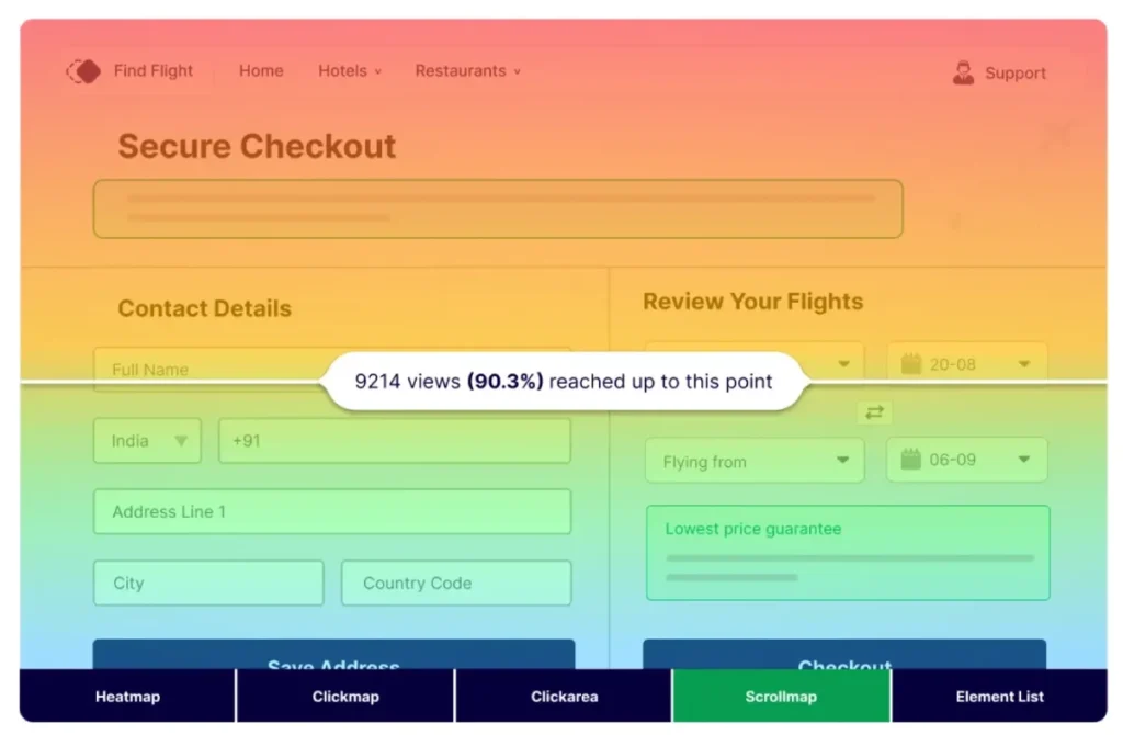
The “Fold” Debate: Marketers have argued about “the fold” (the bottom of the screen before scrolling) for two decades. The data tells us this: Users do scroll, but only if you give them a reason to.
Critical Scroll Map Signals:
- The Sharp Drop-Off: If 100% of users see the header, but only 20% make it past the first 500 pixels, you have a “False Bottom.” This happens when a design element (like a large hero image or a horizontal line) creates the optical illusion that the page ends there.
- The “So What?” Zone: If user retention drops gradually, your content is simply boring. You are not providing enough value to justify the time investment.
- Footer Visibility: Surprisingly, footers often see a resurgence of attention (the “U-Turn” effect). Users scroll to the bottom to find trust signals, such as the address, returns policy, or contact information. If your scroll map shows 0% reach, it’s likely that your page is too long or loads too slowly.
3. Move Maps (The Subconscious Indicator)
Move maps track the movement of users’ mouse cursors on a desktop. This is based on research indicating a significant overlap between eye gaze and cursor position.
According to research by Carnegie Mellon, the cursor typically follows the eye’s movement approximately 84% of the time.
Why this matters: Move maps reveal where users are thinking about clicking but deciding against it. They show hesitation. If you see a lot of mouse movement over a pricing table but no clicks, users are comparing options but are unconvinced. The copy isn’t closing the deal.
4. Rage Click Maps (The Frustration Detector)
This is my favourite metric. A “Rage Click” is registered when a user rapidly clicks the same area multiple times within a short period.
Common Causes:
- Broken Links: The user clicks, nothing happens, so they click harder.
- Slow Loading: The script hasn’t fired yet, and the user is impatient.
- Misleading UI: An element appears to be a button (e.g., a coloured rectangle) but serves only as decoration.
Rage clicks are a direct signal of user anger. Fix these first. They are low-hanging fruit for improving retention.
Strategy: Interpreting the Data Without Hallucinating
The danger with heatmaps is the risk of confirmation bias. You see what you want to see. To avoid this, you must apply a rigorous analytical framework.
The “F-Pattern” vs. The “Layer Cake”
In 2006, NN/g identified the F-Pattern reading behaviour. Users scan the top line, drop down a bit, scan a shorter line, and then stick to the left margin.
However, in 2026, scanning patterns have evolved. We now frequently see the “Layer Cake” pattern, where users scan headings and subheadings (the icing layers) to find relevant sections, ignoring the body text entirely until they find a keyword.
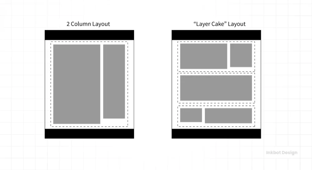
The Fix: If your heatmap shows intense heat on headings but cold blue zones on your paragraphs:
- Break it up: Use bullet points.
- Front-load value: Put the most important information in the first two words of your sentences.
- Bold key phrases: Guide the eye through the text.
The “Banner Blindness” Paradox
Users have become accustomed to ignoring anything that resembles an advertisement. This is called Banner Blindness.
If you place your most important promotion in the right-hand sidebar or at the very top of the page in a banner-style format, your heatmap will likely show a cold zone. Users subconsciously filter it out.
The Fix: Integrate promotions natively into the content flow. Native elements get significantly more visual attention than peripheral elements.
The Contrast Trap
The Wrong Way (Amateur):
- Analysis: “The heatmap shows nobody is clicking the ‘Sign Up’ button.”
- Amateur Reaction: “Make the button bigger and redder.”
- Result: The button becomes annoying, and users leave.
The Right Way (Pro):
- Analysis: “The heatmap shows nobody is clicking the ‘Sign Up’ button, but the move map shows they are hovering over the ‘Pricing’ link.”
- Pro Reaction: The issue isn’t visibility; it’s anxiety. The user isn’t ready to sign up because they don’t know the cost yet.
- Action: Move the pricing information next to the Sign-Up button or change the CTA to “View Pricing” to match user intent.
Technical nuances: The “Rare” Attributes of Heatmaps
To truly leverage this tool, we must look beyond the basics. Here are the technical nuances that separate successful optimisation from guesswork.

1. Resolution and Device Fragmentation
A heatmap is an aggregate. It combines data from users on 27-inch 4K monitors with data from users on 13-inch laptops. If you do not segment your heatmap data by device type, you are looking at a messy average that represents no one in particular.
Rule: Always toggle between Desktop, Tablet, and Mobile views. A 50% scroll depth on a desktop might be the footer; on a mobile, it might be the second paragraph.
2. The Dynamic Content Problem
Modern websites use AJAX, dynamic sliders, and pop-ups. Standard heatmaps often fail to capture interactions on elements that aren’t visible on page load (like a dropdown menu or a modal).
If you are using a single-page application (SPA) or a site with heavy JavaScript, ensure your heatmap tool supports dynamic element tracking. Otherwise, you will see clicks floating in empty space where a pop-up used to be.
3. Combining Heatmaps with A/B Testing
Heatmaps generate hypotheses. A/B tests validate solutions.
The Workflow:
- Heatmap: Shows a cold zone on your testimonial section.
- Hypothesis: The testimonials are too far down the page.
- Action: Move testimonials up.
- A/B Test: Run the new version against the old version to statistically verify the improvement.
Do not make permanent changes based solely on a heatmap without monitoring the impact on conversion.
Real-World Case Study: The “Unclickable” Service Page
We worked with a B2B consultancy firm that was struggling to generate leads through their “Services” page.
The Initial State:
- Traffic was high.
- The time spent on the page was decent (over 2 minutes).
- Conversion (filling out the contact form) was < 0.5%.
The Heatmap Diagnosis: We deployed a click map. The results were startling. The page featured a list of services with custom icons. The icons were receiving thousands of clicks.
- The Problem: The icons were non-interactive SVGs. The actual text link “Learn More” was tiny and located below the icon.
- The User Behaviour: Users assumed the big, representative icon was the button. When it didn’t work, they assumed the site was broken or the service was unavailable, and they left. This is a classic “Dead Click” scenario.
The Fix: We made the entire card (icon, text, and background) a clickable link.
The Result:
- Pageviews per session increased by 40%.
- Lead generation increased by 28% in the first month.
No copy was changed. No new traffic was bought. We simply aligned the design mechanics with the user’s intuitive behaviour.

The State of Heatmaps in 2026: AI and Prediction
The technology is shifting. We are moving from historical analysis to predictive analysis.
Tools like EyeQuant and newer iterations of Hotjar now utilise artificial intelligence, trained on thousands of eye-tracking studies, to predict where users will look before the site even goes live.
Predictive Attention Maps: These tools simulate human vision during the first 3-5 seconds of landing on a page. They can tell you with 90% accuracy whether your headline will be seen or ignored.
Why this changes everything: Traditionally, you had to launch a site, wait two weeks to gather traffic data, and then analyse. Now, you can run a predictive heatmap on your design mockups in Figma or Adobe XD before a single line of code is written. This dramatically reduces the cost of development errors.
If you are a startup or small business, utilising predictive heatmaps during the design phase can provide a significant competitive advantage. It allows you to launch a “Version 1” that is already optimised for human attention.
The Consultant’s Reality Check
I often sit in boardrooms where stakeholders argue over the colour of a button based on “personal preference” or “brand guidelines.”
The CEO likes blue. The Marketing Director likes green.
In these moments, I pull up the heatmap data. It is the great equaliser. It does not care about your job title or your opinion. It only cares about what the user did.
If the user isn’t scrolling past the hero section, your copy is weak. If the user is rage-clicking your logo, it’s likely due to confusing navigation. If the user is ignoring your expensive video background, it’s a waste of bandwidth.
Design is not art. Design is problem-solving. If you are not using data to validate your design decisions, you are practising art, not business.
The Verdict
Heatmaps are essential for any business serious about Web Design Services. They bridge the gap between what you think users are doing and what they are actually doing.
However, they are not a magic wand. They are a diagnostic tool.
Your Action Plan:
- Install a tool: Hotjar, Microsoft Clarity (free), or Crazy Egg.
- Wait: Gather at least 2,000 pageviews per device type to ensure statistical significance.
- Audit: Look for Dead Clicks, False Bottoms, and Rage Clicks.
- Hypothesise: Formulate a reason why the behaviour is happening.
- Test: Implement a fix and measure the results.
Stop guessing. Let the data dictate the design.
Frequently Asked Questions about Website Heatmaps
What is the difference between a heatmap and Google Analytics?
Google Analytics provides quantitative data (Who, When, How many). Heatmaps provide qualitative data (Where, Why, How). GA tells you that users left a page; heatmaps show you where they were looking when they decided to leave.
How many visitors do I need for an accurate heatmap?
You typically need at least 2,000–3,000 pageviews per device type (desktop/mobile) to generate a reliable heatmap. Data based on fewer than 1,000 views can be skewed by outliers or random behaviour.
Are heatmaps GDPR and CCPA compliant?
Yes, most reputable heatmap tools (like Hotjar or Microsoft Clarity) are compliant. They anonymise user data, masking keystrokes in form fields and stripping Personally Identifiable Information (PII) before the data is recorded.
Can heatmaps track dynamic content, such as drop-down menus?
It depends on the tool. Basic tools only capture the static “background” layer. Advanced tools utilise dynamic recording to track interactions with elements that appear after the initial page load, such as modals, accordions, and mega menus.
What is a “cold spot” on a heatmap, and is it a bad thing?
A cold spot indicates an area with little to no interaction. This is not always bad. White space is necessary for cognitive relief. However, if your “Buy Now” button or key value proposition is in a cold spot, that is a critical design failure.
Why do mobile heatmaps look different from desktop heatmaps?
User behaviour changes drastically by device. Mobile users are in “scroll mode,” often scanning faster and interacting with the bottom third of the screen (the “thumb zone”). Desktop users follow an F-pattern or Layer Cake scanning pattern. You must analyse them separately.
What is a “Ghost Button”?
A Ghost Button is a transparent button with a thin border. While stylish, heatmaps often show they suffer from lower click-through rates because they lack visual weight and don’t look “clickable” to some users, blending into the background.
How often should I check my heatmaps?
You should check heatmaps whenever you launch a new page, run a marketing campaign, or notice a drop in conversion rates. For steady-state sites, a quarterly audit is sufficient to ensure user behaviour hasn’t shifted.
Can heatmaps help with SEO?
Indirectly, yes. Search engines use engagement signals (like dwell time and pogo-sticking) to rank pages. By using heatmaps to fix UX issues and keep users on your site longer, you send positive signals to search algorithms.
Do heatmaps slow down my website?
Modern heatmap scripts are asynchronous, meaning they load in the background without blocking the main content. However, running too many third-party scripts can impact performance, so it is best to turn them off when you are not actively collecting data.


