7 Graphic Design Solutions for Common Business Problems
You have a problem in your business.
Sales may be flat. Your marketing may feel like shouting into a void. You may be haemorrhaging customers to a competitor who, frankly, has an inferior product.
So you look at the obvious culprits. You blame the sales strategy, the ad spend, the market, and the economy. You hire consultants. You run more ads. You change your pricing. And nothing fundamentally changes.
Here’s the issue: you’re misdiagnosing the illness. Many of the most persistent business problems aren’t about sales, marketing, or operations. There are communication problems. And visual communication is the native language of commerce.
These are graphic design problems.
Most business owners treat design as decoration. The last step is the “make it pretty” department, a subjective coat of paint applied at the end. This is a costly mistake.
Strategic design isn’t about making things look nice. It’s a rigorous, commercial tool for solving tangible business problems. It’s about clarity, trust, and influence.
This article outlines seven common business failures that are, at their core, graphic design challenges. Let’s get to it.
- Strategic graphic design solves core business issues—clarity, trust, and influence—rather than being mere decoration.
- Consistent brand identity and strict style guides build recognition, credibility, and allow premium pricing.
- Conversion-centred UX, clear information design, and disruptive packaging turn traffic and attention into measurable sales.
Problem 1: No One Remembers Who You Are (The Invisibility Problem)
The Business Symptom: Low Brand Recognition and Zero Recall.
You spend money on advertising, you post on social media, and you network. But it doesn’t stick. Customers don’t remember your name, and prospects can’t distinguish you from three of your competitors. You are functionally invisible.
Your marketing budget is wasted because it’s not building cumulative memory. Each ad is like starting from scratch.
The Design Solution: A Cohesive and Memorable Brand Identity.
The solution isn’t just a clever logo. A logo is a signature, not a story. You need a complete visual system.
This system includes your logo, a defined colour palette, specific typography, and a consistent style for imagery and illustration. It’s a set of rules that governs how you look and feel everywhere, all the time.
A consistent brand presentation across all platforms can increase revenue by 33%. Why? Because consistency builds familiarity, and familiarity builds trust.
When your website, business cards, social media profiles, and product packaging speak the same visual language, you stop being a random encounter and become a recognisable brand.
Case in Point: Mailchimp.
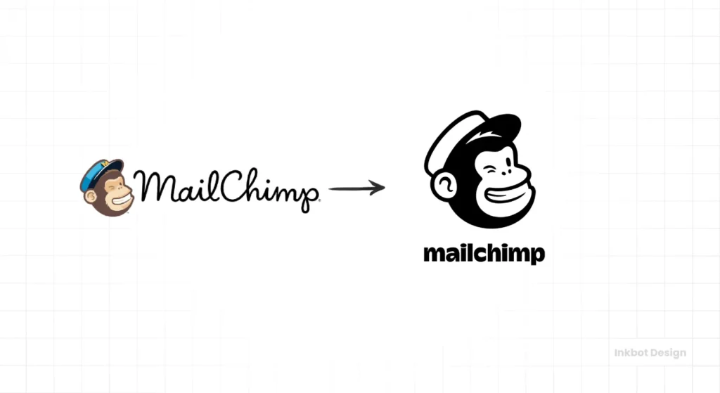
Remember Mailchimp from a decade ago? They were another email marketing tool with a relatively generic tech-company look. Now, you can spot their brand from a mile away.
They invested in a distinctive identity built around their mascot, “Freddie,” a quirky illustration style, and a bold, unapologetic yellow. Their brand feels friendly, approachable, and slightly offbeat—starkly contrasting to their more corporate competitors. They built a personality through design, and it made them unforgettable.
Problem 2: Customers Don’t Understand What You Do (The Complexity Problem)
The Business Symptom: High Bounce Rates and Low Conversion.
You have a brilliant, innovative product or service. The problem is, it takes you five minutes and a whiteboard to explain it.
Potential customers land on your website, are met with a wall of text and jargon, become confused, and leave within seconds. Your analytics show tons of traffic but a pathetic conversion rate. They don’t buy because they don’t understand.
The Design Solution: Clarity Through Information Design and UX/UI.
You don’t need to “dumb down” your product; you need to clarify its presentation. This is a job for information design and user experience (UX).
A clear visual hierarchy guides the eye to the most critical information. Use well-designed icons and simple graphics to communicate complex ideas faster than text ever could. Structure your website or app (the UI) to be intuitive, simple, and focused on a single goal.
Good design removes friction. It translates complexity into simplicity, making it easy for customers to grasp the value you offer and see the path to purchase.
Case in Point: Headspace.
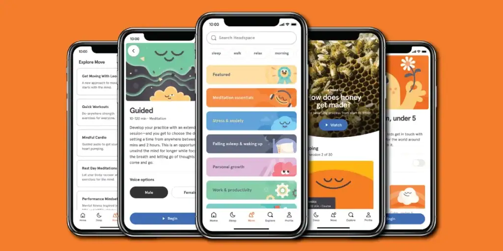
Meditation is an abstract, internal concept. How do you sell that in an app? Headspace solved this problem brilliantly with design.
Instead of complex spiritual texts or clinical explanations, they created a world of charming, simple animations and characters. The app’s interface is clean, calming, and easy to navigate. They used design to demystify meditation, making it feel accessible, fun, and tangible. They didn’t just sell a service; they designed a feeling of calm and clarity.
Problem 3: Your Brand Feels Inconsistent and Unprofessional (The Patchwork Problem)
The Business Symptom: Eroding Customer Trust.
Your logo looks one way on your website, slightly different on your invoices, and is an old, pixelated version on your Facebook page. Your sales decks use Arial, but your website uses Helvetica. The whole brand experience feels cobbled together.
This inconsistency screams “amateur.” It creates a subtle unease and signals your business is disorganised. How can customers trust you to manage their problems if you can’t manage your image?
The Design Solution: A Strict Brand Style Guide.
The solution is a brand style guide. This is not a fluffy document; it’s a rulebook. It’s the central source of truth for your visual identity.
This guide dictates every aspect of your brand’s application. It specifies correct logo usage (and misuse), provides the exact colour codes (HEX, CMYK, Pantone), defines the typographic hierarchy, and sets the tone for all photography and illustration.
It’s the tool that empowers your team and any external partners to represent your brand correctly and consistently, every single time. Consistency doesn’t stifle creativity; it builds a strong foundation for it.
Case in Point: Starbucks.

You know a Starbucks product or location the instant you see it. From the specific shade of green on the apron to the store layout to the typography on the cup, the experience is unwavering.
This global consistency is not an accident. One of the planet’s most rigorous brand style guides enforces it. This visual discipline builds immense trust. You know precisely what you’ll get, whether you’re in Seattle or Seoul. That reliability is worth billions.
Creating a robust brand identity is the foundation. We outline that process in our design services.
Problem 4: You Can’t Charge What You’re Worth (The Perception Problem)
The Business Symptom: Competing on Price, Not Value.
Your product is superior to your competitors’, but you’re constantly forced to discount it. You’re stuck in a race to the bottom because customers perceive your brand as a cheap, interchangeable commodity.
Your branding looks cheap, so customers assume the product is cheap. You’ve lost the pricing battle before you’ve even stated your case.
The Design Solution: Crafting a Premium Experience.
Humans are visual creatures. We judge value based on signals. To command a premium price, you must signal premium quality through design.
This goes far beyond your logo. It’s about the entire sensory experience. Use a clean, minimalist aesthetic. Choose elegant, readable typography. Invest in high-quality photography. For physical products, the texture of the paper on your packaging and the satisfaction of the “unboxing” experience are part of the design. A seamless, beautiful website UI signals a high-quality digital product.
Premium design creates a halo effect that elevates the perceived value of what you sell.
Case in Point: Apple.
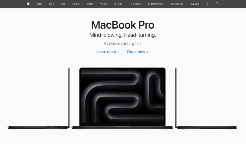
Apple is the master of this. Are their computers functionally worth twice as much as a competitor’s? The debate is irrelevant.
The perception of value is built through design. The sleek, minimalist product design, the weight and texture of the packaging, the theatrical unboxing ritual, and the bright, clean, temple-like atmosphere of their retail stores—every single touchpoint is meticulously designed to communicate “premium,” “quality,” and “innovation.” This justifies the price tag in the customer’s mind long before they assess the processor speed.
Problem 5: Your Product is Invisible on the Shelf (The Shelf-Appeal Problem)
The Business Symptom: Poor Retail Sales Despite a Great Product.
You fought hard to get your product into retail stores. And now it just sits there. It’s a great product, but it’s languishing on the shelf, lost in a sea of visual noise from hundreds of other brands all vying for attention.
In a retail environment, your packaging is your only salesperson. If it’s not doing its job, you don’t make sales.
The Design Solution: Disruptive Packaging Design.
When everyone else zigs, you zag. The solution is packaging that intentionally breaks the visual conventions of its category.
Research shows that 72% of American consumers say their purchasing decision is influenced by the product’s packaging design. Your package has less than three seconds to grab a shopper’s attention.
Do your competitors all use photography? Use bold illustrations. Is the aisle a riot of bright colours? Go with a stark, minimalist black and white design. Is everyone making health claims? Fill your packaging with witty, self-aware copy. The goal is to be the one thing that doesn’t look like the others.
Case in Point: Oatly.
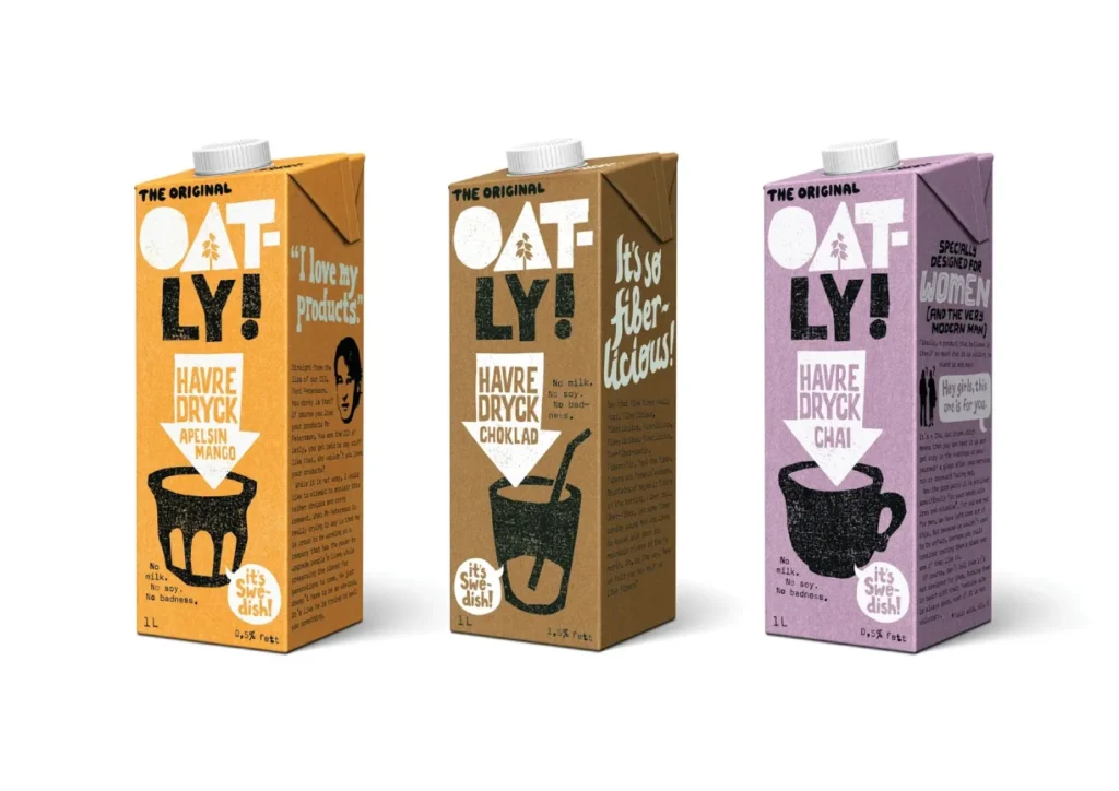
Walk down the milk-alternative aisle. Most cartons feature serene images of oat fields or splashy pictures of milk pouring into a glass. Then you see Oatly.
Their cartons are covered in quirky, hand-drawn-style text, strange slogans, and a bold, simple aesthetic that looks nothing like milk. It feels more like a zine from an indie band than a food product. This disruptive design demanded attention, communicated a rebellious personality, and helped build a cult-like following. They turned a boring carton into a media channel.
Problem 6: Your Team Lacks Cohesion and Pride (The Culture Problem)
The Business Symptom: High Employee Turnover and Low Engagement.
Your company culture feels weak. Employees are not enthusiastic brand advocates. There’s a disconnect between the mission statement on the wall and how people think about their work. Good people keep leaving.
You can’t build a great external brand despite a broken internal culture.
The Design Solution: Robust Internal Branding.
Most businesses inexplicably drop all design standards for internal communications. Onboarding documents are ugly Word files, the intranet is a usability nightmare, and internal presentations are hideous PowerPoint templates from 2003.
Applying the same design rigour internally as you do externally is a powerful lever for culture. A well-designed onboarding kit makes new hires feel valued and excited. A beautiful and functional internal portal makes people’s jobs easier. Branded office environments and high-quality company swag foster a sense of shared identity and pride.
Design signals that you care. It shows employees they are part of a professional, well-run organisation that values quality.
Case in Point: Google.
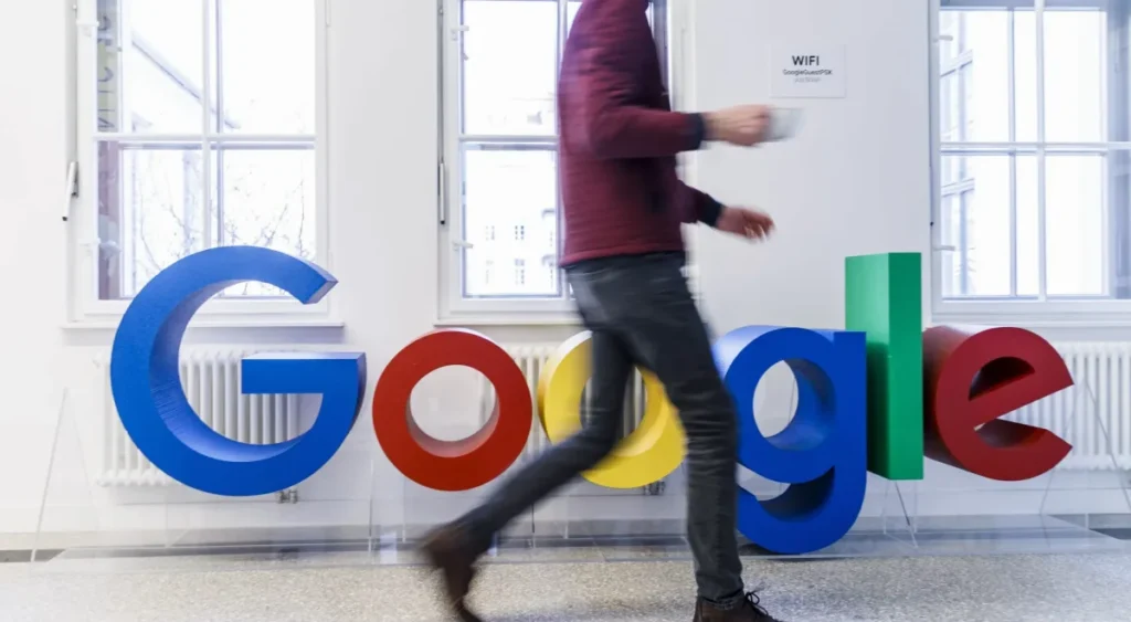
Google’s legendary company culture isn’t just about free food and beanbag chairs. It’s heavily reinforced by design.
Their “Googleplex” campuses are famously vibrant and creatively designed to encourage collaboration. Their internal branding is just as strong as their external branding. From the onboarding process for “Nooglers” to their internal tools and company swag, everything is infused with the playful, colourful, and innovative Google identity. This makes employees feel part of something special, making them the company’s most powerful advocates.
Problem 7: Your Website Doesn’t Convert Visitors (The Leaky Bucket Problem)
The Business Symptom: Lots of Traffic, Very Few Sales or Leads.
Your SEO is working. Your ads are driving clicks. People are coming to your website… and then they’re leaving. Your digital marketing budget is a leaky bucket, pouring traffic onto a website that fails to capture value.
You don’t have a traffic problem; you have a conversion problem.
The Design Solution: Conversion-Centred Web Design (UI/UX).
Your website is not a brochure; it’s a tool designed to achieve a specific business goal. Conversion-centred design ruthlessly eliminates friction and guides the user toward that desired action.
This means a strong visual hierarchy that draws the eye to the call-to-action (CTA). It means using colour, contrast, and whitespace to make the next step obvious. It requires simple, straightforward navigation. It demands a mobile-first design that works flawlessly on any device. Every element on the page should either support the user’s journey to conversion or be removed.
Case in Point: Dropbox.

The original Dropbox homepage is a masterclass in conversion-centred design. It was absurdly simple.
A short, charming explainer video showed exactly what the product did, a single sentence of benefit-driven copy, and a big, blue “Try Free for 30 days” button. That’s it. There were no competing navigation links, feature lists, or blog posts to distract the user. The entire design focused on surgical precision in one action. This frictionless experience was a major driver of their explosive early growth.
If your website leaks customers, a strategic redesign might be the answer. Request a quote to see how we can help plug the leaks.
Design is Not the Paint Job. It’s the Engine.
Stop thinking about design as a final, cosmetic touch-up. It is a fundamental, strategic part of your business.
A bigger marketing budget or a new sales script does not solve the problems of invisibility, confusion, distrust, and inaction. They are solved by clarity, and design is the ultimate tool for creating clarity.
The next time you face a stubborn business problem, don’t just ask your marketing team what to do. Ask a different question: “What business problem are we trying to solve, and how can design be the solution?”
That simple shift in perspective will change everything.
FAQs on Graphic Design Solutions
What is the first step in solving a business problem with graphic design?
The first step is to diagnose the problem correctly. Before you think about visuals, you must clearly define your business challenge—is it low brand recognition, poor user conversion, or something else? Only then can you develop a design strategy to address it.
How is a brand identity different from just a logo?
A logo is a single mark. A brand identity is a complete visual system. It includes the logo and the specific colour palette, typography, imagery style, and guidelines for how all these elements are used together to create a consistent and recognisable brand experience.
Can good graphic design really allow me to increase my prices?
Yes. Strategic design crafts a premium experience across all touchpoints (packaging, website, materials). This builds a perception of high quality and value in the customer’s mind, which can justify a higher price point.
How much does a professional brand style guide cost?
The cost varies widely based on the business’s complexity and the guide’s depth. It can range from a few thousand pounds for a basic startup guide to tens of thousands for a comprehensive corporate system.
What’s the difference between UX and UI design?
UX (User Experience) is the overall feel and effectiveness of the experience—how easy and pleasant it is to use a product. UI (User Interface) is the specific visual layout of the screens, buttons, and interactive elements the user engages with. UX is the strategy and journey; UI is the visual execution.
How do I measure the ROI of graphic design?
You measure it against the business problem you set out to solve. If the problem was low conversion, you measure the increase in your website’s conversion rate. You can track metrics like brand recall in surveys or direct and branded search traffic if there is low brand recognition.
Is it better to follow design trends or create a timeless look?
Creating a timeless look rooted in your unique brand strategy is always better. Chasing trends ensures your design will look dated quickly and makes you blend in with everyone else following the same trend.
Why is consistent branding so crucial for trust?
Consistency creates familiarity and reliability. When a brand looks and feels the same everywhere, it signals professionalism and stability, which makes customers feel more secure in their decision to engage with you.
What are the key elements of conversion-centred web design?
The key elements are a single, clear call-to-action (CTA) per page, a strong visual hierarchy that guides the eye to the CTA, intuitive and straightforward navigation, ample white space to reduce cognitive load, and a frictionless process for the user to complete the goal.
Can a small business afford strategic graphic design?
A small business cannot afford bad graphic design. Strategic design is an investment, not an expense. A well-designed brand identity and website will pay for itself through increased sales, better customer loyalty, and saved marketing dollars.
What is ‘information design’?
Information design is the practice of presenting complex information in a way that is clear, efficient, and easy to understand. It uses tools like charts, graphs, diagrams, infographics, and straightforward typography to make data and complex ideas accessible.
How does packaging design influence consumer behaviour?
Packaging is often the first physical interaction a customer has with a brand. It influences behaviour by grabbing attention on a crowded shelf, communicating the product’s value and personality, and creating a memorable unboxing experience that can build loyalty.
Your business challenges deserve real solutions. If you’re ready to stop putting plasters on symptoms and start fixing the root problems, it might be time to look at your business through a design lens.
Explore the graphic design services we offer at Inkbot Design, or browse our blog for more no-nonsense advice on building a brand that works. Design is how you solve problems you didn’t know you had.
