Newsletter Design: The Guide to Layouts That Convert
Most business owners treat newsletter design like they are dressing a shop window. They obsess over pretty colours, throw in a high-resolution hero image, and assume the job is done.
Then they wonder why their open rates are abysmal, and their click-through rates (CTR) are nonexistent.
Email clients do not care about your aesthetic sensibilities.
Outlook 2019 uses Microsoft Word’s rendering engine to display HTML, which means that the beautiful, complex layout you built in Photoshop will likely look like a broken jigsaw puzzle by the time it hits a B2B prospect’s inbox. Gmail will clip your message if the code exceeds 102KB, hiding your unsubscribe link and tracking pixel.
Design in email marketing is not art; it is engineering. It is about navigating a minefield of technical constraints to deliver a message that is legible, accessible, and actionable.
This guide tears down the facade of “pretty emails” and rebuilds your understanding of what actually works.
- Design for the worst-case client like Outlook using table-based layouts and conditional comments for consistent renderability.
- Use a single-column, mobile-first layout at 600–640px max to ensure readability and avoid complex stacking issues.
- Keep HTML lean under 102KB to prevent Gmail clipping, preserve tracking and unsubscribe links, and improve deliverability.
- Use live text, system font stacks, alt text for images, and a 60:40 text-to-image ratio for accessibility and spam avoidance.
- Build bulletproof HTML CTAs with minimum 44x44 tappable area and test for Dark Mode to avoid inverted or invisible elements.
What is Newsletter Design?
Newsletter design is the strategic arrangement of visual and textual elements within an email aimed at maximising readability, deliverability, and user action. Unlike web design, which relies on modern standards (HTML5/CSS3), newsletter design operates in a restrictive environment that requires support for legacy code (tables, inline CSS) to function across fragmented platforms, such as Gmail, Apple Mail, and Outlook.
The Three Core Components:
- Structure: The architectural grid (usually a single column for mobile dominance) that holds content together.
- Hierarchy: The visual cues (size, weight, colour) that guide the eye to the primary Call to Action (CTA).
- Renderability: The technical code quality ensures the email displays correctly across different devices and operating systems.
The Technical Reality: Why Your Design Breaks
Before we discuss colours or fonts, we must address the infrastructure. If your email looks like a disaster in Outlook, you have just wasted your marketing budget.
The Rendering Engine Wars
Web browsers use sophisticated engines (like WebKit or Blink) to render websites. Email clients are not so kind. The ecosystem is fragmented.
- Apple Mail (iOS/macOS): The gold standard. It uses WebKit and supports modern CSS, video, and even some interactivity. It offers a false sense of security.
- Gmail: Aggressive about stripping styles. It historically blocked <style> blocks in the <head>, forcing designers to inline CSS. While this has improved, it remains quirky, particularly with image gaps and font rendering.
- Microsoft Outlook (Windows): The villain of the story. Versions from 2007 to 2019 use Microsoft Word to render HTML. This means no support for standard div positioning, floats, or modern CSS grids.
The Fix: You cannot design for the best-case scenario (iPhone). You must design for the worst-case scenario (Outlook on Windows). This means using “Ghost Tables”—conditional comments that serve rigid table structures to Outlook while allowing fluid divs for everyone else.

The Gmail Clipping Limit
This is a silent killer. If the HTML file size of your email exceeds 102KB, Gmail clips the bottom of the message. Users see a link saying “[Message clipped] View entire message”.
Why this is catastrophic:
- Tracking Failure: The tracking pixel is usually at the bottom. If it doesn’t load, your open rate data is worthless.
- Legal Risk: The “Unsubscribe” link is also at the bottom. If users cannot see it, they cannot leave legally. They will mark you as spam instead, which can damage your domain reputation.
- Broken UX: Your footer links and final CTA are gone.
We advise clients to keep code lean. Minify your HTML and avoid pasting rich text directly from Word, as this adds kilobytes of unnecessary bloat.
Layout Architecture: The Single-Column Standard
Complex multi-column layouts are a relic of the desktop era. With email marketing shifting heavily toward mobile consumption, the single-column layout is the only logical choice for 90% of newsletters.
The 600px Constraint
Traditionally, email width is capped at 600px (or 640px). This dates back to when monitors were 1024px wide, and email clients had sidebars.
- Is it still relevant? Yes. While screens are wider, the reading pane in desktop clients is often narrow.
- The Strategy: Stick to a maximum width of 600-640px for the container. On mobile, this scales down to 100% width fluidly.

The F-Pattern vs. The Z-Pattern
Jakob Nielsen’s eye-tracking studies established the F-Pattern for text-heavy content. Users scan from top to bottom, then down the left side.
- F-Pattern: Best for text-heavy newsletters (like Substack or B2B updates). Place your logo top left, headline top, and body text aligned left.
- Inverted Pyramid: Best for promotional/e-commerce emails.
- Top: captivating headline/hero image.
- Middle: Concise copy explaining the ‘Why’.
- Bottom: A singular, clear CTA button.
Consultant Note: Never centre-align paragraphs of text longer than three lines. It creates ragged edges on both sides that the eye struggles to track. Keep body copy left-aligned for legibility.
Typography: System Fonts vs. Web Fonts
This is where brand consistency often struggles against technical limitations. You want your newsletter to use “Circular Std” or “Proxima Nova” because they are your brand fonts. Outlook does not care.
The Fallback Stack
You must define a “font stack” in your CSS. If the client cannot load your custom web font, it falls back to the next safe option.
The Wrong Way:
font-family: ‘BrandFont’, sans-serif;
The Right Way:
font-family: ‘BrandFont’, Helvetica, Arial, sans-serif;
The “Times New Roman” Glitch
Outlook has a notorious bug. If a web font fails to load, or if you don’t wrap your font styles correctly in conditional tags, Outlook reverts everything to Times New Roman. It ignores your fallback request for Arial.
To prevent this, you often need to force the issue using specific MSO (Microsoft Office) conditional CSS classes that hide the web font from Outlook entirely, serving it Arial directly.
Images: The Alt-Text Imperative
Many users block images by default. If your entire offer is locked inside a JPG, those users see a blank box. This is why “image-only” emails are a massive failure point.
The Ratio Rule
Maintain a text-to-image ratio of at least 60:40 (60% text). Spam filters analyse the content of your email. If they see a single large image and very little text, they categorise it as a low-quality promotional blast or spam.
Accessibility and Alt Text
You must include alt attributes on every image.
- Functional: If the image is a button, the alt text should say “Buy Now”.
- Descriptive: If it shows a product, describe it. “Black leather ergonomic office chair.”
- Null: If it is a decorative swoosh or divider, use alt=”” so screen readers skip it.
Data Point: According to the Pathwire (Sinch) State of Email Deliverability, valid HTML and a balance of image-to-text are top technical factors influencing inbox placement.
The Call to Action (CTA): Touch Targets Matter
A text link is often insufficient for the primary goal. You need a button. But not just any button—a “Bulletproof Button.”
Bulletproof Buttons
A bulletproof button is built using HTML and CSS (background colours, padding, borders), not an image.
- Image Button: Fails if images are blocked.
- Code Button: Always renders. Even if styles are stripped, the text remains clickable.
The 44×44 Pixel Rule
Apple’s Human Interface Guidelines recommend a minimum tappable area of 44 x 44 points (pixels). Fingers are clumsy. If your “Read More” link is a tiny 12px text crowded by other links, mobile users will mis-click, get frustrated, and leave.
Comparison: CTA Implementations
| Feature | The Amateur Way | The Professional Way |
| Construction | An image of a button (JPG/PNG). | HTML/CSS Table cell with background colour. |
| Resilience | Disappears if images are blocked. | Visible and clickable 100% of the time. |
| Size | Arbitrary visual size. | Min-height 44px, generous padding. |
| Copy | “Click Here” | “Download the Report” (Action-Oriented). |
Dark Mode: The New Nightmare
In 2026, Dark Mode is no longer a niche setting; it has become a standard user preference across iOS, Android, and Windows. Roughly 35-40% of users view emails in Dark Mode.
The Inversion Problem
Email clients handle Dark Mode differently.
- Partial Invert: Detects light backgrounds and turns them dark, and dark text turns light.
- Full Invert: Inverts everything aggressively.
Common Failures:
- Black Logos: If you use a black PNG logo with a transparent background, it disappears completely against the dark background of Dark Mode. Fix: Add a white stroke/glow around the logo or use a version with a light background fill.
- Transparent PNGs: Icons with dark strokes vanish.
- Hard-coded Colours: If you force a specific hex code background without prefers-color-scheme media queries, the text might invert while the background stays white, or vice versa, resulting in illegible contrast.
The State of Newsletter Design in 2026
The landscape has shifted in the last 18 months. We are seeing a shift away from the “mini-website” newsletter toward the “personal letter” aesthetic, driven largely by the success of platforms like Substack and a growing fatigue with corporate gloss.
BIMI and Verified Logos
Brand Indicators for Message Identification (BIMI) is no longer optional for serious brands. It allows your logo to appear in the inbox avatar slot next to the subject line. This requires DMARC authentication and a Verified Mark Certificate (VMC). It is a trust signal that increases open rates by visually validating the sender before the email is even opened.
Hyper-Personalisation Blocks
Static newsletters are dying. We now use dynamic content blocks that change based on user data. If a subscriber bought “Product A” last week, the design dynamically inserts a module for “Product B” in the newsletter, while a new lead sees a “Welcome” module in the same slot. This requires tight integration between your design template and your CRM/ESP (Email Service Provider).
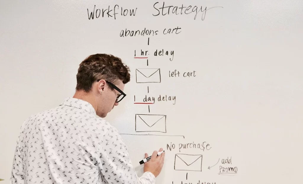
Consultant Note: This is where Drip Marketing becomes powerful. You aren’t just designing one email; you are designing a modular system that adapts to the user’s journey.
I once audited a client—a high-end architectural firm—who insisted on sending their newsletter as a single, sliced PDF exported to images. They wanted “pixel perfection.”
Their open rate was 12%. Their deliverability was atrocious because ISPs flagged the image-heavy emails as spam. Worst of all, the text on the PDF was unreadable on mobile devices without pinching and zooming.
We stripped it down. We built a robust HTML template with live text, a standard single-column layout, and 44px buttons. We used system fonts (Helvetica) instead of their custom architect font.
The result: Open rates jumped to 28% and clicks increased by 200%.
Nobody cared that the font wasn’t “perfect.” They cared that they could actually read the content on their commute. Design serves the content, not the designer’s ego.
The Verdict
Effective newsletter design is about restraint. It is about understanding that you are renting space in a chaotic, hostile environment (the inbox).
If you prioritise a fancy layout over a readable mobile experience, you fail. If you prioritise a 2MB hero image over loading speed, you fail.
Your Checklist:
- Mobile-First: Single column, 600px width.
- Live Text: Never trap essential messaging in images.
- Bulletproof CTAs: HTML-based buttons, big targets.
- Outlook Safe: Use table structures and conditional comments.
- Dark Mode Ready: Test your logos and icons on black backgrounds.
Stop trying to win design awards with your email. Start trying to win clicks.
Next Step: Are Your Current Templates Bleeding Revenue? If you need a forensic audit of your digital strategy or a complete overhaul of your brand communications, request a quote today. Or, explore our comprehensive digital marketing services to discover how we build systems that drive conversions.
Frequently Asked Questions (FAQ)
What is the ideal width for a newsletter design?
The industry standard is between 600px and 640px. This width ensures that the content fits comfortably within the preview panes of desktop clients, such as Outlook and Apple Mail, while allowing for easy scaling down on mobile devices. Going wider often results in horizontal scrolling, which kills engagement.
Why do my images look broken in Outlook?
Outlook for Windows uses Microsoft Word to render HTML, which has very limited support for modern CSS and image styling. It often ignores padding or margins on images. To fix this, you may need to use VML (Vector Markup Language) or reset specific image properties inline. Also, ensure you aren’t using file formats that Outlook dislikes, such as WebP—stick to JPG or PNG.
Should I use web fonts in my newsletter?
You can, but with caution. Support is limited (Apple Mail supports them; Gmail and Outlook mostly do not). You must always code a “fallback stack” (e.g., font-family: ‘Open Sans’, Helvetica, Arial, sans-serif) so that when the web font fails, the email remains legible using a standard system font.
How does Dark Mode affect email design?
Dark Mode inverts colours, turning light backgrounds dark and dark text light. This can make black logos disappear if they have transparent backgrounds. It can also create low-contrast issues if you hard-code colours without using CSS media queries (@media (prefers-color-scheme: dark)). Always test your design in both modes to ensure optimal performance.
What is the “Gmail Clipping” limit?
Gmail clips any email message where the HTML file size exceeds 102KB. This cuts off the remainder of the email, including your tracking pixel and unsubscribe link. To avoid this, minify your code, remove redundant styles, and never paste rich text directly from a word processor into your email editor.
Is it better to use a single-column or multi-column layout?
A single-column layout is superior for the vast majority of newsletters. It translates perfectly to mobile screens without complex stacking logic. Multi-column layouts often break on mobile or become too small to read, requiring users to zoom in, which creates friction.
How many CTAs should a newsletter have?
Ideally, one primary Call to Action (CTA). The “Paradox of Choice” suggests that providing users with too many options can lead to paralysis. If you must have multiple links, ensure the primary goal uses a prominent button style, while secondary links are subtle text hyperlinks.
Why is “Image-Only” design bad for newsletters?
Image-only emails (where text is part of the image) are inaccessible to screen readers (violating ADA/GDPR compliance), cannot be searched by the user, and are often blocked by default in email clients. Furthermore, spam filters aggressively penalise image-only emails due to their low text-to-image ratio.
What is a “Bulletproof Button”?
A bulletproof button is a Call to Action built using HTML code (table cells, background colours) rather than an image. This ensures the button remains visible and clickable, even if the email client blocks images by default, thereby guaranteeing the functionality of your most important link.
How can I prevent my newsletter from being sent to spam?
From a design perspective, maintain a 60:40 text-to-image ratio, keep the code clean and lightweight (under 102KB), include a physical address and a working unsubscribe link, and authenticate your domain using SPF, DKIM, and DMARC protocols. Avoid “spammy” visual tactics, such as using all-caps red text.