DPI vs PPI: What’s the Real Difference and Why It Matters
You’ve probably scratched your head over DPI and PPI more times than you’d care to admit. I know I have.
One minute, you’re exporting a logo for print; the next, your designer asks about pixel density, and suddenly, you’re drowning in technical jargon that sounds like it needs a PhD to decode.
Here’s the thing, though – understanding the difference between DPI vs PPI isn’t just technical nitpicking. The difference between crisp, professional-looking designs and blurry disasters makes your brand look like it was cobbled together on a dial-up connection.
- DPI (Dots Per Inch) is crucial for print quality, affecting image sharpness and detail.
- PPI (Pixels Per Inch) relates to digital displays, defining pixel density on screens.
- A 300 DPI standard is essential for professional printing, ensuring crisp designs.
- Proper understanding of DPI and PPI prevents costly design missteps and enhances brand perception.
- Designers must navigate different resolutions for various outputs, ensuring optimal image quality across formats.
What Is DPI?
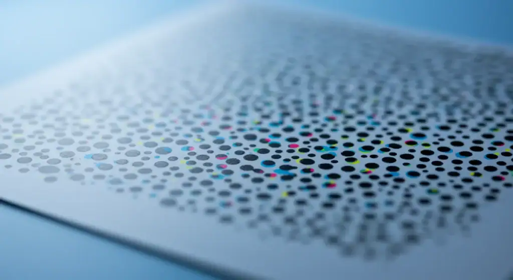
DPI stands for Dots Per Inch, and this one’s all about printing. Think of it as how many tiny ink dots your printer can squeeze into one inch of paper. The more dots, the finer the detail, the sharper your image looks when sitting in someone’s hands.
Most commercial printers work at 300 DPI as standard. Why 300? Because that’s the sweet spot where human eyes can’t distinguish individual dots anymore. Go lower and see those telltale pixelated edges that scream “amateur hour.”
Here’s where it gets interesting – your home inkjet might boast 1200 DPI or even higher. Sounds impressive, right? Well, not quite. That’s often marketing speak for how the printer’s nozzles are arranged, not the actual image resolution you need.
Print Resolution Standards That Matter
For offset printing (the fancy commercial stuff), stick to these numbers:
- 300 DPI for photographs and detailed graphics
- 1200 DPI for line art and text-heavy designs
- 150 DPI minimum for large format prints (billboards, banners)
I’ve seen countless projects delayed because someone uploaded a 72 DPI image, thinking it would work for print. Trust me, that’s a conversation you don’t want to have with your client at the deadline.
PPI: The Digital Side of Things
PPI means Pixels Per Inch. This one’s about screens, monitors, phones, tablets, and anything with a digital display. Each pixel is a tiny coloured square, and PPI tells you how many of these squares are packed into one inch of your screen.
Your standard desktop monitor typically runs at 96 PPI. Smartphones? They’re pushing 300-400 PPI these days. Apple’s Retina displays? Around 326 PPI for phones and 264 PPI for tablets.
But here’s what trips people up – screen resolution and pixel density aren’t the same thing. A 4K monitor could have a lower PPI than your phone if it’s physically bigger. Mental, isn’t it?
Display Technology Breakdown
Let’s get specific about monitor resolution standards:
- 1920×1080 (Full HD) – still the workhorse for most designs
- 2560×1440 (QHD) – becoming standard for professional work
- 3840×2160 (4K) – necessary for detailed photo editing
- 5120×2880 (5K) – overkill for most, essential for colour-critical work
The key insight? Higher resolution doesn’t automatically mean better image quality – it depends on viewing distance and screen size.
Where the Confusion Actually Comes From
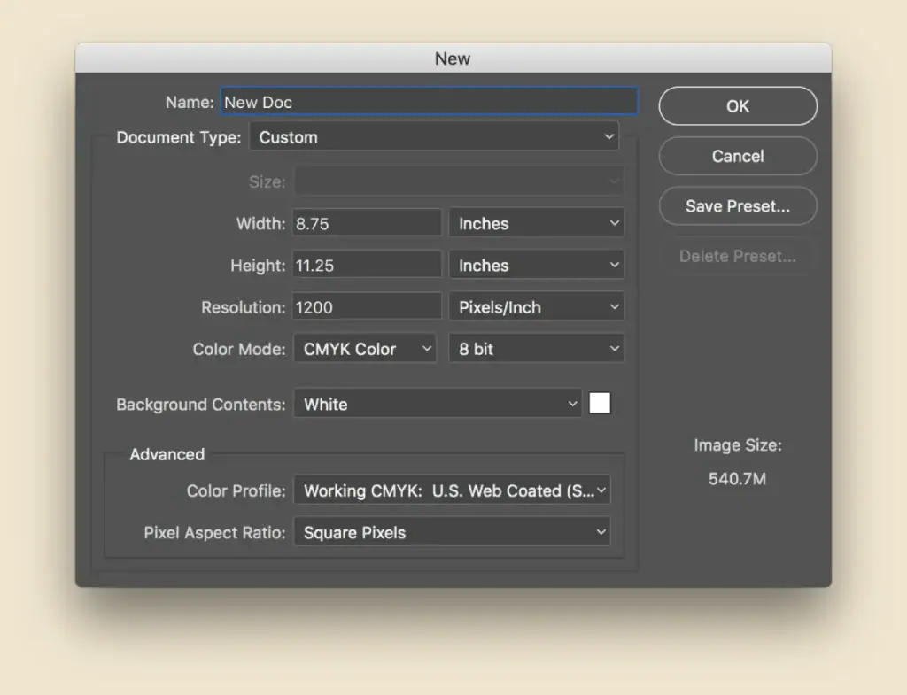
Everyone gets tangled up here – software often uses these terms interchangeably, even when they shouldn’t. Open Photoshop, create a new document, and it asks for “resolution” in pixels per inch. But you’re working digitally, so why is it talking about inches?
The answer lies in print workflow. Photoshop needs to know how your digital creation will translate to physical dimensions. Set your document to 300 PPI, and Photoshop can calculate how big your image will print at various sizes.
The Software Translation Problem
Different programs handle this differently:
- Photoshop uses PPI for digital work but calls it “resolution.”
- Illustrator distinguishes between screen and print settings
- InDesign focuses on output device specifications
- Web browsers ignore PPI entirely (they only care about pixel dimensions)
This inconsistency across photo editing software creates the confusion that haunts designers everywhere.
Real-World Scenarios Where This Matters
Scenario 1: Website to Print Disaster
You’ve got a brilliant logo that looks perfect on your website. The client loves it and wants it on business cards. You grab the web version (72 PPI, 200×200 pixels) and send it to print.
Result? It’s a blurry mess roughly the size of a postage stamp.
The fix: Your logo needs to be 300 DPI and large enough for the intended print size. A business card logo might need 600×600 pixels at 300 DPI to print at 2×2 inches.
Scenario 2: The Retina Display Challenge
Your website images look crisp on older monitors but fuzzy on newer Retina displays. What’s happening?
Retina screens display images at 2x pixel density. Your 100×100 pixel image gets stretched to 200×200 pixels, creating that soft, blurry appearance.
The solution: Create images at 2x their display size (called @2x assets) or use SVG for logos and icons.
Scenario 3: Professional Printing Requirements
You’re designing a magazine spread. The printer asks for CMYK, 300 DPI, with a 3mm bleed. Your image is RGB, 150 DPI, and perfectly sized.
This isn’t just wrong – it will cost money to fix.
What you need: Images converted to CMYK colour space, upsampled to 300 DPI (or re-sourced at higher resolution), with proper bleed areas added.
The Technical Deep Dive: How Resolution Works
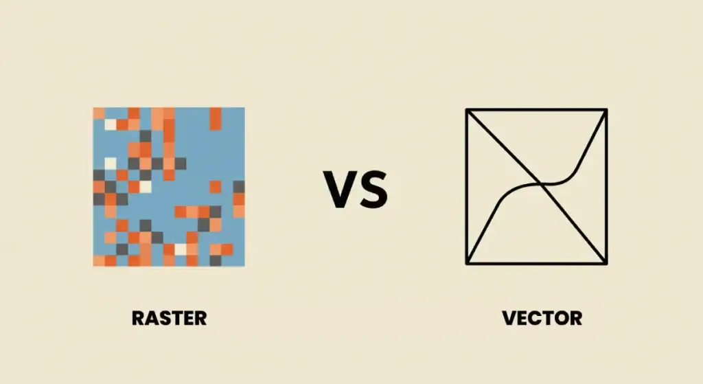
Raster vs Vector: The Fundamental Difference
Raster images (JPEG, PNG, TIFF) are made of pixels. Zoom in far enough, and you’ll see individual coloured squares. These have fixed resolutions – blow them up too much, and quality suffers.
Vector images (SVG, AI, EPS) are made of mathematical paths. They scale infinitely without quality loss. Logos should be created as vectors first, then rasterised for specific uses.
Image Scaling Mathematics
Here’s the maths that matters: if you have a 1000×1000 pixel image at 300 PPI, it’ll print at 3.33 inches square (1000 ÷ 300 = 3.33).
Do you want it to print larger? You need more pixels, or you accept a lower resolution. Want to print at 5 inches? You’d need 1500×1500 pixels to maintain 300 DPI quality.
Compression and Quality Relationships
File size and resolution have a complex relationship. A high-resolution image with heavy JPEG compression might look worse than a lower-resolution image with minimal compression.
For web use, focus on optimised file sizes. For print, prioritise uncompressed quality. These aren’t competing goals – they’re different tools for different jobs.
Modern Challenges: Responsive Design and Multi-Device Reality
The Multi-DPI World We Live In
Today’s designer needs to think about the following:
- 72 PPI for basic web displays
- 96 PPI for standard monitors
- 150 PPI for larger screens
- 300+ PPI for mobile devices
- 300 DPI for print output
That’s five different resolution targets for a single design project. No wonder everyone’s confused.
CSS Pixels vs Device Pixels
Web designers work with CSS pixels – a standardised unit that browsers translate to actual screen pixels. A 100px wide element might display using 200 device pixels on a Retina screen.
This abstraction layer helps, but it means web design resolution isn’t as straightforward as it once was.
Practical Guidelines for Different Design Types
Logo Design Resolution Guidelines
Create your logo in vector format first. Then export:
- SVG for web use (infinite scalability)
- PNG at 300 PPI for print applications
- PNG at 72 PPI for basic digital use
- @2x PNG versions for Retina displays
Photo Resolution for Different Uses
Social media: 72-150 PPI usually sufficient (platforms compress anyway)
Website headers: 150-200 PPI for quality without massive file sizes
Print brochures: 300 PPI minimum, 600 PPI for fine detail
Large format printing: 150-200 PPI (viewing distance compensates)
Screen Design Resolution Standards
Mobile design: Work at 375×667 (iPhone baseline), then scale up.
Desktop design: 1920×1080 remains the safe standard
Tablet design: 768×1024 covers most iPad-size devices
Consider that your design must work across all these formats – responsive design isn’t optional.
Common Mistakes That Cost Time and Money
Mistake 1: Upsampling Low-Resolution Images
Photoshop’s “Image Size” dialogue can increase pixel dimensions, but it can’t create detail that wasn’t there originally. Upsampling a 72 PPI web image to 300 PPI doesn’t magically improve quality – it just makes a larger, blurry image.
Mistake 2: Ignoring Colour Space
RGB looks different from CMYK. That vibrant blue on your monitor might print as muddy purple. Always work in the colour space that matches your final output.
Mistake 3: Wrong Export Settings
Exporting for the web versus exporting for print requires different settings:
- Web: RGB, 72-150 PPI, compressed file formats
- Print: CMYK, 300 DPI, uncompressed or lightly compressed
Mix these up, and you’ll be redoing work.
Mistake 4: Ignoring Viewing Distance
A billboard doesn’t need 300 DPI because nobody views it from 12 inches away.
Large format printing at 150 DPI looks perfect from typical viewing distances and saves enormously on file sizes and printing costs.
Tools and Software: Getting the Settings Right
Photoshop Resolution Settings
Creating new documents: Always specify your intended output. Web document? Set to 72 PPI. Print project? 300 PPI from the start.
Image sizing: Use “Preserve Details 2.0” for upsampling, but remember – you can’t create detail from nothing.
Illustrator for Print and Web
Document setup: Choose “Print” or “Web” preset – this affects default colour spaces and resolution settings.
Export options: “Export for Screens” automatically gives you multiple resolution options. Brilliant for responsive design workflows.
InDesign Professional Workflow
Links panel: Shows the resolution of placed images. Red warning? Your image is too low-res for quality printing.
Print presets: Create custom export presets for different printers and specifications.
The Future: 4K, 8K, and Beyond

Higher Resolution Displays
As 4K monitors become standard, we’re seeing new challenges. Content that looked fine at 1080p appears soft at 4K. The solution isn’t just higher resolution – it’s a scalable design system.
Responsive Image Technologies
CSS background image with multiple sources lets browsers choose the appropriate resolution.
WebP and AVIF formats provide better compression than JPEG while maintaining quality.
AI-Powered Upscaling
Modern AI upscaling tools can genuinely improve low-resolution images. While not magic, they’re significantly better than traditional interpolation methods.
Working with Professional Printers

Understanding Print Specifications
Commercial printers have specific requirements:
- Bleed areas (usually 3-5mm beyond trim)
- Safe zones for important content
- Colour profiles for consistent output
- Resolution requirements based on the printing method
Offset vs Digital Printing
Offset printing typically requires 300 DPI and CMYK colour space.
Digital printing is more forgiving but still benefits from proper resolution.
Screen printing has different requirements again, often needing simplified colour palettes and specific resolution guidelines.
File Delivery Best Practices
Supply native design files when possible (AI, INDD, PSD). Export high-resolution PDFs with print-ready settings. Include a low-resolution proof for reference.
Always communicate with your printer before starting – their requirements might differ from general guidelines.
Getting the Business Impact Right
Why This Matters for Brand Consistency
Poor resolution choices damage brand perception. Blurry logos suggest carelessness. Pixelated images imply amateur execution. Your brand deserves better.
Cost Implications
Getting the resolution wrong costs money:
- Reprinting due to quality issues
- Delayed timelines while sourcing better images
- Lost opportunities when materials look unprofessional
Client Relationship Management
Understanding resolution requirements positions you as the expert. Clients trust designers who can navigate these technical details confidently.
When you need professional design work that gets these details right every time, Inkbot Design’s team has the experience to handle complex print and digital requirements seamlessly.
Quick Reference: Resolution Guidelines
Print Projects
- Business cards: 300 DPI minimum
- Brochures: 300 DPI for photos, 600 DPI for fine text
- Banners: 150 DPI (large viewing distance)
- Magazines: 300 DPI standard
Digital Projects
- Website images: 72-150 PPI
- Social media: Platform-specific optimisation
- Email newsletters: 72 PPI, optimised file sizes
- Digital presentations: Screen resolution dependent
Mobile Considerations
- iOS apps: @2x and @3x image sets
- Android apps: Multiple density buckets (mdpi, hdpi, xhdpi, xxhdpi)
- Progressive web apps: Responsive image solutions
DPI vs PPI – Frequently Asked Questions
What’s the difference between DPI and PPI in simple terms?
DPI relates to printing (ink dots on paper), while PPI relates to digital displays (pixels on screens). They are different measurement systems for different output methods.
Can I use a 72 DPI image for print?
Generally, no – 72 DPI images will appear blurry or pixelated when printed. Print requires 300 DPI for sharp, professional results.
Why do my images look blurry on Retina displays?
Retina displays have higher pixel density. Images must be at least 2x their display size to appear crisp on these screens.
What resolution should I use for large banners?
150 DPI is usually sufficient for large-format printing because banners are viewed from greater distances. Higher resolution creates unnecessarily large files.
How do I check if my image has enough resolution for print?
Divide pixel dimensions by the intended print size—for example, a 1500×1500 pixel image prints at 5×5 inches at 300 DPI (1500÷300=5).
Should logos be created as raster or vector files?
Always create logos as vector files first. This allows infinite scaling without quality loss, then export to raster formats as needed for specific uses.
What’s the best resolution for website images?
72-150 PPI works for most web images but focuses more on pixel dimensions and file size optimisation. Modern responsive design requires multiple image sizes.
Can I increase image resolution in Photoshop?
You can increase pixel dimensions, but you can’t add detail that wasn’t captured originally. Upsampling works best with modern AI-enhanced algorithms but has limits.
Why do my RGB images look different when printed?
Monitors display in RGB colour space, while printers use CMYK. Always convert to CMYK and proof colours before final printing.
What resolution do I need for Instagram posts?
Instagram recommends 1080×1080 pixels for square posts. The platform compresses images, so higher resolution doesn’t constantly improve final quality.
How does viewing distance affect required resolution?
Objects viewed from greater distances need lower resolution. A billboard viewed from 100 metres needs a much lower DPI than a business card viewed from arm’s length.
What’s the minimum resolution for professional printing?
300 DPI is the standard minimum for commercial printing. Some applications accept 150 DPI, but quality may be compromised for detailed images.
Understanding DPI vs PPI isn’t just technical knowledge – it’s essential for delivering professional results that make your work stand out. Whether designing for print or digital, getting the resolution right ensures your creative vision translates perfectly to the final output.
Ready to create designs that look brilliant across every medium? Please request a quote from Inkbot Design and let our team handle the technical details while you focus on the creative magic. Because at the end of the day, shouldn’t your designs be measured in impact rather than just dots per inch?

