Cultural Colour Meanings: Global Branding Considerations
While the physics of light are constant, the psychological interpretation of that light is entirely subjective, deeply rooted in history, religion, and politics.
For entrepreneurs and brand managers, ignoring cultural colour meanings isn’t just an aesthetic oversight—it is a financial liability.
This guide moves beyond the basic “Red means love” fluff. We are examining the challenging, commercial realities of deploying brand assets across borders.
- Colour meanings are culturally learned layers; design for cultural context, not just biological reactions.
- Maintain a rigid core identity and flexible supporting palette to balance global equity with local relevance.
- Test palettes per market—consider substrate, screens, and local taboos to avoid costly brand misreads.
What Are Cultural Colour Meanings?
At its core, cultural colour meaning refers to the specific associations, emotions, and symbolic values that different societies attach to specific wavelengths of light. These are not biological hard-wiring; they are learned behaviours passed down through centuries of tradition, literature, and religious practice.

To understand this for colour psychology, you must separate three layers of interpretation:
- The Biological Layer: The universal human reaction. Bright red raises heart rates everywhere. Blue lowers it. This is evolutionary.
- The Cultural Layer: The learned tradition. White is typically associated with weddings in the West, but with funerals in the East. This is societal.
- The Personal Layer: Individual preference based on memory. “I hate orange because my school uniform was orange.” This is anecdotal.
Branding fails when it relies on the Biological layer but ignores the Cultural one. You cannot design for the Personal layer (it’s too varied), but you absolutely must design for the Cultural one.
The High Stakes of Colour Localisation
Why does this matter? Because colour is the first thing the brain processes—before shape, before text, and certainly before it reads your “About Us” page.
Research published in Management Decision by Satyendra Singh suggests that up to 90% of snap judgments made about products can be based solely on colour. If that colour contradicts the local cultural expectation of your category, you lose the trust signal before you’ve even made your pitch.
The “Glocal” Branding Paradox
The challenge for modern businesses is the “Glocal” paradox. You need a consistent brand identity to build global equity (think Coca-Cola Red), but you need local relevance to convert customers.
If you change your logo colour for every country, you fracture your brand. If you refuse to adapt your supporting palette, you risk alienation. The solution lies in a rigid core identity with a fluid supporting system.
The Global Color Risk Calculator
Are your brand colors safe for international markets? Select your primary color and target region to perform a high-level cultural awareness check.
Analysis Result
Note: These are broad generalizations. Specific country contexts vary significantly.
Get a Professional Global AuditThe “Red” Paradox: A Case Study in Financial Suicide
Nothing illustrates the risk of cultural colour meanings better than the colour Red. It is the most potent colour in the spectrum, yet its meanings are diametrically opposed depending on your longitude.
The West (USA, UK, Western Europe)
In Western markets, Red is a high-arousal colour associated with:
- Danger/Stop: Traffic lights, warning signs.
- Debt/Loss: “In the red” on a balance sheet.
- Passion/Excitement: Valentine’s Day.
For a bank in London, branding your entire interface in aggressive red suggests instability or danger. It is used sparingly for alerts.

The East (China, Taiwan, Hong Kong)
In Chinese culture, Red (hóng) is the most auspicious colour possible. It represents:
- Luck/Prosperity: Red envelopes (hongbao) given at New Year.
- Stock Gains: A rising stock market board in Shanghai is a sea of red.
- Celebration: Traditional wedding dresses.
The Commercial Implication:
If you release a stock trading app in China that uses “Red for Down” and “Green for Up” (the Western standard), you are fighting centuries of cultural conditioning. You create cognitive dissonance. The user has to “think” to understand the data, increasing the cognitive load and the likelihood they will close the app.
Consultant’s Note: We worked with a logistics firm expanding to South Africa. They used red to signify “urgent/priority” delivery. In local contexts, red was also heavily politicised and associated with mourning in specific tribal histories. While not a total dealbreaker, the “aggression” of the red needed to be tempered with grounding neutrals to avoid looking like a warning label.
Regional Deep Dive: Decoding the Spectrum
To effectively manage your colour contrast and accessibility, you must break the world down by cultural clusters. While generalisations are risky, these patterns hold true for mass-market branding.
1. The Far East (China, Japan, Korea)
Asian markets are high-context cultures where colour symbolism is often derived from nature, religion (Buddhism/Shintoism/Taoism), and linguistic homophones.
- White:
- The Trap: In the West, Whiteness is often associated with purity and cleanliness (think Apple stores and bridal gowns).
- The Reality: In China and Korea, White is traditionally the colour of mourning and death. While modern Western influence has normalised white wedding dresses, plain white packaging with black text can look ominously like a funeral notice.
- Fix: Break up white space with gold foils or red accents to reframe the context from “death” to “premium minimalism.”
- Yellow:
- In Imperial China, Yellow was reserved for the Emperor. It signifies royalty, power, and heroism.
- Japan: Yellow signifies courage and nobility, but in a modern context, can be associated with childishness or safety (school hats).
- Purple:
- In Japan, Purple signifies privilege and wealth. It was historically a forbidden colour for commoners. It is an excellent choice for luxury goods branding in Tokyo.
2. The Middle East (MENA Region)
Here, colour is inextricably linked to Islam and the arid environment.
- Green:
- This is the most sacred colour in Islam, associated with Paradise and the Prophet Muhammad.
- Branding Impact: Using green on disposable items (such as bin bags or foot-level signage) can be perceived as disrespectful. However, for food and finance (Islamic Banking), it is the ultimate trust signal.
- Blue:
- Associated with protection and spirituality (think of the Blue Mosque or the Evil Eye/Nazar talismans used for protection).
- It is a safe, corporate colour, but lacks the “sacred” weight of green.
- Black:
- Often associated with modesty and secrecy, but can also denote high quality and premium service.
3. Latin America
A region of high saturation. Muted, “tasteful” European palettes can effectively disappear here.
- Purple:
- The Trap: In Brazil, Purple is strongly associated with death and mourning (specifically Catholic funeral rites).
- The Reality: While a tech startup might see purple as “creative,” a Brazilian consumer might subconsciously associate it with a funeral home.
- Yellow/Green:
- National pride colours (Brazil). However, be careful not to make your brand look like a cheap knock-off of a football jersey. The shade matters. Forest green and mustard are sophisticated; neon green and lemon are cheap.
4. Africa
Africa is a continent of 54 countries and thousands of distinct cultures. Treating it as a monolith is a fatal error.
- Red:
- In South Africa, red is the colour of mourning for many. In other regions like Ghana, red is also worn at funerals (along with black).
- However, in Nigeria, red can signify vitality and aggression.
- Orange:
- Often associated with the earth and grounding. It is a social, communal colour.
Specific Colour Profiles: The Global Checklist
If you are currently choosing a palette using a colour palette generator, run your primary hex codes through this filter.
Blue: The Global Safety Net?
Blue is statistically the “safest” global colour. It is rarely offensive.
- USA/Europe: Trust, Authority, Tech, Stability (IBM, Facebook).
- China: Immortality, feminine (in some ancient contexts), but modern corporate blue works well.
- India: Associated with Lord Krishna; represents strength and divinity. Also, the colour of the national cricket team—high emotional resonance.
- Israel: Holiness (Flag).
Risk: The only risk with blue is being “boring.” It is the beige of the corporate world. To stand out, the shade (Cyan vs. Navy) is your differentiator.

Yellow: Cowardice or Royalty?
- USA: Caution (Road signs), Cowardice (“Yellow-bellied”), Happiness, Cheapness (discount stickers).
- Egypt: Mourning. (Note: This contradicts the “Black/White” mourning binary).
- France: Jealousy (historically).
- Thailand: The Royal Colour (associated with the late King). It is revered.
Black: Luxury or Death?
- Global Luxury: Chanel, Prada, Mercedes. Black is the universal code for “Premium” because it signals you don’t need to shout to be heard.
- Thailand/Vietnam: Heavy association with death/bad luck if used in isolation.
- The Fix: If you are a luxury brand in Vietnam, use Black but pair it with Gold. The metallic accent shifts the meaning from “Void/Death” to “Opulence.”
The Technical Reality: Print vs. Screen vs. Culture
It is not just about the meaning of the colour; it is about the rendering of it.
In my years dealing with RGB vs CMYK vs Pantone, I have seen brands fail because they didn’t account for substrate quality in emerging markets.
- Paper Quality: If you print a deep “Royal Purple” on low-grade newsprint or uncoated packaging (common in some developing markets to keep costs low), it turns muddy brown. In cultures where brown is associated with dirt or poverty, your premium brand just downgraded itself.
- Screen Calibration: Developing markets are mobile-first, often relying on budget Android devices with screens that have a “cool” (blue) tint. A subtle cream or off-white background might render as a dirty grey on a cheap screen. High contrast is safer for global digital deployment.
The Wrong Way vs. The Right Way
You cannot memorise every taboo. But you can adopt a professional workflow.
| Feature | The Amateur Approach | The Professional (Inkbot) Approach |
| Research | Google’s “What does red mean in Asia?” | Audits specific target markets (e.g., “Red in Fintech vs Retail in Shanghai”). |
| Palette | Uses a single rigid palette for the entire world. | Creates a “Core” (Logo) palette and “Flex” (Marketing) palettes for regions. |
| Testing | Ask the office team if they like it. | Runs A/B tests on landing pages in the specific geo-location before launch. |
| Imagery | Uses stock photos of Western offices. | Adapts photography to match local demographics and colour temperatures. |
| Naming | Ignores colour names. | Checks if the colour name (e.g., “Whitewash”) has negative political connotations locally. |
The State of Cultural Colour in 2026
We are seeing a shift in 2025-2026 driven by Gen Z and the “Global Internet Culture.”
Traditional colour meanings are softening among younger demographics. A 20-year-old in Tokyo and a 20-year-old in London consume the same TikTok trends, the same UI patterns (Dark Mode is universal), and the same global streetwear.
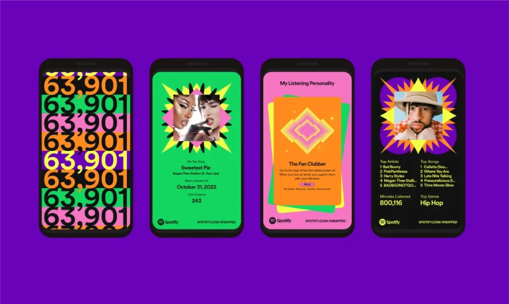
The “Spotify Effect”:
Brands like Spotify or Instagram use gradients and neon colours that don’t belong to any single culture. They are “Digital Native” colours. This is becoming a safe harbour for global brands. If you use hyper-saturated, digital-first colours (such as Electric Purple and Acid Green), you often bypass traditional cultural baggage because these colours didn’t exist in nature or through traditional dyes.
However, this only works for digital brands. If you sell physical goods (such as food, banking, or cars), the traditional roots still hold deep sway.
A Reality Check
I recently audited a UK heritage brand—a tea company—trying to break into the Middle East. Their packaging was distinctly English, featuring a very pale “duck egg blue” with subtle grey text.
In the UK, it looked posh, refined, and expensive.
On a shelf in Dubai, under the intense fluorescent lighting of a supermarket, it looked washed out and clinically sterile. It lacked the vibrancy that local consumers associated with flavour. The local competitors used rich crimsons, golds, and deep emeralds.
The UK brand wasn’t failing because the tea was bad. It was failing because the colour whispered when it needed to sing. We didn’t change the logo. We just darkened the packaging substrate to a rich navy and added gold foiling. Sales ticked up 40% in three months.
The lesson? Context is content.
The Myth of the “Universal” Palette
Stop looking for the one colour that works everywhere. It doesn’t exist. Even White (peace/surrender/death/purity) is fraught with contradictions.
Instead of a universal palette, build a Resilient Palette.
- Primary Brand Colour: Choose one that aligns with your core value (e.g., Blue for Trust). Accept that in 10% of markets, it might be weak, and plan to bolster it.
- Secondary Colours: These are your tools of adjustment. If your Blue logo feels too “cold” for South America, surround it with warm Orange and Yellow photography. If it feels too “sad” for Asia, pair it with lucky Red accents.
The Verdict
Cultural colour meanings are not about memorising a list of superstitions. They are about empathy and market intelligence.
When you ignore the cultural weight of your palette, you are essentially walking into a foreign room and shouting in a language nobody speaks. At best, they ignore you. At worst, you offend them.
Don’t let your brand get lost in translation.
- Audit your assets. Review your top three export markets.
- Check the taboos. Are you selling “Death White” to China or “Funeral Purple” to Brazil?
- Localise the support. Keep the logo, but adapt the campaign background colours.
Would you like me to audit your current brand palette for international risk factors?
Frequently Asked Questions (FAQ)
What is the safest colour for a global brand logo?
Blue is statistically the safest colour for global branding. It is almost universally associated with the sky and sea, transcending cultural boundaries. It typically signifies trust, stability, and intelligence in the US, Europe, and Asia, with very few negative taboos compared to red or white.
Does red always mean luck in China?
In a traditional and celebratory context, yes. Red signifies wealth, luck, and prosperity. However, context is vital. Red text in a formal letter might be seen as a severance notice or a challenge. In modern design, the colour “Communist Red” also carries significant political connotations, making its shade and usage important.
Why is white considered a colour of mourning in some cultures?
In many Eastern cultures (China, Korea, parts of India), white is the colour of bone and is worn at funerals to signify the departure of the soul. This contrasts with the Western association of white with purity and weddings. Brands must be careful with all-white packaging in these regions.
Can I keep my brand colours when expanding internationally?
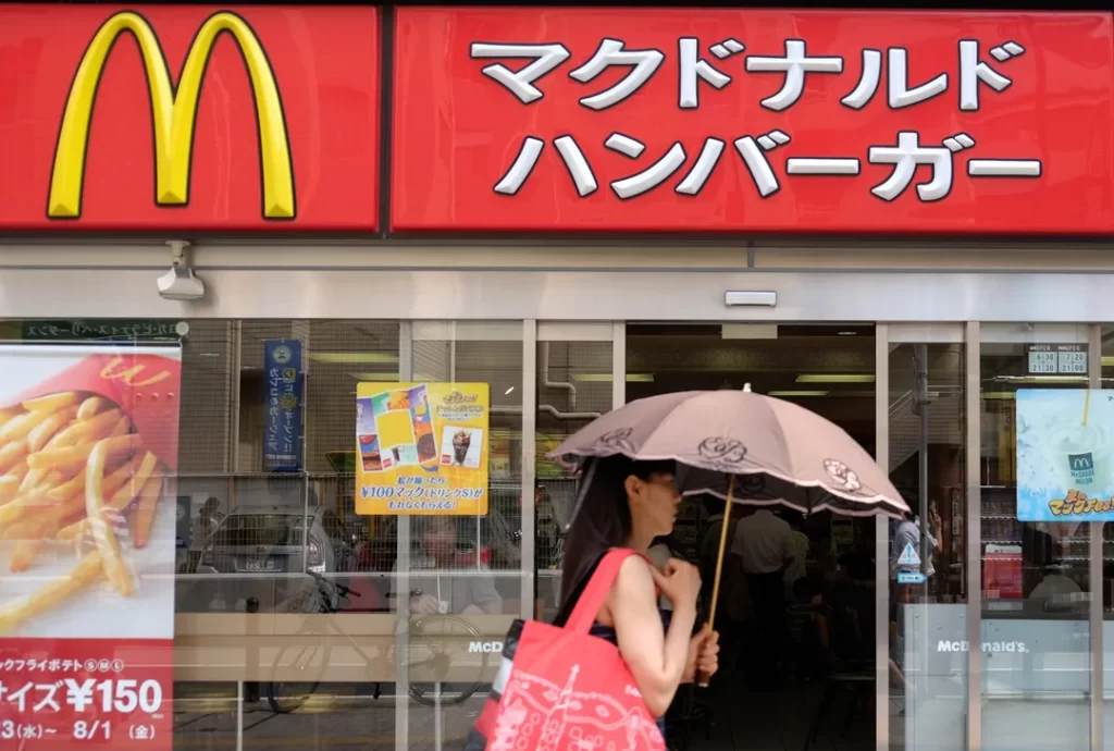
Yes, you should usually keep your primary logo colours to maintain brand equity. However, you should adapt your secondary palette and marketing imagery to fit local tastes. For example, McDonald’s retains its yellow arches but frequently updates store interiors or website backgrounds to match local aesthetics (e.g., Green in Europe).
How does colour meaning affect website conversion rates globally?
Significantly. A red “Buy Now” button may perform well in the US (due to the sense of urgency) and China (due to prosperity), but may be perceived as a warning or error in financial contexts in other regions. Localising CTA (Call to Action) button colours based on local preference can increase click-through rates.
Is purple always associated with royalty?
No. While purple is associated with royalty in the West and Japan (due to the historical cost of the dye), it represents death and crucifixion symbolism in many Catholic Latin American countries like Brazil and Thailand (specifically for mourning widows).
What is the difference between warm and cool colours in branding?
Warm colours (red, orange, yellow) are generally stimulating and draw attention, often used for food or impulse buys. Cool colours (blue, green, purple) are calming and recede, often used for finance, health, and technology. This biological reaction is fairly universal, though cultural overlays modify it.
How do I test if my brand colours are culturally appropriate?
Conduct a “Semiotic Analysis” of your target market. Look at the colours used by the top 5 local competitors. If they all avoid a certain colour (e.g., black), there is likely a cultural reason. Focus groups and A/B testing digital ads in that region are the most reliable methods for gathering insights.
Why is green tricky in the Middle East?
Green is a sacred colour in Islam. While it is excellent for Halal food or Islamic finance (signalling compliance and trust), using it disrespectfully—such as on shoe soles, rubbish bins, or arguably even toilet paper packaging—can cause severe consumer backlash.
Do digital brands need to worry about physical colour meanings?
Yes. Even if you are purely digital, your app icon sits on a screen. If your app notification badges are a colour that signifies “safe” locally rather than “alert,” users might ignore them. Furthermore, screen calibration varies globally; subtle low-contrast colours may become invisible on budget hardware.

