Minimalist Web Design: 5 Principles & Examples for 2026
Minimalism in 2026 isn’t a stylistic preference; it’s a survival strategy.
In an era where human attention spans are shorter than the time it takes for a 404 page to load, your site needs to deliver value instantly.
If you get it wrong, you aren’t being “classy”—you’re invisible.
Ignoring the technical rigour of minimalist design costs you more than just “cool points”; it costs you conversions, SEO rankings, and brand authority.
- Focus on functional minimalism where every element serves a measurable user or business purpose.
- Use purposeful negative space to direct attention and reduce cognitive load for faster conversions.
- Typography and semantic HTML carry brand voice and accessibility; prefer variable fonts and clear hierarchy.
- Design for intent and sustainability: AI-driven UIs, prioritised navigation, and low-carbon, fast-loading pages.
What is Minimalist Web Design?

Minimalist web design is a strategic approach to interface design that prioritises essential elements to reduce cognitive load and enhance user focus.
It is defined by the intentional subtraction of non-functional components, ensuring that every pixel serves a specific, measurable purpose for the user and the business.
The 3 Core Elements:
- Purposeful Negative Space: Using the “emptiness” to direct the eye to the primary Call to Action (CTA).
- Hierarchical Typography: Using scale and weight rather than colour or images to communicate importance.
- Functional Reductionism: Stripping away any feature, plugin, or design flourish that does not directly contribute to the user’s goal.
The Science of Less: Why Minimalism Wins the Brain
Minimalism is not merely a visual style; it is an application of Cognitive Load Theory.
Every element on a webpage—be it an image, a line of text, or a flashing button—requires mental processing power. When a user is overwhelmed by choice or visual noise, they experience “decision paralysis,” often resulting in a bounce.

Reducing Cognitive Friction with Hick’s Law
Hick’s Law states that the time it takes for a person to make a decision increases with the number and complexity of choices.
In the context of 2026 web design, minimalism acts as a filter. By limiting the primary navigation to 3–5 items and featuring a single, dominant Call to Action (CTA), we reduce the time-to-conversion.
- Scenario: A SaaS landing page with 12 features listed above the fold vs. a page featuring one clear problem-solving headline and a “Start Free Trial” button.
- The Result: The minimalist approach typically sees a 20–30% higher conversion rate because it respects the user’s limited attention span.
The Role of “Information Scent”
A common mistake in minimalist design is removing so much that the user loses the “information scent”—the clues that guide them to the next step.
Professional minimalism ensures that while the interface is clean, the wayfinding elements (labels, breadcrumbs, and hover states) remain high-contrast and intuitive.
Dieter Rams and the 10 Principles of Digital Minimalism
To understand the technical rigour of minimalist web design in 2026, we must look at Dieter Rams, the legendary designer whose “Less, but better” philosophy inspired the modern aesthetics of companies like Apple and Braun.
Applying these principles to the web ensures that your site isn’t just “empty,” but “functional.”
| Rams Principle | Digital Application | 2026 Tech Execution |
| Good design is unobtrusive | Sites should be tools, not “art” that gets in the way. | Use of “Quiet UI” patterns and subtle transitions. |
| Good design is honest | Don’t make a product look more innovative than it is. | Clear pricing, no “dark patterns,” and real testimonials. |
| Good design is long-lasting | Avoid trendy “fads” like neumorphism that age quickly. | Focus on CSS Grid layouts and timeless typography. |
| Good design is thorough | Every pixel is intentional. | Precise alignment using 8px or 4px grid systems. |
| Good design is as little design as possible | Subtract until you cannot subtract any more. | Stripping “feature bloat” and unneeded tracking scripts. |
By adhering to this framework, designers avoid the trap of “aesthetic minimalism” (which just looks pretty) and achieve “functional minimalism” (which actually works).
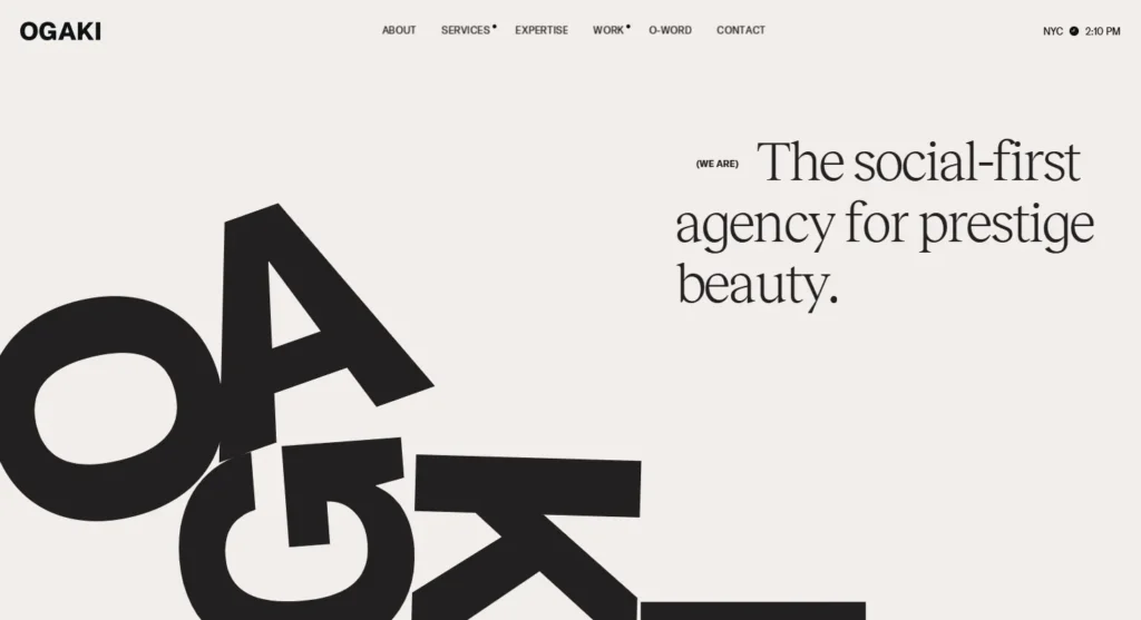
1. The Geometry of Silence: Negative Space as a Tool
Negative space—or white space—is not “empty.” It is a structural element. In the hands of an amateur, it’s a mistake; in the hands of a professional, it’s a spotlight.
The primary failure of most SMB websites is the fear of the void. They feel the need to fill every corner with a “limited time offer” or a generic stock photo of people shaking hands. This creates visual friction.
Data from Nielsen Norman Group indicates that users often skim pages in an F-shaped pattern, and excessive clutter causes “eye-tracking fatigue,” leading to higher bounce rates.
The Technical Reality of Whitespace
When we talk about negative space in 2026, we mean the Signal-to-Noise Ratio (SNR). A high SNR means the user spends zero calories trying to find what they need.

Real-World Example: Apple
It’s the cliché for a reason. Visit the Apple homepage. You won’t see a sidebar. You won’t see a pop-up. You see a single product and a clear path to “Learn more” or “Shop iPhone.” They understand that by giving the product massive amounts of negative space, they increase its perceived value.
2. The UX vs UI Design Paradox in Minimalism
People often confuse minimalism with “simple UI.” But a simple UI often masks a complex UX problem.
If you hide your entire navigation behind a “hamburger” icon on a desktop site to keep it “clean,” you are prioritising aesthetics over usability.
This is where the distinction between UX vs UI design becomes critical. A “minimalist” UI that requires three extra clicks to find the contact page is a UX failure.
We see this constantly in our web design services. Clients want a “clean” look, but they forget that the site’s primary goal is to convert.
Debunking the Myth: “Minimalism is Cheaper”
The Myth: “Because there is less on the page, it should be faster and cheaper to build.”
The Truth: Minimalism is the most expensive design approach because it demands perfection. On a cluttered site, a slightly off-brand font or a poorly cropped image is camouflaged.
In a minimalist layout, that same error is a glaring red flag that destroys information architecture and brand trust.
| Feature | Amateur “Minimalism” | Professional Minimalism |
| Navigation | Hidden behind icons (Mystery Meat) | Clear, prioritised labels |
| Typography | Generic system fonts (Arial/Helvetica) | Custom variable fonts with 16.6ms rendering |
| Imagery | Stock photos to “fill space” | Bespoke, high-res assets or none at all |
| Code | Heavy frameworks with hidden CSS | Lightweight, vanilla JS and lean CSS Grid |
| Loading | Slow due to unoptimised “clean” themes | Sub-1s LCP (Largest Contentful Paint) |
3. Typographic Authority: Why Your Font Choice is Your Brand
In a world without heavy textures or drop shadows, typography does the heavy lifting. It’s not just about legibility; it’s about “Voice.” If your minimalist site uses a generic font, your brand comes across as generic.
For landing page design, the hierarchy of your H1, H2, and H3 tags dictates the user’s journey. You should be able to understand what a company does and why it matters just by reading the headers, without looking at a single image.
Technical Deep Dive: Variable Fonts in 2026
In early 2026, we’ll have moved entirely away from static font files. We now use Variable Fonts, which allow for infinite weights and widths within a single file.
This reduces the number of HTTP requests, which is vital for mobile-first design. A minimalist site that takes 4 seconds to load its “clean” font is an oxymoron.

Real-World Example: Stripe
Stripe uses typography to convey technical competence and security. Their use of the “Inter” font family, combined with a strict grid, makes a highly complex product feel simple and trustworthy. This is “Functional Minimalism” at its peak.
4. The State of Minimalism in 2026: AI-Driven Generative UI
We are entering the era of Generative UI, where the website you see is not the same as the one I see.
By 2026, AI-driven systems will analyse user intent in real-time to strip away any element that doesn’t help that specific user achieve their goal.
How Generative UI Functions
Imagine a user searching for “How to change a tyre” landing on a car manufacturer’s site. Instead of a flashy hero video and marketing copy, the Generative UI detects the “high-urgency” intent and serves an ultra-minimalist, text-heavy page with a 3-step guide.
Conversely, a user browsing for “luxury SUV inspiration” would see a high-impact, visual-heavy minimalist layout.
Designing for AI Agents
In 2026, many “users” are actually AI agents or personal assistants (like LLM-based browsers) scraping your site for answers. A minimalist structure with clear Semantic HTML (using tags like <article>, <section>, and <aside>) ensures that these AI systems can cite your content accurately in AI Overviews.
5. Intentional Colour Palettes and Contrast
Minimalism doesn’t mean “Black and White.” It means “Intentional.” A pop of colour in a sea of monochrome is a powerful psychological trigger.
We use this in web accessibility guidelines to ensure that even while the site looks “high-end,” it remains usable for everyone. High contrast ratios (at least 4.5:1 for normal text) are non-negotiable.

Inclusive Minimalism: Designing for Every User
The most dangerous myth in design is that “clean” means “low contrast.” In 2026, the WCAG 2.2 (Web Content Accessibility Guidelines) will be the standard.
A site that uses light grey text on a white background isn’t minimalist; it’s broken.
Contrast and Legibility
Minimalist design often relies on thin weights and subtle tones. However, to remain inclusive, you must maintain a contrast ratio of at least 4.5:1 for standard text and 3:1 for large text and UI components.
- Technical Tip: Use CSS relative colours to ensure your “minimalist” palette automatically adjusts for users with high contrast needs or those using Dark Mode.
- Case Example: A luxury watch brand transitioned to a minimalist UI but saw a drop in sales from users aged 50+. By increasing the font weight of their product descriptions and improving the focus-state indicators for keyboard navigation, they restored their conversion rate without sacrificing the “premium” feel.
Touch Targets and Fitts’s Law
Minimalism often leads to “tiny” navigation elements. Fitts’s Law reminds us that the time to acquire a target is a function of its distance and size. On mobile-first minimalist sites, ensure that all interactive elements have a minimum touch target size of 44×44 pixels, even if the visual icon is smaller.
Sustainable Minimalism: The Environmental Impact of “Less”
In 2026, web design is part of the global sustainability conversation. A cluttered, heavy website doesn’t just frustrate users; it consumes more energy.
Every kilobyte of data transferred requires electricity at the server, the network, and the end-user’s device.
The Low-Carbon Website Checklist
Minimalism is the ultimate “Green” strategy for the web. By focusing on functional reductionism, you can significantly lower your site’s carbon footprint:
- Reduce HTTP Requests: A minimalist site typically uses fewer scripts and images, reducing the energy required for a page load.
- Optimise Assets: Use WebP or AVIF image formats and host video only when essential.
- System Fonts vs. Web Fonts: Using system fonts (like San Francisco or Segoe UI) requires zero data transfer, making your site “carbon-efficient.”
- Dark Mode Minimalism: OLED screens consume less power when displaying dark pixels. Offering a dark theme isn’t just an aesthetic choice; it’s a sustainable one.
A minimalist site that loads in under 1 second and weighs less than 500KB is not only a win for UX but a commitment to Sustainable Web Design standards.
The Navigation Paradox: When “Clean” Becomes “Confusing”
The “hamburger menu” is the hallmark of minimalism, but it is often a UX crutch. Hiding your entire information architecture behind a single icon increases the “interaction cost.”

The Solution: Prioritised Navigation
Instead of hiding everything, use a “Priority Plus” navigation pattern.
- Visible: The top 2-3 most important links (e.g., Shop, Services, Contact).
- Hidden: Secondary links (e.g., About Us, Blog, Careers) tucked into a “More” menu.
This approach maintains the minimalist aesthetic while ensuring that the user never has to “guess” where your most important content is located.
Minimalist Approaches
| Approach | Ideal Use Case | Pros | Cons |
| Monochromatic Minimalism | Luxury Branding, Art Portfolios | Extreme focus on form and texture. | Can feel cold or unapproachable. |
| Content-First Minimalism | Blogs, News, Documentation | Maximum readability and SEO potential. | It can look “boring” without strong type. |
| Interactive Minimalism | SaaS, Tech Products | High engagement via micro-interactions. | Higher development cost and complexity. |
| Sustainable Minimalism | Non-profits, Green Tech | Lowest carbon footprint; incredibly fast. | Restricted use of heavy imagery/video. |
The Verdict
Minimalist web design is a high-stakes discipline. When executed with technical precision, it creates a fast, authoritative, and high-converting brand presence.
When faked, it creates a confusing, hollow experience that drives users straight to your competitors.
If you are tired of clutter and ready to build a site that actually communicates your value, you need more than a “clean” template. You need a strategy that understands the nuance of the Inkbot Design philosophy.
Are you ready to strip away the noise and start growing?
Frequently Asked Questions (FAQ)
Does minimalist design hurt SEO in 2026?
No. In fact, it often helps. Google’s 2026 algorithms prioritise Core Web Vitals and “Helpful Content.” Minimalist sites typically have faster load times and fewer distractions, which improves user engagement signals. The key is to ensure you don’t remove “Entity Context”—ensure your H-tags and structured data clearly define what the page is about.
How do I make a minimalist site feel “warm” and not clinical?
Use Organic Minimalism. This involves using soft, natural colour palettes (beiges, muted greens), high-quality bespoke photography, and “human” typography. Minimalist doesn’t have to mean “white and square.”
What is the “Five Second Test” in minimalist design?
It’s a usability test in which a user views your site for exactly 5 seconds. If they cannot tell you exactly what you do and what the next step is, your design is either too cluttered or too minimalist (lacking “wayfinding”).
Is minimalism better for mobile-first design?
Absolutely. On a small screen, every pixel is premium real estate. Minimalism forces you to prioritise the “Thumb Zone” and essential interactions, making the mobile experience much more fluid.
How do I handle “Social Proof” (like reviews) on a minimalist site?
Integrate them into the flow rather than using “busy” widgets. Use a clean, single-column slider or a dedicated “Trust” section that uses the same typography and spacing as the rest of the site.
Can a minimalist site be colourful?
Absolutely. Minimalism is about the number of elements and their purpose, not just the colour palette. A site can use vibrant neon colours and still be minimalist if the layout is clean and the functionality is streamlined.
What are the best fonts for minimalist web design?
Variable fonts like Inter, Roboto, or bespoke brand fonts are best. The key is choosing a typeface with a wide range of weights (Thin to Black) to create hierarchy without changing font families.
How does minimalism improve mobile UX?
Minimalist sites naturally adapt better to smaller screens. With fewer elements to shift (layout shift), the experience is more stable and faster. It prioritises the thumb-zone and essential interactions, which are the core focus of mobile-first design.
What is “The Paradox of Choice” in web design?
The Paradox of Choice states that giving users too many options leads to anxiety and inaction. Minimalist design solves this by limiting the number of CTAs on a single screen, guiding the user toward a decisive action.
How do I know if my site is “too” minimalist?
Check your bounce rates and conversion paths. If users are landing on your page but not clicking through, you may have removed too many “wayfinding” cues. Conduct a “5-second test” to see if strangers can identify what you do instantly.
What role does AI play in minimalist design today?
AI is used to automate the “subtraction” process, analysing heatmaps to identify which elements users ignore. These “dead zones” are then removed to further optimise the minimalist interface for better performance.
Does whitespace have to be white?
No. “White space” or “Negative space” refers to any area of the page that is not occupied by content. It can be any colour, pattern, or even a subtle video background, as long as it functions as a buffer between key elements.

