Tactile Maximalism: The Future of Digital Tactility
Flat design has stripped the internet of its personality and, more importantly, its usability.
Users in 2026 are suffering from “Digital Smoothness Fatigue.” When everything is flat, nothing is important.
Tactile Maximalism is the corrective surgery for a digital world that has lost its sense of touch.
It’s about making the screen feel like something you can actually grab. If your brand doesn’t feel tangible, it doesn’t feel real.
- Tactile Maximalism restores sensory richness, adding texture, haptics, and depth to improve affordance and brand recall.
- Spatial UI demands digital materiality so objects have volume, resist, and cast realistic shadows in AR/VR spaces.
- Haptic Synchronicity aligns visual animations with precise localised vibrations using the W3C Vibration API and LRAs.
- Visual Friction and micro-grain reduce cognitive load, guiding attention and lowering user errors compared with ultra-flat interfaces.
- Tactile Maximalism enhances accessibility and B2B trust by making interfaces feel solid, usable, and human-crafted rather than generic.
What is Tactile Maximalism?
Tactile Maximalism is a digital design philosophy that prioritises sensory richness, visual friction, and simulated physical depth to create high-engagement user interfaces.
Unlike minimalism, which seeks to remove elements, Tactile Maximalism adds “sensory weight” through textures, haptics, and layered shadows to improve affordance and brand recall.

The core elements include:
- Visual Friction: Using grain, noise, and rough textures to slow the eye and highlight key information.
- Hyper-Skeuomorphism: Modern 3D rendering of elements (buttons, toggles, cards) that mimic the physical properties of glass, clay, or metal.
- Haptic Synchronicity: Aligning on-screen visual animations with physical vibration patterns on mobile and wearable devices.
From 2D Screens to Spatial Reality: The 2026 Shift
The biggest misconception about Tactile Maximalism is that it is merely a visual “skin” applied to a standard website.
In 2026, we entered the era of Spatial UI. With the mass adoption of headsets like the Apple Vision Pro and the Meta Quest 4, your digital assets no longer live behind a glass barrier—they exist in the user’s physical room.
Flat design in a 3D space looks like a floating piece of paper; it lacks presence. To build trust in a spatial environment, objects must have “volume.”
This is where Digital Materiality becomes a functional requirement.
If a user “reaches out” to tap a button in their AR field, that button needs to respond with a physical-logic animation: it must compress, resist, and cast a shadow that interacts with the room’s lighting.
We are seeing a massive shift in how brands approach their digital footprint.
For example, Teenage Engineering has set the gold standard by ensuring that every digital dial and slider on its interface behaves with the weight and friction of its physical hardware.

This isn’t just about looking “cool”—it’s about providing the brain with the spatial cues it needs to navigate an environment without cognitive friction.
| Surface Type | Visual Cue | Haptic Response | Ideal Use Case |
| Liquid Glass | Refractive blur, internal glow | Soft, high-frequency “ping” | Premium SaaS, High-end Portfolios |
| Brushed Metal | Directional highlights, fine grain | Short, “mechanical” click | FinTech, Engineering Tools |
| Recycled Paper | Organic fibre noise, deckled edges | Low-frequency “thud” or “drag” | Sustainability Brands, Editorial |
| Claymorphism | Soft inner shadows, matte finish | “Squishy” resistance animation | EdTech, Consumer Apps |
The Death of the “Clean” Interface
For years, “clean” was shorthand for “good.” But a study by the Nielsen Norman Group confirmed that ultra-flat designs lead to slower navigation and higher frustration levels.
When users can’t tell the difference between a header and a button, they leave.
Minimalism in 2026 is often just a mask for a lack of brand identity. It’s the “default” setting for companies that have nothing to say.
Tactile Maximalism, on the other hand, leans into sensory branding to create a “sticky” experience.
By providing more visual and physical cues, you reduce the user’s cognitive load. They don’t have to guess what’s interactive; the interface tells them through shadows, depth, and texture.
The Return of the Physical
We saw this shift start in late 2024. Consumers began moving away from the “black mirror” aesthetic of sleek, featureless tech.
Look at the rise of the “Mechanical Keyboard” subculture or the resurgence of vinyl. People want to feel things. In the digital realm, this manifests as haptic branding.
If your website’s buttons don’t “click” (either visually or through a haptic pulse), you’re missing a psychological trick called the Endowment Effect.
This suggests that when people feel they can “touch” or “hold” an object—even a digital one—they value it more.
The Technical Pillars of Tactile Maximalism
Building a tactile site isn’t about throwing a bunch of textures at a wall. It requires a precise understanding of how the human brain processes digital information.
1. Digital Grain and Noise
Flat colours are unnatural. In the physical world, no surface is perfectly smooth. By adding a subtle layer of 1-3% noise to your backgrounds, you create a sense of depth and “materiality.”
This is a key part of our web design services at Inkbot Design. It stops the screen from feeling like a sterile light box and starts making it feel like a surface.

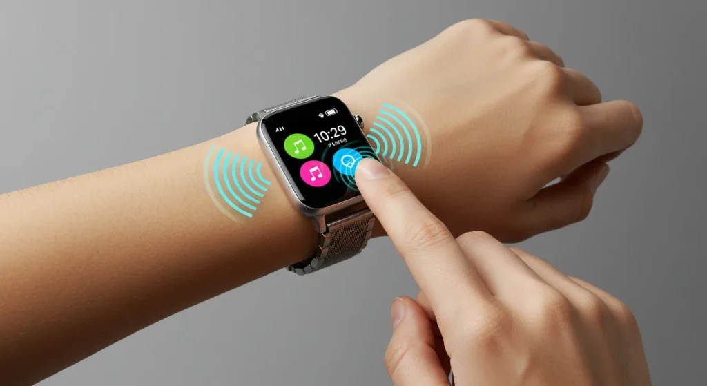
2. Micro-Haptic Layering
In 2026, we are no longer limited to a simple “buzz” on a form submission. The W3C Vibration API has matured, allowing for “Haptic Textures.”
Example: A website slider can now trigger different vibration frequencies based on the “weight” of the selected value. A £1,000 purchase should feel “heavier” than a £10 one.
3. Implementing the W3C Vibration API
To truly move beyond “visual” maximalism, you must integrate the W3C Vibration API. In 2026, this has evolved from a simple “alert” tool to a nuanced language of Haptic Textures.
Modern mobile devices use Linear Resonant Actuators (LRAs) and Piezoelectric Actuators that allow for “micro-bursts” of vibration.
How to trigger a “Mechanical Click” in 2026: A common mistake is using a long vibration for a button press. For a tactile, high-end feel, you should use a pattern that mimics a physical spring:
- The Press: A sharp, 10ms burst at 80% intensity.
- The Release: A softer, 5ms burst at 30% intensity.
JavaScript

// Example of a 2026 Tactile Button Click

function tactileClick() {

  if ("vibrate" in navigator) {

    // Mimics the 'engagement' and 'release' of a mechanical switch

    window.navigator.vibrate([10, 50, 5]);

  }

}
Beyond the code, we must consider OLED Micro-Vibrations.
High-end 2026 smartphones now feature localised haptics. This allows us to trigger feedback exactly where the user’s thumb is, rather than vibrating the whole chassis.
This level of precision is what differentiates a professional Tactile Maximalist interface from a generic “noisy” design.
The State of Tactile Maximalism in 2026
As of February 2026, we’ve hit a tipping point. The hardware has finally caught up to the vision.
- OLED Micro-Vibrations: The latest smartphone displays now support localised haptics. This means a button on the top left can vibrate independently of the bottom right. Tactile Maximalism leverages this to guide the user’s hand literally.
- Variable Refresh Rate (VRR) Textures: We now use shaders that adjust a visual texture’s “roughness” based on scroll speed. It’s a level of audio branding and visual synchronicity that was impossible two years ago.
- The Rise of Spatial UI: With the mass adoption of AR headsets, the “flat” web is dead. You cannot have a flat website in a 3D space. It looks like a floating piece of paper. Tactile Maximalism provides the “volume” necessary for spatial computing.
If you aren’t thinking about how your site “feels” in a 3D environment, you’re already obsolete. You can request a quote to see how we’re implementing these spatial-first tactile strategies for our UK clients.
The B2B Argument: Why “Density” Equals “Reliability”
There is a lingering fear that maximalism is “too messy” for corporate B2B platforms. However, the data from 2025 tells a different story.
In an era where AI can generate a minimalist “template” site in seconds, “flatness” has become synonymous with “cheapness” and “lack of effort.”
For a B2B SaaS company, Tactile Maximalism acts as a signal of structural integrity. Consider a financial dashboard.
When every data card has a subtle Z-axis elevation and a textured background (like brushed aluminium or heavy-stock paper), the information feels “anchored.” It feels like a physical tool that can be relied upon.
The “Professional Density” Workflow:
- Use Bento Grids 2.0: Organise your complex data into “tactile cells.” Each cell should have its own lighting environment and depth.
- Avoid Neon, Embrace “Cloud Dancer”: Use the PANTONE 11-4201 Cloud Dancer (an off-white, airy tone) as your base. It provides the “Tactile” feel without the visual exhaustion of high-contrast maximalism.
- Visual Friction for Critical Actions: Use a 2% grain overlay on “Delete” or “Confirm” buttons. This tiny amount of visual noise forces the eye to slow down, reducing the chance of accidental clicks—a concept known as Friction-Driven Safety.
A 2025 study by the Nielsen Norman Group highlighted that “ultra-flat” dashboards lead to a 22% increase in user error.
By reintroducing physical affordances, you aren’t just making the site look better; you are literally making it more “usable.”
Implementing Tactile Maximalism: A Strategy for 2026
To move away from the flat-design trap, follow these three phases:
Phase 1: The Audit of “Smoothness”
Look at your current site. If you can’t tell where one section ends and another begins without looking at the text, you have a “smoothness” problem. Identify every interactive element and ask: “Does this look like I can touch it?” If the answer is no, it needs a bevel, a shadow, or a texture.
Phase 2: Add Visual Friction
Introduce elements that slow the user down at the right moments. This could be a scent marketing inspired visual cue (like a texture that evokes a specific material) or a voice user interface design that provides tactile feedback when a command is recognised.
Phase 3: Synchronise the Senses
Ensure your visuals match your haptics and sounds. If a button looks like heavy metal, it shouldn’t have a high-pitched “ping” sound or a light vibration. It should feel industrial. This consistency builds “Topical Authority” in the consumer’s mind.
Beyond the Visual: Accessibility Benefits of Haptic Feedback
A common critique of maximalist design is that it creates “visual clutter.” However, when executed correctly, Tactile Maximalism is actually a massive leap forward for accessibility.
For users with low vision or colour blindness, the “flat” web is a nightmare of invisible boundaries.
By using layered shadows and tactile borders, we provide structural cues that don’t rely solely on hue. Furthermore, integrating Sonic Branding and Haptics creates a multi-sensory map of the interface.
Scenario: Navigating a Form
- Standard Site: A user misses a required field because the red error border is too thin to notice.
- Tactile Site: As the user scrolls past the error, the trackpad provides a subtle “rough” texture vibration, and the visual element uses a hyper-skeuomorphic “pressed” state that makes it appear as if it has been physically pushed into the page.
By treating the UI as a physical object, we allow users to “feel” their way through a task.
This is no longer optional; as of 2026, UK and EU digital accessibility laws have begun to recognise haptic feedback as a valid “alternative modality” for interactive elements.
The Verdict
Tactile Maximalism isn’t just a trend; it’s a return to form.
It’s the recognition that humans are sensory creatures who happen to use digital tools. Flat design was a technical limitation masked as an aesthetic choice.
Now that those limitations are gone, there is no excuse for boring, low-converting interfaces.
The entrepreneurs who win in 2026 will be those who embrace the “messy,” tactile reality of the physical world and translate it into their digital presence. Stop being “clean” and start being “memorable.”
If you’re ready to fix your boring UI, you know where to find us. Explore our web design services or contact us for a quote today.
Frequently Asked Questions
What is the difference between Skeuomorphism and Tactile Maximalism?
Skeuomorphism mimics real-world objects literally (e.g., a bin icon that looks like a real bin). Tactile Maximalism uses the properties of the physical world—texture, friction, and depth—to enhance a modern interface without necessarily copying specific objects.
Is Tactile Maximalism bad for website loading speeds?
Not if implemented correctly. Using CSS effects (like filters and shadows) and small, tiled SVG textures is much more efficient than using large, heavy image files. Performance optimisation is still a priority in 2026.
Does Tactile Maximalism work for B2B brands?
Yes. In fact, it’s often more effective in B2B. It conveys a sense of “solidity” and “reliability” that flat, minimalist sites lack. It makes your digital presence feel like an established, physical institution.
Does Tactile Maximalism affect my Core Web Vitals (LCP/INP)?
No, if you use modern methods. In 2026, we will avoid heavy textures by using CSS Shaders and tiled SVG filters. These are rendered by the GPU, ensuring that your Interaction to Next Paint (INP) remains under 50ms, even with complex 3D shadows.
Can I use haptics on desktop browsers?
Yes. While most monitors don’t vibrate, high-end laptops (like the 2026 MacBook Pro) and external trackpads support “force touch” haptics. You can use the same W3C Vibration API to trigger “taptic” feedback on these devices, providing a consistent experience across mobile and desktop.
What is the difference between “Digital Grain” and “Noise”?
In 2026 design, “Grain” refers to organic, film-like textures that mimic the look of paper or stone. “Noise” is usually a more digital, randomised pixel effect used for “Brutalist” styles. For Tactile Maximalism, we recommend Organic Grain at 1-3% opacity to add “material weight” without looking “glitchy.”
How does this trend interact with AI-generated content?
Tactile Maximalism is a “human-first” response to AI. Because AI excels at creating perfectly smooth, average designs, adding “visual friction” and intentional “imperfections” (like hand-drawn underlines or custom haptic pulses) signals to the user that the experience was crafted by a human, building immediate brand trust.
Is there a specific font style that works best?
How does this affect accessibility?
It actually improves it. By providing more visual cues (like borders and shadows), you make it easier for users with visual impairments to identify interactive elements.
What is “Visual Friction”?
It’s the intentional use of design elements to slow a user’s eye movement. This ensures they don’t just “skim” past your most important content. Texture and high-contrast elements are great for this.
Is Flat Design completely dead?
In its “ultra-flat” form, yes. Most modern brands are moving towards “Flat 2.0,” which incorporates many tactile principles, but Tactile Maximalism is the high-performance end of that spectrum.


