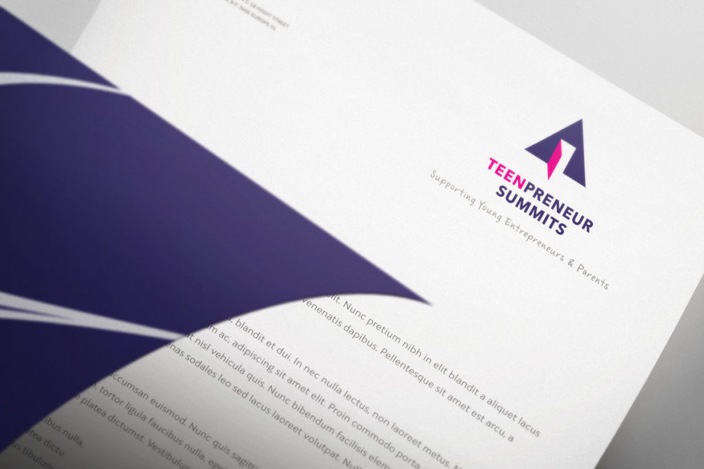
Corporate Stationery Design
Don't Let Your Business Card Be the Weakest Link.
In a digital world, tangible quality stands out. We design print collateral—business cards, letterheads, and presentation decks—that act as a physical seal of quality for your brand.
Professional stationery design and branding that makes your business stand out.
Inkbot Design offers comprehensive stationery design and stationery branding services tailored to your business needs.
Our expert team specialises in creating cohesive brand identities through beautifully designed stationery that reflects your company's professionalism and values.
With our deep understanding of design for print techniques and premium paper stock, we deliver print-ready business stationery that's perfectly optimised for production.
Whether you're printing locally or working with your preferred print company, our files are designed to save you money on postage and shipping costs while ensuring exceptional quality results.
We adhere to international print standards and deliver files in the exact format you need, as stationery dimensions and specifications vary significantly across different markets.
Our stationery branding expertise ensures that every piece, from business cards to letterheads, works together to create a unified and memorable brand experience for your customers.
Ready to elevate your business image with professional stationery design that gets results?
“It’s actually embarrassing how often people comment on our business cards.”
We used to treat stationery as an afterthought. Stuart convinced us that the tactile experience matters. He was right. Now, when I hand a card to a prospect, there is a visible pause—they look at it, feel the weight of the stock, and usually say, ‘Wow, nice card.’ It immediately establishes us as a premium firm before we’ve even started the pitch. It’s the best conversation starter we have.

Request a Quote for Stationery Design

It’s Not Just Paper. It’s Perception.
You send a proposal worth £50,000. Do you want it to arrive in a cheap, windowless envelope? Every physical touchpoint is a signal. Cheap paper signals a cheap service. Premium stock signals authority. We don't just design the layout; we manage the tactile experience. From paper weight (GSM) to foil finishes, we ensure your brand feels expensive before they even read a word.
The Non-Negotiable Core
For almost any serious business, a few pieces are essential. Get these right first.
- Business Cards: The obvious one. A pocket-sized introduction.
- Letterheads: For any official correspondence, from contracts to welcome letters.
- Compliment Slips: For adding a brief, personal note to something you’re sending out.
- Branded Envelopes: The first thing they see. An unbranded envelope is a missed opportunity.
The ‘Context is Everything’ Extras
Beyond the core, other items might be useful depending on your business model.
- Branded Presentation Folders: Essential if you’re handing out packets of documents.
- Appointment Cards: If you run a service-based business with bookings.
- Branded Notepads: Can be a nice client giveaway or useful for internal meetings.
The Fluff: Where Money Goes to Die
Then there's the tat. The branded stress balls, the cheap plastic pens, the mouse mats.
Unless you have a very specific and clever marketing angle, most of this content is essentially landfill. It cheapens your brand more often than it builds it. Focus your budget on making the core items exceptional, rather than producing a multitude of mediocre items.
The One Thing You Can't Fix Later: Your Foundation
You can reprint a business card. You can change your paper stock. But if your core brand identity is flawed, you're just putting lipstick on a pig.
Your stationery design doesn’t start with picking paper. It starts with the building blocks of your brand.
It All Starts and Ends with Your Logo
Here’s a hard truth: a bad logo on a £5-a-sheet, gold-foiled, triple-thick card is still a bad logo. It’s actually worse, because you’ve spent good money to draw attention to how poor it is.
Your logo is the heart of your visual identity. It must be professional, and it absolutely must be versatile. Can it be reproduced in a single colour and still be recognisable? Does it work at a tiny size on the corner of an envelope and at a huge size on a banner?
If the answer is no, you have a logo problem, not a stationery problem.
This is why getting the core logo design right is non-negotiable. It’s the single most important investment, and it underpins everything else you do. Fix this first.
Your Colour Palette Isn't a Vague Suggestion
Brand consistency is crucial for building recognition and trust. Seeing slightly different shades of your brand’s blue across different items is jarring. It feels unprofessional.
Your stationery will be printed. That means your colours need to be defined in CMYK (Cyan, Magenta, Yellow, Black) – the four-colour process used in printing. Your website uses HEX or RGB (Red, Green, Blue). They are not the same.
A good designer will provide you with the exact CMYK values for your brand colours. Use them. Every single time.
And don't go mad. A strong brand rarely needs more than two or three core colours. Simplicity is confidence.
Typography That People Can Actually Read
Fancy, elaborate fonts have their place. And that place is rarely mentioned on a business card or letterhead.
The primary job of your stationery is to communicate information clearly. Legibility always trumps quirky creativity.
Establish a simple typographic hierarchy:
- One font for headlines (your name on a business card).
- One font for body copy (including the address and details).
They can be different weights of the same font family or two complementary fonts. That’s it. Keep it clean.
A Practical Look at the Key Pieces
Theory is one thing. Execution is another. Let’s get practical.
The Business Card: Your Tiny Billboard

The business card is not a miniature brochure. Its purpose is to exchange contact information quickly and effectively.
I have a pet peeve about this. I was once handed a card by a marketing consultant. It included their name, phone number, email, website, social media links (X, Facebook, LinkedIn, Instagram, Pinterest, TikTok), and a QR code. My eyes glazed over. I couldn't find the email address in the sea of icons. The card was a failure.
Here’s the rub: White space is your most valuable tool.
A great business card needs only this:
- Your Logo
- Your Name
- Your Title
- Your Company Name
- One Phone Number
- One Email Address
- Your Website URL
That’s it. That’s the lot. All this information should be presented clearly and cleanly. Anything else is noise.
The Letterhead: Your Official Voice
A letterhead frames your most important communications. Its design should be professional and understated. The content of the letter is the hero; the design is the supporting act.
Your logo and contact information should be present but not overbearing. The top of the page is traditional, but a design that places it at the bottom or side can also work, as long as it's out of the way of the main content.
A crucial point people miss: test how it looks as a PDF. More and more “letters” are sent as email attachments. Does your design translate well to the screen? Does the file size remain manageable?
The Compliment Slip: The Handshake on Paper
The compliment slip has one job: to make a generic mailing feel personal. It exists to carry a short, handwritten note. “Thanks for this.” “Here’s that document you asked for.” “Great to meet you.”
The design should be minimal. Your logo, “With Compliments,” and basic contact details. Don't clutter it. Its power is in its simplicity and the personal touch it enables.
Paper and Finish: Where Good Intentions Go Bad
Once the design is solid, you choose your materials. This is where people either smartly elevate their brand or make it look tacky.
Understanding Paper (The Simple Version)
You’ll hear printers talk about GSM, or ‘Grams per Square Metre’.
It’s just a measure of weight and thickness. Standard office paper is about 80-100 gsm. A decent business card starts around 350 gsm. Heavier paper generally feels more substantial and premium. It’s that simple.
You’ll also choose between finishes:
- Uncoated: Natural, slightly textured feel. Absorbs ink. Great for a rustic, organic, or seriously corporate look. Easy to write on.
- Matte: A smooth, non-shiny coated finish. Makes colours look crisp. Professional and modern.
- Gloss: Shiny, reflective coating. Makes colours pop. It can appear somewhat cheap if not used with care. Often used for flyers and photos.
Choose the finish that matches your brand’s personality, not what’s on offer. An eco-friendly food company should probably use uncoated, recycled stock. A high-tech startup might lean towards a matte finish.
A Word on Special Finishes
Foil stamping, embossing (creating a raised effect), and die-cutting (for custom shapes) can add a “wow” factor. But they can also scream, “I have poor taste.”
Here's the rule: use a special finish to highlight one specific element, such as your logo. Don't foil your name, emboss your logo, and die-cut the card into the shape of a van. It’s desperate.
These techniques are seasoning. A light sprinkle can enhance the flavour. Too much ruins the dish. Ask yourself: Does this serve the brand, or is it just a gimmick?
Sustainable by Design.
Looking professional doesn't have to mean being wasteful. We specialise in specifying high-quality recycled stocks and eco-friendly finishes. This isn't just “green-washing”—it's a modern business requirement. Show your clients you care about the details and the planet.

The Inkbot Standard: What We Deliver
Standard 1: Print-Ready Perfection.
- No more blurry logos or incorrect margins. We deliver files that professional printers love (CMYK, bleed, crop marks included).
Standard 2: Visual Consistency.
- Your invoice should resemble the company logo and branding used on your website. We unify your visual language across every document.
Standard 3: Function First.
- We design for the real world. Business cards you can actually read. Letterheads that don't break your Word processor.
Building a Cohesive Stationery System
Think of your stationery not as individual items, but as a family. They need to appear cohesive. They share the same DNA: the same logo, colours, fonts, and general layout principles.
A simple one-page brand style guide can be your best friend in this situation. It specifies your colours (CMYK values), your fonts, and rules for logo usage. It’s the blueprint that ensures consistency for you, your staff, and any printer you use.
When your physical stationery perfectly matches the branding on your website and your social profiles, you create a seamless brand experience. This builds trust. It shows you are organised, professional, and in control of your image.
It’s a Tool, Not an Ornament
Let's circle back.
Your business stationery is not an afterthought. It’s not something to be ticked off a list with the cheapest template you can find.
It’s a powerful, tangible tool for communication. It’s a physical manifestation of your brand’s promise. When you hand someone your business card, you are handing them a small piece of your company. It should be considered. It should feel professional. It should feel like you.
Getting it right shows attention to detail. And in business, the details are everything.
If you’re realising your brand’s foundation isn't as solid as it should be, that's a problem worth solving. For direct, professional input on building a brand that works everywhere, from a screen to a business card, you can request a quote here.
For more brutally honest observations on branding and design, you’ll find plenty more on our blog.
Stationery Design Services FAQs
How much does professional stationery design cost?
Let’s be realistic—most businesses spend more on coffee each month than they do on the stationery that represents their company for years. Our packages typically start from £400, depending on the complexity and the number of items (such as business cards, letterheads, and presentation folders). When you consider that a high-quality business card can be the difference between closing a deal and being forgotten, the investment pays for itself with a single client.
Why can't I just use Canva or design it myself?
You absolutely can. Just like you can cut your own hair or represent yourself in court. However, there is a risk: you spend 20 hours creating something that looks “fine” instead of using those 20 hours to grow your business. Furthermore, Canva files often fail when sent to professional lithographic printers (colour shifts, bleed issues, low resolution). We prevent those expensive mistakes and ensure you don't look like an amateur.
Do you handle the printing?
We act as your Print Managers. We don't own the printing press, but we liaise with trusted trade printers on your behalf. We handle the technical specs, paper selection (GSM), and quality control so you don't have to worry about the details. However, we deliver print-ready files that work with any professional printer, giving you the freedom to shop around for the best production prices if you wish.
Can I use my letterhead in Microsoft Word?
Yes. This is a critical requirement for modern businesses. We design the high-end print version first (for contracts and formal letters), and then we recreate a digital-friendly version specifically for Microsoft Word or Google Docs. This ensures your daily digital correspondence looks just as professional as your printed mail.
What exactly do I get in the final package?
You receive a complete Print Production Pack. This includes:
Vector Files (AI/EPS): The master files for future edits or large-scale printing.
Print-Ready PDFs: High-resolution files with crop marks and bleed areas, ready for the printer.
Digital Files (JPG/PNG): For email and web use.
Brand Guidelines: Instructions on which fonts and paper stocks to use to maintain consistency.
How long does the process take?
Typically, 7–14 days from brief to final files. We don't rush because quality takes time. However, if you have an urgent networking event or product launch, please let us know—we can often accommodate rush timelines for a specific fee.
How many revisions do I get?
Three rounds of revisions are included. Frankly, that is usually enough to get it perfect if we are both doing our jobs properly. We start with a clear brief to capture 80% of the vision in the first draft; the revisions are for fine-tuning the details.
Will my stationery work internationally?
Yes. We design to international print standards because your business might expand beyond the UK. American business cards are different sizes (3.5 x 2 inches) compared to European cards (85 x 55 mm). We handle all these technical conversions so you don't have to redesign everything when you open an office abroad.
Does paper quality really matter?
Absolutely. In a study on tactile marketing, heavier paper stock was proven to increase the subconscious perception of a company's competence. If you are selling a premium service but hand over a flimsy, lightweight business card, it creates a “disconnect” in the client's mind. We ensure your paper stock matches your price point.
What if I don't have a logo yet?
Then we need to take a step back. Stationery is the application of your brand, not the creation of it. If you don't have a logo (or if your current one is poor), we highly recommend starting with our Logo Design or Brand Identity packages. Putting a bad logo on expensive paper is a waste of money.
Why invest in print when everything is digital?
Because scarcity creates value. When everyone else is hiding behind LinkedIn messages and emails, a physical, high-quality letter or business card stands out from the noise. It is tangible. It sits on a desk. It reminds the client of you long after the browser tab is closed. Physical stationery is a differentiator in a digital world.
What happens if I'm not happy with the design?
Here is our guarantee: If we haven't nailed your stationery design after three rounds of revisions based on your brief, we will rethink the approach or refund your deposit. However, over the course of our over a decade in business, this has rarely happened because we don't start designing until we fully understand your goals.
