Top 10 Tips to Improve Your Typography Design
The design world is a vibrant and dynamic realm of creativity and imagination. For those with the necessary skills and vision, it offers an opportunity to bring beauty and meaning into the world. At its heart, design is about connecting with people through aesthetics and functionality.
When you become fluent in the language of design – the interplay of colour, shape, texture, and composition – you unlock the ability to craft experiences and artefacts that can inspire, inform, and delight. Mastery of these elements allows you to experiment and innovate, developing designs that capture a mood or tell a story.
Typography, in particular, is a foundational skill for any designer. Fonts and typefaces have personality; they convey emotion and meaning beyond the literal words on the page. The choice of font, size, spacing, and formatting all subtly influence how the audience perceives and interacts with the text. A talented typographer understands how to use these variables strategically, guiding the reader's eye and shaping their impressions.
In our modern visual culture, design skills are more relevant than ever. We are surrounded by visual communication that competes constantly for our attention. Standing out in this landscape requires creativity, taste, and technical excellence. Those who can rise to the challenge have the opportunity to build careers and make their mark upon the world.
For any designer ready to refine their skills, typography is a rewarding place to focus one's efforts. Subtle improvements in working with fonts and layouts can elevate designs to be more polished, professional, and profound. This guide offers tips and techniques to help unlock new potential in your typographic designs. By incorporating these insights into your process, you can continue to grow as a designer and achieve ever-greater heights of success. Let us begin the journey.
Table of Contents
10 Tips to Improve Typography Design
1 – Choose your Fonts wisely

Choosing the right fonts is a crucial first step when designing visual content. The fonts you select set the tone and feeling for your entire design. While it may be tempting to go font crazy and use various stylised fonts, restraint is vital.
When selecting fonts, it's best to limit yourself to no more than three font families for the entirety of your design. This helps create visual harmony and consistency. The fonts you choose for headings, subheadings, and body text don't necessarily have to be from the same family, but they should complement each other.
For body text, sans serif fonts like Arial or Helvetica are clean and easy to read. You can get more creative with serifs or display fonts with visual impact for headings. Combining a simple sans serif body font with an elegant serif heading font is a timeless, foolproof font pairing.
Whichever font combination you choose, use font weights (like bold and italics) strategically to establish hierarchy. Only use one or two font weights within each family. The goal is to find a font pairing that works cohesively together for your content without competing. Simpler is often better when it comes to fonts.
The fonts you choose make a solid first impression. You can elevate your design and engage your audience with the proper font selection. Please limit yourself to no more than three complementary font families and use them strategically to create a visually pleasing and cohesive design.
2 – Be careful with Font Hierarchy

Font hierarchy is the strategic use of different font sizes, weights, and styles to create visual contrast between headings, subheadings, body text, and other elements on a page. Proper font hierarchy allows readers to quickly scan a page and understand the underlying structure and importance of different content elements.
There are several fundamental principles of effective font hierarchy:
- Headings are largest – Headings capture attention and communicate the main ideas of a section. They should be set in the page's most prominent, boldest fonts.
- Subheadings are secondary – Subheadings break up content into logical sections and sub-topics. They are larger than body text but smaller than headings.
- Body text is uniform – Body text makes up the majority of content. A single, consistent font creates cohesion and improves readability.
- Visual contrast creates separation – Sufficient contrast between font sizes/weights allows readers to recognise differences in the content hierarchy instantly.
- Alignment impacts flow – Headings and subheads create visual connections with corresponding content.
- White space adds breathing room – Using white space around headings improves scannability.
Effective font hierarchy helps readers extract meaning, focus attention, and systematically move through content. It establishes a logical, visual representation of the information architecture behind the text. Reading comprehension and retention improve when font styles, sizes, and formatting reinforce the underlying content structure.
The strategic use of typography to build a visual hierarchy is crucial to excellent web design. When fonts are carefully chosen and arranged to highlight differences in content importance, users can quickly scan, digest, and act on information.
3 – Creatively play around with Kerning
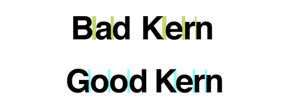
Kerning refers to adjusting the space between individual letter pairs in a line of text to create a more even and optically consistent appearance. It is one of typography's most intricate and nuanced aspects, requiring a careful eye for detail and aesthetic balance.
While modern software has automated some kerning capabilities, the keen eye of a typographer is still needed for the finest kerning adjustments. This is because not all letter combinations are created equal – specific pairs like ‘AV' or ‘To' naturally have less space between them than more comprehensive pairs like ‘OO' or ‘TT'. Kerning aims to account for these optical illusions and ensure each letter spacing appears visually in harmony.
For beginners, kerning can be a frustrating skill to master. There are no hard and fast rules on how much space to use between letters. It takes much practice analyzing letterforms and developing an intuition for what looks best. Many beginning designers avoid kerning altogether, leaving texts with uneven, distracting gaps.
Thankfully, there are some valuable tricks to aid the kerning process. Using tracking to adjust space over a whole text uniformly is a good starting point before fine-tuning with kerning. Features like optical kerning in programs like InDesign automate some of the most obvious letter pair adjustments. Though still requiring refinement, these tools give beginners a helpful baseline to build upon.
Mastering the nuances of kerning takes time but pays off in creating beautifully set, professional-looking typography. The details may seem minute, but they make a difference in polished design work. Persistence in developing a keen eye for balanced letterspacing is what separates the good from the great in typographic design.
4 – Try to Pair Fonts Together
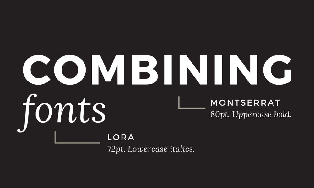
Choosing complementary fonts is an art that can significantly enhance your typography design when done well. The key is finding font pairings that work together to create visual interest while maintaining readability.
When selecting fonts, consider both the style and size. For small formats like business cards, lean towards simple, modestly-sized fonts that will be clear and easy to read. Decorative fonts can look cluttered and hard to decipher at small sizes. Focus first on readability, then add stylistic flair through a complementary font for headings or accents.
Feel free to experiment with contrasting font styles – for example, pairing a bold, heavyweight slab serif with a delicate, thin script. The juxtaposition can create visual dynamism. You can also play with capitalization, using ALL-CAPS for impact against lowercase text.
Colour contrast is another vital typography tool. Black lettering on a white background provides the highest readability. You can also experiment with shades of grey or complementary colours, taking care to ensure enough contrast between the environment and text.
The mood and theme of your design should guide your typography choices. A refined, elegant invitation may pair a traditional serif with a flowy, romantic script. A tech startup could use a geometric sans-serif for a clean, modern look. Let your creative inspiration run wild!
With mindful font pairing and contrasting styles, you can take your typography design to the next level. Be bold and try new combinations once you find aesthetically pleasing fonts that work harmoniously while maintaining readability. Typography is meant to be explored and enjoyed!
5 – Make use of White Space
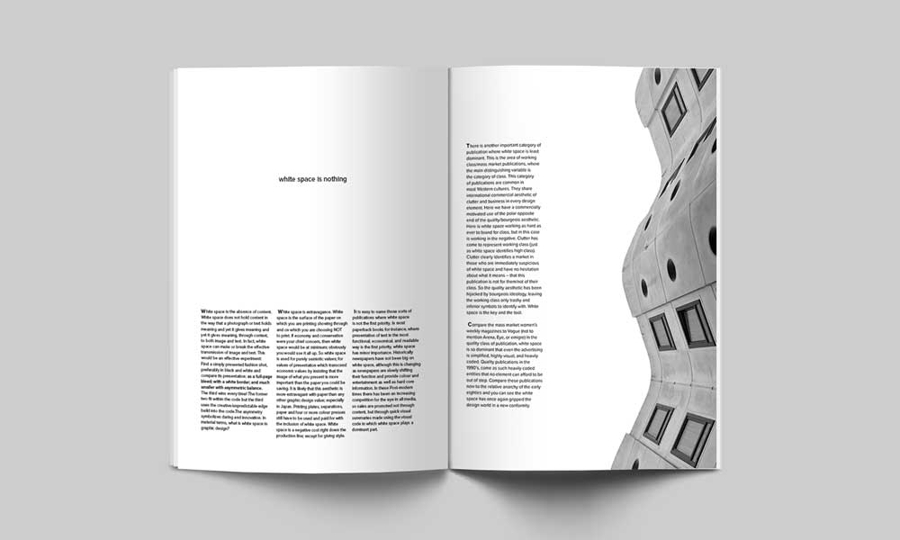
The strategic use of white space is a crucial design element that impacts a work's aesthetics and functionality. More than just empty space, white space helps dictate the design's flow, organisation, and visual hierarchy.
Proper use of white space enhances clarity and prevents clutter. Generous whitespace makes a design feel open and airy, creating room to breathe around elements. This improves readability by separating content into clean, digestible chunks. White space also directs the viewer's gaze, highlighting key points and establishing visual relationships.
Specifically, white space can:
- Promote clarity and preventability by lending a clean, well-organised aesthetic. White space declutters layouts and makes contents more accessible.
- Improve readability and accessibility by separating textual and visual elements into clear, easily digestible groupings. More white space allows content to be absorbed more readily.
- Guide the viewer's attention and establish a visual hierarchy by focusing on some aspects while allowing others to recede. Strategic whitespace creates emphasis.
- Facilitate responsive design across devices and mediums. More white space ensures that content can flex and reflow across display sizes.
- Aid navigation by grouping related items and delineating different sections.
- Enhance aesthetics and impart sophistication through balanced, considered use of empty and filled space.
In summary, intelligent use of blank space between design elements profoundly impacts presentation and accessibility. White space lends organisation, flexibility, visual clarity, and aesthetic appeal.
6 – Pay Attention to Font Families
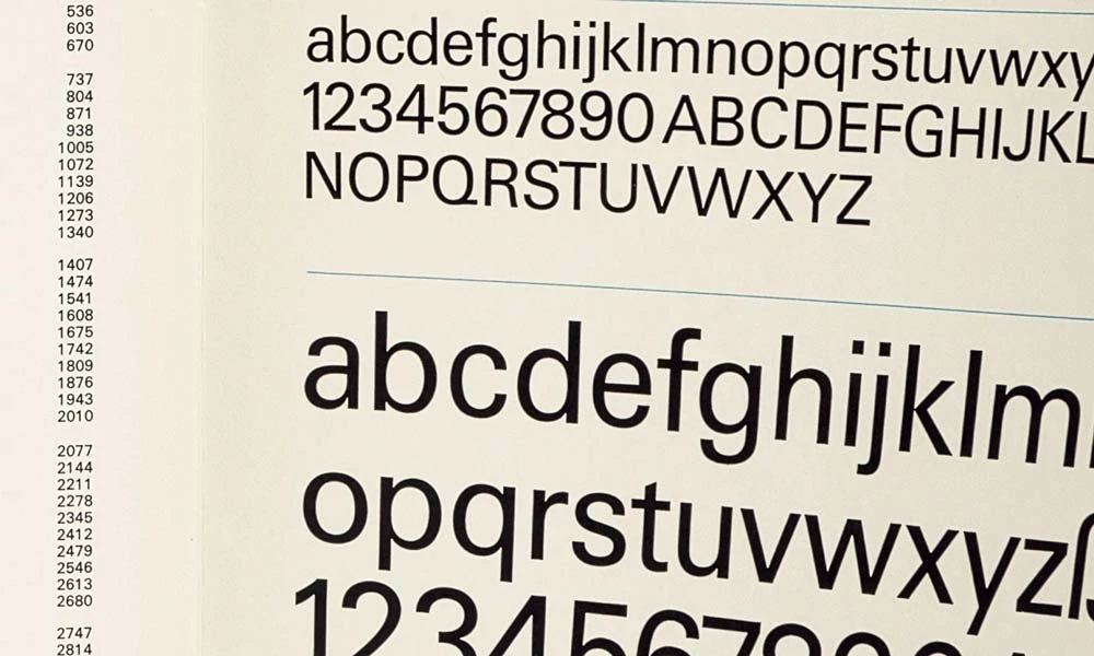
Font families are groups of related font designs with common visual characteristics yet distinctive styles. Fonts within the same family are intended to be used together to create typographic harmony.
There are several broad classifications of font families:
- Old Style fonts originated in European types before the 18th century. They have a traditional, classic look with low contrast between thick and thin strokes. Examples include Garamond and Bembo.
- Modern fonts emerged in the late 18th century and contrast highly between thick and thin strokes. They convey a sharper, more vertical feeling. Popular current fonts include Bodoni and Didot.
- As the name suggests, geometric fonts have a geometric style based on simple shapes like circles and squares. They create a technical, constructed look. Examples include Futura and Avant Garde.
- Humanist fonts have roots in calligraphy and handwriting. They have organic, natural shapes with character and warmth. Some humanist fonts are Gill Sans and Optima.
- Slab serif fonts have block-like, thick serifs. They have a bold, eye-catching appearance. Rockwell and Courier are well-known slab serifs.
When used together in a design, fonts from the same family can create visual harmony through shared characteristics like x-height, serifs, stroke contrast, and more. Different styles, like regular, italic, and bold, can be combined to provide typographic variety and hierarchy. The overall effect is a cohesive, balanced use of type that adds beauty and enhances readability.
7 – Keep your Audience in Mind

The main focus of any design project should be effectively communicating your core message to the intended audience. The delivery of that message must be tailored specifically for the target demographic you want to reach.
For example, compare a corporate holiday party to an outdoor music festival aimed at college students. Both events may share the goal of bringing people together to celebrate, but the design strategy for each needs to be vastly different.
For the corporate party, a formal, polished aesthetic with minimalist sans-serif fonts in dark colours on a light background could appeal to professionals. The design might incorporate the company's brand colours and logo. Photos could feature coworkers mingling in upscale venues.
Meanwhile, a festival for college students requires a lively, playful design. Bold, handwritten-style fonts in bright neons paired with a textured, paint-splattered background could catch the eyes of young people. The imagery could include candid crowd shots and close-ups of musical equipment on stage.
To ensure your typography and overall design resonate with the intended audience, it's wise to solicit feedback from a representative sample. For example, run potential font choices by relevant coworkers or classmates. Seeing which options excite your demographic versus fall flat can steer you towards the most compelling final design.
Remember, the specifics of font, colour, layout, imagery and more should all be crafted to speak directly to the sensibilities of your target audience. Keep them in mind at each stage of the design process. Your message will come through clearly and effectively with the right tailored approach.
8 – Focus on Creating the Right Mood
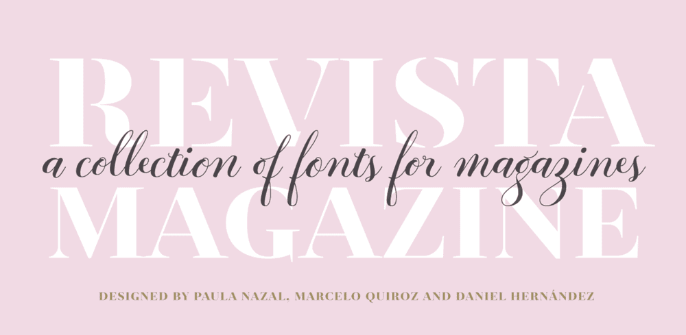
Typography design is an art that can be carefully crafted to evoke certain emotions and convey particular attitudes. This is because every font style has its unique personality and voice. The choice of typeface is, therefore, crucial in setting a design's overall tone and mood.
It would be an oversight to assume that any font in any size could serve every design purpose equally well. On the contrary, typographers must thoughtfully determine what message a specific typeface conveys and whether it aligns with the desired aesthetic.
Experts agree that each font has a distinct voice influencing how we feel about the text we read.
The letters' shape, weight, and other attributes impact how we absorb and process the information. A bold, blocky font might convey confidence and strength. An elegant script could impart sophistication and grace.
Furthermore, typography can have functional implications for text communication. If the goal is clarity and readability, typographers will select clean, simple fonts that allow visitors to parse the words quickly and easily. The more effortless it is to read the text, the better chance people have of finding the information they need.
In summary, typography is not merely a decorative style. It is a nuanced art that can set the tone, amplify the message, and enhance the readability of a design when done thoughtfully. The most successful typographers understand that each font has its personality that can be strategically leveraged to evoke the desired emotional response in the viewer.
9 – Attention to Detail on the Headlines
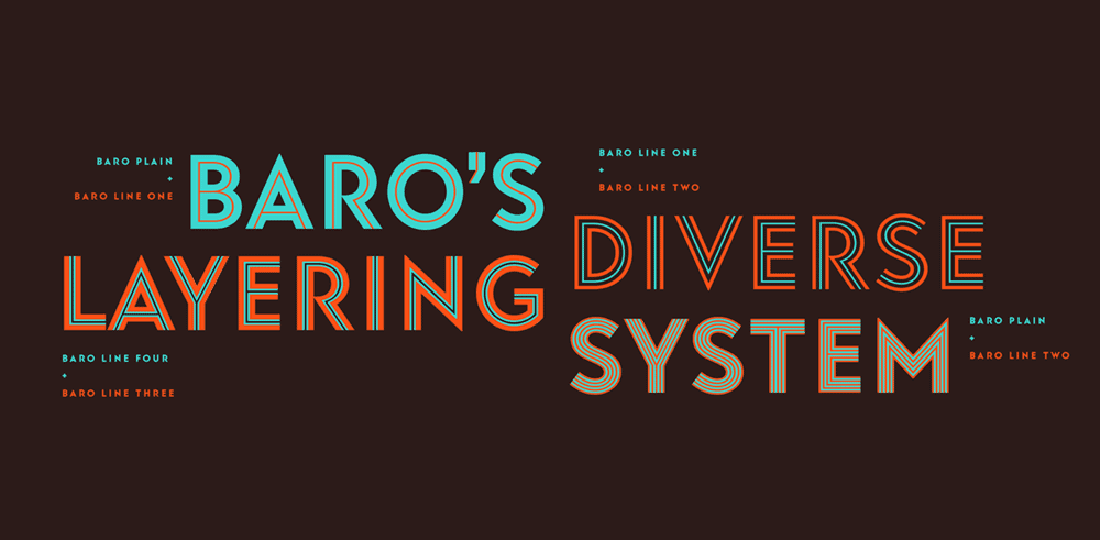
A strong, compelling headline is one of the most critical elements of any content marketing strategy. Without an attention-grabbing headline, even the most useful, insightful information will likely go unread. A fantastic headline acts like a magnet, drawing readers in and convincing them to engage further with the content.
Think of it this way – you could write the most exciting, page-turning novel in the world, but if it had a dull, generic cover, most people would pass it by without a second glance. Your headlines serve the same function as that cover, making a vital first impression on potential readers.
So, what goes into a headline that genuinely captures attention? Here are some essential tips:
- Use powerful, vivid language. Active verbs and vivid imagery intrigue readers far more than vague, passive phrasing.
- Make bold statements. Don't be afraid to make big promises or even stir up controversy, as long as you can back it up within the content.
- Ask interesting questions. Posing an intriguing question in a headline virtually forces the reader to seek the answer.
- Target keywords. Incorporate one or two keywords or phrases with high search volume to attract readers already seeking that topic.
- Keep it simple. Find a balance between compelling phrasing and clarity. Avoid overstuffed headlines that are hard to parse.
- Mind the formatting. Pay close attention to letter spacing (kerning) and keep headlines concise enough to display well on all devices. Lousy kerning can undermine excellent headline writing.
With a striking, ultra-clickable headline guiding them, readers are far more likely to stick around and engage with your content. So, take the time to craft headlines that genuinely showcase your ideas and capture the imagination of your audience. The difference it can make for your content's success is astounding.
10 – Check out Spacing and Alignment

Margins are critical in web design and document layouts that help separate main content from the surrounding environment. When used thoughtfully, margins create visual harmony across pages and draw attention to critical information.
Margins serve several vital functions. First, they provide breathing room between paragraphs, images, and other page elements. Without adequate margins, content can feel cramped and cluttered. Generous margins make the reading experience more comfortable.
Second, margins create alignment and organisation. When text is aligned consistently within margins, it becomes easier to scan and comprehend. Flush left text alignment along the same left margin line brings the eye back to the start of each new line, supporting readability.
Finally, margins create negative space and visual interest. Blank spaces formed by margins help focus attention on primary content while providing visual relief. Strategic use of asymmetric or varying margins can add dynamism and flair to page design.
In short, margin use is a fundamental typographic technique that impacts aesthetics, readability, and usability. Consistent, thoughtful margins contribute to harmony and order in any document. Meanwhile, creative manipulation of margins can produce visual interest, energy, and even drama. Masterful margin design is a hallmark of excellent graphic and web design.
Conclusion
Typography design is undeniably experiencing a renaissance of limitless creativity in the current digital age. With countless new fonts being created and easily accessible, designers today have many typographic styles at their fingertips. This presents exciting opportunities but also challenges in effectively communicating through the use of type.
Ultimately, typography is all about visual communication. A designer's stylistic choices in selecting and arranging type send cues that shape how messages are received. So, when conceptualising a design, it is wise to carefully consider how your intended audience will interpret and interact with the typography. Keep the needs of the reader in mind.
To fully harness the power of typography, one must continuously learn about and experiment with different styles, classifications, and compositional techniques. The world of typography is as deep as it is wide. There is always more to explore and apply towards crafting impactful visual communications.
The abundance of typographic choices makes this an opportune time for typography design professionals to showcase their skills. Designers can create standout work that attracts new clients by thoughtfully selecting and arranging types with their audiences in mind. When skillfully applied, typography has immense power to inform, delight, persuade and inspire.
We are in a typography renaissance for devoted designers who continuously expand their knowledge; the possibilities for creating typographic messages that connect with readers and make an impression are limitless. The way is open for typographers to bring positive change to the world through skilful visual communication and unlock new professional opportunities.
