Evolution of the Nike Logo Design: A Story of Branding
Nike is a multinational company specialising in manufacturing and distributing sports equipment, footwear and apparel. With more than 75,000 employees worldwide, Nike has become a household name and leader in the sports industry. The brand was valued at over $180 billion in 2023, making it one of the world's most valuable and recognisable brands.
One of the reasons for Nike's success is its clear vision, goals and approach. Nike's mission statement is: “To bring inspiration and innovation to every athlete in the world”, and this vision is reflected in everything Nike does. The company strives to create high-quality and innovative products and inspires people to do their best and achieve their athletic goals.
To achieve its vision, Nike has set itself concrete goals. For example, the company aims to reduce its carbon footprint by using sustainable materials in its products, reduce waste by recycling and reusing materials, and support diversity and inclusion in the workplace and the communities in which it operates.
Nike is known for its “Just Do It” attitude, which encourages people to go beyond their limits and reach their full potential. This attitude is also reflected in Nike's marketing campaigns, which often feature inspirational athletes and messages of perseverance and determination.
Nike's success can be attributed to its clear vision, goals and approach. By staying true to its mission and values, Nike has become a global leader in the sports industry, inspiring millions of people worldwide.
Table of Contents
Blue Ribbon Sports: 1964 -1971

Nike, formerly Blue Ribbon Sports, has a rich history reflected in its logo's development. The company's original logo consisted of the initials “BRS” intertwined with stripes and a unique shape. However, the legibility of the text posed a problem, so they developed a simplified design.
The intertwined letters “BRS” were designed to form a unique shape that would reflect the innovative and dynamic spirit of the company. The first “B” was separated from the other two letters and overlapped the top of the “R” on the left, while the “R” merged seamlessly into the “S” on the right. This design created a distinct visual identity for the brand, setting it apart from its competitors.
Despite the creativity of the interlocking letters, the design proved difficult to read, especially in smaller font sizes. Therefore, the company decided to change the logo to improve readability. The updated logo incorporates the company's full name, “Blue Ribbon Sports”, in cursive capital lettering in a simple sans-serif font. This simple and elegant design made the company's name recognisable and readable.
The Original Nike Logo Design: 1971 – 1978

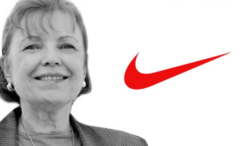
The Nike Swoosh logo is one of the most famous logos in the world. Carolyn Davidson designed it in 1971, but interestingly, Nike co-founder Phil Knight didn't like it when he was first introduced to the logo. Despite Knight's initial reservations, the Swoosh logo became an iconic Nike brand symbol.
The story of how Davidson became involved in the project is also fascinating. At the time, Knight was teaching an accounting class at Portland State University, where Davidson was a student. One day, Knight overheard Davidson talking to her friends about her lack of money to attend an oil painting class. Knight offered to “write some signs” for her for $2 an hour.

Davidson spent 17.5 hours designing the Nike Swoosh logo. Her goal was to create a symbol of the movement that would set Nike apart from its competitors, notably Adidas. The Swoosh was a radical departure from Adidas' three straight lines, with a single curved line representing speed and movement. Originally called the Strip, the logo later became known as the Swoosh.
The Swoosh logo also had a deeper meaning, as it was inspired by the fibres used in Nike shoes at the time. The word “swoosh” referred not only to the movement of the logo but also to the sound of the fibres rubbing together in Nike shoes.
Despite Knight's initial reservations, the Swoosh logo became a hugely successful symbol of the Nike brand. It is now considered one of the most iconic logos in the world. It represents the company's commitment to innovation and sport and its rich history and cultural significance.
Redesigning: 1978 – 1985

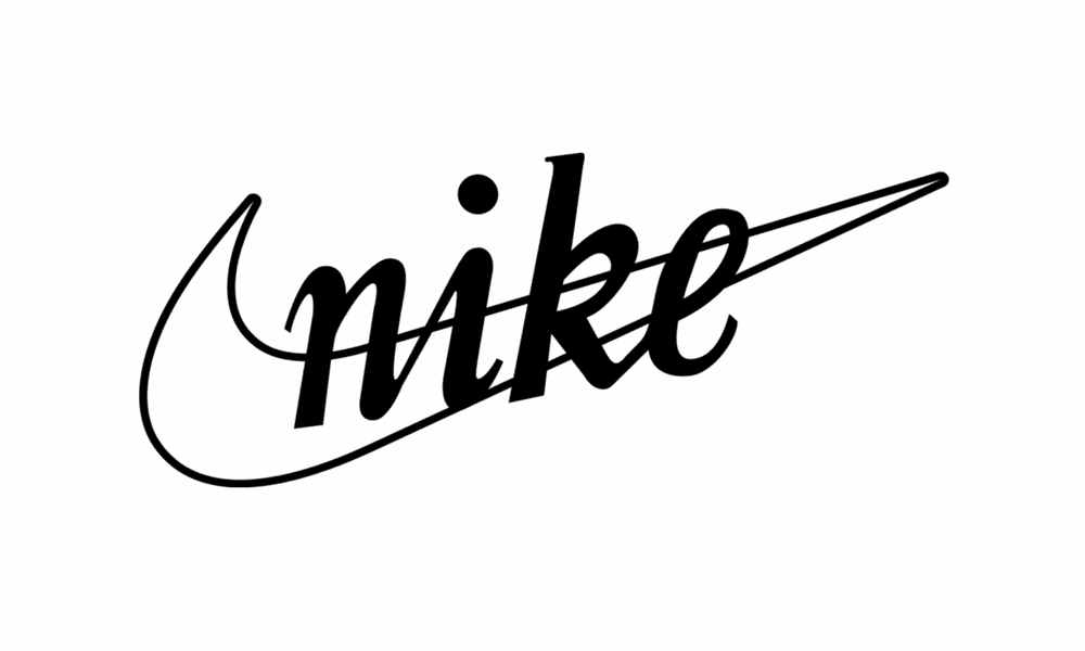
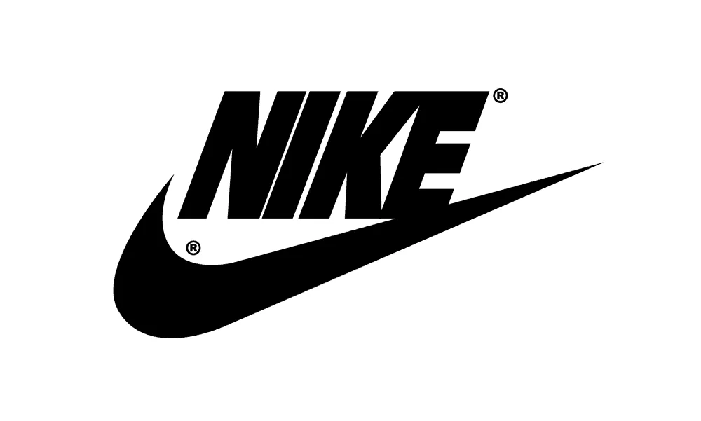
Nike's Swoosh logo has undergone a few changes, with one of the most notable in 1978. At that time, the Swoosh logo was changed from a simple line drawing to a more imposing solid black check mark, while the Nike wordmark was also redesigned from a cursive font to an all-caps cursive version of Futura Bold.
This redesign was significant as it ushered in a new era for the Nike brand. The new logo was more geometric and bold, making it more eye-catching and memorable. The change also aligned with Nike's growing popularity and success as a brand. The company quickly became one of the most recognisable and influential brands in sports and athletics.
One of the most notable features of the redesigned logo was how the edge of the last letter of the Nike wordmark blended seamlessly into the end of the Swoosh. This design element created a sense of unity and continuity between the two parts of the logo and underlined Nike's commitment to innovation, quality and consistency.
The new Nike logo quickly became a trademark and has since become one of the most recognisable logos in the world. Its sleek, modern design and bold, imposing lines symbolise Nike's commitment to excellence and its determination to remain at the forefront of the sports industry.
Updating: 1985 – 1995

In 1985, Nike's iconic Swoosh logo underwent a significant change. The original design, which featured a solid black checkmark with the Nike wordmark in cursive Futura Bold, was updated with a new colour scheme. They now showed the Swoosh and wordmark in white against a bright red background. This new colour scheme was bold, dynamic, eye-catching, and immediately well-received by consumers.
The redesigned logo quickly symbolised Nike's passion, drive and commitment to excellence and was widely adopted as a visual representation of the company's values and ethos. From 1988 onwards, the logo was often accompanied by Nike's new motto, “Just Do It”, perfectly reflecting the brand's determined and ambitious spirit.
The motto “Just Do It” became an instant classic, encapsulating the Nike brand's message of self-determination and inspiration. It encouraged people to push their limits, strive for greatness, and never give up on their dreams. The new Nike logo and the “Just Do It” slogan helped establish Nike as one of the world's most powerful and influential brands, with a message that resonates with people of all generations and cultures.
Current Nike Logo Design: 1995 – Today

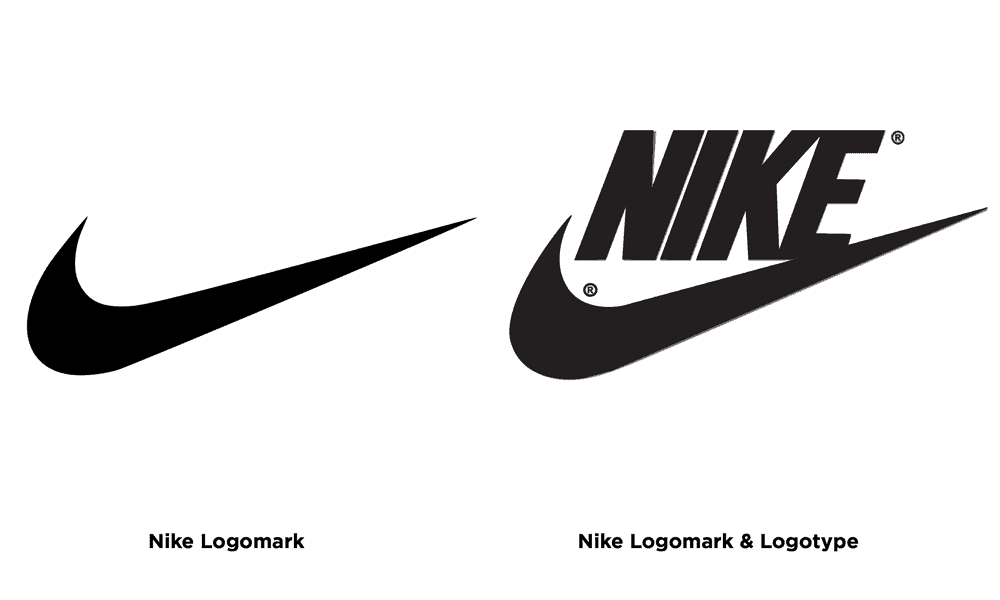
By the mid-1990s, Nike had already become a global phenomenon, and its Swoosh logo was one of the most recognisable symbols in the world. This allowed the company to take a bold step and drop its wordmark altogether and use only the iconic Swoosh as its logo.
The decision to switch to a pure symbol logo was not new. Brands like Apple and Shell had already taken similar steps, recognising the power of a simple, easily recognisable image to convey a message and connect with consumers.
By dropping the wordmark, the logo became even more eye-catching and impactful, as it was now the sole focus of the Nike logo. This made it easier to apply the logo to different products and goods, such as footwear and apparel, and to extend its use to global markets where language barriers can be challenging.
The shift to a pure symbol logo also had a significant psychological impact on consumers. Research has shown that people respond more strongly and instinctively to images than text. Nike strengthened its position as a sportswear and equipment industry leader by creating a deeper connection with the brand.
As a result, Nike's Swoosh logo has become one of the most iconic and enduring logos in history, one that the company will likely never change. It is a powerful reminder of Nike's brand identity, vision and commitment to empowering athletes worldwide to “just do it.
What we can learn from Nike's Branding

Celebrity Endorsements
Nike has long been known for its excellent marketing strategies, and one of its most successful tactics is using celebrities as advertising partners. One of the most well-known advertisers for Nike is basketball legend Michael Jordan. The company has used its image and reputation to represent its brand and associate it with success and athleticism.
The concept behind using a celebrity advertiser is to embed his image in the minds of consumers and create an association between the celebrity and the brand. This, in turn, increases the brand's appeal and value. Jordan's iconic stance and the perception of his successes on the court have helped create Nike's image as synonymous with sportsmanship and excellence.
Through its advertising deals with top athletes, Nike has been able to promote its products in a way that meets consumers' desires. For example, when consumers see their favourite athletes wearing Nike products and performing at peak levels, it reinforces the idea that Nike is a brand that can help them achieve their personal goals. The Nike logo is one of the most prominent during sports events. Gregg Popovich, NBA Coach, is often seen in Nike shoes.
The Nike logo has become emblematic of a successful lifestyle brand, and the company's association with top athletes has played an essential role. The emblem has gained a high recognition value worldwide and has further strengthened Nike's brand identity. With the help of celebrity endorsements, Nike has succeeded in creating a brand that consumers want to associate with, which has ultimately contributed to the company's overall success in the market.

As part of Modern Culture
The Nike logo has become a cultural icon representing athleticism, strength and fitness, among other values Nike seeks to embody in its brand image. The company's advertising has successfully established the Swoosh as one of the most recognisable logos, symbolising athletic excellence, determination, authenticity and confidence.
Nike's advertising campaigns, such as the famous slogan “Just Do It”, have become entrenched in popular culture, inspiring people worldwide to push their limits and pursue their goals. The Swoosh has become synonymous with this spirit of determination and excellence, making it a powerful symbol for the Nike brand.
To maintain the visibility and relevance of the brand, Nike invests around 10% of its annual revenue in advertising and promotion. This significant investment is a testament to the company's commitment to promoting its values and products to consumers worldwide. In addition, Nike spends about 3% of its annual revenue on capital expenditures, including investments in manufacturing facilities, research and development, and other infrastructure.
In recent years, Nike has also been at the forefront of social and cultural issues, using its brand to promote diversity, inclusion and equality. Nike has strengthened its brand and maintained its position as a cultural icon by taking a stand on important issues and aligning its values with its customers. Overall, the Nike Swoosh is more than just a logo – it symbolises excellence, determination and a commitment to promoting positive change in the world.

They Invested in Branding
Establishing a brand is crucial for companies but often comes at a high cost. This was the case with Nike in 1997 when the company invested $978 million in advertising, marketing and sales promotion. Despite the high price, Nike recognised the importance of keeping its brand visible to drive future growth and revenue.
Nike's significant investment in advertising and marketing was a critical factor in establishing the brand as a leader in the sports industry. By investing millions of dollars in advertising campaigns, sponsorships and promotions, Nike has created a strong brand image that resonates with consumers worldwide.
While $978 million may seem an exorbitant amount, it was a wise investment for Nike. The company's continued success over the past decades is partly due to its strong brand image, which has helped it stand out from its competitors and be remembered by consumers.
In addition to investing in advertising and marketing, Nike has also focused on innovation and product development to maintain its position as a market leader. By continually pushing the boundaries of what is possible in sportswear and footwear, Nike can stay ahead of the curve and offer innovative and high-quality products to its customers.
While investing in branding can be expensive, Nike's success over the years has proven worth the cost. By staying true to its brand and continuously investing in advertising, marketing and product development, Nike has become one of the world's most recognisable and successful brands.
Wrapping Up
In summary, the evolution of the Nike logo design tells an impressive story of branding and the importance of a strong brand image. From its beginnings with a simple check mark to the iconic swoosh we know today, Nike has continuously evolved its logo to reflect its values and vision.
The Nike logo is more than a symbol – it represents the company's commitment to excellence, innovation and pushing the boundaries of what is possible. It is a testament to the power of branding and the importance of creating a robust and recognisable brand image.
As Nike continues to grow and evolve, expect more changes to the logo and brand strategy. But one thing is sure – the Nike logo design will continue to symbolise sporting excellence, determination and the relentless pursuit of greatness.
