
Niche Marketing: The Power of Narrowing Down
There is a pervasive lie in the business world that “more” equals “better.”
More traffic, more leads, broader reach.
Entrepreneurs and marketing managers often look at the total population and think, “If I can just get 1% of everyone, I’ll be rich.”
This is the fastest way to bankruptcy.
When you try to speak to everyone, you end up speaking to no one. Your message becomes diluted, your advertising budget evaporates into the ether of general interest, and your brand becomes a commodity.
The antidote to this strategic suicide is niche marketing. It is not about thinking small; it is about acting with precision. It is the difference between a shotgun and a sniper rifle.
In this guide, we examine the mechanics of niche marketing—not the fluffy “find your passion” advice, but the hard economic reality of why narrowing your focus is the only way to build a sustainable, high-margin business in a saturated digital landscape.
- Narrow focus beats broad reach; speaking to everyone makes your message invisible and commoditises your brand.
- Define a specific audience using demographics and psychographics to target true motivations, not just surface traits.
- Specialisation lowers acquisition costs, enables premium pricing, and increases customer loyalty and advocacy.
- Execute with product adaptation, insider language, niche channels, and gatekeeper content to filter qualified leads.
- Use a niche as a beachhead: dominate, prove economics, then expand into adjacent markets strategically.
What is Niche Marketing?
Niche marketing is a strategic approach where a business targets a specific, well-defined segment of a larger market. Instead of competing for a broad audience, the brand tailors its product, messaging, and acquisition channels to satisfy the unique needs of a smaller, distinct group.
A robust niche strategy relies on three non-negotiable components:
- Specific Demographics & Psychographics: You are not targeting “women”; you are targeting “vegan professional women in London who cycle to work.”
- Specialised Product Offering: The product solves a problem that generalist competitors ignore or solve poorly.
- Exclusionary Messaging: The brand actively signals who the product is not for, which reinforces its value to the core audience.
Note: A niche is not just a “small market.” It is a focused market. Amazon started as a niche bookseller. Facebook started as a niche network for Harvard students. Niche is a wedge, not a ceiling.
The Economics of Exclusion: Why Narrowing Works
The hesitation most clients have when we discuss target audiences is the fear of missing out (FOMO). They worry that by defining a niche, they are leaving money on the table. The data suggests the exact opposite.
1. Reduced Customer Acquisition Cost (CAC)
When you target “everyone,” you are bidding against the world’s largest companies. If you sell “shoes,” you are competing with Nike for ad space. Good luck with that.
If you sell “orthopaedic running shoes for trail runners with flat feet,” your keyword competition drops. Your click-through rates (CTR) skyrocket because your ad directly addresses a specific pain point. You stop paying for impressions from people who will never buy from you.
2. Price Inelasticity (Higher Margins)
Generalist products are commodities. If I can buy a white t-shirt anywhere, I will buy the cheapest one. However, specialised products command a premium.
Consider the cycling industry. A generic bike saddle costs £20. A saddle specifically engineered for triathletes to prevent numbness during 100-mile rides can sell for £200. The customer is not paying for the materials; they are paying for the solution to a specific, painful problem. Niche marketing enables you to avoid the “race to the bottom” in terms of pricing.
3. Brand Loyalty and Advocacy
Seth Godin refers to this as building a “tribe.” When a customer feels that a brand “gets” them—understands their specific slang, their problems, and their worldview—they become evangelists.
Generalist brands have customers. Niche brands have fans. Fans create user-generated content, defend the brand on social media, and refer others with similar interests, further lowering your marketing costs.
Defining Your Territory: How to Identify a Viable Niche
Identifying a niche is not guesswork. It is an auditing process. You must look for the intersection of passion, profit, and problem.
Niche Strength Calculator
Trying to sell to everyone? That’s a “Red Ocean.” Fill in the blanks below to narrow your focus and find your “Blue Ocean” opportunity.
Niche Analysis
Found your niche? Now let’s brand it.
Get a Quote for Your Niche BrandStep 1: The Competitor Matrix Audit
You need to see where the giants are sleeping. Large companies excel at logistics but struggle with nuance. They ignore the fringes because the fringes don’t move the needle on their quarterly reports. That is your entry point.
Look at a major competitor in your sector. Read their negative reviews. What are customers complaining about?
- “The software is too complex for my small team.” -> Niche: Simplified software for freelancers.
- “This protein powder upsets my stomach.” -> Niche: Hypoallergenic pea protein for sensitive digestion.
Step 2: Demographics vs. Psychographics
Amateur marketers stop at demographics (Age, Gender, Location). Professional strategists use psychographics.
- Demographic: Male, 25-40, UK.
- Psychographic: Values sustainability, distrusts big banks, prefers analogue experiences over digital, and reads philosophy.
We have written extensively on psychographics vs demographics, but the core lesson is this: Demographics tell you who they are; psychographics tell you why they buy. A niche built on shared values is infinitely stronger than one built on age or postcode.
Step 3: The “Minimum Viable Audience” (MVA)
This concept debunks the need for millions of customers. Ask yourself: What is the smallest number of customers you need to survive and thrive?
If you sell a high-ticket consulting service at £10,000, and you need £200,000 in revenue, you only need 20 clients. You do not need to market to a million people. You need to market to the exact 200 people who fit your profile, assuming a 10% conversion rate. This drastically changes your channel strategy. You stop buying billboards and start sending handwritten letters.
The Niche Marketing Framework: A 4-Step Execution Plan
Once you have a hypothesis, you need to execute. This is where many businesses fail—they identify a niche but continue to market like a generalist.

1. Specialise Your Offering (The Product)
You cannot just slap a new label on a generic product. The product itself must be adapted.
- Generic: A digital marketing agency.
- Niche: A digital marketing service specifically for Fintech startups in Series A funding.
The “Fintech” aspect dictates that your team understands compliance, financial terminology, and investor reporting. The product becomes fundamentally different from a general agency’s offering.
The same logic applies to agencies specialising in Amazon creatives, where deep knowledge of A+ Content, storefront constraints, and Amazon-specific buyer behaviour defines the product itself, not just the branding.
2. User-Centric Language
Your copy should be filled with the “inside language” of the niche. If you are targeting developers, use the correct technical syntax. If you are targeting knitters, be aware of the differences between knitting and crocheting. One wrong word exposes you as an outsider.
3. Choose Niche Channels
Where does your audience spend their time when they’re not engaging with your brand?
- Generalist Channel: Facebook Ads.
- Niche Channel: A specific Subreddit, a dedicated Discord server, an industry-specific trade journal, or a podcast with 2,000 die-hard listeners.
Advertising on a podcast with 50,000 listeners who might be interested in your product is expensive. Advertising on a podcast with 2,000 listeners who need your product is an efficient approach.
4. Create “Gatekeeper” Content
Create content that is useless to anyone outside the niche. This may seem counterintuitive, but it actually works.
- Generic Blog Post: “How to Save Money.”
- Niche Blog Post: “Tax Optimisation Strategies for Locum Doctors in the NHS.”
The second title scares off 99% of the population, which is exactly what you want. The 1% who click are highly qualified leads. This aligns with effective customer journey mapping; you are catching them at the consideration phase with hyper-relevant information.
Real-World Evidence: Niche vs. Generalist
Let’s examine the data and historical examples.
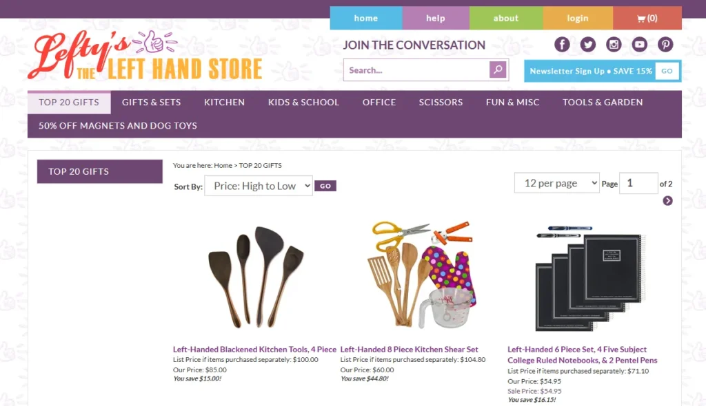
Case Study: Lefty’s San Francisco
Lefty’s is a store in San Francisco (and online) that sells products exclusively for left-handed people.
- The Problem: The world is designed for right-handed people. Scissors, notebooks, and can openers are frustrating for 10% of the population.
- The Niche: Left-handed individuals.
- The Result: By ignoring 90% of the population, they became the global destination for the 10%. They don’t compete with Walmart on price; they compete on utility. A generic pair of scissors is a commodity; Lefty’s scissors are a necessity.
Case Study: Lush Cosmetics
In the crowded beauty market dominated by giants such as L’Oréal and Estée Lauder, Lush has carved out a distinct niche.
- The Stance: Zero packaging (naked products), fresh ingredients, anti-animal testing, strong ethical/political stance.
- The Risk: Alienating customers who prefer luxury packaging or disagree with their politics.
- The Reward: A fanatical cult following. Lush does not spend money on traditional advertising. Their distinct smell and store layout act as a filter—if you don’t like strong scents, you don’t walk in. Their market segmentation is based entirely on ethical and sensory preferences.

The “Wrong Way” vs “The Right Way”
| Feature | The Amateur Approach (Generalist) | The Pro Approach (Niche) |
| Target Audience | “Everyone aged 18-65” | “Freelance graphic designers using iPad Pro” |
| Key Metric | Impressions / Reach | Engagement Rate / Conversion Rate |
| SEO Strategy | Head terms (e.g., “Best Laptops”) | Long-tail (e.g., “Best laptop for 3D rendering under £1k”) |
| Pricing Power | Low (Price wars) | High (Value-based pricing) |
| Competition | High (Global giants) | Low (Specific specialists) |
| Content Strategy | Broad appeal, viral focus | Deep technical depth, problem-solving |
The Fear of “Too Small”
In my years as Creative Director at Inkbot Design, I have sat across from dozens of founders who physically flinch when I tell them to narrow their audience.
I once audited a client in the financial services sector. They wanted to target “SMEs, Startups, and Enterprises.” Their website was a jargon-filled mess that meant nothing to anyone. We forced them to pivot to only “Creative Agencies with 10-50 staff.”
They panicked. “But that’s such a small market!”
Here is what happened:
- They rewrote their copy to address agency pain points (cash flow due to 60-day payment terms, freelancer management).
- They became the “go-to” accountants for the creative industry in London.
- Their referrals increased significantly because agency owners often discuss their business with other agency owners.
They worked less, charged more, and closed deals faster. The fear of “too small” is an illusion. You are not shrinking your business; you are sharpening your offer.
If you are struggling to define this for your own business, you may want to request a quote so we can review your positioning objectively. We are honest, so expect candid feedback.
Myth-Busting: “Niche Marketing Limits Growth”
This is the most common objection. “If I only sell to X, how do I become a billion-pound company?”
The Wedge Strategy.
You do not stay in the niche forever. You utilise the niche to establish a stronghold, generate cash flow, and establish a brand reputation. Then, you expand into adjacent concentric circles.
- Tesla: Started with a niche luxury sports car (Roadster) for rich early adopters.
- Then: Luxury Sedan (Model S).
- Then: SUV (Model X).
- Then: Mass market (Model 3).
- Under Armour: Started with a niche moisture-wicking shirt for American Football players to wear under pads.
- Then: All athletes.
- Then: General athleisure.
If Under Armour had launched with “shirts for everyone,” Nike would have crushed them. By owning the “moisture-wicking undershirt” niche, they built a beachhead.
The State of Niche Marketing in 2026
As we move through 2026, the necessity of niche marketing is being driven by AI and algorithmic shifts.
- AI Search (SGE): Generative AI answers broad questions (“What is a laptop?”) instantly. It is more challenging to attract traffic for generic terms. However, specific, experience-based queries (“best laptop for running CAD software on a construction site”) still require human nuance and deep content.
- The Death of Third-Party Cookies: With privacy laws tightening and tracking becoming increasingly difficult, “spray and pray” advertising is on its way out. You can no longer rely on Facebook’s algorithm to find your customers for you. You must know who they are and where they are before you spend a penny. Contextual targeting—placing ads where your niche lives—is the new standard.
The Verdict
Niche marketing is not a tactic for small businesses that cannot afford to go big. It is a fundamental law of modern commerce. In a noisy world, clarity is currency.
You have two choices:
- Be a generalist, compete on price, shout to be heard, and watch your margins erode.
- Be a specialist, compete on value, whisper to the right people, and build a fortress.
The market rewards specificity. It ignores the average.
What to do next:
Audit your current marketing materials. If you can swap your logo with a competitor’s and the website still makes sense, you are too broad. If you need help carving out your territory, explore our Digital Marketing Services or read more about market segmentation to get the technical details right.
Frequently Asked Questions (FAQ)
What is the main disadvantage of niche marketing?
The primary risk is market cap limitation. If a niche is too small (e.g., “left-handed underwater basket weavers”), there may not be enough customers to sustain the business. This is why validating the “Minimum Viable Audience” (MVA) is critical before launching.
How do I know if my niche is too small?
Calculate the Total Addressable Market (TAM). If the product of (Number of Potential Customers × Average Customer Lifetime Value) does not exceed your operating costs + desired profit, the niche is too small. You may need to broaden the scope slightly to an adjacent market.
Can a business have more than one niche?
Yes, but be careful. This is called “multi-niche” marketing. It is effective but requires distinct landing pages and marketing funnels for each segment. Do not attempt to address all of them on a single homepage, as this will only confuse everyone.
Is niche marketing better for B2B or B2C?
It is effective for both, but critical for B2B. B2B buyers have specific compliance, technical, and operational needs. A “generalist” B2B software provider is rarely trusted. In B2C, niche marketing drives lifestyle and identity-based purchasing.
How does niche marketing improve SEO?
It allows you to rank for “long-tail keywords.” These search terms have lower volume but higher intent. It is easier to rank #1 for “vegan leather boots for hiking” than for “boots.” High rankings for specific terms drive better-qualified traffic.
What is the difference between a segment and a niche?
A market segment is a large slice of the market (e.g., “Remote Workers”). A niche is a highly specific subset of that segment (e.g., “Remote Workers with chronic back pain”). Niches are defined by specific needs, not just broad categories.
How do I find a profitable niche?
Look for “unserved friction.” Identify areas where customers are dissatisfied with existing solutions. Utilise tools like Reddit, Amazon reviews, and AnswerThePublic to identify specific questions that major competitors are not addressing.
Can I start with a niche and then expand later?
Absolutely. This is the Amazon model. Start by dominating a small category (books) to build infrastructure, trust, and cash flow. Once you own that space, use the profits to expand into adjacent categories (such as CDs, Electronics, and Everything Else).
Why is ‘Target Audience’ different from a ‘Niche’?
Your target audience is the group of people you want to reach. Your niche is the space you occupy in the market. The niche combines the audience, the specific problem you solve, and your unique positioning relative to competitors.
Does niche marketing cost less?
Generally, yes. While the cost per click (CPC) for specialised keywords might be higher, the overall budget is lower because you are not wasting money showing ads to irrelevant people. Your conversion rates are higher, leading to a better Return on Ad Spend (ROAS).
