Colours in Logo Design – Tips and Branding Advice
Your logo design is a crucial element to consider when creating your company branding.
The reason why it is so important is that it will represent your business once it goes live in the world.
You must understand that your company logo has a significant part in defining your brand's overall identity, which means the logo design is relevant.
This is why it needs to be designed properly and the right colours were chosen before being released.
If you have your logo design already created, but are stuck on colours in logo design, then this article will give you the top tips and advice when it comes to choosing the right colours for your logo.
Let's get started.
Table of Contents
Choosing The Best Colours in Logo Design
What Does Each Colour Mean?
Before you can choose the colours in logo design, you first need to work out what each colour means and how it matches your overall brand identity and voice.
This is because every colour you choose can give different impressions to your audience and viewers.
Let's take a look now at what each colour means:
Yellow
Yellow represents optimism, warmth, and clarity.
It is a vibrant colour that can stand out on billboards and busy streets.
Businesses that use yellow, generally want to grab attention and want people to feel comfortable and warm when seeing it.
You will find that many large fast-food restaurants use yellow in their brand logo to help evoke warm emotions from their consumers.
Orange
Orange represents confidence and is an excellent colour for grabbing people's attention.
You may have seen a call to action in this colour as it draws the eye.
Nickelodeon, the children's TV show, uses orange to grab the attention of young minds.
It is also a favourite advertising colour for soft drinks such as Fanta and Crush.
Red

Red colours in logo design represent urgency, sexy, exciting and passion.
Red is visually stimulating, and it is designed to raise pulse rates.
It is a colour that's used in many big retail companies such as K-Mart and Target.
Coca-Cola also uses red to create a sense of urgency and excitement when seeing the label.
Purple
Purple represents royalty and trust.
Purple also sparks the imagination, and images of grandeur, mysticism, and opulence.
It gives off the illusion that anything is possible, and it offers an open feel with a regal appeal.
This is why purple is used in many beauty products.
Blue

Blue colours in logo design represent strength and calmness.
It is a colour that many health care providers use in their brand logo and is used to help bring the allure of power, tranquillity, and dependability.
It signals a level of pride and shows professionalism and reliability.
Green
Green represents growth and money.
You will find that many money-related brands have green in their logo design.
It is also used for companies that are involved in the environmental space.
For example, the tractor company John Deere uses green in their logo.
Woolworths, the food retailer, also uses green.
Black and White
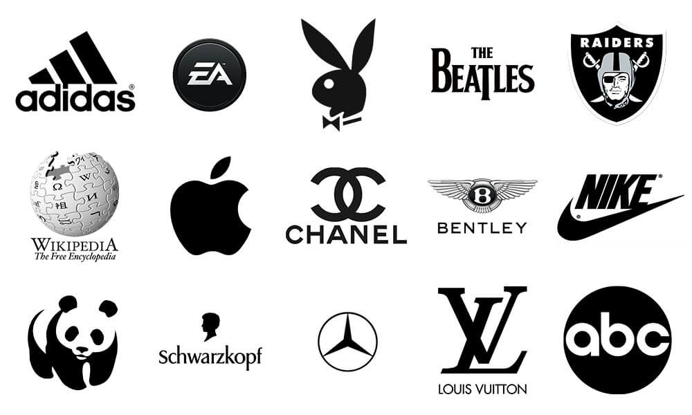
Black and white colours in logo design represent elegance, sophistication, and class.
Black and white can be seen in logos that want to represent power.
Nike, Puma, and Mercedes-Benz are some of the brands that incorporate black and white.
Black is a great colour if your brand caters to audiences that want to feel mysterious.
Meanwhile, white is an excellent colour to signify simplicity.
The meaning of each colour is significant as it will represent what your business portrays to the world.
Mixing and matching these colours with your logo design can help create a multitude of effects for your audiences, which can significantly help “establish” your presence in your niche.
How Many Colours Should You Use?
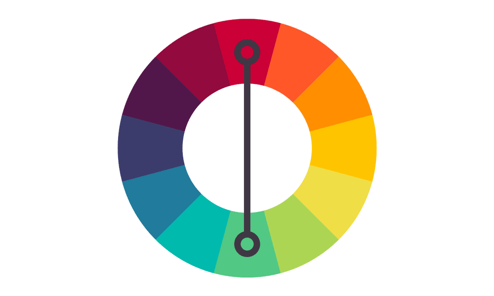
The number of colours in logo design is really up to you.
After all, this depends on the design you want to choose and the direction your company or business is taking.
However, here are some things to consider when choosing how many colours you want to use:
Too many shades together can cause an overwhelming and sometimes cheap appearance.
Unless you are selling rainbows, it is probably best not to include all colours of the rainbow in your logo design.
2 to 3 colours are generally what most brand names use.
There are two primary colours and then white which makes the third shade.
This helps “ground” the logo into a design that isn't too overwhelming for viewers.
You may notice this logo design trend in today's brands, where most are in fact using just one colour to “define” their name.
This is because the colour in itself and the logo design can already work in tandem.
The number of colours you use should balance evenly and shouldn't try to fight each other on the design.
Considerations When Selecting Colours
You cannot just choose a colour or a group of colours in logo design because they are “appealing” to you or your company.
Other factors can affect your colour choice and how it affects your logo.
When choosing your colours, here are some things to remember:
Use contrasting colours to create a more visually appealing appearance.
Unbalanced colours can create an odd reaction from your consumers and may cause them not to want to buy from you.
Decide which colour combination best represents your products, services, or overall company.
Try to choose between two to three colours only, to avoid overwhelming your potential customers.
These choices are important because you will stick to this colour scheme for a while.
Rebranding into a completely different design scheme can be risky for any business, which means this first choice matters.
Compare your business with your competitors.
What colours do they use in their designs?
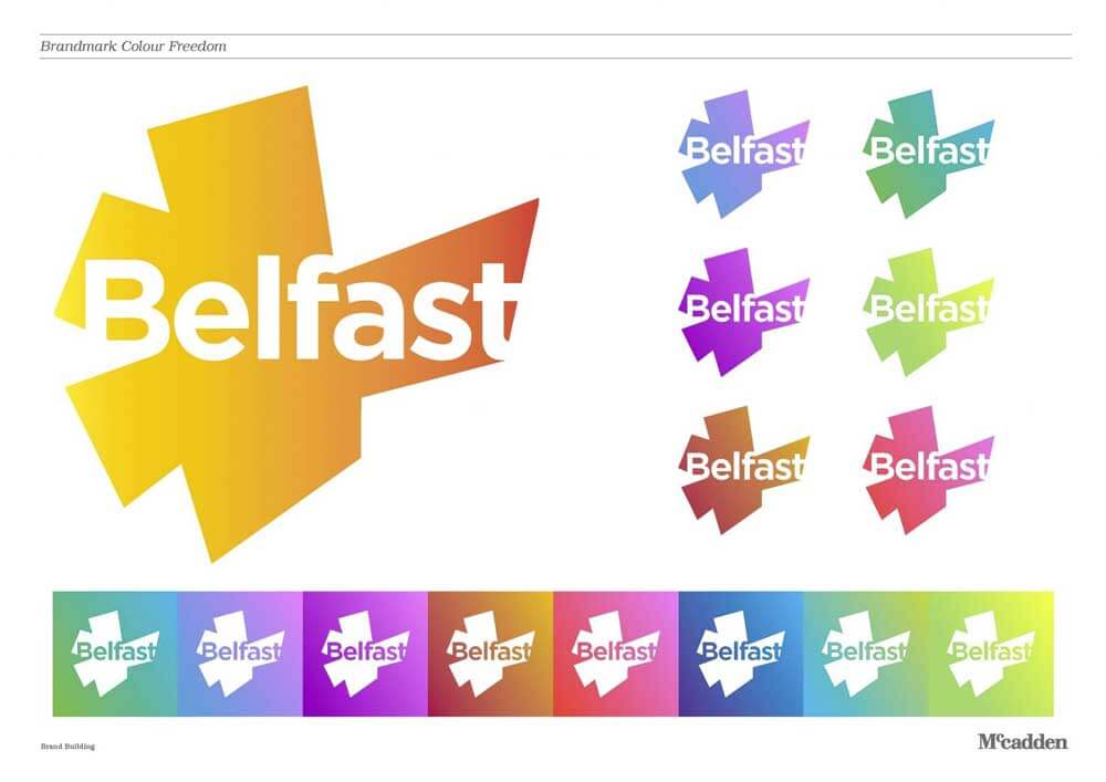
Try to create an analysis as to what makes your competitors' logos “unique” in the landscape, and try applying these methods to your designs.
Colours are not limited to any particular industry, so don't be afraid to venture into shades not typically seen in your industry if you feel it is right for you.
This means regardless of what your competitors use; you can always try to bring something “unique” into the industry.
It is not wrong to do a logo study at this point, where you try to have people assess how attractive your potential logo designs can become.
Try to look at the world and the current trends in style to determine the kind of approach you should do to choose colours for your logo.
In today's time, minimalism is becoming more popular, so try to consider using colours that are fit for flat designs.
In fact, the trend nowadays is to either use just one or two colours, as this allows consumers to “focus” on your branding.
Depending on where you live in the world, decide whether the colours you choose have significant cultural meanings and work this to your advantage if you are only a local company.
Remember, your company logo design is not just there for show.
Not only can it define your brand and its potential contribution to your niche, but it can also hold a message.
Overall your colour choice should feel right for you.
Don't be afraid to look at other logo designs and colours to get an idea of how they feel when viewed.
By doing this, you will be able to see the different colour combinations brands use that you too could use in your design.
Always remember to experiment with preliminary concepts in the logo design process and find what you think is the most efficient for your company.
You can do this by asking around and doing surveys for people to choose the kind of logo that will “work” for them.
This is an excellent test to see whether or not your logo will be a “hit” to consumers.
Always work on making your logo an identifiable mark for your business.
Conclusion
Logo design is an integral part of establishing your identity as a Brand name.
After all, your logo helps define your branding, which in turn helps create your mark in your niche.
Choosing your logo design correctly down to the colours you select can help make a big difference when attracting customers.
The above tips are just some you can mix and match to make sure your logo will stand out ahead of the competition.
Choosing a colour for your logo design is an important choice when building a business and brand name.
By taking the time to select the colours in logo design, you can ultimately create a powerful brand name that drives appeal and results for your business.
At Fone Dynamics, we chose black and white for our logo.
So what colours are you leaning towards using in your new logo?
