10 Mistakes Logo Designers Should Avoid
Experienced designers and marketers know how impactful well-executed, professional logo design is to any business, large or small.
After all, not only does a logo visually represent a business entity, but it also plays a role in telling its story, communicating its values, and helping potential and existing clients become familiar with its presence in the market.
Simply put, a logo makes for a visual representation of brand identity.
With this in mind, it’s no surprise that business owners and marketers often strive towards finding the perfect logo design. Unfortunately, though, perfection is quite hard to accomplish. And not only that, but it also comes at a steep price.
So what should you be aiming for when coming up with a visual representation for your business? And what are the top logo design mistakes designers need to look out for? Let’s find out.
Table of Contents
Exceptional Logo Design: What It Does

As the supporting pillar of any brand’s identity, a logo plays many roles.
For one, it’s a piece of visual information. More precisely, it’s the type of information that the human brain has an easier time remembering.
Research conducted in 2009 showed that the picture superiority effect (the fact that we’re better at remembering images than words) plays a significant role in memory processes, namely familiarity and recollection.
Knowing this, marketers can strategically use a brand’s logo to speed up recognition.
For example, we know that it takes an average of 3.4 touches between the moment a consumer is introduced to a brand and becomes a customer.
Therefore, designing a world-class logo can significantly lower customer acquisition costs by speeding up the buyer’s journey through the marketing funnel.
The second benefit to utilising a well-designed brand logo that’s attractive and memorable is that 59% of consumers prefer to buy from brands they are already familiar with.
So, having a recognisable visual element to signify a business increases the chances of customers recalling that they trust the brand in question and make a purchase.
And, of course, that’s not all the benefits of a professionally designed logo.
Get it right, and you’re opening up a whole new host of possibilities for your business.
From communicating a message to creating an additional income stream (Playboy earned about $45 million in 2017, just from licensing its signature sign), having a great logo is a must.
Why Logo Designers Need to Avoid Mistakes
Now that you understand everything you stand to gain from having a world-class logo to represent your brand, there’s one more thing to cover: the cost of poor logo design.
You see, the cost of a poorly designed logo isn’t just the money you throw out when paying for its next iteration.
It’s much more.
For example, a poorly designed logo may not connect with your audience. Whether due to colour choices, typography, or oversight, the cause of your logo’s shortcomings don’t matter.
At least not in the grand scheme of things. What matters is that when your target customer sees your logo, they’ll get the wrong impression of your brand.
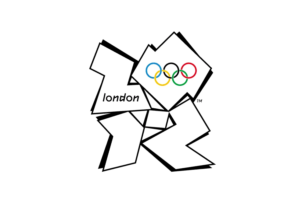
Similarly, confusing logos often fall short. A famous example comes from the 2012 London Olympics, with a design that barely resembles the year and reminds most people of a little girl sitting at her computer.
Some logos send the wrong message — a tacky visual used to represent a legal company or a business advertising its dedication to detail, then failing to develop a detailed logo.
Nevertheless, when it comes to the most impactful consequence of having a poor logo made for your business, it’s that, at some point or another, you’ll have to rectify the mistake. And that will cost you both money and reputation.
Research from 2012 uncovered that brands who changed their logos or visual identity tended to see adverse reactions from their committed customers.
In other words, their most loyal buyers hated the changes and perceived the new development as a signal that their favourite brand wasn’t what it once was.
Fortunately enough, you can avoid such backlash. To help designers (both new and experienced) lessen the amount of time, issues and headaches, we have compiled a list:
The top 10 mistakes logo designers should avoid
1: Copying, Plagiarising or Stealing Someone Else’s Logo

Copyright and trademark infringement is rife on the internet and not just for design.
It happens in all spheres of creation, from media to ideas and intellectual property.
Among designers, a common excuse for stealing someone else’s idea is lack of time.
Sometimes, the short timeframe originates with the clients’ under evaluation of the nature of the work.
Others happen because industry novices compete in crowdsourcing competitions, hoping to “win” a job (and the monetary prize that comes with it).
But the thing is, this type of behaviour is problematic for both designers and brands.
On the one hand, the client stands to lose a huge deal. Not only does using a stolen logo open them up to potential legal ramifications, but they also risk losing money, time, and their reputation.
On the other hand, designers need to understand the consequences of stealing as well.
Not only is “borrowing” a potential end of a career, but it’s also a lawsuit waiting to happen, eventually costing much more than the quick $50 the ripoff earned through Upwork.
We have often found some of our logos, created for clients, blatantly ripped off under the guise of another business.
For example, one Russian company used the logo from our graphic design portfolio. And not only did they make zero changes, but their name was even the same as our client’s.
This wasn’t just a problem for them, but for us, the designers, as well. And, of course, the people who paid for that logo in the first place weren’t happy either.
Fortunately, after a polite email to the company, they removed it apologetically and got in touch with their creative genius to sort it out.
So, what’s the best way to avoid plagiarism in your logo design?
Well, the first step is setting a clear timeline. If the job was due yesterday, then you’d better charge nicely or let go.
Secondly, make it your mission to become more organised about research.
If you browse the internet for inspiration, ensure that you save and adequately label each inspiring design you wish to draw from.
This way, you won’t just have a vision board handy for quick reference, but you’ll also be able to check whether you’ve subconsciously copied someone else’s design before you send your work for approval.
Finally, don’t forget about the importance of feedback.
If you’re a beginner designer who’s not yet sure about their skill, your best bet will be to find a mentor.
Not only will they be able to help you avoid further logo design mistakes, but they’ll also know how to direct you towards becoming an original artist who doesn’t have to rely on stealing to make a living.
Conclusion: Even if the logo isn’t from a well-known brand, don’t risk stealing/copying it for your client in the hopes of making a quick buck.
2: Vague or Overly-Complex Design
You have just started an exciting project and are working to a tight deadline. You have so many ideas in your head that they are bursting out of the sketch pads and onto the floor.
In the excitement of the creative juices flowing, your deadline is catching up to you, and you end up combining several of the most potent approaches into one.
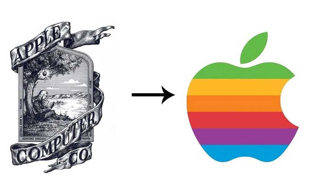
The problem is, the final logo you propose to the client is a complicated design, sending various messages and ultimately lacking clarity. This can be a significant branding issue.
After all, one of the primary purposes of a logo is to communicate a message to the viewer about the company. And if that message is unclear, how will the potential buyer understand and trust the business in question?
Moreover, when designing a logo, you must understand that a consumer reaction doesn’t have to be harmful to your business to suffer.
You can feel the consequences of indifference just as severely when trying to win over new clients or buyers.
The key to designing a logo for clarity is usually to go with a simple solution. For example, if you check out this logo from Flamingo, you’ll see how well it combines the brand’s name, initial visual association, and colour palette to maximise recall. And the reason it works is that it’s simple and to the point.

So, next time you’re tasked with creating a great logo, ask yourself: is there a more straightforward way to do this?
Conclusion: Sure, you may be bursting with ideas. But remember, developing the most robust approach will always work better than creating a Frankenstein mix of multiple directions. That way, you’ll be successfully conveying the meaning you’re being paid to represent visually.
3: Poor Colour Choices
Another common mistake many designers seem to make is related to colour choices.
Sure, logos can be very colourful and vibrant. Going in that direction is an excellent way to capture consumer attention and form a memorable brand image.
But the thing designers have to remember is that not all colours go with each other.
One great way to avoid the mistake of a tacky, colour-bomb-explosion logo is to work in black and white. Even if the idea is for the final result to be colourful, designers can ensure that the final result is timeless and adaptable by stripping away the colours during the planning phase.
Plus, you’ll be giving your clients two options for the price of one, which will come in handy on adaptive sites, like in this example from Rain or Shine Golf.

As for when the time comes to add colourful hues, designers need to use every single tool at their disposal.
One of those is Adobe Color. This software allows you to see the colour spectrum and use sliders to create complementary colour palettes that work well together.
Although colour can be very subjective, it is also essential to consider the psychological effect colours have on consumers.
It seems like an obvious point to make, but think about what the colour means from a conceptual background before assigning it the messages you are trying to convey.
Furthermore, not presenting jarring colour schemes will prevent clients from turning an idea down before even considering it properly.
On that note, when picking colour schemes for your next design, try to involve the customer, even if they are the least creative person in the world.
Ask them the following questions:
- What colours appeal to them for the brand, and why?
- Request that they collect colours that stand out, either through screenshots or scrapbooks and then form that as the basis for your colour development stages.
Conclusion: Start in black and white, only adding limited colours that complement and make sense if required for the design.
4: Typographic Issues
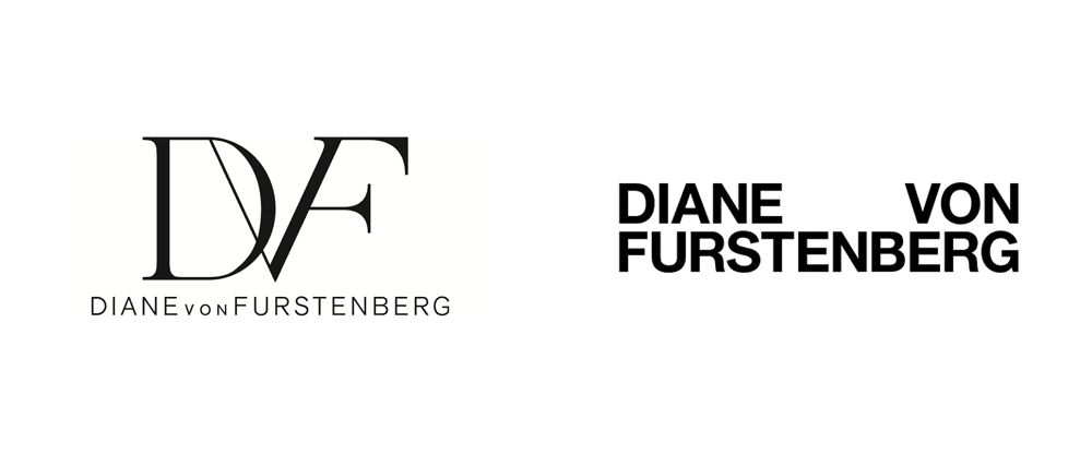
Believe it or not, many designers make fundamental mistakes regarding typeface and lettering used in their logo designs.
Typography is one of the essential aspects of logos, and choosing appropriate fonts is part of the process. But, the thing is, knowing how to choose the suitable typeface takes education and experience.
And even then, trends change, technology advances, and suddenly, a font that looked great in print no longer offers the required legibility for it to be appropriate for digital use.
For this reason, it’s a good idea to keep a checklist of typographic rules to follow when designing logos for your clients.
- Spacing — Excessive or insufficient spacing can destroy legibility and readability on both large and small scales. The same goes for kerning. When choosing fonts, make sure to space each visual representation in a way that allows maximum readability, even with scaling.
- Predictable or overused typefaces — We all know Times New Roman and Arial. They are the default, go-to fonts installed on every computer. Still, when designing a logo for your clients, be sure to experiment and check out other fonts on the market before taking the easy route.
- Ridiculous Font Choices — I have genuinely seen serious companies (or at least attempting to be serious) using ‘professional’ logos attached to Papyrus and Curlz fonts. And don’t even get me started on Comic Sans.
When choosing typography for your next design, make sure you use appropriately formal fonts.
Having trouble deciding: ask yourself: would this do an excellent job at representing the business?
Or does it resemble a pre-school presentation project that somehow got approved for professional use?
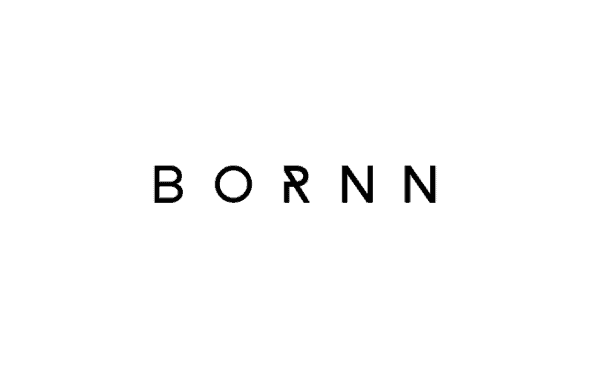
If you’re trying to go for a unique visual effect, try not to go about it with tackiness. Instead, take inspiration from brands like BORNN, which manages to turn a minimalistic font into a showstopping design choice with a single added line on the letter R.
- Fonts With Extremities of Weight — Skinny fonts can look glamorous. Super-heavy fonts can be playful and bold. However, for most logos, a better balance needs to be struck between message and legibility. While it may look great on a mocked-up billboard, how is that business card going to handle Helvetica Neue LT Std 25 UltraLight at 8pt? To avoid this mistake, test the font out on all the assets it will be used on. That way, you can make your decisions based on tangible info and won’t have to feel around in the dark.
- Using Too Many Fonts — Three, four, or even more fonts in the same design overcomplicate and confuses any message. Within logo designs, I recommend two at the most typefaces be used. My guide tends to fall with one primary ‘brand font’ that you can utilise across all corporate media. Then, if the brand requires a tagline, for example, using a readable and complimentary typeface can work efficiently. Choose balanced and legible typefaces that can be read at extreme sizes and convey the correct message for the brand.
5: Designing Logos That are not Suitable for All Mediums
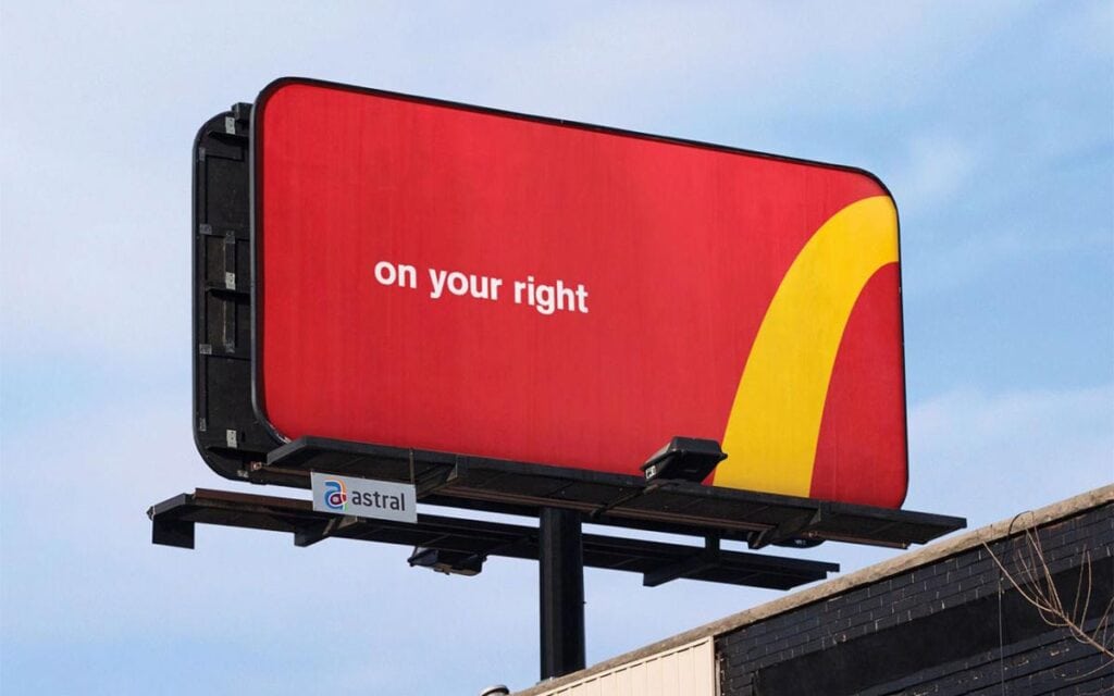
After creating what they think is the perfect logo, many logo designers call it a day and finalise the work with the client, without double-checking if it will work in all mediums. That can be a costly mistake.
Nowadays, most logos appear in more than just one format. Even if you are branding a wine company that only prints their logo on the bottle labels, what happens in a year or two when they decide to get it embroidered on a staff uniform, only to find out that the design doesn’t work?
They will have to do a whole redesign after just a single year or, even worse, will have to sacrifice innovation and expansion.
Ensuring that logos work for multiple mediums goes back to the idea of making sure you start the design process in black in white.
By nailing the logo’s most straightforward of forms (and ensuring it is adaptable), you’ll be future-proofing your client’s investment.
A good test to check for medium versatility? The fax test. If the logo holds up to be faxed, you are okay — even though fax is not precisely popular nowadays. But, if it doesn’t, you should consider going back to the drawing board.
Conclusion: Don’t create a logo that relies solely on stylisation or fancy effects to get the message across — it must work in the simplest forms.
6: Designing for Your Portfolio Instead of the Client’s Needs
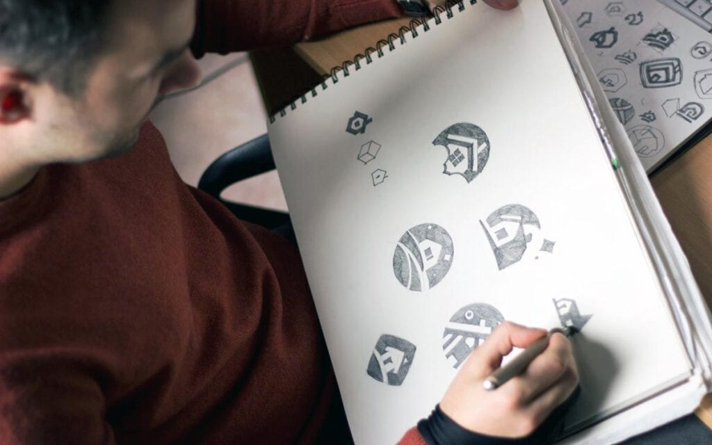
A selfishly designed logo is something that the designer has created with only themselves in mind, rather than their client’s success.
The problem with some designers is that they focus on how the logo will look in their portfolio.
But, as a professional, you have to remember: designing a logo that puts your needs before the clients is not why they hired you. What they want is your honest advice, expertise, and dedication.
They rely on you to use strategy to create the most robust and most suitable logo design possible.
Similarly, if you have a ‘style’ of design, sometimes it may not be appropriate for a particular project.
In these cases, instead of forcing a brand to fit your ‘look’, drop the arrogant mentality and put the client first.
Design should never say, Look at me. It should always say, Look at this.
Conclusion: Before you begin creating a logo, make sure that you know its goals and keep them in mind when working on the concepts.
Remember that it is not all about you. Instead, it is about your client trying to reach out to their target audience for their company to be successful.
Designing a logo that puts you before the customer is not why they’ve hired you. Put them first.
7: Using Clipart and Stock Imagery

Please don’t laugh; it happens!
As with designers using the Papyrus font for a logo, I have seen more clip art and overused template logos than is desirable.
Of course, clipart no longer just stands for the silly illustrations that came bundled with Windows 95. It has taken on a new form in logo design through the abstract symbols sold on stock photo sites.
But there’s a big problem with these types of catch-all solutions: they lack meaning.
No one that calls themselves a professional logo designer should ever consider using these re-sellable template options for client work.
Unique and appealing are two words that should fit a custom logo design, neither of which apply to the overused, cliched, swoosh around a globe mark that has 15,000 sales on some stock sites at $5 apiece.
Logos that come with these images are cheap to look at and are not a good way of establishing a company branding.
Conclusion: Always come up with original work for your client, and they will undoubtedly thank you for it.
8: Unnecessary Inclusions
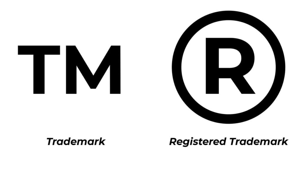
There are certain characters, symbols and elements that aren’t necessary to include in a logo.
For example, there is no need to include “Co.”, “L.L.C.”, “Inc.”, etc., when creating the logo for a company.
Although some clients may request an adaption of the primary logo with symbols such as the Trademark (TM), Registration symbol (®) or Copyright (©), these should not be critical elements of your basic design solution. Instead, they’re variations to be used as necessary.
Part of the logo design process is to simplify and reduce superfluous elements within the design to get to the core forms — having these additional, unnecessary items is only distracting from the logo itself.
In any project where I have been requested to include items like the above, I have always been sure to ask, “does the law require you to include this in the logo?” with the usual answer being “well… no.”
Of course, if a small design detail, such as the dot at the end of Morrama’s logo, makes for an attractive aesthetic choice, you don’t have to remove it from your final solution. But be sure not to fall into the trap of overembellishment in places where simplicity works better.
Conclusion: If something is not needed, get rid of it. Simplify!
9: Using the Wrong Logo Design Software
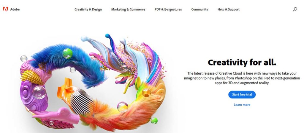
If you want to be a professional, using the right logo design software is essential.
Other designers have criticised me for saying that you ‘MUST use Adobe Illustrator,’ but I stand by my point.
That point, by the way, is about creating logos in vector form instead of bitmap — I am in no way affiliated with or firmly attached to Adobe by any means; quite simply, it is the best software out there currently for designing logos professionally.
Reading this, you may use another vector design application (I believe Sketch is the next favourite), which is okay for logo design.
The critical point to draw attention to is that the best logo design software is vector-based, not something like Photoshop, which is raster.
The first logo I ever created was in Adobe Photoshop, and it worked well initially. That is until the client emailed me asking for a larger version of a poster.
When I enlarged it, it naturally blurred out of focus, and there was no easy fix. I had to learn Illustrator quickly, recreate the logo in vector form, then email all the new files with an explanation.
Having your logo files in vector format will solve 99% of potential issues you could come across.
If it is too small, enlarge it and export. If it needs to be a different shade of blue, no problem, select the colour, update the file and export.
Conclusion: Using the correct software cuts out much work in the long run. If you are reading this and the only logo files you have are raster files (JPEG, PNG, PSD, etc.), I would advise getting in touch with a designer to vectorise or recreate it in a professional format.
10: Lacking a Process for Designing Logos

The final reason so many designers spend so much time designing the logo yet cannot come up with a satisfactory final result is that they just do not have the proper design process to follow.
As with any project, logo design requires a set of stages that you need to adhere to when working.
What often happens is that designers, especially young designers, want to finalise concepts as soon as possible. So, they start sketching right away without doing their research.
But, the problem arises when they realise they have missed a step, forcing them to go back and redo the work they’ve already put precious time into.
Therefore, as a designer, you need to remember: the first step is always to do your research.
Read and understand the creative brief correctly and if there are things that are not clear to you, ask your client about them before you proceed.
Once you have understood everything, then that is when you can start exploring and sketching.
After sketching, the next step is to get your design onto the computer in digital, vector form.
The final stage is the presentation, and this is where you decide the colours to use, font styles, etc.
Once you have worked on a few projects, smoothly following each stage, you will begin to do all this naturally.
And, after a while, it will become ‘your’ process. It will allow you to express your creativity, practice efficiency, and see great results.
You can also research case studies of other logo designers to see how they get from design brief to end product.
Conclusion: Having an in-depth process of creating logos will allow you to focus on the actual design itself.
Final Thoughts
As you can see, there are plenty of mistakes you need to avoid when venturing to create a winning logo for your clients.
Fortunately, it’s a process with a natural learning curve, which means that the more you do it, the better you’ll get at it.
In the meantime, while you’re still honing your craft, try to keep an eye out for these common mistakes. Avoid them, and your battle is already half-won.
Using your skills and expertise, you will be able to finish your job in a reasonable amount of time with no headaches.
What mistakes have you seen in logo design?
Feel free to leave a comment below.

Great post, I think the poor color choices are the worst mistake a designer can do. I have also seen most the people repeating same mistakes. Thanks for sharing this guide. I hope this will help many of us.